

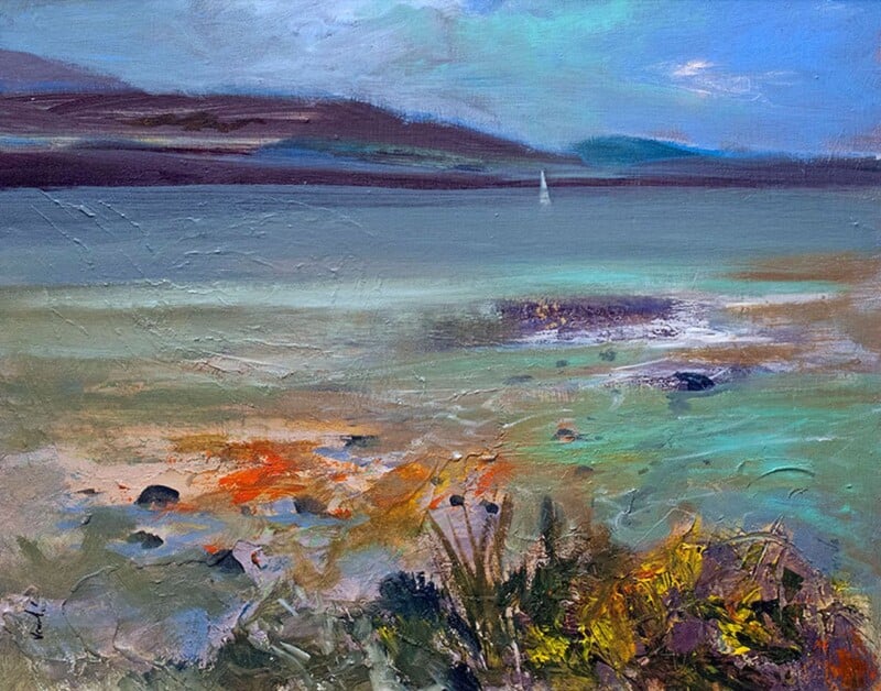
Choosing art for a hallway with stone flooring is often about softening a practical surface. Stone floors are durable, handsome, and easy to live with, but they can also make a hallway feel cooler if the walls do not bring enough warmth. Rocky Shore Orkney works well here because it adds movement and atmosphere without cluttering the entrance.
Why entrance spaces need more than practicality
A hallway with stone underfoot often already has structure and texture. What it needs next is something on the wall that makes the space feel welcoming rather than purely serviceable. One framed print can do that far more effectively than a collection of smaller decorative touches.
- It helps harder finishes feel more relaxed and lived with.
- It gives the entrance a focal point people notice as they arrive.
- It suits both contemporary and more traditional homes with stone flooring.
Why Rocky Shore Orkney suits the setting
The artwork has enough energy to lift a cooler surface, but it still feels composed enough for an everyday route through the house. That balance matters in hallways, where the decoration has to be effective without ever feeling busy.
First 4 Frames completes the piece in-house in Falkirk with bespoke framing, colour-managed Giclee printing, and hand-finished craftsmanship. In a close-view space like a hallway, that polished presentation makes a real difference.
You can see more from Arie Vardi and view the exact framed product here.
If you need art for a hallway with stone flooring that makes an entrance feel warmer and more grounded, Rocky Shore Orkney is a very good choice.