Posted on

Approaching Elgol and the Appeal of Wall Art for Crittall Doors

Approaching Elgol" vividly depicts a coastal landscape with a winding path through colorful fields, white cottages, bright flowers, blue water, and distant mountains beneath a turquoise sky.

The best wall art for Crittall doors needs to balance structure with warmth. Metal-framed glazing gives a room definition and plenty of light, but it can also make the scheme feel slightly hard if nothing softens it. Approaching Elgol works beautifully because it introduces atmosphere and distance without fighting the architectural lines.

Why glazed rooms still need a grounded focal point

When a room has Crittall doors, the eye naturally notices frames, panes, and sight lines. That crispness is part of the appeal, but it leaves the wall art with an important job. The right piece should stop the space from feeling all edges and geometry. Approaching Elgol brings enough movement and depth to do exactly that.

  • It suits open-plan rooms divided by internal glazing.
  • It softens stronger architectural detailing without looking vague.
  • It helps a modern scheme feel more welcoming and less severe.

Why this subject works in a more architectural interior

Coastal artwork often brings breathing space to rooms with stronger lines. Here, the sense of approach and distance gives the eye somewhere calmer to rest. That makes the whole room feel more layered, particularly if the doors open between a kitchen, dining area, or sitting space.

It can work especially well on the wall beyond the glazing, near a dining table, or in the seating area that needs a little more softness against black, bronze, or painted metal frames.

Why the First 4 Frames finish matters

First 4 Frames completes every piece in-house with bespoke framing, colour-managed Giclée printing, and hand-finished craftsmanship. In a room where metalwork, glazing, and joinery are already carefully chosen, that higher standard helps the artwork feel like part of the design rather than an afterthought.

This artwork is by Jean Feeney, and you can view the exact framed product here.

If you need wall art for Crittall doors that feels warm, composed, and professionally finished, Approaching Elgol is an excellent fit.


Posted on

Why Lighthouse Works So Well as Wall Art for Picture Rails

Choosing wall art for picture rails is often about proportion. In a room with period detail, the wall already has structure, so the artwork needs to feel properly placed rather than floating too high or looking lost below the rail. Lighthouse works especially well because it gives the wall a clear focal point while still respecting the room’s traditional lines.

Why period details need calm balance

Picture rails bring character, but they also divide the wall visually. That means the artwork has to feel intentional within the space beneath them. Lighthouse has enough clarity and presence to stop the wall from feeling fragmented, while the subject keeps the room light rather than formal.

  • It suits bay-windowed sitting rooms, dining rooms, and older hallways.
  • It helps a traditional wall treatment feel more connected.
  • It adds colour without making the room feel crowded.

Where it tends to look best

This kind of piece works beautifully above a sideboard, between two windows, or on the main wall where the room needs one stronger visual anchor below the rail. The framed finish helps the artwork feel settled and deliberate, which is exactly what period spaces respond to best.

Why the framing standard matters here

First 4 Frames completes each piece in-house in Falkirk using bespoke framing, colour-managed Giclée printing, and hand-finished craftsmanship. In a room with original features or more classic detailing, that superior quality matters because the artwork needs to hold its place alongside joinery, plasterwork, and better furniture.

This artwork is by Esther Cohen, and you can view the exact framed product here.

If you want wall art for picture rails that feels balanced, polished, and easy to live with, Lighthouse is a very smart choice.

Posted on

Choosing Art for Butter Yellow Walls, Why Cromwell Harbour, Dunbar Works So Well

Choosing art for butter yellow walls is often about keeping warmth under control. Yellow can make a room feel welcoming and full of light, but it can also tip into looking sugary or dated if the artwork does not give the scheme enough contrast. Cromwell Harbour, Dunbar works beautifully because it introduces cooler notes and structure while still feeling friendly and approachable.

Why yellow rooms need balance more than brightness

A butter yellow wall already carries plenty of warmth. The artwork does not need to repeat that loudly. It is often more useful when it brings calm, definition, and a little freshness into the mix. This piece does exactly that, helping the room feel more grown-up and better resolved.

  • It keeps a warm wall colour feeling lively rather than heavy.
  • It suits kitchens, breakfast spaces, and sunlit sitting rooms.
  • It helps colour feel intentional instead of overly nostalgic.

Why the subject makes sense here

Coastal imagery often works well with yellower walls because it introduces air and distance. Cromwell Harbour, Dunbar offers that sense of openness, which stops the room from feeling too enclosed by its own colour. The framed piece becomes a point of relief as much as a decorative feature.

It can work especially well above a sideboard, beside a dining table, or on a wall that catches the sun and benefits from something a little cooler in tone.

Why a hand-finished framed print elevates the look

At First 4 Frames, each piece is completed in-house with bespoke framing, colour-managed Giclée printing, and hand-finished craftsmanship. That superior quality is especially useful in colour-led rooms, where weaker prints can quickly look flat or accidental.

This artwork is by Esther Cohen, and you can view the exact framed product here.

If you need art for butter yellow walls that feels balanced, fresh, and professionally finished, Cromwell Harbour, Dunbar is an excellent choice.

Posted on

Why Heres looking at you Isle of Bute Works So Well as Wall Art for a Room With French Doors

Choosing wall art for a room with French doors is often about balance. The doors bring welcome light, movement, and a strong connection to the garden, but that same openness can leave the room feeling a little visually loose unless the walls carry enough weight. Heres looking at you Isle of Bute works especially well because it keeps the room airy while still giving it a clear focal point.

Why garden-facing rooms need something steady on the wall

French doors naturally pull the eye outward. That is part of their appeal, but it also means the interior can feel underplayed if every surface is too pale or too quiet. This piece helps pull the room back together. It adds colour, shape, and enough presence to stop the space feeling unfinished once the daylight starts shifting.

  • It suits sitting rooms and dining rooms that open directly onto the garden.
  • It adds atmosphere without fighting with the view.
  • It helps the room feel styled in its own right rather than only defined by the doors.

Where it can make the biggest difference

This kind of framed piece works well on the wall perpendicular to the doors, above a sideboard, or anywhere the room needs a little more visual structure. The subject keeps things relaxed, but the framed presentation gives the space a more settled and deliberate feel.

Why the finish matters in a bright room

First 4 Frames completes each piece in-house in Falkirk with bespoke framing, colour-managed Giclée printing, and hand-finished craftsmanship. In a light-filled room, that standard matters. Cleaner framing and better print quality help the artwork hold its own rather than washing out beside the glass.

This artwork is by Arie Vardi, and you can view the exact framed product here.

If you want wall art for a room with French doors that feels light, balanced, and professionally finished, Heres looking at you Isle of Bute is an excellent option.

Posted on

Bright and Breezy, Isle of Arran as Wall Art for Painted Floorboards, Why It Works

Good wall art for painted floorboards should work with a room’s easy character while still giving it enough visual weight. Painted boards often make a space feel brighter, cleaner, and more informal, but they can also leave the room looking a little sparse if the walls are not doing their part. Bright and Breezy, Isle of Arran is a very good answer to that problem.

Why lighter flooring needs a little more lift on the wall

Painted floorboards create openness, which is exactly why people like them. The room then benefits from artwork that introduces colour and shape without making the whole scheme feel heavier. This piece keeps things fresh while still anchoring the space.

  • It suits brighter, more relaxed interiors beautifully.
  • It adds presence without disturbing the airy feel of the room.
  • It works well in bedrooms, sitting rooms, and coastal-inspired hallways.

Why the mood feels so compatible

Some artwork feels too formal for a room with painted boards. Bright and Breezy, Isle of Arran does not. It has enough energy and colour to feel uplifting, but it still sits naturally in a room where the atmosphere is relaxed and welcoming.

It can work especially well above a sideboard, along a stair run, or on the wall that benefits from one more confident element in an otherwise light scheme.

Why a hand-finished frame helps

At First 4 Frames, every piece is completed in-house in Falkirk with bespoke framing, colour-managed Giclée printing, and hand-finished craftsmanship. That superior finish gives the artwork enough presence to hold a lighter room properly.

This artwork is by Jean Feeney, and you can view the exact framed product here.

If you are looking for wall art for painted floorboards that feels uplifting, balanced, and professionally finished, Bright and Breezy, Isle of Arran is a strong option.

Posted on

Why Tranquility, Plockton Works So Well as Wall Art for Jute Rugs

Finding the right wall art for jute rugs is often less straightforward than it sounds. Jute brings welcome texture and softness underfoot, but it can also leave a room feeling a little unfinished unless the walls carry enough visual interest. Tranquility, Plockton works especially well because it keeps that natural ease while giving the room a stronger focal point.

Why natural flooring needs balance above it

Jute often appears in rooms that aim for a relaxed, pared-back look. That can be beautiful, but the scheme still needs a little colour and shape on the walls if it is going to feel fully considered. This piece brings exactly that without disturbing the calm.

  • It adds atmosphere without making the room feel busier.
  • It works well with timber, linen, and woven textures.
  • It suits sitting rooms, bedrooms, and casual dining spaces particularly well.

Why this pairing feels easy to live with

The room still keeps its natural softness, but the artwork stops it from drifting into looking incomplete. Tranquility, Plockton has enough colour and distance to help the whole space breathe while still feeling anchored.

It can work beautifully above a sofa, near a favourite chair, or on the wall that frames the seating area in a more relaxed scheme.

Why the First 4 Frames finish matters

First 4 Frames completes every piece in-house with bespoke framing, colour-managed Giclée printing, and hand-finished craftsmanship. That superior finish helps the artwork feel properly at home in a room built around better materials and a quieter style of decorating.

This artwork is by Colin Robertson, and you can view the exact framed product here.

If you need wall art for jute rugs that feels calm, layered, and professionally finished, Tranquility, Plockton is an excellent choice.

Posted on

Why Sound Of Taransay Works Beautifully as Wall Art for Rattan Furniture

Choosing wall art for rattan furniture is often about getting the balance right. Natural textures already bring warmth and character into a room, but they can start to feel a little expected if the artwork leans too heavily into a beach-house cliché. Sound Of Taransay works beautifully because it keeps the room light and relaxed while still giving it a more considered focal point.

Why it suits natural textures so well

Rattan, cane, and woven finishes tend to look best with artwork that has movement and atmosphere rather than something too rigid or overworked. This piece has that easy sense of flow, which helps a room feel collected rather than themed.

  • It adds colour without fighting the room’s lighter materials.
  • It keeps a natural scheme feeling airy rather than rustic.
  • It suits sitting rooms, sunrooms, and relaxed bedrooms especially well.

Where it can make the biggest difference

This kind of framed print works especially well above a woven bench, near occasional chairs, or on the main wall of a room where timber and natural fibres already do much of the talking. It gives the eye somewhere to settle while still keeping the overall mood easy to live with.

Why the framed finish matters

At First 4 Frames, each piece is completed in-house in Falkirk with bespoke framing, colour-managed Giclée printing, and hand-finished craftsmanship. That superior quality helps the artwork feel polished enough for a room built around quieter materials and better textures.

This artwork is by Arie Vardi, and you can view the exact framed product here.

If you are looking for wall art for rattan furniture that feels refined, restful, and professionally finished, Sound Of Taransay is an excellent option.

Posted on

Why Whispered Shore Works Beautifully as Art for Boucle Furniture

Choosing art for boucle furniture is often about texture as much as colour. Boucle brings softness and comfort into a room, but without the right artwork nearby the whole scheme can start to feel a little too muted. Whispered Shore is a strong answer because it adds movement and clarity while keeping that softer overall mood intact.

Why texture-led rooms need visual contrast

Rooms built around tactile fabrics benefit from artwork that brings definition without becoming harsh. The better pieces usually echo the softness of the room in spirit, but still introduce enough shape, colour, and direction to stop everything blending together. That is exactly where this artwork works well.

  • It suits softer interiors without feeling overly pale.
  • It gives a textured room more visual depth.
  • It helps neutral upholstery feel finished rather than unfinished.

Why Whispered Shore fits the setting

The coastal atmosphere brings ease and light, while the composition gives the room something more definite to gather around. It can work beautifully in sitting rooms, bedrooms, or relaxed guest spaces where boucle chairs, benches, or cushions need a companion piece that keeps the scheme elevated.

Why the First 4 Frames finish helps

First 4 Frames produces every piece in-house with bespoke framing, colour-managed Giclée printing, and hand-finished craftsmanship. In a texture-led interior, those finishing details stand out. A superior quality frame helps the artwork feel considered and keeps the softer room scheme looking polished rather than vague.

This artwork is by Colin Robertson, and you can view the exact framed product here.

If you need art for boucle furniture that feels soft, balanced, and beautifully finished, Whispered Shore is a very appealing choice.

Posted on

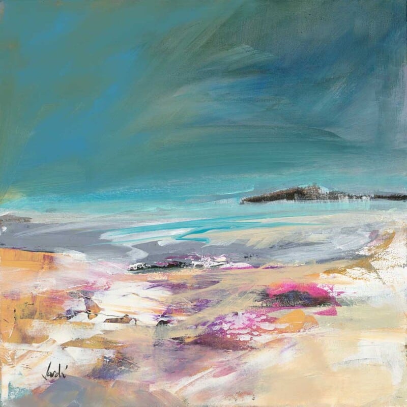
Choosing Wall Art for Walnut Furniture, Why Low Cloud at Melvich beach Sutherland Works

Finding the right wall art for walnut furniture is often about preventing a room from feeling too visually heavy. Low Cloud at Melvich beach Sutherland works beautifully because it brings air, movement, and coastal light into a scheme shaped by richer timber tones.

Walnut furniture has depth and warmth, but it can dominate if everything around it is equally dark or dense. This piece helps counter that. The landscape feel introduces breathing space, while the framed presentation still has enough presence to sit comfortably alongside more substantial furniture.

  • It softens deeper wood tones without making the room feel washed out.
  • It works well with walnut sideboards, dining furniture, shelving, and occasional tables.
  • It helps a scheme feel layered and intentional rather than simply brown-on-brown.

Where it works best

This kind of piece suits a dining room, living room, or study where walnut furniture already gives the space structure. It is especially effective when the room also uses neutral upholstery, stone, or soft blue-grey accents that benefit from one connecting focal point.

Why the print quality matters

At First 4 Frames, the artwork is completed in-house with colour-managed Giclée printing and bespoke hand-finished framing. That superior quality matters when the piece is sitting near better furniture, because the presentation needs to hold its own.

The artwork is by Arie Vardi, and you can view the exact framed product here.

If you are choosing wall art for walnut furniture and want the room to feel lighter, richer, and more resolved, Low Cloud at Melvich beach Sutherland is a very good option.

Posted on

What Makes Earth Wind and Tide Such a Good Choice for a Room With Large Windows

Choosing art for a room with large windows can be harder than it sounds. Natural light is a gift, but it can also make artwork feel visually thin if the piece does not have enough presence. Earth Wind and Tide works especially well because it brings movement, colour, and structure without making the room feel weighed down.

Why bright rooms need a little visual weight

In a room with generous glazing, the eye is constantly drawn outward. That often means the artwork needs enough depth to hold its own. Earth Wind and Tide has exactly that quality. It feels open and atmospheric, but it still gives the wall a clear focal point.

  • It works well in spaces with full-height windows or wide patio doors.
  • It adds energy without fighting the natural calm of the light.
  • It helps a brighter room feel finished rather than slightly underdressed.

Where this kind of piece earns its place

This sort of artwork suits a main sitting room, a garden-facing family room, or a dining area with strong daylight. Because the subject has both horizon and movement, it helps connect the inside of the room with the sense of openness beyond the glass.

That balance matters. In brighter rooms, the best artwork usually does not shout. It simply has enough confidence to stay present throughout the day as the light changes.

Why the framed finish matters here

At First 4 Frames, each piece is completed in-house in Falkirk with bespoke framing, colour-managed Giclée printing, and hand-finished craftsmanship. In a bright room, those cleaner details really show. A superior quality finish helps the artwork feel deliberate and well judged rather than temporary.

This artwork is by Arie Vardi, and you can view the exact framed product here.

If you are looking for art for a room with large windows that feels expansive, balanced, and properly finished, Earth Wind and Tide is a very strong option.