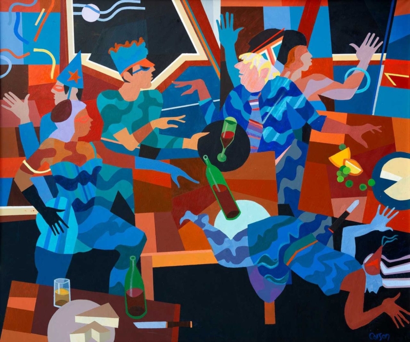
Wall art for a room with garden views does not need to reproduce the same foliage seen through the glass. Garden Party takes a more interesting route. Its garden-led setting adds human narrative and sociable energy, giving the interior a distinct scene of its own.
Choose wall art for a room with garden views by contrast
A changing outdoor view already supplies movement, weather, and seasonal colour. The artwork can therefore offer something different: a stable composition and a story that remains present after dark. Garden Party can connect to the outlook without becoming a visual imitation of it.
Room condition
Useful response
Dense green outlook
Pick up one accent colour rather than every shade of foliage.
Wide glazing
Place the picture on a solid side wall where it can hold its own.
Evening use
Test nearby lamps for glare before fixing the height.
The landscape-oriented 360 by 300 mm print can suit a side wall, a reading corner, or the space above a small cabinet. Its modest proportion also makes it easier to maintain breathing room beside windows and doors.
First 4 Frames uses colour-managed Giclée production and bespoke framing at its Falkirk workshop. A carefully selected frame can connect the picture to timber furniture or painted joinery while keeping it visually separate from the view beyond.
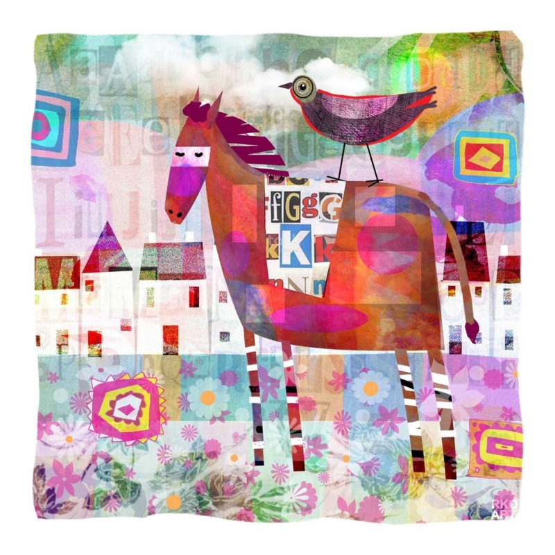
A thoughtful thank you gift for a riding instructor should recognise patience, knowledge, and a shared love of horses. Jockey does that through the artwork itself. It feels personal to equestrian life without depending on a printed message or a short-lived novelty.
Why framed art makes a lasting thank you gift for a riding instructor
Consumable gifts are welcome, but artwork can remain part of a home, tack-room office, or teaching space for years. Jockey’s 265 mm square print format is especially practical. It can fit a compact wall or sit within an existing group of pictures without demanding a complete room rearrangement.
The most successful thank-you gift reflects what the recipient has given their time and skill to.
Think about presentation as part of the gift. A clean dark frame can add crisp definition. A softer timber finish may suit a relaxed country interior. If several pupils are contributing, add a private card with their names rather than writing on the artwork or frame.
When should the gift be given?
It can mark the end of a season, a rider’s progression, a competition milestone, or simply sustained support. The reason should be specific to the relationship rather than attached to a generic calendar occasion.
First 4 Frames completes the colour-managed Giclée print and bespoke framing in-house at its Falkirk workshop. That hand-finished result helps the gesture feel considered and ready to display from the moment it is opened.
Choosing art for a south facing room means thinking about how colour behaves from morning to late afternoon. Purple Thistle offers a concentrated purple note and a clear botanical subject. It can stay visually present in generous daylight without making a bright room feel crowded.
Test art for a south facing room through the whole day
Strong natural light can make a pale picture look washed out at noon, while a very dark work may become dominant later in the day. Purple Thistle occupies a useful middle ground. Its colour creates definition, yet the botanical subject keeps the mood fresh and natural.
Check the proposed wall in direct and indirect light.
Position the frame away from a persistent reflection.
Repeat one purple accent, not an entire matching palette.
Leave clear wall around the square format.
The available 265 mm and 500 mm square print sizes suit different roles. The smaller size can brighten a narrow return wall or breakfast corner. The larger option has enough presence for a brighter sitting room without relying on an oversized composition.
Keep the framing crisp but not harsh
A pale timber frame can preserve an airy mood. A darker edge can give the purple stronger definition against a light wall. First 4 Frames handles the colour-managed Giclée production and hand-finished framing in-house, helping the artwork retain clean colour and a polished edge.
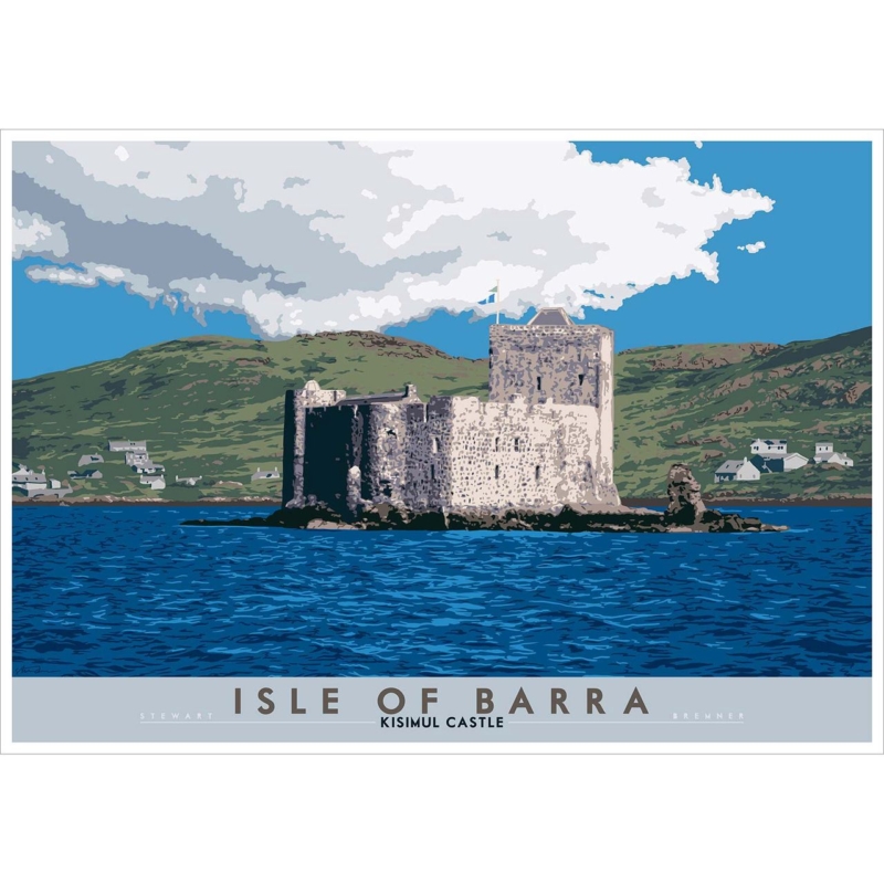
Scottish coastal art can offer more than a broad horizon. Isle of Barra: Kisimul Castle brings stone architecture, island history, and surrounding water into one composed image. That combination makes the print a useful focal point for a room that needs character as well as a feeling of space.
Let Scottish coastal art carry a sense of history
Kisimul Castle sits on a rocky islet in Castlebay, so the subject naturally balances shelter and exposure. In an interior, the strong silhouette gives the eye a clear stopping point. The water and sky then prevent that architecture from making the composition feel too formal or heavy.
Where it can work
Above a hallway console
On a dining-room feature wall
In a study with natural materials
What to pair with it
Wool and weathered timber
Stone, slate, or soft blue-grey
Simple lighting that limits glare
The available square format can create a self-contained focal point, while the larger option gives the island setting more breathing room. Avoid adding nautical ornaments around it. The specific place and architecture already provide enough coastal identity.
First 4 Frames produces the colour-managed Giclée print and bespoke frame in-house in Falkirk. Careful framing can echo the castle’s definition while preserving the lighter atmosphere around it.
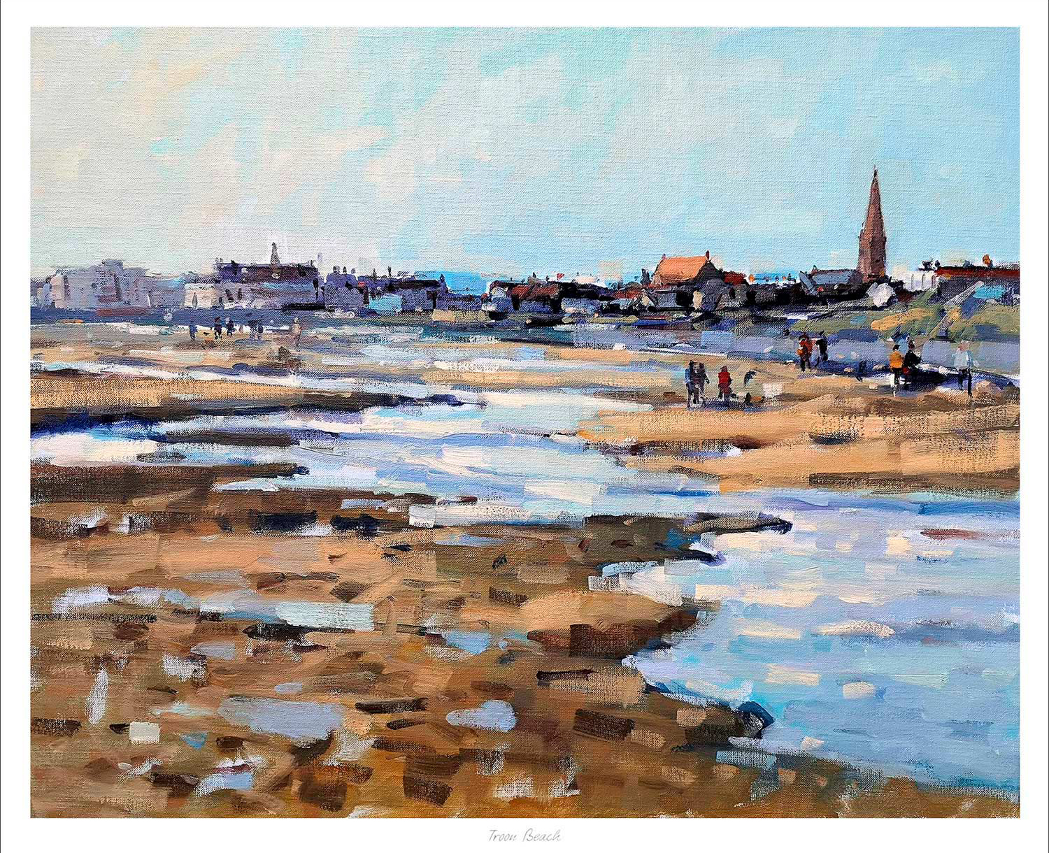
coastal wall art for blue and white décor should add more than another blue accent. The strongest piece brings depth, variation, and a believable sense of place. Troon Beach by Peter Foyle does that through an open Ayrshire shoreline, reflective pools, distant figures, and the town beyond. It supports a blue-and-white scheme without reducing the room to a nautical theme.
Look beyond a simple blue match
Blue and white can feel fresh, but too many exact matches make it look flat. A coastal landscape introduces several related tones instead. Sky, water, wet sand, stone, and distant buildings each shift the palette slightly. Those variations make navy, chalk white, denim, pale blue, and natural timber feel connected without appearing overly coordinated.
Troon Beach also adds warmth through the shoreline. That matters in a room with white walls or pale upholstery, where a cooler seascape might feel detached. Sand and rock provide a quiet counterweight. They let the blue stay bright while giving the whole arrangement more substance.
Place coastal wall art for blue and white décor with purpose
First decide what the artwork needs to do. Above a pale sofa, it can anchor a larger seating area. In a dining space, it can open the view and keep the room sociable. On a landing, the distant shoreline can create a welcome pause without demanding a wide collection of smaller coastal objects.
A simple three-step palette
Use white or a light neutral as the largest background area.
Repeat one deeper blue in a limited number of textiles or ceramics.
Add timber, woven texture, or warm stone to echo the beach and soften the scheme.
This approach leaves the print in charge of the detailed colour. It also avoids predictable anchors, shells, and signs. The room can feel coastal because of light and landscape, not because every accessory announces the idea.
Keep the finish crisp but not cold
A clean frame suits a blue-and-white interior, although stark white is not the only option. A slim dark moulding can define the image against a pale wall. A natural timber finish can bring out the warmer shoreline colours. At First 4 Frames, bespoke framing and colour-managed Giclée printing are completed in-house in Falkirk, so the final combination can be judged as one piece.
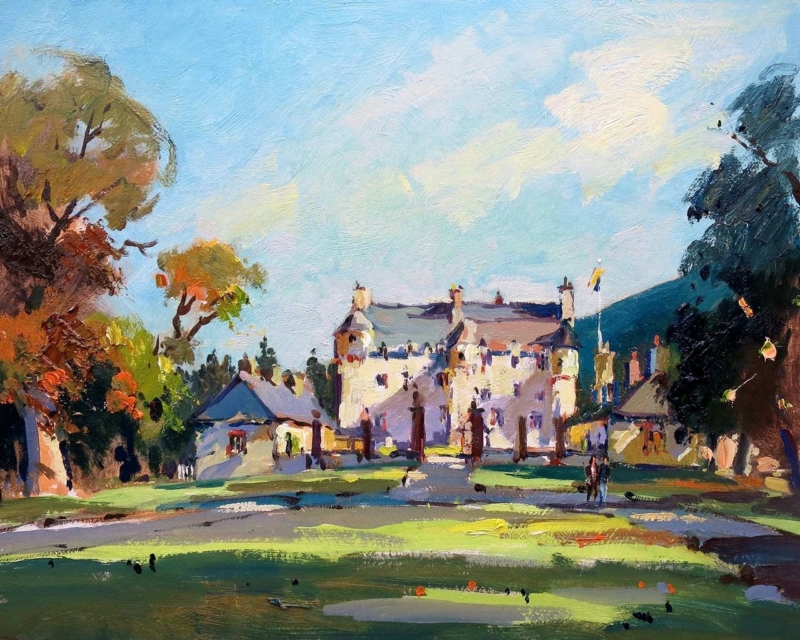
wall art for mixing antique and modern furniture can do more than fill an empty space. It can give two different periods a shared visual language. Traquair House, Early Autumn by Joseph Maxwell Stuart is especially useful here. Its historic subject speaks naturally to older pieces, while the clear composition and autumn colour can sit comfortably beside simpler contemporary furniture.
Why wall art for mixing antique and modern furniture matters
A room with furniture from several eras often feels more personal than a matched scheme. However, it still needs a point of connection. Artwork can provide that link through subject, colour, and finish. A view of a historic Scottish house acknowledges the character of an antique chest or dining table. The open landscape around it also gives cleaner modern shapes room to breathe.
The early-autumn palette helps too. Warm foliage can pick up the depth of older timber without making the entire room feel brown. Cooler sky and landscape notes can then relate to pale upholstery, painted joinery, glass, or metal. This balance is more convincing than trying to match every item directly.
Start with one visual bridge
Choose a wall that can be seen alongside both furniture styles. Above a sideboard, opposite a mixed dining set, or at the end of a sitting room can work well. Avoid surrounding the print with too many small period objects. Some clear wall gives the composition enough presence to connect the room rather than becoming another layer of detail.
Repeat one warm tone from the print in a cushion, lamp, or ceramic.
Let a modern piece keep its clean outline instead of crowding it with accessories.
Use the artwork’s historic subject as context, not as a reason to theme the room.
Frame for the room you have now
An ornate frame is not automatically the best partner for antique furniture. It may make the older side of the room too dominant. A restrained dark moulding can echo traditional timber while keeping the finished piece crisp. A lighter frame can be effective when the modern furniture is pale and the room needs a softer transition.
First 4 Frames can help compare those options in person. The framed print is prepared with colour-managed Giclée production and hand-finished presentation at the Falkirk workshop. That in-house approach makes it easier to choose a finish that respects the artwork and the room around it.
What if the most thoughtful part of your gift isn’t the artwork itself, but the way you’ve chosen to protect and present it? We know that picking something for another person’s home often feels like a high-stakes gamble. You might worry that the frame style won’t match their specific decor or feel overwhelmed by technical choices regarding mounts and glazing. It’s natural to want a gift that arrives ready to hang and looks like a professional gallery piece rather than a cheap, mass-produced alternative that might not even fit the art properly.
In this guide, you’ll learn exactly how to choose a frame for a gift using expert artisan tips. We’ll show you how to use our online wall art visualiser to see artwork before you buy, ensuring a perfect match for any interior. You’ll discover why our bespoke, hand-made frames use 2mm float glass for superior clarity instead of the flimsy perspex used by many competitors. From selecting Scottish landscape art to understanding our secure courier shipping process, we’ll give you the confidence to design a beautiful, custom framed art print that your recipient will cherish for years.
Key Takeaways
Learn how to assess your recipient’s home decor and metallic accents to select a frame style that feels like a natural extension of their personal sanctuary.
Discover professional artisan tips on how to choose a frame for a gift by matching the visual weight of the art to specific textures like rich woods or driftwood.
Understand the value of bespoke craftsmanship and why 2mm float glass provides superior clarity and longevity compared to the cheap perspex found in standard shop frames.
Master our online picture framing tools and wall art visualiser to design your framed artwork and see exactly how the finished piece will look before you buy.
Assessing the Recipient’s Decor and Personal Style
Understanding the environment where your gift will live is the first step in learning how to choose a frame for a gift that truly resonates. Start by considering the architectural soul of their home. Does the recipient live in a sleek, modern apartment with minimalist lines, or a traditional period property filled with classic features? A bespoke frame acts as a bridge between the artwork and the wall it inhabits. To make the right choice, start by considering these key elements of their space:
Architectural style (minimalist vs. period features)
Primary colour schemes and metallic accents
The intended room’s function and lighting
Observe their dominant colour palette. If their home features brushed silver handles or gold-toned lighting, selecting a matching metallic finish in the frame creates a cohesive, professional look. It’s these small details that elevate a simple present into a permanent part of their sanctuary.
Identifying Modern vs. Traditional Interiors
Modern interiors often thrive on simplicity. For these spaces, contemporary art prints paired with slim, dark frames provide a sophisticated edge. In contrast, traditional homes with crown moulding and antique furniture often suit wider, textured wood frames. These styles echo the grandeur of a classic picture frame found in fine art galleries. By choosing a bespoke option, you ensure the frame is individually crafted to suit these specific architectural nuances, rather than settling for a mass-produced shop frame that lacks character and longevity.
The ‘Safe Bet’ Styles for Gifting
If you’re unsure about their specific decor, certain styles offer timeless versatility. A natural oak or simple thin black frame is almost always a safe bet. These neutral choices complement everything from vibrant coastal wall art to moody landscape photography. Our tools help you visualise art on your wall before making a final decision. You can use our wall art visualiser to test different mouldings virtually, giving you confidence that your selection will look stunning. Unlike cheap alternatives, our frames use 2mm float glass for superior clarity, ensuring the gift remains a beautiful, ready-to-hang piece for years.
Selecting a Frame That Complements the Artwork
Selecting the right surround is about balance. You don’t want the frame to shout over the art; it should act as a supportive partner. When considering how to choose a frame for a gift, match the “visual weight” of the moulding to the medium of the piece. Bold oil paintings require a substantial profile to anchor them, while delicate watercolours or fine art sketches benefit from slimmer, more refined mouldings. This ensures the frame supports the work rather than fighting it for the viewer’s attention.
Matching Frames to Specific Art Genres
Knowing how to choose a frame for a gift involves understanding these subtle aesthetic relationships. Texture plays a vital role in enhancing a subject. For Scottish landscape art, which often features a Highlands palette of mossy greens and deep heathers, earthy wood tones work best. They pull out the natural warmth of the scenery. If you’re gifting coastal wall art, driftwood-style frames bring the organic character of the shoreline into the home. For contemporary photography prints, the sleek, professional look of matte black or aluminium provides a crisp finish. Our bespoke process means every frame is hand-made to order, ensuring a perfect fit that mass-produced shop frames simply can’t match.
The Role of the Mount in Gifting
A mount provides essential “breathing room,” preventing the artwork from feeling cramped against the frame. It also creates a professional gallery finish that elevates a simple print into a significant gift. This follows expert advice from Christie’s, which suggests the frame should always focus the viewer’s eye. We use premium components like 2mm float glass for superior clarity, a sharp contrast to the cloudy perspex used by many competitors. You can browse our curated gallery collection to find the perfect combination of mount and moulding. Each finished piece is fully packaged to prevent damage and shipped via professional couriers, so your gift arrives in pristine condition.
Quality Markers: Bespoke Craftsmanship vs. Standard Shop Frames
Choosing a high-quality surround is about more than aesthetics; it’s about preservation. When you research how to choose a frame for a gift, the structural integrity of the piece is just as vital as the style. Unlike mass-produced shop frames that use generic sizes and flimsy materials, a bespoke frame is individually crafted for every single order. This ensures a perfect fit that protects the artwork from slipping or buckling over time. Our professional finishing includes acid-free backing, secure taping to keep out dust, and heavy-duty hanging hardware, making it a truly ready-to-hang gift.
Why Glazing Matters: 2mm Float Glass
The choice of glazing defines the clarity of the piece. We exclusively use 2mm float glass because it offers superior fidelity and scratch resistance. Many competitors use thin perspex or acrylic to save on costs. While lighter, these plastic alternatives often look dull and can distort the fine details of your art. High-quality glass ensures that the vibrant colours of contemporary art prints remain vivid for decades, providing a professional gallery finish that plastic simply cannot replicate.
Logistics and Safe Delivery
We understand the fear of a gift arriving damaged. To prevent this, every finished frame is fully packaged with reinforced corner protection and layers of shock-absorbent material. We ship exclusively via professional couriers to ensure your bespoke framed wall art arrives in pristine condition. This logistical care provides peace of mind that your investment is protected from the workshop to the recipient’s door. It’s this commitment to quality that transforms a simple gesture into a lasting heirloom. Experience the difference of hand-made quality by exploring our bespoke framed wall art collection.
Designing Your Framed Artwork Online
Creating a bespoke gift should be an inspiring journey rather than a technical chore. Our Online picture framing platform simplifies the process of how to choose a frame for a gift by putting professional design tools directly in your hands. You don’t need to be an interior designer to create something stunning; you just need the right framework to guide your creativity. Our streamlined process ensures your vision is translated into a physical masterpiece with just a few clicks.
Step 2: Use the “Choose your frame online” tool to browse hundreds of high-quality mouldings, from rustic woods to sleek modern metals.
Step 3: Utilise the “See artwork before you buy” feature to adjust your mount widths and glazing to perfect the look.
Step 4: Finalise your order. Our artisans then hand-craft your bespoke framed wall art using premium 2mm float glass.
The Print and Frame Service for Personal Gifts
We transform your digital memories into museum-quality Custom framed art prints. We use professional Giclée printing to ensure high fidelity and longevity, matching the quality of our bespoke frames. This all-in-one Art print framing service removes the stress of coordinating multiple providers. Every print is treated with the same respect as a work by famous artists, ensuring your gift feels substantial and professional. For a deeper understanding of how Giclée printing and bespoke framing work together to preserve your art, our definitive guide to framed Giclée prints covers quality, craftsmanship, and curation in full detail.
Visualising the Final Result
Confidence is essential when gifting. Our Wall art visualiser lets you Visualise art on your wall virtually. You can Design your framed artwork to match a specific room’s mood, whether you’re selecting moody Scottish landscape art or vibrant contemporary art prints. Once your design is complete, our workshop takes over. Your finished frame is fully packaged and shipped via professional couriers, arriving ready to hang and enjoy immediately.
Transform Your Gift into a Lasting Legacy
Gifting art is a deeply personal gesture, and the frame you select is the final touch that defines its presence in a home. By understanding how to choose a frame for a gift, you ensure that every coastal print or Highland landscape is presented with the respect it deserves. By focusing on quality materials and selecting premium 2mm float glass, you elevate your gift far beyond mass-produced alternatives. These bespoke choices don’t just decorate a wall; they preserve a memory.
Every piece we create is individually hand-crafted in the UK and delivered in secure, damage-proof packaging via professional couriers. This commitment to craftsmanship gives you total confidence that your gift will arrive in pristine condition, ready to hang. Whether you’re framing a digital photograph or a best-selling artist’s print, our online tools make the creative process effortless. It’s time to create something truly unique that your loved ones will cherish for a lifetime.
How do I choose a frame colour for a gift if I haven’t seen their house?
Opting for neutral tones like natural oak or a slim black moulding is the most versatile strategy. These classic choices transcend interior trends and complement almost any wall colour or architectural style. If you’re struggling with how to choose a frame for a gift, these safe bets ensure the focus remains on the artwork. You can also use our wall art visualiser to see how these frames appear against generic room settings.
Is glass or perspex better for a high-quality gift frame?
We always recommend 2mm float glass for high-quality gifts because it provides superior clarity and scratch resistance. While many competitors use perspex or acrylic to reduce shipping costs, these plastic alternatives often appear dull and can distort the image over time. Our float glass ensures the vibrant colours of framed Giclée prints remain sharp and clear. It’s a hallmark of a truly bespoke, hand-made frame that mass-produced options simply can’t match.
What is the best frame for a Scottish landscape print?
Earthy wood tones like walnut or mahogany are ideal for Scottish landscape art as they echo the natural Highlands palette. These rich textures pull out the deep heathers and mossy greens often found in traditional and contemporary prints. If the artwork is a more modern photography print, a sleek black frame provides a crisp, professional border. Every frame is individually crafted to order, ensuring your chosen moulding perfectly supports the specific visual weight of the scenery.
Can I send a framed picture directly to the recipient safely?
Yes, sending a gift directly is simple and secure through our professional courier service. We use specialized, damage-proof packaging that includes reinforced corner protection and multiple shock-absorbent layers. This ensures your bespoke framed wall art arrives in pristine, ready-to-hang condition. Because we handle the entire process from printing to shipping, you don’t have to worry about the logistical risks of handling fragile glass yourself during transit.
What size frame should I get for a standard digital photo?
The ideal frame size depends on your photograph’s resolution and the visual impact you want to create. Our print and frame service allows you to upload digital files and see exactly how they look in various sizes. Remember that adding a mount will increase the overall dimensions of the finished piece. This extra border provides essential breathing room, elevating a standard digital snap into a professional-grade custom framed art print suitable for gifting.
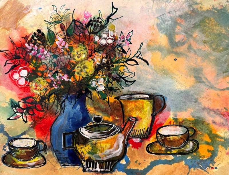
Good art for a dining room should help the space feel sociable even when nobody is sitting at the table. Tea with Friends has that convivial quality built into its subject. Familiar tableware and lively colour suggest shared time, making the room feel ready for conversation rather than reserved for formal occasions.
Connect art for a dining room to the table
Do not match the picture to a full dinner service. Instead, borrow one or two colours for everyday objects: a small vase, napkins, or a bowl. This creates a gentle relationship between wall and table. It also allows the artwork to remain relevant when seasonal settings change.
Dining-room feature
Useful artwork response
Long table
Choose the wider available print size for better visual balance.
Strong pendant light
Keep enough space above the frame and check evening reflections.
Mixed tableware
Repeat one colour, not every pattern.
Keep it welcoming, not themed
A food or table subject can become too literal if surrounded by signs and matching accessories. Give Tea with Friends clear wall space and let its colour do the work. A bespoke frame can then connect it to timber furniture or provide sharper definition in a contemporary scheme.
First 4 Frames completes its colour-managed Giclée production and framing in-house in Falkirk. This craftsmanship is especially valuable in a dining room, where daylight and evening lighting can reveal colour and finish in very different ways.
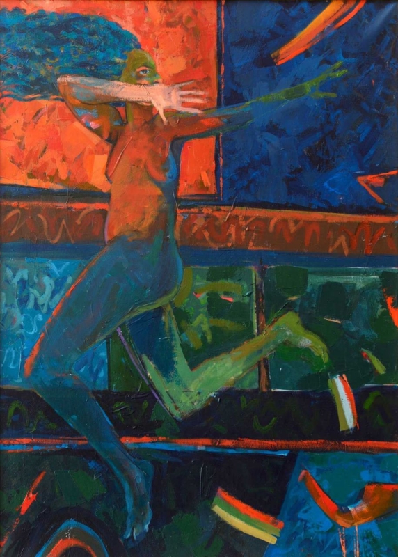
Well-placed abstract wall art can organise an open-plan room without adding a screen or changing the layout. Echo of the Unseen can mark a reading chair, dining area, or quiet end of a larger living space through colour and form. The artwork becomes a visual pause between activities.
Use abstract wall art to define one zone
Begin with function. Decide which part of the room needs identity, then centre the work on that furniture group rather than on the entire wall. This small change can make a dining table or reading chair feel intentional, even when it shares one uninterrupted space with the kitchen and sitting area.
Choose the zone that currently feels least anchored.
Repeat one colour from the artwork within that area only.
Use the frame edge to give the composition a clear boundary.
Leave enough wall around the piece to create a pause.
Echo of the Unseen has a portrait-oriented format, which can add height above a compact console or beside a lower chair. Avoid scattering several equally assertive objects around it. One lamp, textile, or ceramic note is often enough to connect the art to its zone.
First 4 Frames produces the Giclée print and bespoke frame in-house at its Falkirk workshop. Colour-managed production preserves the intended relationships between colours, while hand-finished framing helps the work create a precise edge in a visually busy room.
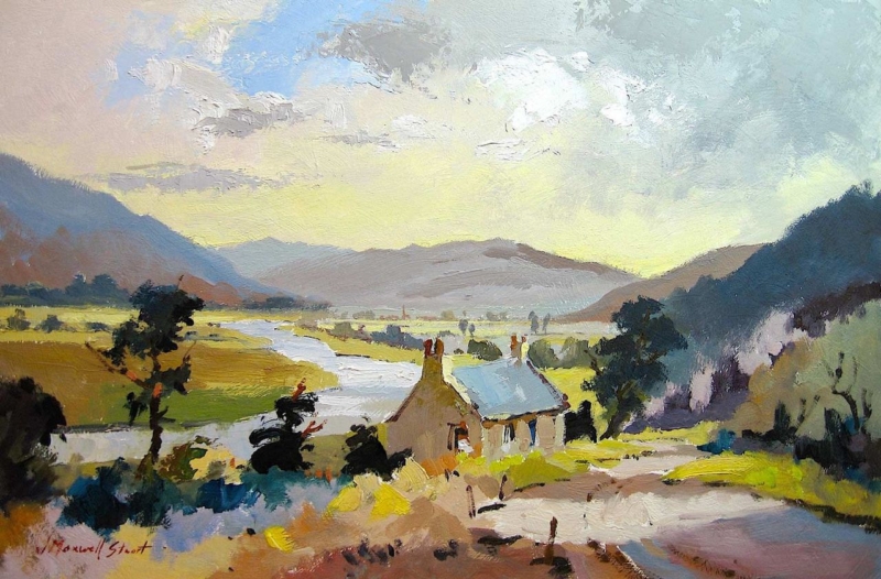
The best relaxing bedroom art gives the eye somewhere peaceful to settle without disappearing into the décor. Walkerburn Retreat offers that balance through a quiet Borders landscape. Its sense of distance can help the room feel open, while the natural subject keeps the mood grounded.
What makes Walkerburn Retreat relaxing bedroom art?
A restful picture does not need to be pale or empty. It needs a composition that feels stable and a palette that can sit comfortably in changing light. This landscape provides a gentle visual route through the scene rather than demanding an immediate dramatic reaction.
Bedroom artwork should reward a slow look, not compete for attention at the end of the day.
Choose the wall from the bed
Test the position from your usual resting viewpoint. Above a low chest or opposite the bed often works better than squeezing art beside a tall wardrobe. The horizontal format can also widen a wall visually. Keep the frame away from harsh bedside glare and allow a calm margin around it.
Soft linen, wool, washed timber, and quiet green or stone tones can support the landscape. First 4 Frames handles the colour-managed Giclée print and bespoke frame in-house. This gives the image a polished, hand-finished presence without disturbing its softer character.