Posted on

Extra Large Wall Art Without Guesswork: Scale Stomp Before You Order

Image of Stomp by David Short

extra large wall art becomes more useful when the picture solves a real placement question. Stomp offers a clear starting point because its 265, 500 and 800 mm square options allow the same image to be tested as a close-view accent, furniture-led focal point or broad wall anchor.

extra large wall art - Stomp

Plan extra large wall art from the finished outline

Print sizeBest test
265 x 265 mmTry it on a short return or above a small cabinet.
500 x 500 mmCompare it with a chest, compact sofa or defined seating corner.
800 x 800 mmUse it where wall and viewing distance support a strong square anchor.
Finished frameAdd mount and moulding before making any width comparison.

Do not measure the bare wall alone. Place furniture first, include lamps at their working height and note door swings. Then tape the outer framed square on the wall. The 800 mm print may suit a substantial sideboard, but it can overwhelm a narrow route even when it technically fits.

Run a three-view check

  • Stand at the entrance to judge first impact.
  • Sit in the main chair to test comfortable viewing.
  • Move along the nearest route to check clearance.

A large square already has graphic authority. Keep nearby objects below or beside its boundary rather than allowing shelves, plants or a television to clip its edges. Clear wall is part of the composition.

Make the frame part of the scale calculation

As artwork grows, small inaccuracies become more visible. Controlled Giclée output, square mounting and sound frame construction are practical requirements. First 4 Frames completes the work in-house, allowing print and presentation to be considered together.

For further practical principles on spacing and hanging groups, see National Galleries of Scotland’s picture-hanging guidance. You can also browse the David Short collection or view the exact framed product.

Extra large wall art should feel inevitable once installed, not merely impressive on a product page. Stomp’s three sizes let furniture, distance and the complete frame lead the decision.

Posted on

Art for Limestone Flooring: Let Autumn Light Supply the Warmth

Image of Autumn Light by Josepth Maxwell Stuart

art for limestone flooring becomes more useful when the picture solves a real placement question. Autumn Light offers a clear starting point because its vertical format and warm seasonal idea can counter a broad, cool floor without covering the stone or forcing the whole room into an autumn palette.

art for limestone flooring - Autumn Light

Balance art for limestone flooring from the ground up

Limestone usually contributes pale tone, quiet variation and a strong horizontal plane. A portrait artwork answers that structure by drawing the eye upwards. Mark both available print sizes—230 x 320 mm and 400 x 550 mm—then add allowances for mount and moulding.

Use warmth selectively

Repeat one russet, amber or soft brown in a textile or ceramic. Leave other surfaces quieter so the artwork remains the source of warmth.

Keep the stone visible

Avoid several heavy rugs and dark objects merely to correct a cool floor. Texture and one framed focal point can be enough.

Check the picture in the light that reaches the room. Limestone can bounce daylight upwards, while evening lamps may introduce warm glare. View the proposed glazing from seated and standing positions before finalising the hanging point.

  1. Photograph the room in morning and evening light.
  2. Template the complete frame above the main furniture group.
  3. Choose one colour connection instead of a fully matched palette.
  4. Keep the lower wall clear enough for floor and picture to read together.

Separate warm colour from pale stone

Subtle seasonal colour needs accurate relationships, not simply extra saturation. Colour-managed Giclée production helps preserve that balance. A hand-finished frame creates a measured transition between the artwork, wall and limestone below.

For natural context on the changing colour that inspires autumn imagery, read the Woodland Trust’s guide to autumn leaf colour. You can also browse the Joseph Maxwell Stuart collection or view the exact framed product.

Art for limestone flooring should add warmth while respecting the material already in the room. Autumn Light offers upward movement and seasonal colour, allowing the floor to remain calm rather than cold.

Posted on

Local Scottish Art for an Edinburgh Home: Choose Victoria Street

Victoria Street is depicted in black-and-white watercolor, its curved path framed by historic buildings and arched walkways. A distant church steeple adds a reflective, timeless mood to this evocative painting.

local Scottish art becomes more useful when the picture solves a real placement question. Victoria Street offers a clear starting point because the familiar curved street can connect daily routes, remembered visits and Edinburgh’s layered architecture in one city-led composition.

local Scottish art - Victoria Street

Let local Scottish art carry one real memory

Recognition is useful, but it is not the whole decision. Think about why Victoria Street matters. It may recall a first flat, a regular Old Town walk, a graduation visit or a favourite independent shop. That private connection gives a familiar landmark more staying power.

Keep the display rooted rather than themed

  • Choose one Edinburgh view for the main wall.
  • Avoid adding tartan, street signs and skyline ornaments around it.
  • Relate the frame to timber or paint already in the room.
  • Leave the city detail clear of tall lamps and shelving.

A hallway rewards the picture at close range, while a sitting room gives more viewing distance. In either setting, centre it on the furniture or sightline that people use. Do not centre it mechanically if a doorway or bookcase shifts the room’s balance.

Can recognisable city art work in a modern interior?

Yes. Keep surrounding objects edited and use the frame as a clean boundary. The architecture supplies detail; the room can remain quiet and contemporary.

Frame a city view for living with, not collecting

Ismael Pinteño Visuara’s Scottish work carries an artist’s interpretation as well as a recognisable location. Colour-managed Giclée production and precise mounting help the detail remain clear. A bespoke frame gives the view permanence without making it look like tourist ephemera.

For background on the care and character of Edinburgh’s historic townscape, explore Edinburgh World Heritage’s resources on the historic city. You can also browse the Ismael Pinteño Visuara collection or view the exact framed product.

Local Scottish art feels most convincing when it marks a genuine connection. Victoria Street can bring Edinburgh identity into the home while one disciplined frame keeps the result personal and polished.

Posted on

Photography Prints With a Story: Read the Weathered Hull in Doomed

Image of Doomed by Noel Fenech Photography

photography prints becomes more useful when the picture solves a real placement question. Doomed offers a clear starting point because the abandoned wooden vessel carries visible age while the broad shore, mountains and moving cloud open the story beyond the hull.

photography prints - Doomed

Judge photography prints by what keeps you looking

Start at the foreground. The worn timber provides grain, broken edges and evidence of exposure. Then follow the shoreline towards the distant mountains. That change of scale gives the eye a route and prevents the photograph from becoming only a picture of decay.

Viewing questionWhat to examine
Does the subject hold attention?Look for detail in the hull, shore and patches of water.
Is there enough distance?Check how the mountains and sky balance the strong foreground.
Will the room light help?Test glazing reflections across dark timber and soft cloud.
Which scale works?Compare the finished outlines of the 400, 500, 600 and 700 mm widths.

Place the photograph where there is time to pause: above a sideboard, opposite a reading chair or on a landing with a clear approach. Avoid surrounding it with rope, anchors or other maritime props. The vessel already carries the theme.

A narrative photograph should leave enough unanswered for the viewer to return and notice something new.

Protect texture across a wide tonal range

Doomed depends on separation between weathered timber, muted shore, distant land and soft cloud. Controlled fine-art printing preserves those transitions. Bespoke in-house framing can support the photograph without adding a showy maritime border.

For wider context on preserving Britain’s historic vessels, visit National Historic Ships UK’s maritime heritage resources. You can also browse the Noel Fenech Photography collection or view the exact framed product.

Photography prints earn their wall space through more than sharpness. Doomed combines material detail, open landscape and an unfinished story, making it a considered focal point rather than a quick coastal reference.

Posted on

Scottish Landscape Prints for a Railway Enthusiast: Magical Glenfinnan

Magical Glenfinnan: A whimsical painting of the iconic steam train crossing a stone viaduct above mountains, forests, a river, and a castle under a vibrant sunset sky.

Scottish landscape prints becomes more useful when the picture solves a real placement question. Magical Glenfinnan offers a clear starting point because its steam train, stone viaduct, water, mountains and vivid sky create a layered Highland story rather than a simple locomotive portrait.

Scottish landscape prints - Magical Glenfinnan

Choose Scottish landscape prints by the recipient’s connection

A good railway gift begins with the person’s interests. Some collectors respond to engineering detail. Others remember journeys, family holidays or the sound of a steam train crossing open country. Magical Glenfinnan suits the second group because the railway sits within a complete landscape.

For the railway story

The train and viaduct provide recognition without turning the wall into a display of logos, timetables or reproduction signs.

For the Highland setting

Mountains, woodland, water and sunset colour give the picture enough depth to remain interesting after the occasion has passed.

Ask where the recipient could enjoy a landscape-format picture. A study or wall above low furniture often provides a better sightline than a crowded hobby room. Mark the complete frame on paper and check it from the usual chair.

  • Choose it for a genuine Glenfinnan or railway connection.
  • Keep models and memorabilia on another surface.
  • Allow the colourful scene enough plain wall around it.
  • Use a card to explain the memory behind the choice.

Turn a shared interest into a finished artwork

Rob Hain builds lively places from architecture, landscape and human stories. Colour-managed Giclée production helps the sunset and detailed scene remain distinct. A hand-finished frame makes the gift ready to hang, with all work completed in-house in Falkirk.

For history and visitor context around the location, explore the National Trust for Scotland’s Glenfinnan Monument guide. You can also browse the Rob Hain collection or view the exact framed product.

Scottish landscape prints make stronger gifts when place and personal interest meet. Magical Glenfinnan celebrates railway history within a broader Highland view, so it can stay meaningful long after the wrapping is gone.

Posted on

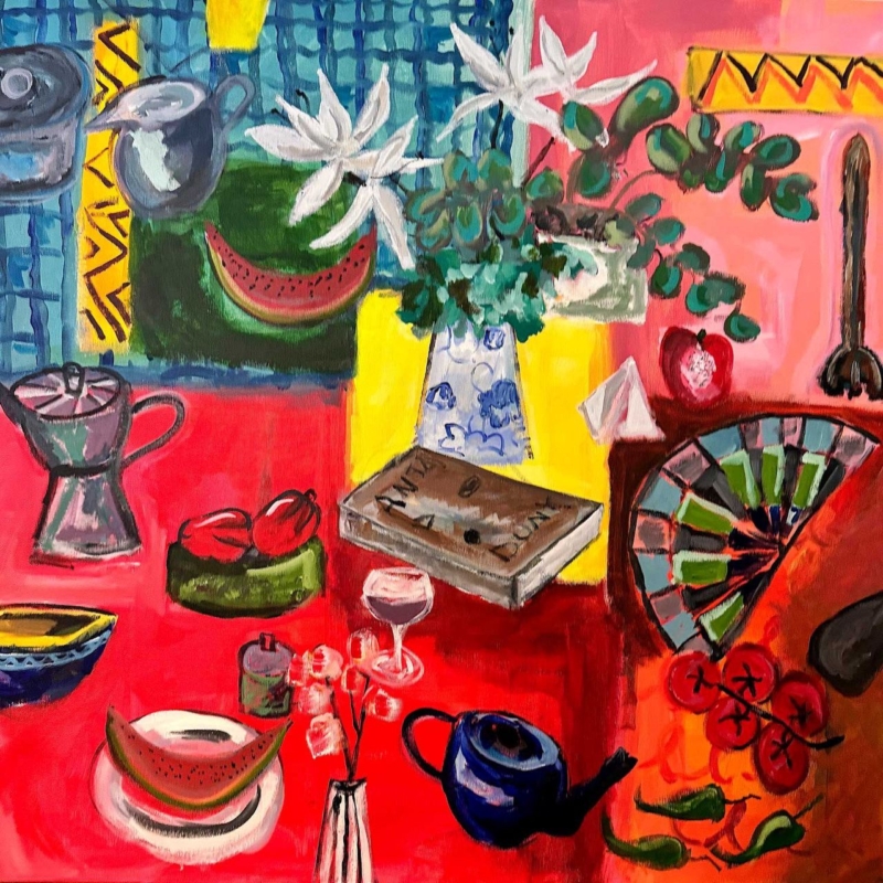
Here Comes the Sun: Colourful Wall Art for a Dining Room With Red Accents

Image of Here Comes the Sun by David Short

colourful wall art for a dining room with red accents should organise the room’s energy rather than add random colour to it. Here Comes the Sun by David Short brings a red table, pink ground, yellow panels and blue pattern into one square composition. Watermelon, tomatoes, flowers, a teapot and a coffee pot make the scene feel sociable. Because those objects are gathered within one clear frame, the artwork can unite existing red details without requiring every chair, cushion or plate to match.

colourful wall art for a dining room with red accents: Here Comes the Sun by David Short

Why colourful wall art for a dining room with red accents needs structure

Red is visually assertive. A pendant, chair seat or painted cabinet can command attention even when it occupies little space. Adding a picture with one isolated red patch may make the room feel as though several accents are competing. A more varied artwork can work better because it shows red as part of a complete palette.

Here Comes the Sun uses red across the lower table, the background and several pieces of fruit, but it breaks that warmth with cobalt, turquoise, leaf green, white and black. Repeated curves also hold the image together: cups, bowls, fruit, a fan and the rounded coffee maker. The eye discovers separate objects while the square format keeps them part of one lively whole.

Repeat red selectively, not everywhere

Start by identifying the dining room’s existing red. A deep oxblood chair behaves differently from a bright tomato-red cabinet or a rust-coloured rug. The artwork does not have to reproduce the exact shade. Its range of coral, scarlet and pink can bridge nearby warm colours, provided the rest of the room includes enough quiet space.

  • Choose one main red feature. Let the artwork support a cabinet, pendant or group of chairs rather than all three.
  • Add one small bridge. A vase, napkin or candle can repeat a warm tone without becoming a permanent colour commitment.
  • Keep large surfaces calmer. Pale walls, timber and simple flooring give the composition room to breathe.
  • Borrow a cooler colour. One blue or green detail can connect with the teapot, foliage or patterned upper section.

This selective approach makes the room feel collected rather than themed. It also allows table settings to change. The painting remains useful when seasonal flowers, serving dishes and textiles introduce temporary colours of their own.

Use the square format to anchor the dining zone

A square picture can create a stable focal point above a sideboard, a compact table or the end wall of an open-plan dining area. It does not pull strongly in one direction, so it can help define the zone without making a narrow room look longer or a low wall feel flatter. Centre it on the furniture beneath it rather than on the entire wall.

The product is offered in several print sizes, so use a paper template to judge the finished framed footprint. Above a sideboard, leave clear space for serving dishes and tall bottles. Beside the table, check that chair backs cannot reach the frame. From the room entrance, the red table in the painting should read as a broad colour field rather than a small, busy patch.

Existing featureColour to borrow from the printWhat to limit
Red dining chairsUse blue or green tableware as a cooler counterpointMore large red furniture
Warm timber tableConnect it with orange, yellow and the cardboard boxAn orange-brown frame that nearly matches the wood
White wallsLet the white flowers and pale vessel create small pausesToo many colourful prints on the same wall
Black metal lightingRepeat the loose dark outlines with a slim frame edgeA broad black frame that overwhelms the colour

Let the subject support conversation

The picture is full of recognisable objects but does not explain one fixed event. A watermelon slice, wine glass, flowers, fruit, vessels and a folded fan suggest a table assembled from travel, memory and ordinary pleasures. That openness suits a dining room, where the artwork can start conversation without turning the space into a literal food-themed interior.

Avoid surrounding it with slogan signs, menu typography or several smaller pictures of food. The composition already provides enough detail. A clear area around the frame will make the brushwork and unexpected combinations easier to appreciate from a seated position.

Preserve the differences between strong colours

Intense colour needs accurate reproduction. If reds merge into one flat tone, the cup, fruit and table lose their separation. First 4 Frames uses colour-managed Giclée production and completes bespoke framing in-house at its Falkirk workshop. This process supports the contrast between coral, scarlet, deep red, blue and green while retaining the loose painted marks.

A simple moulding gives the image a necessary boundary. Dark charcoal can echo the drawn outlines, while a pale frame can keep the overall result lighter against a saturated room feature. A mount is helpful when the wall itself is strongly coloured, as it creates a neutral pause before the composition begins.

David Short creates bold contemporary work shaped by colour, pattern, memory and familiar objects. Explore more of his work at David Short’s official website, or browse the David Short collection at First 4 Frames.

Well-chosen colourful wall art for a dining room with red accents can make a sociable room feel more coherent, not more crowded. View the framed Here Comes the Sun print for a vivid table scene that turns everyday objects into a confident focal point.

Posted on

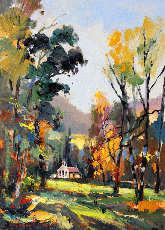
Autumn Light: Portrait Landscape Art for a Cottage Hallway

Image of Autumn Light by Josepth Maxwell Stuart

portrait landscape art for a cottage hallway has to bring atmosphere into a compact route without making the walls feel tighter. Autumn Light by Joseph Maxwell Stuart is well suited to that balance. Its upright composition follows the height of a narrow wall, while a pale sky and sunlit clearing create distance. The small white cottage gives the eye a destination beyond the foreground trees, so the hallway gains a view rather than another layer of decoration.

portrait landscape art for a cottage hallway: Autumn Light by Joseph Maxwell Stuart

Why portrait landscape art for a cottage hallway works vertically

Cottage hallways often contain several interruptions: door frames, radiators, switches, coat storage and turns in the plan. A broad horizontal picture may need more uninterrupted wall than the room can offer. A portrait piece uses height instead. It can occupy a clear section beside a doorway or above a slim console while leaving the walking route visually open.

Autumn Light reinforces that vertical movement through tree trunks rising on both sides of the scene. The darker trees frame the lighter centre rather than forming a solid wall. That structure matters in a small interior. It creates the impression of looking through the woodland towards open ground, distant hills and the cottage beyond.

Use the painting to create a destination

The strongest place for this print may be the wall seen at the end of the hall, not the largest empty surface. From the entrance, the white cottage acts as a small focal point. The bands of green, yellow and shadow lead towards it. That visual journey can make a short passage feel more intentional and can draw attention away from practical storage nearer the door.

  1. Stand at the threshold. Check that the pale cottage remains visible from the normal entrance position.
  2. Mark the finished size. Include the mount and frame when making a paper template.
  3. Open every nearby door. Make sure handles and door leaves cannot strike the frame.
  4. View it under evening light. A hallway is often used with lamps on, so check for glare before fixing the position.

Avoid hanging the centre automatically at standard gallery height. The right level depends on the ceiling, nearby joinery and the main viewing distance. In a narrow hall, the picture may be seen from several metres away and then at close range. Test both views before drilling.

Balance autumn colour with cottage materials

The painting combines bright yellow and orange with deep evergreen, blue-green, charcoal and a broad area of pale blue sky. This makes it easier to place than an image built entirely from russet tones. The cooler greens prevent the autumn palette from feeling too heavy, while the white building can connect with painted woodwork or a light wall.

Hallway featureConnection to makeUseful restraint
Flagstone or slate floorRelate it to the charcoal trunks and cool shadowsKeep the frame slim enough to avoid a heavy dark block
Natural timber doorsPick up the warm ochre and orange passagesDo not force the moulding to match the timber exactly
Warm white wallsLet the pale sky and cottage create breathing roomUse a mount edge if the image needs clearer separation
Green painted benchRepeat one muted woodland greenAvoid adding several more botanical patterns nearby

Keep practical clutter separate from the focal point

A hallway needs to cope with coats, shoes, keys and bags. Artwork works best when it is not asked to hide that storage. Group practical items on one side and preserve a calmer section of wall for the print. If the frame sits above a console, keep the surface arrangement low and simple. One bowl or lamp is enough; tall objects can obscure the cottage and the central light.

Allow a sensible gap from a busy coat rack. Sleeves, damp outerwear and bag straps should not brush the glazing or moulding. Direct sunlight from a glazed front door should also be considered. A position slightly around a corner may offer a better view with less exposure and fewer reflections.

Frame the woodland with clarity

The loose brushwork contains small changes of yellow, red, green, blue and near-black. First 4 Frames uses colour-managed Giclée production and completes bespoke framing in-house at its Falkirk workshop. That care helps the bright clearing remain distinct from the deeper woodland marks and preserves the fine contrast around the distant building.

A restrained dark moulding can connect with the tree trunks and stone flooring. A warm timber option can make the arrangement softer beside painted walls. A measured mount gives the energetic brushwork a calm boundary, which is especially useful where the hallway already contains several doors and architectural lines.

Joseph Maxwell Stuart studied drawing at the Ruskin School in Oxford and Fine Art in Edinburgh before developing a practice closely connected to the Borders landscape. Learn more through this profile of Joseph Maxwell-Stuart, or browse the wider Joseph Maxwell Stuart collection at First 4 Frames.

Well-positioned portrait landscape art for a cottage hallway can turn a practical route into a warmer arrival without consuming valuable floor space. View the framed Autumn Light print for a tall, light-filled woodland scene that rewards both the first glance and a closer look.

Posted on

Framing a Collection of Medals in the UK: Layouts and Protection

Framing a Collection of Medals in the UK: Layouts and Protection

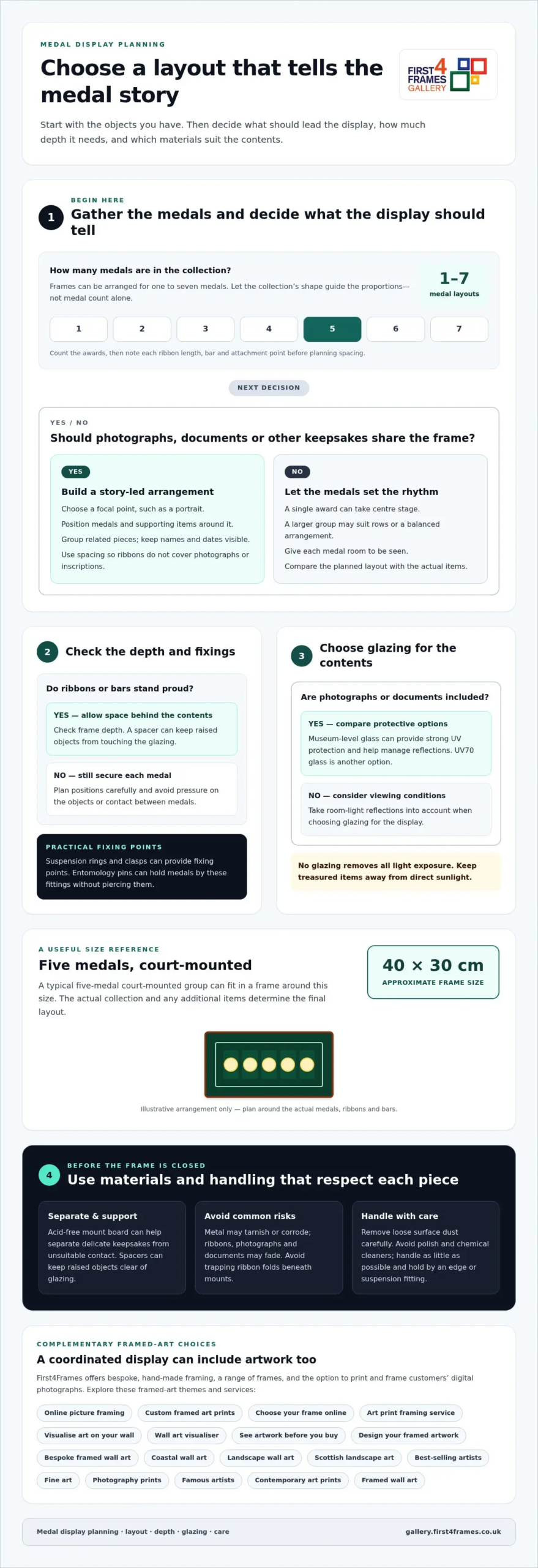
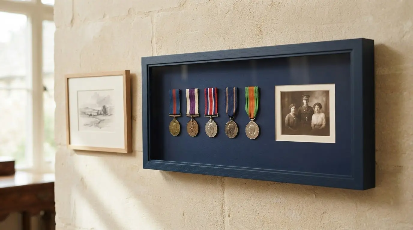
A medal display works best when its layout gives each award room and makes its story easy to follow. For framing a collection of medals in the UK, arrange the medals as a group and decide whether photographs, a certificate or other memorabilia should share the space; a typical five-medal court-mounted group can fit in a frame around 40 cm by 30 cm. The right format depends on the collection, not medal count alone.

It’s natural to want a display that honours the medals while protecting and presenting them thoughtfully. This guide explains how layouts can work for different collection sizes, First World War photographs and sports awards, and what to consider when choosing materials for conservation. You’ll also see how spacing, mounting and glazing can shape a display that feels balanced and keeps its personal story at the centre.

Key Takeaways

  • Choose a layout around the number of medals and whether photographs or other keepsakes should share the display.
  • Bring First World War photographs and medals together with considered spacing and mounting so the display tells a clear family story.
  • Compare glazing and conservation materials to help protect treasured items and keep them easy to view.
  • For sports awards, plan how medals, photographs, shirts or race numbers can form a balanced display; bespoke framing can help bring the pieces together.

Frames for one, two, three, four, five, six or seven medals

When framing a collection of medals in the UK, start by counting the awards and deciding what story the display should tell. A bespoke layout can accommodate ribbons, bars and other keepsakes while giving each item room to be seen.

Medal Capacity Options

Frames can be arranged for one to seven medals, with the collection’s shape guiding the proportions. A single award can take centre stage, while a larger group may suit rows or a balanced arrangement. Before choosing, lay out every medal and note its ribbon length, bar and attachment points. This makes it easier to plan spacing and avoid a crowded display.

Mounts and Frame Mouldings

A dark green window mount with gold frame moulding can give a medal display a traditional look. The mount creates a clear boundary around each item, while the moulding finishes the arrangement. Consider how the colours complement the medals and ribbons. Glazing affects the display’s appearance under room lighting, so take reflections into account when choosing the frame.

Handcrafted UK Medal Frames

Handcrafted frames made in the UK can be built around the medals’ dimensions and preferred arrangement. Look for a frame that leaves enough depth for ribbons and bars, with secure positioning that avoids pressure on the objects. Bespoke work can also accommodate an inscription or keepsake. For framing a collection of medals in the UK, compare the proposed layout with the actual items before finalising the design.

You can frame military medals at home using a suitable frame and mount, but professional framing can help with delicate pieces or complex layouts. Plan the placement around the shape of each ribbon and bar.

Framing costs depend on the frame, mount, glazing and layout, including any photographs or additional items. The time involved also varies according to the design, materials and fitting.

Framing a collection of First World War photographs and medals

A First World War display can bring medals, family photographs and documents together in a clear arrangement. Choose a focal point, such as a portrait, then position the medals and supporting items around it. This gives the eye a route through the story instead of giving every object equal prominence.

Plan the spacing around the shape of each object. Medals can sit beside or below photographs, while a certificate or service document can add context without dominating the display. A medal arrangement can also include meaningful memorabilia, such as a letter or military identification detail. Keep names and dates visible, and group related items together.

Suspension rings and clasps provide practical fixing points for medals. Entomology pins can hold medals by these fittings without piercing them, keeping the face and ribbon visible while helping each award sit neatly. Map the positions before framing, and check that overlapping ribbons won’t cover photographs or inscriptions.

Photograph dimensions influence the frame’s proportions. A 6×4-inch photograph can sit alongside medals, while a larger portrait may need more room and a different balance. Use the actual print dimensions when planning, and leave enough space for the mount to separate photographs from metal objects. Documents can be arranged as a panel, or placed beneath a portrait as a caption-like detail.

A 2024 example brought together photographs and medals belonging to Richard James Whalley. A gold-colour nameplate with details was added before glazing, giving the display a clear personal identification. For a family collection, a concise nameplate can help future viewers connect the objects with the person and their history.

Gather the medals, photographs and papers before settling the layout, then decide which item should lead the story. To explore artwork and visual choices that may help you plan a complementary display, browse the gallery of framed artwork.

Framing a Collection of Medals in the UK: Layouts and Protection

UV protection and conservation materials

Choose the glazing and internal materials with the medals, ribbons and papers in mind. Each has different surfaces and sensitivities, so material choice is an important part of the design.

Glass and UV Protection

Museum-level glass can provide strong UV protection for framed photographs and documents, while also helping manage reflections. One First World War display used museum-level glass for both benefits. UV70 glass is another option; compare its stated protection with the needs of the contents and the display’s position. No glazing removes all light exposure, so avoid placing treasured items in direct sunlight.

Materials inside the frame matter too. A spacer can keep raised objects from touching the glazing, while acid-free mount board can help separate delicate keepsakes from unsuitable contact. These choices allow medals and paper items to sit at different depths rather than forcing everything onto the same flat plane. Check the depth of the medals and any attached bars before deciding on the frame construction.

Framing Risks to Medals

Pressure, unsuitable contact and environmental exposure can affect different parts of a collection. Metal may tarnish or corrode, while ribbons, photographs and documents may fade. Avoid trapping ribbon folds beneath mounts, and position medals securely so they don’t rub against one another. Review the full arrangement before closing the frame.

To prepare medals, carefully remove loose surface dust and avoid polish or chemical cleaners that could alter historic finishes. Handle each item as little as possible, with clean hands, and hold it by the edge or suspension fitting. Keep the medals in a dry place while planning the display, and don’t force one into a mount if this strains its ribbon.

The main risks when framing medals include changes to metal surfaces, fading of fabric or paper, and corrosion where moisture is present. Suitable spacing and materials help reduce contact damage, while careful placement limits exposure to harsh light. If a medal already has active corrosion or loose components, preserve its condition rather than cleaning or altering it before display.

Sports and achievement medal layouts

Sports displays can bring medals together with shirts, photographs or race numbers. Arrange the items to show the story of the achievement without crowding them together.

Arrange medals by event or achievement, and label the display with concise, accurate details. Keep each label close to its award without hiding ribbons or other items.

Arranging Medals in a Display

Make the medal the focal point, then arrange related items around it. For example, a rugby shirt and medal can be framed together with blue mount card and an oak picture frame. A marathon display might combine a shirt, medal and runner’s number. Place the largest item first, then balance the smaller pieces around it.

Photographs can add context to a sports display, while mount colours can connect the objects visually. Two Oceans marathon medals and photographs were framed with cream mounts and a 418 Grey frame. This example shows how a restrained mount can let varied items sit together without competing for attention.

Labelling Medal Displays

A label can identify the event, achievement or recipient, helping viewers understand the display at a glance. Keep the wording brief, and check names and event details before framing. A nameplate can sit beneath the medals or alongside supporting items, as long as it remains readable and doesn’t interrupt the arrangement.

Before choosing positions, gather the medal, any shirt or number, and the details to include. A marathon shirt, medal and runner’s number have been framed with a 441 white frame and double white and blue acid-free mounts. Another example pairs marathon medals with double mounts and a 418 natural wood frame. These layouts demonstrate how frame and mount choices can suit different collections.

For colour inspiration, explore framed artwork styles and note which tones complement your sports keepsakes. Then choose a layout that gives each medal, photograph and label a clear place.

First4Frames Gallery offers Custom Picture Framing for personal displays and artwork. Its online picture framing choices let you choose your frame online and design your framed artwork around the room. To visualise art on your wall, compare colours and proportions; a wall art visualiser can help you picture the result. See artwork before you buy by exploring the gallery’s selection.

Ready-to-Hang Framed Art and Giclée Fine Art Prints offer finished options, including custom framed art prints. Browse fine art, contemporary art prints, photography prints, framed wall art and Scottish landscape art. Coastal wall art and landscape wall art can suggest different moods, while best-selling artists and famous artists offer further inspiration. An art print framing service can help bring a chosen image and frame together as bespoke framed wall art.

Explore the gallery to find a direction for your collection or home, and contact First4Frames Gallery to discuss your framing project.

Give Your Collection Its Next Chapter

A thoughtful approach to framing a collection of medals in the UK begins with deciding what story you want the display to tell. Choose the objects that matter most, consider where the finished piece will hang, and let those choices guide its design. A family portrait, a race-day photograph or a meaningful inscription can make the arrangement feel personal and complete.

When you’re ready to shape that idea, First4Frames Gallery offers Custom Picture Framing alongside Ready-to-Hang Framed Art and Giclée Fine Art Prints. These options suit different needs, from a tailored display to a finished artwork that complements the room. Share your preferred direction and explore the available artwork and framing choices at your own pace.

Explore framed artwork in the gallery and find inspiration for the space around your collection. Your medals carry a story worth bringing into view, and the right design can help it live on beautifully.

Frequently Asked Questions

What types of frames and mounts are suitable for displaying medals?

A deep box frame can provide space between medals and the glazing. Size the frame around the complete arrangement, including ribbons and labels, rather than measuring only the medal faces. A contrasting mount can help distinguish each item. If the display includes a photograph or certificate, plan its position before settling on the frame proportions.

How do you frame medals without damaging them?

Keep medals secure without applying adhesive directly to their surfaces or ribbons. First, arrange the items on a flat surface and decide where each award belongs. Check that hanging ribbons won’t pull against neighbouring pieces. A display containing a medal, clasp and bar needs enough depth and clearance to avoid pressure when the frame is closed. Keep original labels or notes separately if they can’t be included safely.

Should medals be mounted with UV-protective glass and acid-free materials?

UV-protective glazing and acid-free materials are sensible choices, especially when photographs or documents share the frame. Paper can be more vulnerable to light and unsuitable contact than metal, so consider the needs of every item. UV glazing doesn’t eliminate light exposure: position the display away from direct sunlight and use materials that keep its contents separated and supported.

How much does it cost to frame a collection of medals in the UK?

Bespoke framing costs vary according to the frame, mount, glazing and fitting involved.

Where can I find medal framing services in the UK, and how long do they take?

The framing showroom is in Derbyshire near the Peak District. Turnaround time varies with the design, materials and fitting involved.

Posted on

Black and White Wall Art for a Dark Academia Study: Greyfriars Kirkyard

Greyfriars Kirkyard: a black and white watercolor featuring gravestones, a bare tree, and a distant church spire, all softly blurred for an ethereal effect.

black and white wall art for a dark academia study works best when the artwork answers a practical need rather than merely filling a gap. Greyfriars Kirkyard offers a useful example because the monochrome gravestones, bare tree and distant church spire provide genuine Edinburgh history and atmosphere without invented gothic decoration.

black and white wall art for a dark academia study - Greyfriars Kirkyard

Ground black and white wall art for a dark academia study

Start with the working desk and reading chair. Place the artwork where it can be seen during a pause, not where a monitor or tall book stack cuts across the scene. The kirkyard subject has enough narrative weight to lead the room, so old maps, candles and faux antiquities do not all need to compete beside it.

Study elementMeasured response
Dark wallChoose a mount and frame that separate the monochrome image from the paint.
Timber shelvesLet real books provide texture; avoid colour-sorting everything to match.
Desk lampAngle warm light across the wall without creating a bright glazing reflection.
Historic objectsUse one item with personal meaning instead of a staged collection.

The soft black-and-white treatment offers quieter detail than a sharp architectural photograph. Give it enough light for the tree, stones and spire to remain legible. A pale wall can make the work contemplative; a deep wall can intensify it, provided the frame creates a clear boundary.

History feels more convincing when one real place carries the story and the room remains useful.

Preserve the soft range within monochrome

Black and white art still contains many tonal steps. Colour-managed Giclée production helps keep pale stone, dark branches and softened distance separate. Bespoke in-house framing can then relate the image to timber, leather or painted joinery without swallowing it.

For visitor information and the history of this Edinburgh site, read Greyfriars Kirk’s guide to the historic kirkyard. Browse the Ismael Pinteño Visuara collection, or view the exact product and framing choices.

Black and white wall art for a dark academia study should add substance, not stage scenery. Greyfriars Kirkyard supplies real place and layered tone while warm light and edited furnishings keep the study comfortable for daily use.

Posted on

Kitchen Wall Art for a Pantry Door Sightline: Put Ladels on Display

Image of Ladels by David Short

kitchen wall art for a pantry door sightline works best when the artwork answers a practical need rather than merely filling a gap. Ladels offers a useful example because an artwork based on familiar utensils can make the view into a pantry feel purposeful while the square format stays separate from busy work surfaces.

kitchen wall art for a pantry door sightline - Ladels

Plan kitchen wall art for a pantry door sightline

Prop the door in its normal open position and stand at the kitchen entrance. The artwork should be visible without being clipped by the door leaf. Inside the pantry, keep it away from sinks, steam, heat and shelves where jars or appliances could strike the frame.

  1. Photograph the normal view with the pantry stocked.
  2. Mark 265, 500 and 800 mm print squares, adding the proposed frame.
  3. Open drawers and cupboards to confirm working clearance.
  4. Remove hanging utensils that duplicate the artwork directly.
  5. Check the sightline in daytime and under task lighting.

The smallest size can reward a compact pantry. The middle square may relate well to a preparation zone seen from farther away. An 800 x 800 mm print needs a genuinely broad, dry wall and enough distance to be read comfortably; it should not be chosen merely because the room is busy.

Should real ladles hang beside the print?

Only if they are used and the arrangement stays clear. The artwork already supplies the playful repetition, so a large decorative utensil display is unnecessary.

Frame everyday objects with lasting colour

David Short’s work celebrates familiar objects, colour and memory. A colour-managed print keeps that playful character clear, while a hand-finished frame gives the subject enough authority to sit beside hardworking kitchen materials.

For wider design context around the changing domestic kitchen, explore the V&A’s exploration of kitchen design history. Browse the David Short collection, or view the exact product and framing choices.

Kitchen wall art for a pantry door sightline can make an ordinary task route memorable. Ladels turns practical objects into the picture, while careful positioning keeps the real kitchen efficient.