Choosing wall art for willow green walls is easier when the picture adds contrast as well as harmony. Wild Gorse, Arisaig offers both. The Arisaig subject keeps the palette connected to nature, while flowering gorse introduces warmth that can stop a muted green room feeling flat.
Test wall art for willow green walls in real daylight
Willow green can look grey in northern light and yellower in a sunny room. Move a printed colour reference or the online visualisation around the room before selecting a frame. The aim is not an exact green match. It is to keep enough separation for the landscape and its warmer gorse notes to remain visible.
Room detail
Useful response
Pale oak furniture
Let the timber echo the warmer vegetation rather than adding more green accessories.
Cream upholstery
Use it as a quiet bridge between the wall and brighter yellow notes.
Patterned curtains
Keep the frame area clear so the square composition has a firm boundary.
Low natural light
Choose layered room lighting and test glazing reflections after dark.
The two square print sizes provide useful flexibility. A 265 x 265 mm print can finish a small reading corner or wall return. The 500 x 500 mm choice has enough presence above a compact sideboard. In either case, mark the complete framed outline and leave visible wall around all four sides.
Use one yellow accent instead of a matching scheme
A small ochre cushion or warm ceramic can acknowledge the gorse. More is rarely needed. Colour-managed Giclée production helps the different natural tones stay distinct, while bespoke framing creates a clean edge between the artwork and painted wall.
Wall art for willow green walls should deepen the room, not disappear into it. Wild Gorse adds a Scottish destination and a controlled touch of warmth while allowing the wall colour to remain calm.
Scottish typography wall art for a landing can give a passing space a reason to pause. It’s a Braw Bricht Moonlicht Nicht the Nicht brings a familiar Scots phrase into that role. Its musical wording feels welcoming, while the portrait proportions suit a wall that may be taller than it is wide.
Give Scottish typography wall art for a landing time to be read
A landing is viewed from several directions. Walk upstairs, come out of each doorway and look back towards the proposed wall. The complete line should appear before a door leaf, banister or tall light fitting interrupts it. A paper template at the finished framed size makes that test more reliable than judging the print dimensions alone.
Use the smaller size
The 420 x 594 mm print can suit a compact return wall where the phrase is read at close range. Keep its centre connected to normal eye level.
Consider the larger size
The 594 x 840 mm option can hold a taller stair landing, provided switches, alarms and opening doors remain clear of the full frame.
Typography already supplies pattern and personality. Avoid surrounding it with several other sayings. One runner, a simple wall colour and warm, even light are enough. If the landing is dim after sunset, position a fitting so it reveals the words without throwing a hard reflection across the glazing.
Frame a familiar phrase as lasting artwork
Precise mounting and a hand-finished frame help bold lettering feel deliberate rather than temporary. First 4 Frames completes the work in-house in Falkirk, so the final proportions and finish can be judged for a narrow circulation space.
Scottish typography wall art for a landing works when people can read it naturally as they move. Give this braw bricht line one clear position and it can make the route feel personal without filling every wall.
woodland wall art for an open-plan kitchen dining room can give a large shared space a visual pause between cooking, eating and relaxing. Autumn Colours by Sheila Fowler brings that pause through a winding path, upright tree trunks and richly worked colour. Orange and red marks create warmth near the foreground. Green, pink and soft blue keep the scene fresh rather than heavy. The picture feels seasonal, but its real value is the way it leads the eye into depth.
Give woodland wall art for an open-plan kitchen dining room a clear role
An open-plan room already contains many visual signals. Cabinet runs, worktops, appliances, stools, dining chairs and pendant lights all create lines and changes in material. Artwork is most effective when it does one clear job. It might mark the dining area, soften the end of a kitchen run or create a destination on the wall seen from the entrance.
Autumn Colours is particularly useful as a transition piece. The vertical trunks provide structure that can relate to cabinetry and doors. In contrast, the loose painted marks and curving path soften those hard architectural edges. That combination helps practical and social zones feel connected without pretending they are identical.
Choose the sightline before the wall
Do not begin by looking for the largest empty wall. Begin with the routes people take through the room. Stand at the kitchen worktop, sit at the table and approach from the hall. The strongest position is often the one that offers a complete view from several of those points.
From the cooking zone: use the artwork to provide a view beyond appliances and splashbacks.
From the dining table: keep it at a comfortable seated eye level rather than hanging it too high.
From the entrance: let the path draw attention into the room instead of towards kitchen clutter.
From the garden: check that the woodland subject complements outdoor greenery without disappearing into it.
The square format can sit naturally above a compact sideboard or between a door and a window. Give it enough clear wall to remain legible. If nearby shelving is busy, edit the objects closest to the frame so the painted texture does not have to compete.
Connect the palette without matching the kitchen
A kitchen finish is expensive and long-lived, so artwork should not be chosen simply because it matches a current cabinet colour. Instead, look for relationships with smaller elements that can evolve. The greens can connect with plants or a garden view. Orange can relate to warm timber, terracotta or a bowl used on the table. Dark trunks can echo black handles or chair legs.
Existing feature
Connection to try
What to avoid
Painted green cabinets
Use the orange foreground as contrast
Repeating the exact cabinet green everywhere
Oak table
Relate timber warmth to the woodland subject
A frame that blends invisibly into the furniture
Black hardware
Pick up the dark tree trunks with a slim edge
Adding several more heavy black accessories
Colourful tableware
Select one quiet shared accent
Displaying every colour directly beneath the print
Keep art away from the hardest-working surfaces
Steam, heat and splashes make the area immediately beside the hob or sink a poor choice for framed art. A dining wall, a circulation zone or the far end of the room is usually safer. Check that opening cabinet doors and pulled-out chairs will not reach the frame. Also consider how pendants and downlights reflect in the glazing after dark.
A paper template is useful for judging scale, but leave it in place through a normal day. Open every nearby door. Sit at each seat. Switch on the evening lights. This small test often reveals practical conflicts that are invisible when the room is quiet.
Frame expressive colour with a calm boundary
The image contains energetic brush and palette-knife marks, so its presentation benefits from clarity. A measured mount can separate the colour from a painted wall. A simple dark frame may define the tree trunks, while a timber finish can reinforce the natural subject. The final choice should respond to the room as a whole, not only to the nearest cabinet.
First 4 Frames uses colour-managed Giclée production and completes bespoke framing in-house at its Falkirk workshop. This careful process preserves the relationships between bright orange, fresh green, pink, pale sky and dark trunks. It also turns a lively image into a polished, ready-to-hang focal point for an everyday family space.
Sheila Fowler is a Scottish artist working near Glasgow. Her oil paintings use expressive brushwork, palette knife, rich colour and texture, with the landscapes and coastlines of Arran and western Scotland providing regular inspiration. Explore more at Sheila Fowler’s official website, or browse the Sheila Fowler collection at First 4 Frames.
Well-positioned woodland wall art for an open-plan kitchen dining room can connect several parts of the room without becoming another piece of visual clutter. View the framed Autumn Colours print for a bright woodland scene with structure, movement and enough depth to reward several viewpoints.
winter landscape art for cool grey walls needs more than a blue-and-white palette. If every element is cold, a grey room can feel flat or severe. A Cold Old Man of Storr by Scott McGregor avoids that problem. Snow, blue water and dark rock establish a crisp winter scene, while coral, peach and gold in the sky bring controlled warmth. The result can deepen a grey scheme without fighting its calm character.
Why winter landscape art for cool grey walls needs warmth
Cool grey paint reflects blue light readily, especially in a north-facing room or during darker months. An entirely icy image may repeat that cast until the space feels unfinished. The warmer horizon in this print acts as a bridge. It keeps the winter atmosphere intact but introduces enough contrast to make the wall feel deliberate.
The Old Man of Storr also supplies strong tonal anchors. Its dark pinnacles stand clearly against snow and sky, so the picture remains readable from across the room. Those near-black notes can connect naturally with charcoal upholstery, black window frames or dark metal lighting. They stop pale grey and white surfaces from drifting into one another.
Read the grey before choosing the presentation
Not every grey behaves in the same way. Test the wall in morning light, late afternoon and under lamps before deciding how to frame the print. A grey with a blue undertone may benefit from timber or a subtly warm moulding. A warmer grey can carry a darker, cleaner edge without looking harsh.
What you see in the room
Useful response
Pale grey looks washed out by day
Use the dark rock shapes to add definition
Blue-grey feels cold after sunset
Echo a small coral or ochre note from the sky
Charcoal furniture feels heavy
Let the snow and bright horizon restore visual space
Several metallic finishes compete
Choose a restrained frame rather than another decorative surface
A mount can be especially useful here. It creates a quiet interval between the painted wall and the active colour in the image. That separation lets both greys remain distinct instead of appearing like an imperfect match.
Use the panoramic shape to widen the wall
The long horizontal composition moves from open water and glowing sky towards the rocky pinnacles. That sweep can make a wall feel broader. It is well suited above a low sideboard, a sofa with a simple back or a dining bench. Avoid squeezing it between tall cabinets, because the open left side is part of the picture’s effect.
Mark the finished dimensions. Include mount and moulding in a paper template.
Check the main view. Make sure the Storr remains visible from the room’s usual entrance.
Test reflections. Wide areas of pale sky can reveal glare from windows and spotlights.
Leave horizontal breathing room. Keep lamps and tall objects away from both ends of the frame.
Repeat colour with restraint
One warm accent is usually enough. A rust cushion, a muted terracotta vessel or a small line of ochre in a rug can pick up the sky. There is no need to repeat turquoise throughout the room; the sea and clouds already carry plenty of blue. Natural wool, pale oak and textured linen can soften the scheme without introducing another strong colour family.
This restraint also preserves the landscape’s drama. The print should remain the place where snow, water, rock and sunrise meet. Nearby objects only need to help it belong, not reproduce the entire palette.
Protect the clarity of a high-contrast scene
Subtle shifts in snow and cloud can disappear in weak reproduction. First 4 Frames uses colour-managed Giclée production and completes bespoke framing in-house at its Falkirk workshop. That quality-led process supports the bright snow, saturated blue, dark rock and warm horizon while giving the panoramic print a hand-finished presentation.
Successful winter landscape art for cool grey walls should add atmosphere and contrast while keeping the room composed. View the framed A Cold Old Man of Storr print for a panoramic Skye scene that balances winter clarity with a carefully judged warm sky.
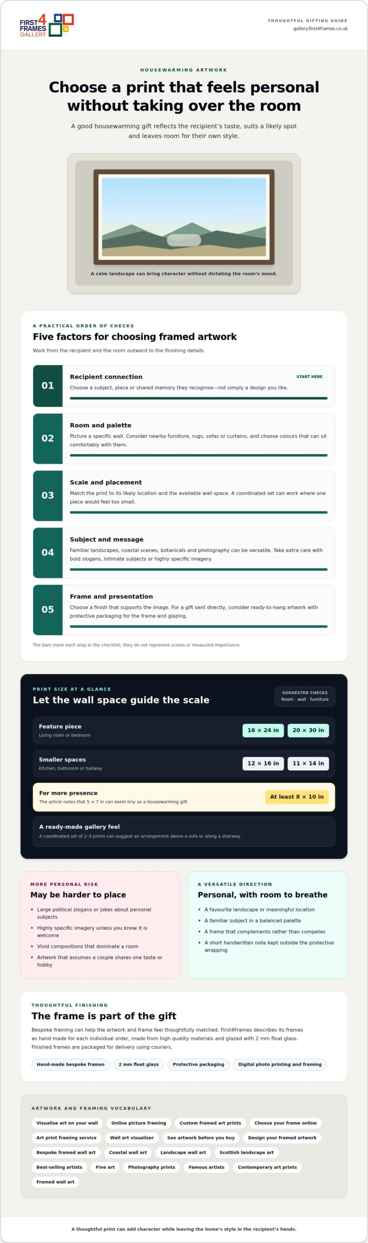
A highly personal framed print can be a risky present: bold slogans, intimate subjects or a strong style may not suit the recipient’s taste. For housewarming presents, framed artwork feels thoughtful when the subject and palette leave room for the recipient’s own style. A versatile image is often a safer choice than one that dictates a room’s mood.
It’s natural to want a present to feel distinctive, especially when someone is settling into a new home. Art can make a space feel warmer and more complete, but the right choice depends on the recipient’s preferences and how well you know their décor. Consider what they enjoy, not only what looks striking to you.
This guide explores why prints can make lasting housewarming presents, which styles may be risky, and how to choose framed artwork for a new home. You’ll find practical ways to weigh subject, colour, size and framing, so your gift feels personal without asking the recipient to redesign a room around it.
Key Takeaways
Choose artwork that complements the recipient’s taste without requiring the whole room to follow one strong theme.
Consider how the print’s subject, colours and scale will work in the home before settling on a gift.
Personal touches can make a print feel more meaningful, while a highly specific style may be harder to place.
Explore bespoke framing when you want the artwork and frame to feel thoughtfully matched.
A print can create a focal point in a new room and remain part of the home as its décor changes. For a housewarming gift, choose a subject the recipient can enjoy without needing to match every detail of their interior.
Lasting Gift Appeal
Unlike flowers or food, a framed print can stay on display long after the moving-day boxes are unpacked. It might add colour above a reading chair or bring a hallway wall to life. Look for an image with lasting appeal rather than a design tied to a short-lived trend.
Match the print’s scale to its likely location. For a living room or bedroom feature piece, consider 16×24 or 20×30 inches. For a kitchen, bathroom or hallway, 12×16 or 11×14 inches may feel more at home. A 5×7-inch print can seem tiny as a housewarming gift, while at least 8×10 inches gives the artwork more presence.
Standard print dimensions can make choosing a frame more straightforward. Before deciding, consider the wall space, nearby furniture and whether the recipient already owns frames. A coordinated set of 2-3 prints can suggest a ready-made gallery arrangement above a sofa or along a stairway.
Versatile Styles for Gifting
Choose artwork that connects with the recipient without relying on an exact colour scheme. Coastal scenes, landscapes and botanical subjects offer familiar themes, while photography or contemporary art can suit different rooms. For example, a calm seascape might appeal to someone who loves the coast, while an abstract print could suit a friend with modern furnishings.
Consider how much attention the image demands. A quiet landscape can sit alongside varied furnishings, while a vivid composition or humorous slogan may dominate a room. If you’re unsure of their taste, choose a balanced palette and a familiar subject. The print can add character without defining the entire space.
Artwork as a housewarming present
A framed print can mark a move without adding another practical item to an already busy home. Choose artwork with a clear connection to the recipient, such as a favourite landscape, a meaningful place or a subject linked to a shared memory. That personal detail gives the gift a story, while the image can still suit the new room.
Think about how the artwork will arrive as well as how it will look. A framed piece should have sturdy outer packaging, with the frame and glazing cushioned against knocks in transit. If you’re giving it in person, attach a card to the outside of the protective wrapping so the message stays separate from the artwork.
If you’re sending the gift directly, choose framed artwork supplied ready to hang and protected for delivery. A finished frame can be awkward to wrap at home, and loose paper or ribbon won’t protect its corners. Protective packaging helps the artwork arrive ready for its new wall.
Before settling on a print, work through three practical checks:
Room: Picture a specific spot, such as the wall beside the dining table or above a hallway console.
Connection: Choose a place or subject the recipient recognises, rather than a design based only on your own taste.
Presentation: Decide whether a single piece or a coordinated pair better suits the available wall space.
For a couple who enjoy long countryside walks, a landscape can recall favourite weekends without spelling out a message. For a first-time buyer, a familiar local scene may help the new house feel like home. These choices make the present personal while leaving room for the recipients’ own decorating decisions.
Browse artwork for a housewarming gift by subject and mood, then choose a piece that connects with the people receiving it. A thoughtful image, secure wrapping and a short handwritten note can make the unboxing feel as considered as the artwork.
What framed artwork makes a good housewarming present?
Good framed artwork reflects the recipient’s taste without imposing one look on every room. Start with a subject they already enjoy, then consider how its colour, message and frame will sit alongside their belongings.
Some styles carry more risk than others. A large political slogan, explicit image or joke about a personal subject can feel uncomfortable in a shared home. Highly religious imagery may also feel too specific unless you know the recipient welcomes it. A striking portrait of someone they don’t know could be difficult to place, even if it is beautifully made.
Use these checks before choosing a print:
Message: Read every word in a slogan print and consider how it might feel on daily display.
Subject: Match a recognisable interest, such as gardening, architecture or music, rather than an uncertain in-joke.
Palette: Look at the room’s existing colours, including a rug, sofa or curtains.
Frame: Choose a finish that supports the image, such as a simple profile for a detailed print.
For a considered choice, explore fine art, architectural studies or photographs of places the recipient loves. These subjects can feel distinctive without relying on a bold slogan or current trend. A gift for a couple should suit both people, so avoid artwork that assumes they share one hobby or taste.
Think about where the piece could hang. A detailed image may suit a quiet study, while a busy composition can compete with patterned wallpaper in a small hallway. Picture the print above a console or beside a bookcase to judge its visual weight. When uncertain, choose a balanced image and a frame that complements its tones, rather than an ornate finish that draws attention away from the artwork.
Can you personalise framed artwork with names, dates or locations?
Yes, you can make a framed print feel personal through its image, setting and presentation. A location with shared meaning often adds warmth without changing the artwork itself. Put names and dates in a handwritten card to keep the print flexible for display.
Choose a detail that connects with the new home or its residents. It might be the place where they met, a coastline they return to, or a landscape near their former home. A print of a familiar city, for example, could mark a couple’s time there without adding text across the image. This keeps the artwork decorative as well as meaningful.
For a personal gift, use this simple sequence:
Pick the connection: Decide whether a place, shared memory or favourite subject matters most.
Choose the image: Find artwork that reflects that connection while suiting the recipients’ taste.
Add the details separately: Write names, a moving date or a short message inside the accompanying card.
Consider the room: Think about where the framed print might hang and whether its colours suit that space.
Putting names or dates directly onto artwork makes the design more specific. That may suit a carefully planned interior, but it can also limit where the piece works later. A separate note preserves the personal meaning while leaving the image uncluttered. For a shared gift, a place or subject both residents recognise can feel more inclusive than a message aimed at one person.
Keep the inscription concise. A date and a few sincere words usually feel more considered than a long dedication. You can also write the story behind the chosen image, such as why a particular view matters to the household. Browse artwork by subject and style to find an image that carries that connection naturally.
First4Frames Gallery: Ready-to-Hang Framed Art
First4Frames Gallery offers Ready-to-Hang Framed Art with handmade, bespoke frames made for each order from high-quality materials. Each frame is glazed with 2 mm float glass. The careful packaging and courier delivery help the finished gift arrive ready for its new home.
Explore framed wall art from best-selling artists and famous artists, or choose Custom Picture Framing and Giclée Fine Art Prints. You can also have your own digital photograph printed and framed. With Online picture framing, you can choose your frame online and design your framed artwork as custom framed art prints or bespoke framed wall art. See artwork before you buy, and visualise art on your wall by considering how its subject and frame might suit the room. Treat a wall art visualiser as a planning idea, not a requirement. The Art print framing service makes it easier to bring a personal image or fine art print together with a considered frame.
Choose a Gift That Feels Like Theirs
The best housewarming presents don’t dictate how a new home should look. Choose something that reflects the people who live there, while leaving them to decide where it belongs. That balance makes framed artwork feel personal and gives the recipient freedom to shape their own rooms.
Before choosing, picture the moment they unwrap it. Will the image bring a favourite place to mind, start a conversation or simply make them smile? That question can help you move beyond a generic new-home motif and choose something with lasting meaning.
Take a relaxed look through the available artwork and notice which pieces feel connected to the recipient, rather than just suited to a trend. Explore framed art for a housewarming gift and find an image that feels right for their next chapter. A thoughtful choice can help a new space begin to feel like home.
Frequently Asked Questions
What Art Styles Should I Avoid as Gifts?
Avoid artwork built around an unfamiliar cultural reference, niche humour or a strong decorative theme. The recipient may not connect with its meaning, even if the image looks striking. Consider whether the subject assumes a particular lifestyle, such as travel or pet ownership. A gift that depends on knowing these preferences can feel less thoughtful than an image with broader appeal.
What if I don’t know their interior style?
Choose an image that feels complete without relying on a particular room colour or furniture trend. A simple architectural study or softly toned botanical print can work in different settings. If you’ve visited their home, notice recurring materials, such as pale wood or dark metal, and use that clue when selecting the frame. A gift receipt or exchange option can also give them flexibility.
Where can I buy framed artwork gifts in the UK?
You can buy framed artwork from UK galleries that sell finished prints, as well as from businesses offering bespoke framing. First4Frames Gallery offers Ready-to-Hang Framed Art, Custom Picture Framing and Giclée Fine Art Prints. This gives you options whether you want to select an existing framed piece or choose a print and frame combination for a particular recipient.
How much does framed artwork cost in the UK?
The cost depends on the print, its dimensions and framing choices. Larger artwork uses more materials, while the frame profile, mount and glazing affect the finished piece. Compare like with like: check whether the price covers both print and frame, and whether it arrives ready to hang. Bespoke framing is tailored to the artwork and the finish you choose.
What are popular styles of framed art for housewarming gifts?
Landscape scenes, botanical studies, architectural images and contemporary abstracts are useful styles to explore. A line drawing of a familiar building, for example, can suit someone interested in design, while a calm seascape may appeal to a coastal walker. Choose a style because it connects with the recipient, not simply because it appears often in home décor photographs.
How do I choose framed artwork to suit someone’s home decor?
Start with the room where the recipient might display the artwork, and note its wall colour, furniture materials and existing art. Repeat one feature, such as a warm timber tone or muted blue accent, rather than trying to match every colour. Consider the room’s purpose too: a restful image may suit a bedroom, while a more energetic piece can bring character to a workspace.
Isle of Skye prints for a spa treatment room should respond to the room as well as the subject. Loch Eishort on the Isle of Skye offers a practical example because clear foreground water reveals rocks and seaweed before the eye moves towards a coloured sunset and distant mountain silhouettes.
Choose Isle of Skye prints for a spa treatment room carefully
A treatment room needs a focal point that rewards slow looking without demanding attention. Loch Eishort creates that route naturally. Foreground detail holds the first glance, water carries it outward and the mountains settle the distance. This is more useful than a printed instruction to relax.
Practical check
Reason
Client sightline
Test the picture from the treatment couch and doorway.
Working clearance
Keep equipment and moving trolleys away from the frame.
Humidity
Maintain ventilation and avoid direct steam or splashes.
Low lighting
Confirm water and mountain detail remain visible.
Use the sunset as a small warmth cue instead of repeating every colour across candles, towels and packaging. Quiet timber, stone and plain fabrics can support the landscape. Clear wall around the frame helps the image remain calm when the room is prepared for work.
Calm comes from a coherent visual route, not from adding the word “relax” to the wall.
Specify a finish suited to a client-facing room
The clear water and sunset depend on clean colour transitions. Certified, colour-managed Giclée production helps preserve them, while in-house bespoke framing provides a professional, ready-to-hang finish for a commercial room.
Isle of Skye prints for a spa treatment room can provide genuine place and depth without generic wellness décor. Loch Eishort offers a measured journey from clear water to mountain distance.
framed coastal photography for a sandy beige bedroom should respond to the room as well as the subject. Luskentyre beach offers a practical example because golden dunes connect naturally with the wall colour, while blue water, distant mountains and soft pink cloud prevent the scheme from becoming flat.
Balance framed coastal photography for a sandy beige bedroom
Beige works well when its materials and tones remain varied. Luskentyre’s sand supplies a natural connection, but the photograph also introduces cool water and atmospheric sky. That contrast matters. If the frame, bedding, carpet and curtains all match, the artwork may disappear.
Above the bed
Measure from the headboard and centre the finished frame within that furniture zone. Leave wall for the horizon to breathe.
Opposite the bed
Use the photograph as the first morning view. Keep a television or tall mirror outside its immediate outline.
Choose one secondary colour from the image. A muted blue throw or small blush detail is sufficient. Natural linen and timber can continue the beach palette, but shells, rope and stripes are unnecessary; the Harris landscape already establishes the coast.
Should the frame match the beige wall?
Not automatically. Test a finish that separates the pale dunes from the wall and still suits the room’s timber and fixed details.
Protect the shifts between sand, water and sky
A restrained coastal palette contains many subtle changes. Colour-managed printing helps retain the dunes, soft cloud and distant land, while one-to-one frame selection creates definition without turning the calm bedroom into a high-contrast display.
Framed coastal photography for a sandy beige bedroom should add distance and character, not more of the same colour. Luskentyre Beach layers natural warmth with cooler air and water for a resolved room.
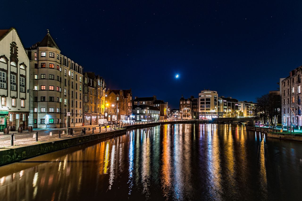
Edinburgh wall art for a dining alcove should respond to the room as well as the subject. Night shot by Water of Leith offers a practical example because historic riverside buildings glow above dark water, with reflected lights and a crescent moon extending the scene beyond a compact wall.
Let Edinburgh wall art for a dining alcove create depth
An alcove benefits from a view that carries the eye beyond its boundary. Place the photograph on the wall seen when someone approaches the table. Reflected water creates vertical depth, while illuminated buildings provide detail that rewards closer viewing during a meal.
Measure the alcove when it is occupied
Pull every chair back to its normal clearance.
Include the pendant shade in the sightline.
Mark the finished frame rather than the print alone.
Check whether glassware catches the same reflected light.
Warm bulbs can echo the lit windows, but avoid several mirrored or metallic accessories around the picture. The water already supplies reflection. Plain tableware and one deeper blue textile can support the image without making a small dining area restless.
In a compact dining space, one framed view can supply more depth than a shelf full of objects.
Keep night detail visible under dining light
Night photography loses atmosphere if dark tones merge or highlights become harsh. Colour-managed Giclée production helps preserve the separation, while a bespoke frame made in-house gives the reflected scene clarity against the wall.
Edinburgh wall art for a dining alcove can connect a small area to a larger place. This Water of Leith scene brings architecture, moonlight and reflected colour without taking space from the table.
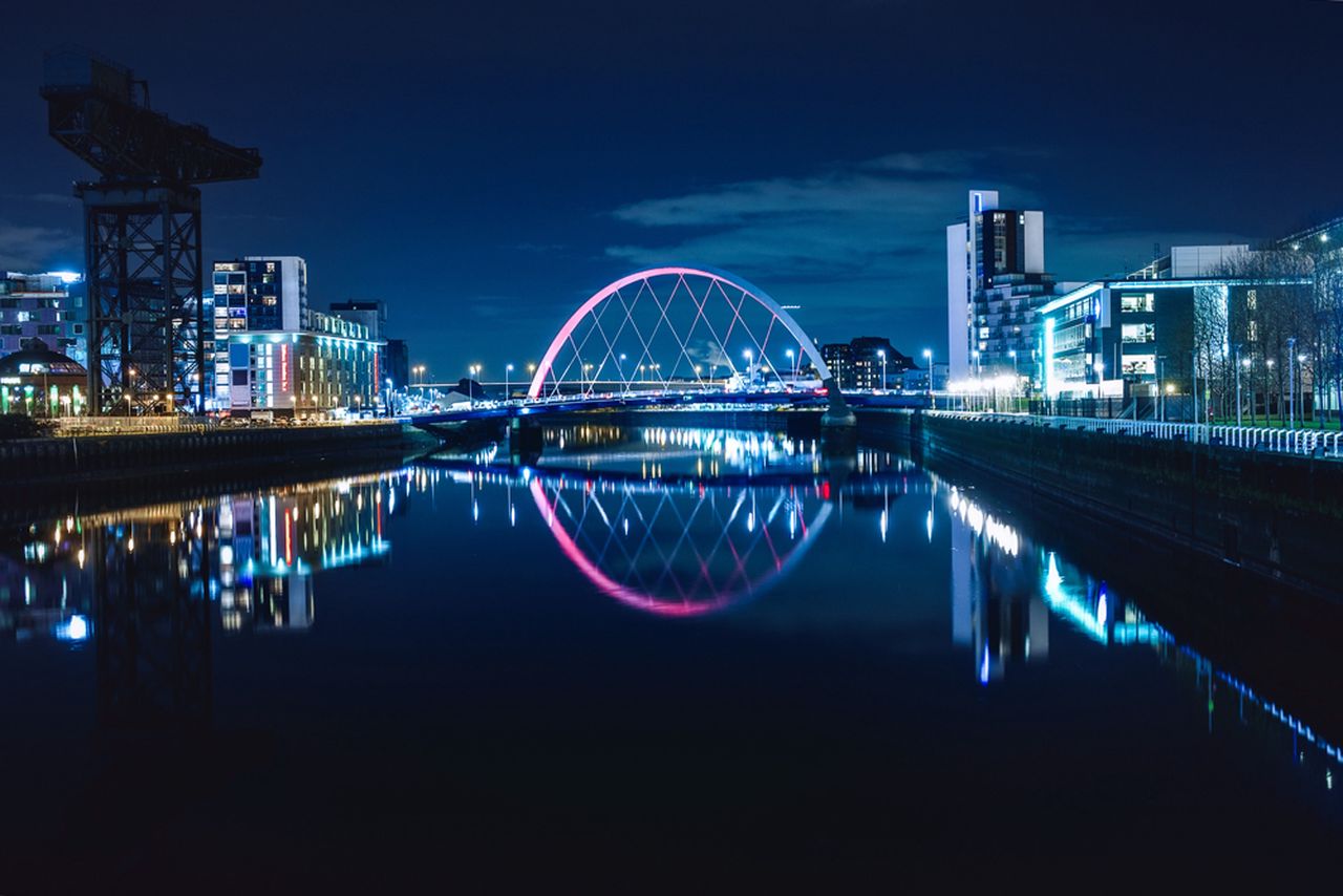
Glasgow wall art for a modern meeting room should respond to the room as well as the subject. Night view of the Clyde Arc offers a practical example because the bridge’s bright curve crosses calm reflected water, connecting recognisable engineering with Glasgow’s modern riverside character.
Use Glasgow wall art for a modern meeting room sightline
Set the table, chairs and display screen before measuring the wall. The photograph should be visible to people entering and to those seated for conversation. Avoid the screen wall if presentations would hide it, and avoid placing the bridge behind high chair backs.
Room element
Useful response
Long table
Align the bridge’s movement with occupied furniture, not the empty wall.
Video screen
Use another wall so moving content and city lights do not compete.
Glass partitions
Check reflections from the corridor and every seat.
Brand colours
Repeat one restrained tone instead of recolouring the room.
The Clyde Arc contributes local recognition without behaving like signage. Its curve also softens the rectangles of tables, screens and acoustic panels. Leave enough plain wall around the frame for that shape and its river reflection to read as one composition.
Specify a professional frame for repeated use
A client-facing room exposes artwork to many sightlines and changing light. Colour-managed production protects the deep blue sky and illuminated reflections, while precise in-house framing provides a dependable commercial finish.
Glasgow wall art for a modern meeting room should establish place without issuing instructions. The Clyde Arc offers structure, movement and evening colour, helping a practical workspace connect to the city.
aurora wall art for a cinema room should respond to the room as well as the subject. Northern lights and snowy mountains offers a practical example because green and pink aurora light rises above a snowy peak and rocky foreground, creating drama that belongs naturally in a low-light setting.
Plan aurora wall art for a cinema room after dark
Assess the room in its normal viewing mode, not in full cleaning light. Switch on the screen, dim the fittings and sit in every usual seat. The best wall keeps the photograph visible before and after a film without placing a bright reflection beside the moving image.
Exclude the wall directly opposite a glossy screen.
Mark the full framed size with the seats in place.
Keep LED strips outside the frame outline.
Use indirect light that reveals the print without washing it out.
Check the glazing from the widest seating angle.
The aurora already supplies several accent colours. Resist adding green strip lighting, star projectors and multiple illuminated signs. Dark upholstery can support the night setting, while one quiet pink or stone-grey detail is enough to connect the photograph with the room.
Does cinema-room artwork need to be dark?
No. It needs controlled contrast. A luminous subject works when surrounding light is indirect and reflections are tested from each seat.
Preserve colour in bright and dim viewing conditions
Aurora photography relies on subtle changes within intense colour. A colour-managed print helps green, pink, snow and shadow remain distinct. Hand-finished framing gives the image a stable boundary when the room becomes dark.
Aurora wall art for a cinema room can feel immersive without becoming another light effect. Northern lights and snowy mountains provides the atmosphere; disciplined placement allows it to remain artwork.