Posted on

Relaxing Bedroom Art: Follow the Quiet Water at Loch Eishort

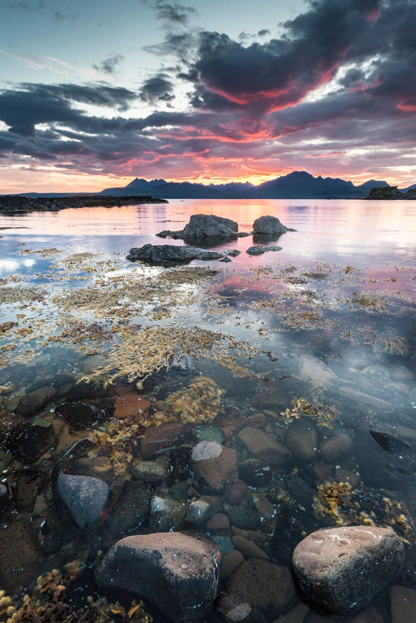
A tranquil sunset at Loch Eishort on the Isle of Skye in Scotland, with clear water revealing rocks and seaweed, dramatic clouds overhead, and distant mountains silhouetted against a colorful sky.

relaxing bedroom art should answer a practical need in the room, not simply fill an empty wall. Loch Eishort on the Isle of Skye is a useful example because its transparent foreground water leads towards distant mountains and a sunset sky, creating a slow route for the eye without becoming pale or anonymous.

Why relaxing bedroom art needs somewhere for the eye to travel

Calm does not have to mean low contrast. In this scene, visible rocks and seaweed give the foreground substance. The water then carries attention towards the silhouetted hills. That progression creates depth, allowing the gaze to settle and move naturally rather than meeting one flat decorative surface.

  • Hang the work where it can be seen from the bed without sitting directly above a bright lamp.
  • Let the deeper mountain tones provide definition against a lighter wall.
  • Choose bedding from one quiet neutral in the scene instead of matching the sunset.
  • Keep the bedside area uncluttered so the long view remains the restful element.

Check the photograph in morning and evening light. A bedroom changes character across the day, and the framed work should remain legible when curtains are open as well as when a softer bedside light is in use.

Give relaxing bedroom art a low-glare setting

Controlled Giclée production supports the transitions between clear water, cloud and fading sunset colour. Bespoke framing completed in-house can then give the photograph definition without introducing a bright, distracting border near the bed.

For wider context on the location, see the official Isle of Skye destination guide. You can also browse the Photography collection or view the exact framed product.

Relaxing bedroom art works through composition as much as colour. Loch Eishort offers a grounded foreground, a quiet visual journey and enough distant space to reward an unhurried look.


Posted on

Beach Wall Art Without the Seaside Theme: Seilebost Beach

beach wall art should answer a practical need in the room, not simply fill an empty wall. Idyllic Seilebost Beach on the Isle of Harris is a useful example because the sweeping shore, turquoise water and distant hills offer a genuine landscape with enough visual space to work beyond a conventionally coastal scheme.

Choose beach wall art for horizon and space

Focus first on what the composition does. The long meeting point between beach and water carries the eye across the photograph, while the hills stop the scene becoming empty. That structure can help a compact living room or bedroom feel more open without pretending that the picture is a window.

Room elementUseful response
Natural timberConnect it with the sand rather than adding driftwood ornaments.
Soft linenUse texture to support the landscape’s quiet character.
Turquoise waterRepeat one small blue-green note, not the entire palette.
Open horizonLeave clear wall around the frame so the breadth remains visible.

Avoid shells, anchors and wording around the picture. They reduce a specific Harris landscape to a generic theme. One confident framed photograph can carry place and coastal character without extra explanation.

Frame beach wall art as landscape, not decoration

A carefully judged frame can separate pale sand and bright water from the wall while preserving the photograph’s breadth. First 4 Frames handles colour-managed printing and bespoke framing in-house, keeping the subtle coastal colours clear and the finish controlled.

For more about the island landscape behind the photograph, explore Visit Outer Hebrides’ guide to Harris. You can also browse the Photography collection or view the exact framed product.

Beach wall art feels more lasting when it is rooted in a real place. Seilebost Beach brings light and distance into the room without requiring a seaside theme.

Posted on

Blue Wall Art After Dark: Night by the Water of Leith

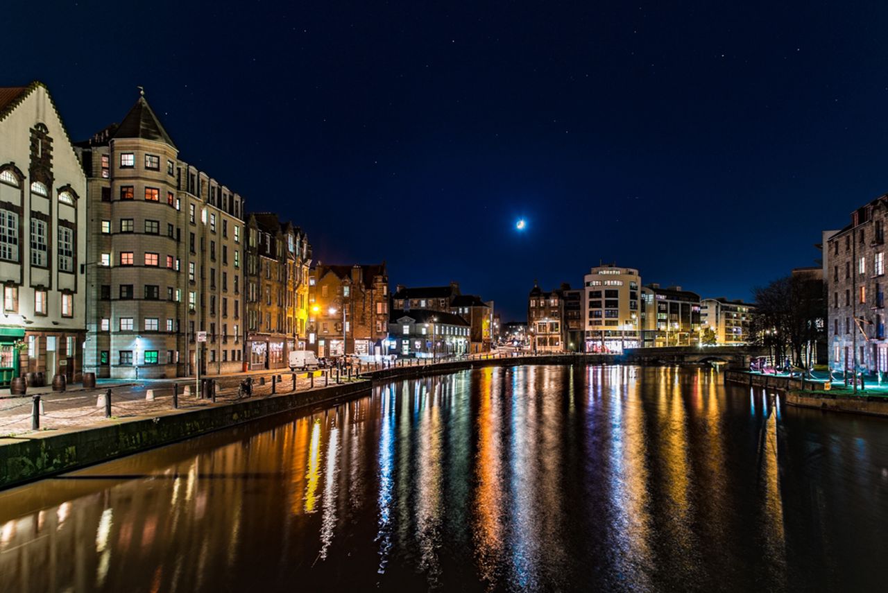
blue wall art should answer a practical need in the room, not simply fill an empty wall. Night shot by Water of Leith is a useful example because its moonlit blue setting is balanced by glowing windows and reflections, giving the scene depth without leaving it visually cold.

Balance blue wall art with warmer points of light

Keep the blue varied

Night colour is rarely one flat navy. Water, sky and building shadows should remain separate, giving the eye several quiet layers to explore.

Echo the warm light once

A warm lamp or a small brass detail can answer the riverside glow. Avoid repeating blue across every cushion, curtain and accessory.

This photograph suits a sitting room, dining area or hallway used in the evening. Position it away from a lamp reflected directly in the glazing. Soft light from the side will reveal the buildings and water while protecting the calm night atmosphere.

Successful blue wall art needs contrast and tonal depth, not a room filled with matching blue objects.

Preserve the difference between water, sky and shadow

Colour-managed Giclée production helps keep neighbouring dark tones readable instead of allowing them to merge. A restrained bespoke frame provides a clean boundary, while the hand-finished presentation gives the illuminated details suitable presence after dark.

To learn more about Edinburgh’s river and walkway, visit the Water of Leith Conservation Trust. You can also browse the Photography collection or view the exact framed product.

Blue wall art can make an evening room feel settled rather than chilly. Night by the Water of Leith achieves that balance through moonlight, architecture and warm reflections.

Posted on

Preview Artwork Before Buying: Test the Scale of Old Man of Storr

preview artwork before buying should answer a practical need in the room, not simply fill an empty wall. Old Man of Storr is a useful example because the bright sunrise, dark rock and reflected light create a strong focal point whose impact is worth testing at the intended viewing distance.

How to preview artwork before buying for a stronger result

Begin with the usable wall, then mark the likely outside edge of the finished frame with low-tack tape or a paper template. Stand at the doorway, the main seat and any route through the room. The Old Man of Storr has a powerful central landform, so it should feel deliberate from each important sightline rather than squeezed between furniture.

  1. Photograph the empty wall straight on in even daylight.
  2. Mark a realistic framed outline rather than the image alone.
  3. Check that the horizon does not clash with shelves or a television.
  4. Compare the dark rock with the visual weight of furniture below.
  5. Repeat the check after lamps are switched on.

A digital mock-up helps with broad proportion, while a physical template confirms height and clearance. Use both as decision aids. Screen colour is not a reliable substitute for seeing the finished colour-managed print.

Let the preview guide the frame, not replace it

The final frame adds real width, depth and material character that a flat screen cannot reproduce. First 4 Frames completes colour-managed Giclée production and bespoke framing in-house in Falkirk, so the photograph becomes one resolved, hand-finished object.

For background on the photographed landmark, see VisitScotland’s guide to the Storr. You can also browse the Photography collection or view the exact framed product.

When you preview artwork before buying, concentrate on proportion, position and visual weight. Old Man of Storr can then command the wall without overwhelming the room around it.

Posted on

Archival Ink Prints for Everyday Rooms: Why Process Matters

archival ink prints becomes more useful when the artwork answers a real feature of the room. Over the Meadow offers a clear example because a nature-led image intended for daily enjoyment still benefits from informed choices about printing, paper, framing and placement.

What archival ink prints need beyond the word archival

Longevity is a chain rather than one specification. Ink and paper matter, but so do colour control, handling, mounting, glazing and the wall where the finished piece hangs. Ask how the image is produced and framed instead of relying on a single reassuring label.

Four practical questions

  • Is the file printed through a colour-managed workflow?
  • Is the paper suitable for fine-art reproduction?
  • Will the mount and frame support the work without crowding it?
  • Can the finished piece avoid direct sun, damp and abrupt temperature changes?

Placement does not need to become anxious. Choose a stable interior wall, keep the frame away from persistent moisture and use curtains or blinds when direct sun is strongest. Normal, thoughtful care lets the artwork remain part of everyday life.

Join print quality to careful presentation

First 4 Frames combines certified colour-managed Giclée production with bespoke framing completed in-house at its Falkirk workshop. That joined-up process helps the print, mount and frame function as one hand-finished object rather than unrelated components.

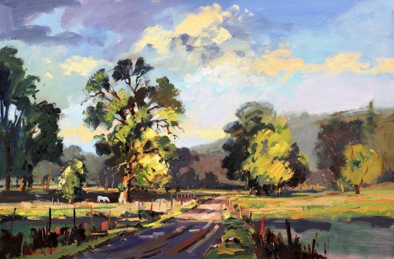
For conservation-minded display advice, read the Library of Congress guidance on caring for works on paper. You can also browse the Charlotte Strawbridge collection or view the exact framed product.

Archival ink prints are best understood through process and care, not a promise in isolation. Over the Meadow can be enjoyed as everyday artwork while informed production, framing and placement support its presentation over time.

Posted on

Abstract Landscape Art at Square Scale: Plan Upside Down II

abstract landscape art becomes more useful when the artwork answers a real feature of the room. Upside Down II offers a clear example because its 265 mm, 500 mm and 800 mm square print choices allow the same composition to move from an intimate accent to a substantial focal point.

Judge abstract landscape art by distance as well as dimensions

Print sizeLikely rolePlanning priority
265 × 265 mmClose-view accentKeep nearby objects sparse.
500 × 500 mmIndependent focal pointAlign with a cabinet or chair grouping.
800 × 800 mmRoom anchorConfirm viewing distance and finished frame size.

Square artwork creates a stable visual centre, but that does not mean it should be centred on every wall. Relate it to the furniture group used most often. An offset position above a sideboard may feel more balanced than the mathematical middle of a long open-plan wall.

At larger scale, remove small competing pictures from the immediate area. At compact scale, leave enough blank wall that the piece does not look like an afterthought among shelves and switches.

Use the frame to clarify an open composition

Abstract work benefits from accurate colour separation and a frame chosen for the whole composition, not one isolated tone. Colour-managed Giclée production and bespoke in-house framing give Upside Down II a precise square boundary at each available scale.

For context on abstraction and interpretation, see Tate’s guide to abstract art. You can also browse the David Short collection or view the exact framed product.

Abstract landscape art can shift role dramatically as it grows. Upside Down II makes that choice practical: decide whether the room needs a detail, a focal point or a true anchor before choosing the size.

Posted on

Art Size Guide for Every Room: Use The Attic Room on Awkward Walls

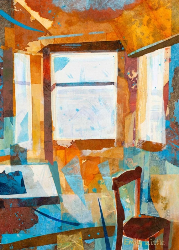
art size guide for every room becomes more useful when the artwork answers a real feature of the room. The Attic Room offers a clear example because its portrait proportions and 230 × 322 mm or 360 × 500 mm print options suit the kinds of vertical spaces that standard sofa-wall advice often overlooks.

An art size guide for every room starts with usable wall space

Do not measure only the total wall. Record the rectangle that remains after skirting, sloping ceiling, door swing and furniture are considered. That usable area determines whether the framed work can breathe and whether its centre will sit near a comfortable eye line.

  1. Measure the narrowest width along the intended hanging area.
  2. Mark the expected outer frame, not just the print dimensions.
  3. Open doors and drawers to check clearance.
  4. View the paper outline from the room entrance and usual seat.
  5. Confirm where a hook can be fixed safely before ordering.

The smaller print can suit a wall return or reading corner. The larger option needs more uninterrupted height, but it may feel better balanced beside a chest or low chair. A paper template makes that difference visible before the frame arrives.

Treat the finished frame as the true measurement

Bespoke framing adds mount, moulding and glazing around the listed print size. First 4 Frames can bring those elements together in-house, creating a proportioned outer edge that looks intentional even on a difficult wall.

For a general reminder to record dimensions accurately, consult RICS consumer guidance on measuring up. You can also browse the Emily Little collection or view the exact framed product.

A useful art size guide for every room must account for awkward architecture. The Attic Room offers portrait flexibility, but the final decision should always be based on the complete framed outline.

Posted on

Dance Wall Art That Gives a Social Room Its Rhythm

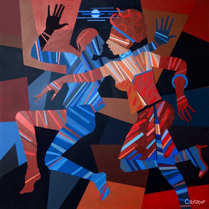
dance wall art becomes more useful when the artwork answers a real feature of the room. Dance Till Dawn offers a clear example because its title carries a clear sense of movement and shared energy, making it suitable for a space used for music, meals or conversation.

Place dance wall art where the room becomes social

Movement in an artwork is most effective when the room leaves it space to continue.

Choose a wall seen as people enter or gather, not one hidden behind a tall speaker or open door. The compact 265 × 265 mm print format can create a deliberate beat above a drinks cabinet, beside record shelving or within a dining corner.

  • Keep cables and audio equipment visually tidy beneath the picture.
  • Use warm ambient light, but avoid placing a bright fitting directly opposite the glazing.
  • Repeat one energetic line or colour in a small object rather than adding dance-themed signs.
  • Leave clear wall around the frame so the square shape reads confidently.

The artwork should support the atmosphere even when no music is playing. That is why a resolved framed presentation matters more than a collection of literal decorative references.

Give movement a disciplined frame

A hand-finished frame provides a still boundary around an energetic subject. Combined with colour-managed Giclée production, that clean edge helps Dance Till Dawn hold its own among furniture, lighting and the activity of a social room.

For a wider view of contemporary dance in Scotland, visit National Dance Company of Scotland. You can also browse the Fred Carson collection or view the exact framed product.

Dance wall art can suggest sound and movement without dictating the whole scheme. Dance Till Dawn gives a social space rhythm, while its compact framed form keeps the result controlled.

Posted on

Giclée Art Prints in Changing Light: Look Closely at Late Afternoon

Giclee art prints becomes more useful when the artwork answers a real feature of the room. Late Afternoon offers a clear example because the scene’s atmosphere depends on the transitions that occur as stronger daylight softens towards evening.

What to notice in Giclee art prints with subtle light

A print built around time of day needs more than a bright overall result. Look for separation between the lightest areas, middle tones and deeper passages. If those zones collapse together, the atmosphere becomes flat. A colour-managed workflow is valuable because it aims to reproduce those relationships consistently.

Viewing checkWhat to look for
Morning daylightQuiet tones should remain distinct rather than appearing washed out.
Late afternoonWarm room light should support the scene without turning every neutral orange.
After darkA nearby lamp should reveal detail without reflecting directly in the glazing.

Late Afternoon is offered in 350 × 230 mm and 550 × 365 mm print sizes. Compare the finished framed outline with the viewing distance, since the larger option can reveal gradual tonal changes more readily from across a room.

Frame atmosphere without introducing visual noise

First 4 Frames produces colour-managed Giclée work in-house in Falkirk. A restrained bespoke frame can then protect the quieter mood, while careful positioning prevents glare from hiding the tonal work the print process preserves.

For background on the print method, read Tate’s definition of a Giclée print. You can also browse the Joseph Maxwell Stuart collection or view the exact framed product.

The appeal of Giclee art prints lies partly in controlled detail and tone. Late Afternoon rewards checking those qualities under the real light in which the finished work will be seen.

Posted on

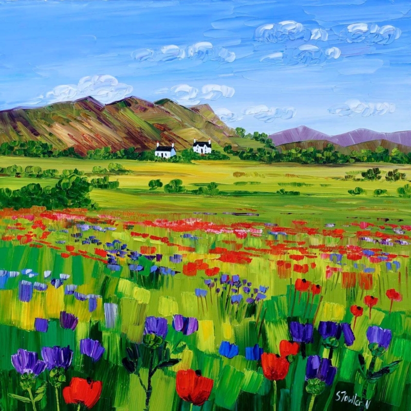
Art by Colour: Build a Room Palette Around Poppies and Thistles

art by colour becomes more useful when the artwork answers a real feature of the room. Poppies and Thistles, Perthshire offers a clear example because its floral subject and rooted Perthshire identity make it possible to draw out colour without turning the whole interior into a matching botanical scheme.

Use art by colour as a starting point, not a formula

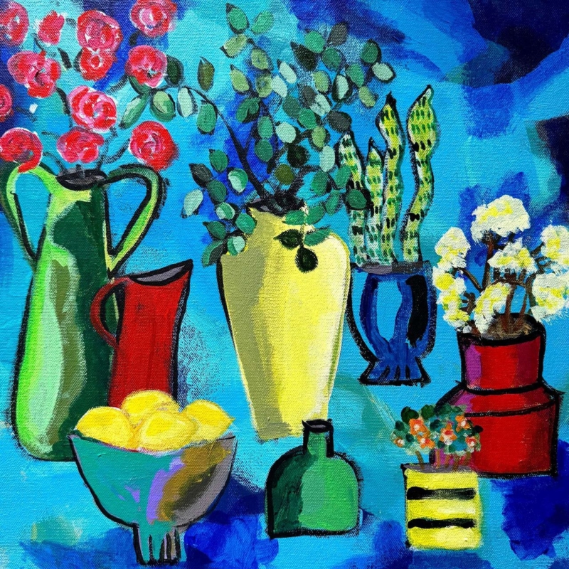
Start with the picture rather than a handful of paint cards. Identify the colour that catches your eye first, then decide whether it should lead the room or remain a small accent. With a floral work, repeating every petal and leaf tone can feel forced. One flower colour in a cushion or lamp base is often enough.

Choose a lead note

Let one poppy or thistle tone provide energy. Keep the repeat smaller than the framed work so the picture remains the source.

Add a quiet support

Use foliage, field or earth colours in timber, linen or ceramics. These supporting notes connect the artwork without obvious copying.

The square 265 × 265 mm and 500 × 500 mm print choices can serve different rooms. Mark the finished frame outline before deciding how much colour to repeat nearby.

Let framing give the palette a clean boundary

A considered frame separates concentrated floral colour from wall paint and furnishings. Colour-managed Giclée production helps retain distinctions between neighbouring tones, while bespoke in-house framing gives the square composition a calm edge.

For a useful explanation of colour relationships, see the V&A’s introduction to the colour wheel. You can also browse the Sheila Fowler collection or view the exact framed product.

Art by colour should create connection rather than perfect coordination. Poppies and Thistles, Perthshire can lead a layered interior while still keeping its own visual identity.