Posted on

Limited Edition Prints: Choose Duns, Stary Night for Connection, Not Scarcity

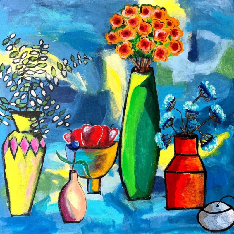
A whimsical night street scene inspired by "Duns, Stary Night," featuring vibrant blue and pink patterned houses, tall trees, cobblestone pavement, and a crescent moon in a dark, star-studded sky.

limited edition prints should answer a specific need in the room or for the buyer. Duns, Stary Night is a useful example because its stylised Scottish place, night-time character and Nikki Monaghan’s colour-led approach offer reasons to enjoy the work before edition scarcity is considered.

Assess limited edition prints in the right order

  1. Start with the image. Would the place, mood and colour still appeal if the edition were not mentioned?
  2. Look at the artist. Read about Nikki Monaghan’s Scottish landscapes and layered materials.
  3. Confirm the product details. Check the edition information shown with the exact product before ordering.
  4. Plan the wall. Use the stated print dimensions and add the proposed mount and frame.
  5. Choose presentation for the artwork. Avoid a frame selected merely to make the piece look collectible.

Duns gives the work a particular Scottish identity, while the night setting shifts attention towards light and atmosphere. That can suit a snug, study or evening sitting room. Keep nearby lamps from reflecting directly in the glazing, and avoid surrounding the print with several unrelated limited editions simply to form a collection.

Does limited edition mean the artwork will rise in value?

No future value should be assumed. Buy the picture because the artist, subject and finished presentation deserve a place in your home. Treat scarcity as supporting information, not an investment promise.

If the piece is intended as a gift, explain the connection to Duns or to the artist in a separate card. That story will often matter more to the recipient than edition terminology on its own.

Protect the qualities that made the image matter

Limited status does not reduce the need for sound production. Colour-managed Giclée output supports Nikki Monaghan’s expressive colour, while accurate mounting and bespoke framing protect the physical print and give it a resolved place on the wall.

To understand the artist’s wider practice and Scottish inspirations, visit Nikki Monaghan’s official website. You can also browse the Nikki Monaghan collection or see the exact framed product.

Limited edition prints are most rewarding when scarcity follows genuine connection. Duns, Stary Night offers place, colour and artist identity first; verified edition details and a carefully made frame complete the decision.

Posted on

Meaningful Gift Wall Art for a Graduate: Edinburgh University Old College

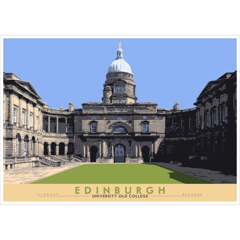
meaningful gift wall art should answer a specific need in the room or for the buyer. Edinburgh: University Old College is a useful example because Old College can mark years of study and a specific Edinburgh connection without relying on dates, slogans or short-lived graduation merchandise.

Choose meaningful gift wall art from a true connection

Begin with the recipient, not the occasion. Did they study in or regularly pass Old College? Does Edinburgh represent independence, friendships or a change in direction? A recognisable place becomes a stronger gift when it carries one of those personal stories.

Gift questionWhy it matters
Where might it hang?The 594 x 420 mm and 840 x 594 mm print options both need realistic wall space after framing.
Will they move soon?A versatile frame and clear landscape format can transfer more easily between homes.
Which memory matters?A short handwritten note can explain the location without adding wording to the artwork.
Is the subject personal?Choose it for a genuine university or Edinburgh link, not simply because graduation is Scottish.

Do not guess at the largest option. If possible, ask a partner or family member for a wall photograph and furniture width. Include the mount and moulding in the planned outline. Good scale makes the gift easier to enjoy immediately rather than creating a storage problem.

A graduation picture should carry the memory after the cards and ceremony have passed.

Make the presentation worthy of the milestone

Stewart Bremner’s place-led illustration gives the recipient a recognisable Edinburgh subject. Colour-managed Giclée production and hand-finished framing turn that connection into a substantial, ready-to-hang gift, with the work completed in-house in Falkirk.

For practical information about visiting the university and its city-centre sites, use the University of Edinburgh’s official visitor information. You can also browse the Stewart Bremner collection or see the exact framed product.

Meaningful gift wall art succeeds when the picture belongs to the recipient’s story. Edinburgh University Old College can honour achievement, place and memory in a form designed to remain part of the home for years.

Posted on

Music Wall Art: Set the Rhythm of a Listening Room With Take Five

music wall art should answer a specific need in the room or for the buyer. Take Five is a useful example because its rhythmic title and square format can give a listening space identity without covering the walls in sleeve reproductions or printed lyrics.

Arrange music wall art around listening, not equipment

Set the speakers and main chair first. Good listening positions rarely match the geometric centre of a wall, so artwork should respond to the complete arrangement. Keep it clear of speaker tops, cable routes and shelving that may grow as a collection changes.

Compact 265 mm square

Use it near a reading chair, headphone station or short record cabinet where it can be seen closely.

Flexible 500 mm square

Test it above a medium console or between equipment zones, including the full framed outline.

Bold 800 mm square

Reserve it for a broad wall with enough distance and no conflict with tall speakers or acoustic panels.

Let records and instruments remain useful objects rather than turning them into a forced backdrop. One artwork with a suggestive title creates a looser connection to music. It leaves room for changing tastes and does not make the space look like a themed bar.

  • Check reflections under evening listening light.
  • Keep turntable lids and cabinet doors clear of the frame.
  • Use one size template at a time.
  • Leave visual separation from acoustic treatment.

Give an energetic square a quiet boundary

A music room already contains strong shapes and detailed equipment. Controlled Giclée output and a precisely made frame give Take Five its own visual boundary. First 4 Frames completes the work in-house, so scale and presentation can be considered together.

For recordings, stories and wider context from Britain’s jazz heritage, explore the National Jazz Archive. You can also browse the David Short collection or see the exact framed product.

Music wall art should support the pleasure of the room rather than compete with it. Take Five can set a visual rhythm while measured placement keeps the listening chair, speakers and record collection at the centre of use.

Posted on

Framed Art Prints: Give Eilean Donan Castle a Contemporary Edge

framed art prints should answer a specific need in the room or for the buyer. Eilean Donan Castle is a useful example because the recognisable castle and loch are overlaid by colourful, abstract sky marks that prevent the scene from feeling like a conventional heritage view.

Choose framed art prints for image and interpretation

A landmark print does not have to lead to tartan, dark timber and traditional accessories. Look first at the artwork’s treatment. Here, the castle creates an anchor while the energetic colour above it introduces a modern note. Let that contrast guide the room.

DecisionUseful test
350 x 230 mm printTry it where the view will be enjoyed at closer range, such as above a console.
550 x 365 mm printTemplate it over broader furniture and include the finished frame.
Frame colourRelate it to one existing material instead of imitating castle stone.
Room accentsLift one colour from the expressive sky and stop there.

Keep surrounding Scottish references edited. A room does not need maps, antlers and souvenir objects to make the location legible. The castle supplies place; the abstract colour supplies personality. Clear wall around the landscape format allows both readings to remain visible.

Can a castle print suit a modern home?

Yes. Choose a treatment with its own visual energy, use a clean frame boundary and avoid styling the whole room around heritage motifs.

Frame the colour as carefully as the landmark

The quieter castle and more expressive sky need accurate colour relationships. Controlled Giclée production helps preserve that contrast. In-house mounting and framing can then connect the print to a contemporary interior without making it feel cold or overly formal.

For visitor information and the history of the location, explore the official Eilean Donan Castle website. You can also browse the Joseph Maxwell Stuart collection or see the exact framed product.

Framed art prints become more personal when a familiar subject is seen through an individual artist’s treatment. Eilean Donan Castle offers recognition and surprise together, while a measured frame keeps the result polished and easy to live with.

Posted on

Conservatory Wall Art: Let Bass Rock and Beach Grasses Balance the View

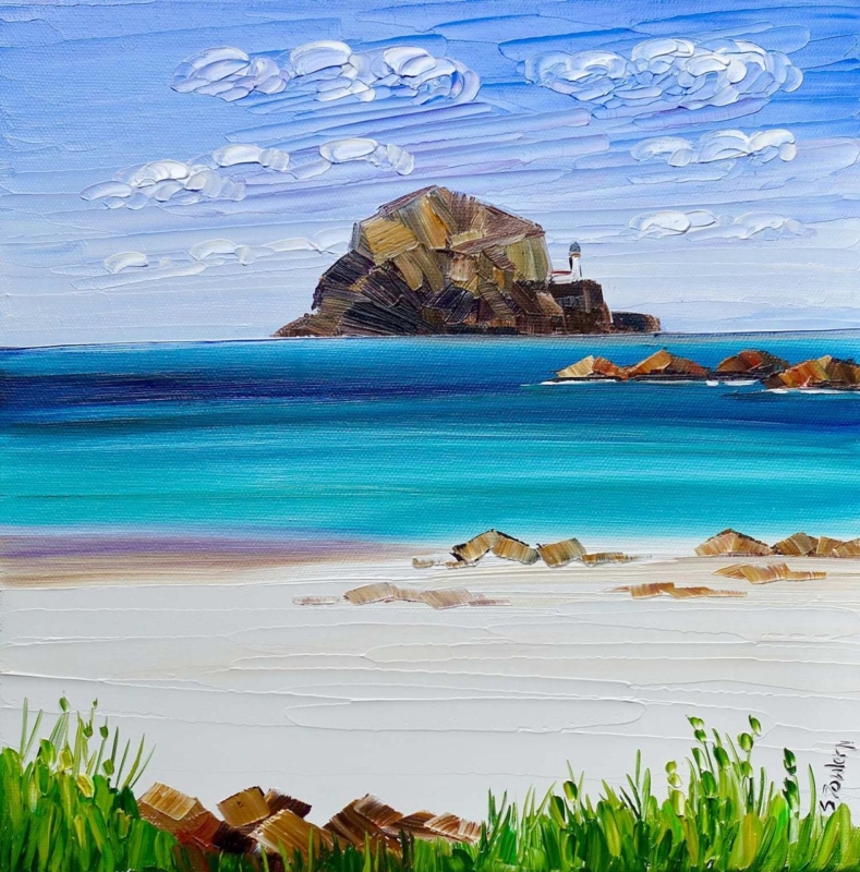
conservatory wall art should answer a specific need in the room or for the buyer. Bass Rock and Beach Grasses is a useful example because its beach grasses create a foreground layer, while Bass Rock supplies a clear destination beyond them in a compact square composition.

Plan conservatory wall art around the changing view

A conservatory rarely looks the same all day. Strong sun can flatten pale details, reflections can move across glazing, and the garden competes for attention. Choose the solid internal wall first. Then check it in morning, midday and evening light before deciding where the frame should sit.

Use the 265 mm square nearby

The smaller print can create an intimate pause beside a chair or compact table. Keep plants from overlapping the finished frame.

Test the 500 mm square at distance

The larger option can hold a broader wall. Mark the complete frame and judge it from the doorway as well as from a seated position.

Beach grasses can relate naturally to rattan, linen or woven blinds, but repetition needs restraint. One basket or textured shade is enough. Avoid adding shells, rope and several blue accessories, because the landscape already provides a convincing coastal reference.

  • Use an internal wall away from leaks and condensation.
  • Check glare from the normal seats before hanging.
  • Leave space between foliage and the frame.
  • Repeat one sandy or green note rather than the full palette.

Keep a coastal image clear in bright light

A light-filled room exposes weak colour and imprecise finishing. Colour-managed Giclée production helps the grasses, sky and distant rock remain distinct. A bespoke frame, completed in-house in Falkirk, gives the image a defined edge against garden views and textured furnishings.

For natural and historical context behind the landmark in the picture, read this background to Bass Rock and its remarkable seabird colony. You can also browse the Sheila Fowler collection or see the exact framed product.

Conservatory wall art works best when it holds its own without trying to outshine the garden. Bass Rock and Beach Grasses offers depth, texture and a clear horizon, giving the room one calm point of focus through changing seasons.

Posted on

Minimalist Wall Art for a Quiet Pause: Give Isolation Enough Space

minimalist wall art becomes more useful when the picture solves a real placement question. Isolation offers a clear starting point because the compact square and evocative title can reward a close sightline when surrounding objects are edited rather than removed without purpose.

Use minimalist wall art to shape attention

Minimal does not mean placing a small picture in the centre of a large blank wall. Begin with the route and the moment of viewing. A short landing, reading-chair return or wall beside a bedroom dresser can provide the closeness that a 265 x 265 mm print needs.

Negative space works when it directs attention. Space without a viewing reason can simply make an artwork feel stranded.

  1. Stand where the picture will normally be noticed.
  2. Mark the complete framed square at eye level.
  3. Remove objects that interrupt the sightline, not every useful object.
  4. Check that a door, shade or plant does not cast a changing shadow.
  5. Use one nearby material connection, such as timber or a quiet textile.

The title can encourage reflection, but the room need not become severe. A comfortable chair, reading lamp and a few used books add life. Keep decorative objects from forming a tight halo around the frame, and let the square hold its own boundary.

Does minimalist artwork always need a white frame?

No. The frame should separate image from wall and relate to the room. A restrained timber, dark edge or soft painted finish may work better.

Use precise finishing at intimate scale

Compact art is often inspected from nearby, making clean mounting, accurate corners and controlled colour important. In-house Giclée production and bespoke framing give Isolation a resolved edge without adding visual noise around it.

For art-historical context on reduction, material and space, read Tate’s introduction to Minimalism. You can also browse the Rikki O’Neill collection or view the exact framed product.

Minimalist wall art succeeds through deliberate attention rather than emptiness. Isolation can make a quiet wall purposeful when the viewing point, clear space and frame are chosen with equal care.

Posted on

Extra Large Wall Art Without Guesswork: Scale Stomp Before You Order

extra large wall art becomes more useful when the picture solves a real placement question. Stomp offers a clear starting point because its 265, 500 and 800 mm square options allow the same image to be tested as a close-view accent, furniture-led focal point or broad wall anchor.

Plan extra large wall art from the finished outline

Print sizeBest test
265 x 265 mmTry it on a short return or above a small cabinet.
500 x 500 mmCompare it with a chest, compact sofa or defined seating corner.
800 x 800 mmUse it where wall and viewing distance support a strong square anchor.
Finished frameAdd mount and moulding before making any width comparison.

Do not measure the bare wall alone. Place furniture first, include lamps at their working height and note door swings. Then tape the outer framed square on the wall. The 800 mm print may suit a substantial sideboard, but it can overwhelm a narrow route even when it technically fits.

Run a three-view check

  • Stand at the entrance to judge first impact.
  • Sit in the main chair to test comfortable viewing.
  • Move along the nearest route to check clearance.

A large square already has graphic authority. Keep nearby objects below or beside its boundary rather than allowing shelves, plants or a television to clip its edges. Clear wall is part of the composition.

Make the frame part of the scale calculation

As artwork grows, small inaccuracies become more visible. Controlled Giclée output, square mounting and sound frame construction are practical requirements. First 4 Frames completes the work in-house, allowing print and presentation to be considered together.

For further practical principles on spacing and hanging groups, see National Galleries of Scotland’s picture-hanging guidance. You can also browse the David Short collection or view the exact framed product.

Extra large wall art should feel inevitable once installed, not merely impressive on a product page. Stomp’s three sizes let furniture, distance and the complete frame lead the decision.

Posted on

Art for Limestone Flooring: Let Autumn Light Supply the Warmth

art for limestone flooring becomes more useful when the picture solves a real placement question. Autumn Light offers a clear starting point because its vertical format and warm seasonal idea can counter a broad, cool floor without covering the stone or forcing the whole room into an autumn palette.

Balance art for limestone flooring from the ground up

Limestone usually contributes pale tone, quiet variation and a strong horizontal plane. A portrait artwork answers that structure by drawing the eye upwards. Mark both available print sizes—230 x 320 mm and 400 x 550 mm—then add allowances for mount and moulding.

Use warmth selectively

Repeat one russet, amber or soft brown in a textile or ceramic. Leave other surfaces quieter so the artwork remains the source of warmth.

Keep the stone visible

Avoid several heavy rugs and dark objects merely to correct a cool floor. Texture and one framed focal point can be enough.

Check the picture in the light that reaches the room. Limestone can bounce daylight upwards, while evening lamps may introduce warm glare. View the proposed glazing from seated and standing positions before finalising the hanging point.

  1. Photograph the room in morning and evening light.
  2. Template the complete frame above the main furniture group.
  3. Choose one colour connection instead of a fully matched palette.
  4. Keep the lower wall clear enough for floor and picture to read together.

Separate warm colour from pale stone

Subtle seasonal colour needs accurate relationships, not simply extra saturation. Colour-managed Giclée production helps preserve that balance. A hand-finished frame creates a measured transition between the artwork, wall and limestone below.

For natural context on the changing colour that inspires autumn imagery, read the Woodland Trust’s guide to autumn leaf colour. You can also browse the Joseph Maxwell Stuart collection or view the exact framed product.

Art for limestone flooring should add warmth while respecting the material already in the room. Autumn Light offers upward movement and seasonal colour, allowing the floor to remain calm rather than cold.

Posted on

Local Scottish Art for an Edinburgh Home: Choose Victoria Street

local Scottish art becomes more useful when the picture solves a real placement question. Victoria Street offers a clear starting point because the familiar curved street can connect daily routes, remembered visits and Edinburgh’s layered architecture in one city-led composition.

Let local Scottish art carry one real memory

Recognition is useful, but it is not the whole decision. Think about why Victoria Street matters. It may recall a first flat, a regular Old Town walk, a graduation visit or a favourite independent shop. That private connection gives a familiar landmark more staying power.

Keep the display rooted rather than themed

  • Choose one Edinburgh view for the main wall.
  • Avoid adding tartan, street signs and skyline ornaments around it.
  • Relate the frame to timber or paint already in the room.
  • Leave the city detail clear of tall lamps and shelving.

A hallway rewards the picture at close range, while a sitting room gives more viewing distance. In either setting, centre it on the furniture or sightline that people use. Do not centre it mechanically if a doorway or bookcase shifts the room’s balance.

Can recognisable city art work in a modern interior?

Yes. Keep surrounding objects edited and use the frame as a clean boundary. The architecture supplies detail; the room can remain quiet and contemporary.

Frame a city view for living with, not collecting

Ismael Pinteño Visuara’s Scottish work carries an artist’s interpretation as well as a recognisable location. Colour-managed Giclée production and precise mounting help the detail remain clear. A bespoke frame gives the view permanence without making it look like tourist ephemera.

For background on the care and character of Edinburgh’s historic townscape, explore Edinburgh World Heritage’s resources on the historic city. You can also browse the Ismael Pinteño Visuara collection or view the exact framed product.

Local Scottish art feels most convincing when it marks a genuine connection. Victoria Street can bring Edinburgh identity into the home while one disciplined frame keeps the result personal and polished.