Posted on

Wall Art for a Bright Staircase Feels More Grounded With Ardnamurchan Lighthouse

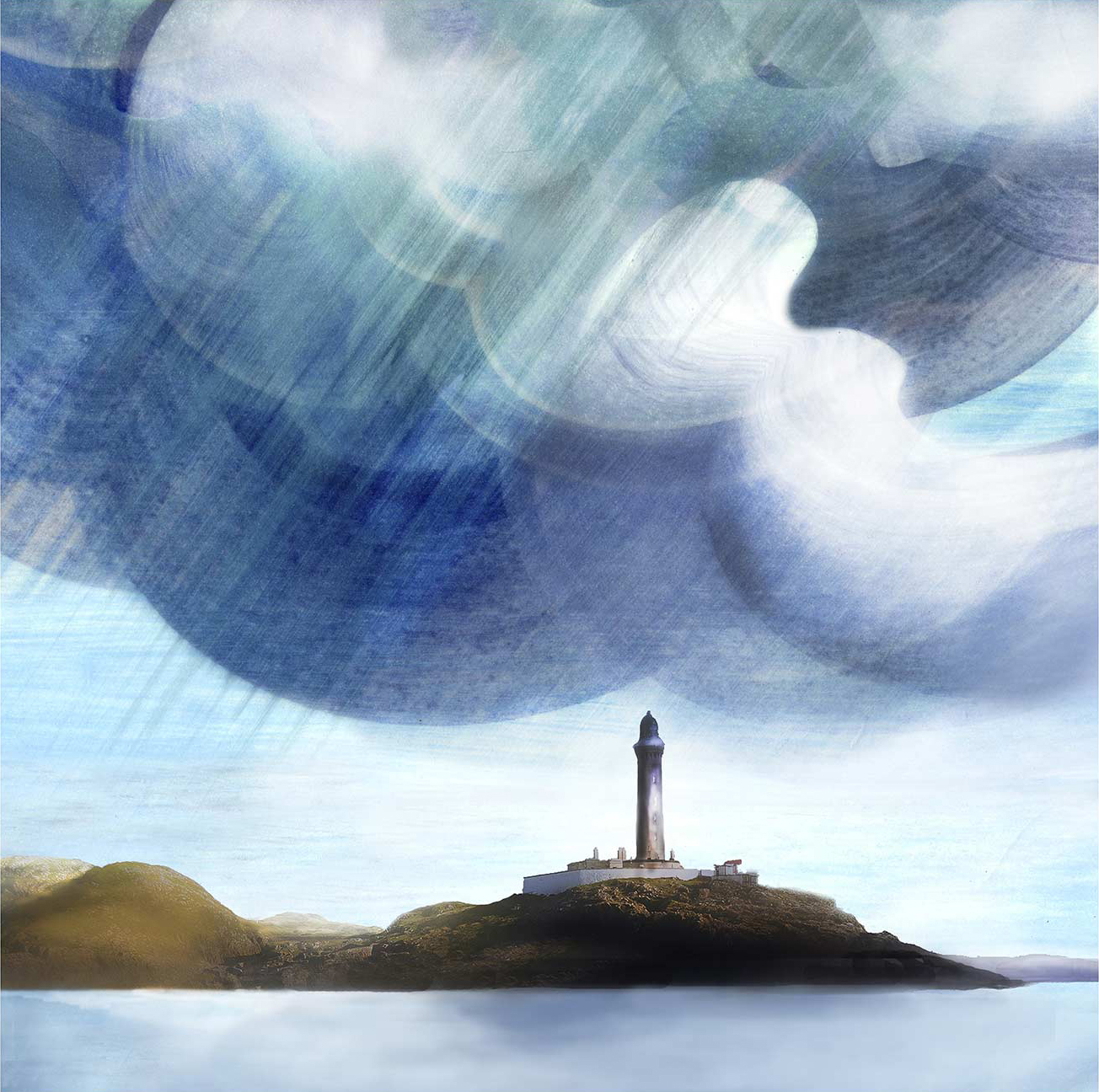
Ardnamurchan Lighthouse rises on a rugged island beneath swirling clouds, with sunlight streaming through to illuminate the surrounding water and landscape.

The best wall art for a bright staircase usually gives a taller space more direction. Ardnamurchan Lighthouse does that naturally, using the lighthouse form to anchor a bright staircase wall without cluttering it or breaking the sense of air that makes the space feel open.

Why Ardnamurchan Lighthouse works as wall art for a bright staircase

Staircases often have more light than furniture, which means the artwork has to do more of the visual shaping. Ardnamurchan Lighthouse works especially well because the vertical subject echoes the rise of the stairs, while the coastal setting keeps the image light and spacious. That balance helps the wall feel intentional rather than blank, particularly in upper halls, split-level homes, or stairwells with larger windows.

  • It gives a tall wall clear structure without visual heaviness.
  • It suits brighter staircases where airy artwork still needs enough presence.
  • It brings character to a transition space people notice every day.

At First 4 Frames, the print is completed in-house with bespoke framing and hand-finished craftsmanship, so the piece arrives ready to hang with a more polished presence than a generic poster-style print. That finished quality matters on a staircase wall, where clean presentation is what makes the whole space feel better resolved.

You can see more by Esther Cohen, learn more about Ardnamurchan Lighthouse, and view the exact framed product here.

If you want wall art for a bright staircase that gives the space height, order, and a stronger sense of place, Ardnamurchan Lighthouse is a very good fit.

Posted on

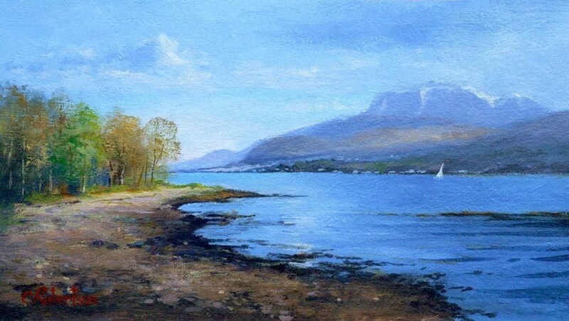
Wall Art for a Room With Low Winter Light Feels Brighter With A Passing Sail Loch Linnhe

Choosing wall art for a room with low winter light is often about finding something that creates lift without forcing brightness. A Passing Sail Loch Linnhe does that beautifully, using open water, a pale sail, and spacious light to help a darker room feel more breathable and less boxed in during the greyer months.

Why A Passing Sail Loch Linnhe suits wall art for a room with low winter light

Rooms that struggle with winter light usually benefit from artwork that creates visual air. A Passing Sail Loch Linnhe achieves that through a broad stretch of water and a simple sail shape that keeps the image moving upward and outward. Rather than making the room feel busier, it gives the eye somewhere lighter to rest, which works especially well in sitting rooms, hallways, and home offices that can feel flatter in colder months.

  • It adds brightness without relying on sugary colour.
  • It suits darker rooms that need more openness rather than more objects.
  • It keeps the atmosphere calm while still lifting the overall mood.

Because First 4 Frames produces and frames the piece in-house in Falkirk, the final result carries the bespoke finish and colour-managed Giclée quality that help softer tones stay clear once on the wall. That matters when subtle brightness is doing the hard work rather than a louder palette.

You can browse more work by Colin Robertson, read more about Loch Linnhe, and view the exact framed product here.

If you are comparing wall art for a room with low winter light, A Passing Sail Loch Linnhe is a refined way to make a darker room feel lighter, calmer, and more considered.

Posted on

Large Landscape Prints Feel More Expansive With Bay of A Thousand Names

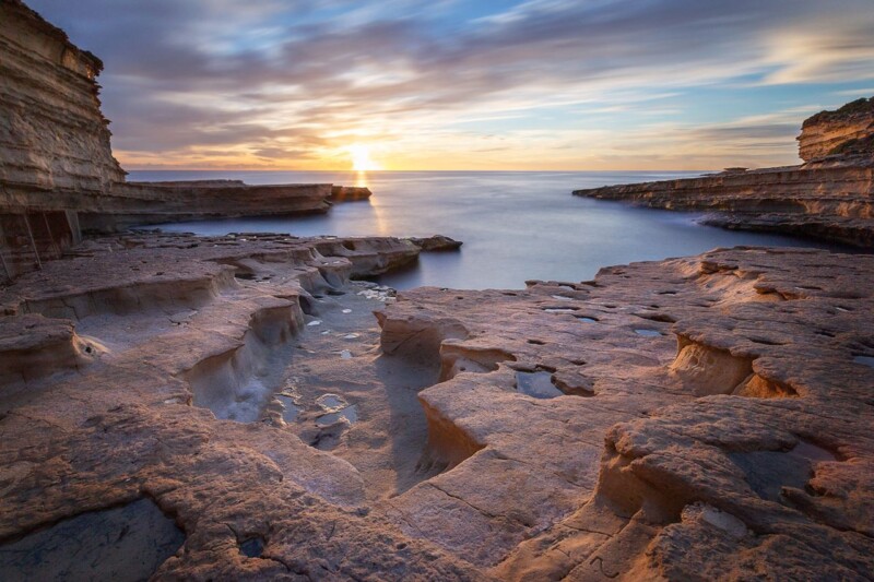
Choosing large landscape prints is not only about scale. It is also about how the picture holds a wider wall. Bay of A Thousand Names works especially well because its broad shoreline, long exposure water, and layered sky create a more immersive kind of width rather than a blunt oversized statement.

Why Bay of A Thousand Names suits large landscape prints

Larger walls need artwork with enough breadth to feel intentional, but too much noise can make the room feel pressured. Bay of A Thousand Names finds a better balance. The limestone formations give the image structure, while the water and sky create breathing room across the frame. That makes it useful above sofas, across dining-room walls, or anywhere a room benefits from a wider, calmer focal point.

  • It gives a broad wall more presence without making the room feel crowded.
  • It works well where softer movement is better than sharp detail.
  • It turns scale into atmosphere rather than mere size.

At First 4 Frames, the finished piece is produced and framed in-house, with bespoke workmanship and colour-managed printing that help a larger image keep its depth and subtle tonal flow. That craftsmanship is what allows a wide landscape to feel polished and room-ready instead of simply enlarged.

For more on the photographer, visit Noel Fenech. You can also browse more work by Noel Fenech Photography and view the exact framed product here.

If you are considering large landscape prints, Bay of A Thousand Names is a strong choice for creating width, atmosphere, and a more composed sense of space.

Posted on

Nature Wall Art Feels More Uplifting With First Morning Rays

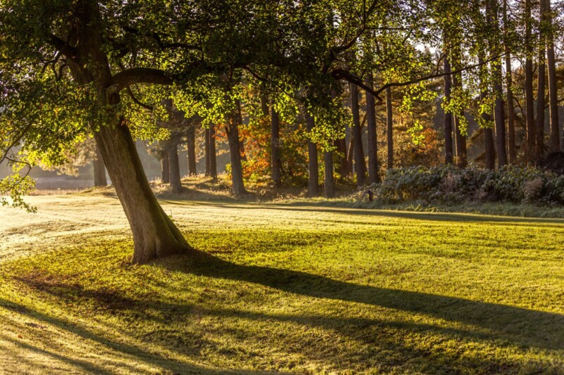
The best nature wall art should do more than reference the outdoors. It should change how the room feels. First Morning Rays does that especially well, using low sunrise light, long shadows, and woodland texture to create an uplifting focal point that still feels restful enough to live with every day.

Why First Morning Rays gives nature wall art a brighter mood

Some nature-led pieces are chosen mainly for calm. First Morning Rays adds something extra. The shafts of light create optimism and direction, which can be very useful in a hallway, breakfast room, home office, or living area that needs more energy without becoming visually loud. The woodland setting keeps the effect grounded, while the early light gives the image a more hopeful lift.

  • It helps a room feel lighter without relying on stronger colour alone.
  • It suits spaces that need warmth and momentum as well as calm.
  • It offers a more atmospheric answer than generic botanical decor.

First 4 Frames produces and frames every piece in-house with bespoke care, which is important for images built around light. Colour-managed Giclee printing and hand-finished framing help preserve the subtle glow and shadow detail that give the picture its sense of depth and morning clarity.

To learn more about the photographer, visit Noel Fenech. You can also browse more work by Noel Fenech Photography and see the exact framed product here.

If you want nature wall art that feel uplifting, spacious, and easy to place at home, First Morning Rays is an excellent option.

Posted on

Art for Plum Walls Feels More Balanced With Mossy Red

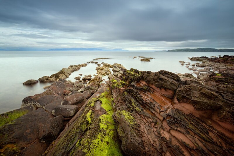
Finding the right art for plum walls is usually about contrast, not matching. Mossy Red shows why, combining rock texture, mossy greens, calm water, and warmer tones in a way that gives a richer wall colour more life rather than making it feel darker still.

Why Mossy Red works as art for plum walls

Plum walls can look elegant and cocooning, but they also need artwork that prevents the scheme from becoming too enclosed. Mossy Red helps because it introduces surface texture and natural variation. The red-brown rock notes sit comfortably with a deeper palette, while the green moss and open water stop the room from feeling visually flat. That balance works well in dining rooms, lounges, and more atmospheric bedrooms.

  • It gives darker paintwork contrast without clashing.
  • It brings natural texture that keeps a richer room feeling alive.
  • It suits spaces where warmth matters but heaviness does not.

Because First 4 Frames handles the production and framing in-house, the final piece benefits from bespoke workmanship and careful colour control. That is especially useful when artwork is being chosen for a stronger wall colour, because subtle tonal balance is what keeps the result sophisticated rather than overworked.

For more on the photographer, visit Noel Fenech. You can also browse more work by Noel Fenech Photography and view the exact framed product here.

If you are comparing options for art for plum walls, Mossy Red is a very good way to add warmth, contrast, and natural depth to a richer interior.

Posted on

Framed Photography Prints Feel More Expressive With Ship Ashore

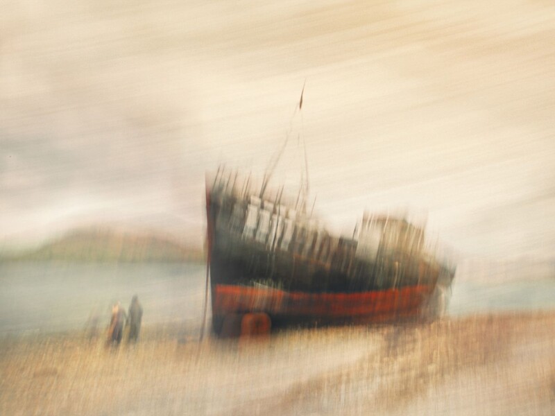
People searching for framed photography prints often want something more imaginative than a straightforward literal image. Ship Ashore answers that well, turning an abandoned vessel into a more dreamlike composition with movement, softness, and a painterly sense of atmosphere.

Why Ship Ashore gives framed photography prints more character

One reason photography works so well in interiors is its range. Ship Ashore shows that clearly. Rather than feeling purely documentary, the image carries mood and memory, which makes it especially useful in living rooms, studies, hallways, or reading corners where the artwork should invite a second look. It brings structure through the boat itself, but the handling keeps the overall effect softer and more emotional.

  • It suits rooms that need atmosphere more than sharper detail.
  • It bridges photography and painterly wall art in a very natural way.
  • It gives a room a more individual focal point than generic coastal imagery.

At First 4 Frames, the finished piece is produced and framed in-house with bespoke care. That matters with expressive photography like this, because the framing has to support the image without making it lose its softness. Hand-finished craftsmanship and colour-managed printing help the final artwork feel deliberate, polished, and ready to live with.

For more about the artist behind the image, visit Noel Fenech. You can also browse more work by Noel Fenech Photography and see the exact framed product here.

If you want framed photography prints that feel more evocative and less purely descriptive, Ship Ashore is a particularly strong example.

Posted on

Bathroom Wall Art Feels More Spa Like With Silent Morning

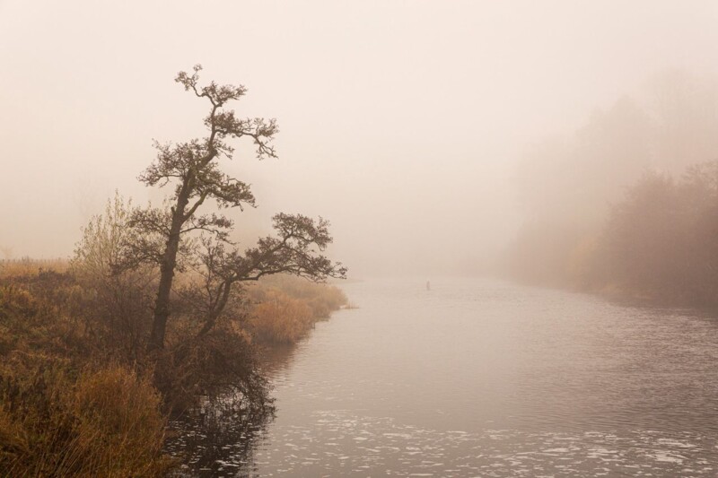
The best bathroom wall art should help the room exhale. Silent Morning does exactly that, using mist, water, and softened morning light to create a quieter focal point that feels far more restorative than novelty prints or overly themed bathroom decor.

Why Silent Morning suits bathroom wall art so well

Bathrooms often look best when the artwork supports the overall mood instead of grabbing attention too abruptly. Silent Morning keeps that balance. The low mist, filtered light, and still water create a sense of privacy and calm that works beautifully in bathrooms, en suites, and dressing spaces where people want the room to feel settled rather than merely finished.

  • It helps a harder, more functional room feel softer.
  • It works especially well with pale tiles, brushed metals, and simple cabinetry.
  • It adds atmosphere without making the room feel busy.

First 4 Frames completes the print and framing in-house, which is especially valuable for subtler landscape photography. Colour-managed production and hand-finished framing help those quieter tonal changes stay visible, so the final piece still has presence even in a clean, light-filled bathroom.

To learn more about the photographer, visit Noel Fenech. You can also browse more work by Noel Fenech Photography and view the exact framed product here.

If you are comparing bathroom wall art, Silent Morning is a refined choice for creating a calmer room with more atmosphere and less visual fuss.

Posted on

Art for Maple Furniture Feels Warmer With Out of Reach

Choosing art for maple furniture is often about keeping a lighter room from feeling too bare. Out of Reach does that beautifully, bringing golden canopy colour, branching texture, and a clear blue backdrop that gives pale timber more warmth without taking away its freshness.

Why Out of Reach works as art for maple furniture

Maple furniture has a clean, useful lightness, but that can leave a room feeling visually thin if everything else follows the same note. Out of Reach adds the missing contrast in a gentle way. The upward woodland view introduces shape and energy, while the autumn tones help bedside tables, dining pieces, or lighter storage furniture feel more grounded and complete.

  • It adds natural warmth without forcing darker colour into the room.
  • It suits bedrooms, hallways, and living areas with pale timber pieces.
  • It gives lighter furniture a more layered and collected setting.

Because First 4 Frames produces and frames every piece in-house in Falkirk, the final artwork benefits from bespoke craftsmanship, hand-finished presentation, and colour-managed printing that keeps the blue and gold tones clear once framed. That superior finish matters when a print is helping to balance a lighter scheme rather than overpower it.

For more about the photographer, visit Noel Fenech. You can also browse more work by Noel Fenech Photography and see the exact framed product here.

If you are weighing up art for maple furniture, Out of Reach is a very good choice for making pale timber feel warmer, richer, and more deliberately styled.

Posted on

Art for Ash Wood Furniture Feels Richer With Where Ghosts Wander

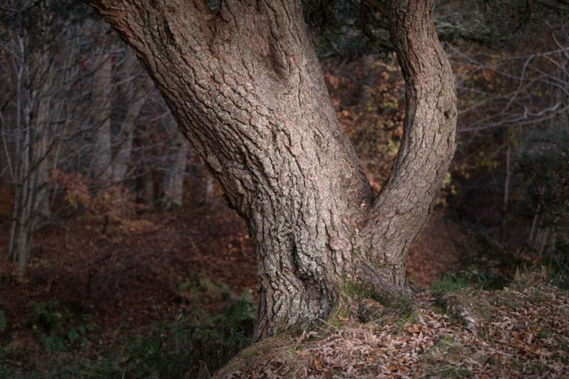
Paler timber can make a room feel fresh and airy, but it sometimes needs more texture around it to avoid looking visually dry. That is where art for ash wood furniture becomes important. Where Ghosts Wander brings exactly that missing depth, using bark detail, autumn colour, and woodland atmosphere to build warmth around lighter furniture.

Why Where Ghosts Wander works as art for ash wood furniture

Ash wood often looks best with artwork that introduces natural contrast but stays gentle enough to preserve the room’s calm. Where Ghosts Wander does that very well. The tree study gives the wall texture and weight, while the softer woodland background keeps the whole piece atmospheric rather than heavy. It suits bedrooms, hallways, studies, and living rooms where pale timber needs more depth beside it.

  • It adds texture that works naturally with timber grain.
  • It brings warmth to lighter furniture without forcing stronger colour into the room.
  • It helps a pale scheme feel layered and collected rather than sparse.

At First 4 Frames, every piece is framed and produced in-house with bespoke care. That hand-finished approach matters with more textural photography like this, because the final presentation needs to preserve subtle bark detail and tonal depth if the image is going to enrich the room properly.

For more on the artist behind the photograph, visit Noel Fenech. You can also browse more work by Noel Fenech Photography and see the exact framed product here.

If you are choosing art for ash wood furniture, Where Ghosts Wander is a very good way to give a lighter timber scheme more warmth, texture, and quiet character.

Posted on

Best Frame Colours for Black and White Photography Start Getting Clearer With Trippy

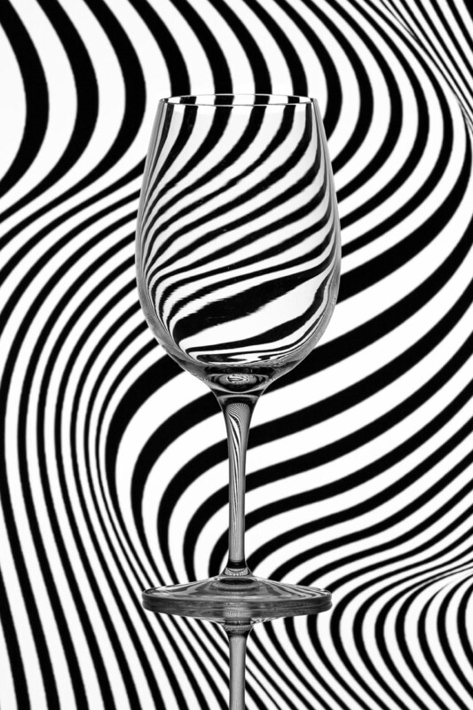
Questions about the best frame colours for black and white photography are rarely just technical. They change how the artwork behaves in the room. Trippy makes that easy to see because the image is already full of movement, contrast, and distortion, so the framing choice has a direct effect on whether it feels sharper, calmer, or more dramatic.

What Trippy shows about the best frame colours for black and white photography

With simpler black and white pictures, a frame can quietly support the image. With Trippy, the frame has a more active job. A darker frame can intensify the drama and keep the piece feeling crisp, while a lighter or softer finish can introduce more breathing space around the pattern. The right answer depends on whether the room needs energy, restraint, or a more gallery-like presentation.

  • Darker frames can make graphic black and white work feel bolder and more architectural.
  • Softer finishes can stop a high-contrast piece from overwhelming a smaller room.
  • The mount and frame need to work together so the image feels intentional rather than busy.

This is exactly where First 4 Frames stands out. Because the framing is completed in-house, customers can approach the final presentation as a design decision rather than an afterthought. Bespoke guidance, hand-finished workmanship, and colour-managed production make it easier to land on a result that feels right for the room as well as the image.

For more on the photographer, visit Noel Fenech. You can also browse more work by Noel Fenech Photography and view the exact framed product here.

If you are weighing up the best frame colours for black and white photography, Trippy is a particularly helpful product-led example because presentation makes such a visible difference to the final mood.