Imagine discovering a 1924 portrait of your great-grandmother, only to find the delicate emulsion has fused permanently to the glass. It’s a silent tragedy that strikes many heirlooms, but your family’s legacy doesn’t have to end in a storage box. You likely want to display these treasures, yet you’re held back by the fear that sunlight or “archival” labels of dubious quality might destroy the image forever. We understand that these aren’t just pictures; they’re the bridge between your history and your modern home.
This guide reveals the professional secrets to framing antique family photographs using preservation techniques that ensure they remain safe for another 100 years. At First 4 Frames, we’ve spent over 20 years perfecting the art of craftsmanship, backed by a 4.9-star Google rating from customers who trust us with their most precious memories. Whether you need bespoke framing services from our main workshop or want to pair your history with the fine art styles found at our gallery, we’re here to help. You’ll learn how to choose UV-protective glazing, avoid common mounting mistakes, and create a beautiful, ready-to-hang piece of history that fits perfectly with your current decor.
Key Takeaways
- Identify the unique vulnerabilities of heritage prints, from silver mirroring to brittle emulsions, to determine the best preservation path for your irreplaceable family history.
- Discover why professional archival standards and bespoke spacers are vital when framing antique family photographs to prevent the irreversible damage caused by direct glass contact.
- Compare the long-term safety of bespoke gallery craftsmanship against off-the-shelf frames, ensuring your originals aren’t compromised by acidic materials or standard clips.
- Learn to apply the “Bridge” design concept to your display, selecting frames that honour the photograph’s historical era while perfectly matching your contemporary 2026 interior.
- Explore how our Falkirk-based artisans use Giclée printing to create spectacular display copies, a service backed by our “Excellent” Google and Trustpilot ratings for total peace of mind.
Understanding the Vulnerability of Antique Family Photographs
An antique photograph is a physical bridge to your family’s past. Unlike a digital file that stays perfect on a hard drive, a physical print from 1920 is a complex chemical object. It’s composed of paper, animal glues, and silver halides that are constantly reacting to the world around them. Understanding the Vulnerability of Antique Family Photographs is the first step toward ensuring they survive for another century. These items are irreplaceable artefacts. While you can always reprint a modern digital snap, an original albumen print or daguerreotype carries the actual light captured over a hundred years ago.
To better understand how to protect your precious memories, watch this helpful video on preservation best practices:

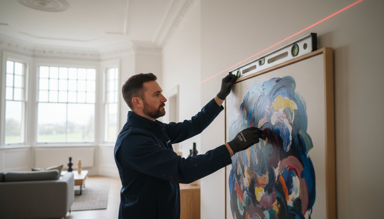
Framing antique family photographs requires a specialist touch that goes beyond standard retail framing. At First 4 Frames, we bring over 20 years of experience to every project. We’ve earned our high Trustpilot and Google ratings by treating every heirloom as a unique piece of history. While you might browse contemporary artists at our online gallery for home inspiration, protecting an original 19th-century portrait involves managing three main threats: UV light, moisture, and acid contact. Professional framing antique family photographs ensures these delicate items remain a vibrant part of your home décor without risking their structural integrity.
The Science of Fading: Why Old Photos Discolour
UV radiation is the most aggressive enemy of old emulsions. It breaks the molecular bonds in photographic chemicals, leading to irreversible loss of detail. You’ll often see “silver mirroring” on early 20th-century prints. This is a metallic sheen caused by silver ions migrating to the surface and oxidising. High humidity levels over 60% can also trigger foxing, which appears as small brown spots on the paper, while heat accelerates the chemical breakdown of the image itself.
The “Acid Clock”: How Standard Backing Damages Art
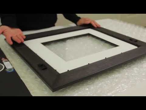
Most old frames use cheap cardboard backings. These materials contain lignin, which releases sulphuric acid as it decays. This “acid clock” causes the paper to become yellow and brittle from the edges inward. We use PH-neutral, museum-grade materials at First 4 Frames to stop this process. Using the right bespoke mount creates a vital air gap, preventing the delicate emulsion from sticking to the glass, which is a common cause of damage in humid UK homes.
The Essentials of Preservation Framing: Archival Standards
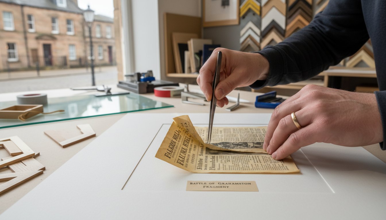
Preserving a century-old heirloom requires more than a standard off-the-shelf frame. At First 4 Frames, we bring 21 years of expertise to every project, treating your family heirlooms with the same reverence we show for the fine art in our online gallery. When framing antique family photographs, the frame acts as a protective envelope, sealing the history away from humidity and atmospheric pollutants. Professional galleries follow strict “Golden Rules” to ensure longevity, with the most critical being reversibility. Anything done to the photo must be undoable without damage, which is why we use hinging techniques with Japanese paper and starch paste rather than permanent glues or tapes.
- The Spacer Rule: Never allow the photograph to touch the glass.
- Acid-Free Environment: Every layer must be pH neutral to prevent chemical decay.
- UV Shielding: Light damage is cumulative and irreversible.
- Reversible Mounting: No adhesives should touch the original print directly.
Acid-Free Mounts and PH Neutral Barriers
Standard mountboards often contain lignin, which turns acidic over time and causes “mount burn,” visible as dark yellow staining. We always recommend museum-grade cotton rag board for antique pieces. These boards are naturally pH neutral and won’t degrade over the next 100 years. A mount isn’t just a decorative border; it creates a vital micro-climate. It provides a physical spacer that prevents the photograph’s emulsion from sticking to the glazing. If moisture enters the frame, an unmounted photo can bond to the glass, leading to permanent loss. While you can use standard photo picture sizes as a baseline for your design, bespoke mounts allow us to create custom proportions that highlight the unique character of aged prints. Following conservation framing best practices ensures your family history remains intact for future generations.
UV-Protective Glass and Glazing Options
Our team at First 4 Frames has earned a 4.9-star rating on Google by focusing on these technical details. Whether you’re looking for professional framing for an original or using our photo printing and framing service to display a copy, we apply the same artisan craftsmanship to every piece. You’ll find this same commitment to quality in the curated works of artists featured in our fine art gallery.
Bespoke Framing vs. Off-the-Shelf Solutions
Choosing between a ready-made frame and a professional service is the difference between temporary storage and long-term preservation. Off-the-shelf frames found in high-street shops usually rely on acidic backing boards and standard glass. Over time, these materials leach chemicals that turn old paper yellow and brittle. In contrast, bespoke gallery frames use conservation-grade, acid-free mounts and UV-filtering glass to create a safe environment for your history. At First 4 Frames, we’ve spent over 20 years perfecting this craft, ensuring that every piece of timber and every sheet of glass meets our premium standards.
A professional eye is vital when selecting the right picture frames. Our team views a frame as a bridge between your room’s decor and the artwork itself. We don’t just provide a border; we ensure the aesthetic matches the era of your photograph while providing a “one-stop-shop” convenience. With excellent 5-star ratings on Google and Trustpilot, we’ve refined the process into a simple journey that takes the stress out of protecting your most precious items.
When to Choose Custom Picture Framing
You should opt for professional care whenever you’re framing antique family photographs that are truly irreplaceable. If a photo is the only surviving copy of an ancestor, it’s too valuable for a DIY attempt. Antique photos often come in non-standard dimensions, such as Victorian “Cabinet Cards” or long panoramic school photos, which won’t fit into standard 6×4 or 8×10 frames. For these unique items, you can visit First4Frames Bespoke Framing for an expert consultation. Our artisans ensure the frame is built to the exact millimetre, preventing the photo from shifting or buckling over the decades.
The Risks of DIY Framing for Antiques
DIY methods often involve “dry mounting” or heat-sealing, which is a total disaster for original prints. These processes are permanent. You can’t undo them without destroying the image. Using standard sticky tape or blue tack is equally dangerous. The adhesives in these products migrate into the paper fibres, leaving oily, dark stains that are impossible to remove. Cheap frames also lack a proper seal. This allows dust and tiny insects like silverfish to crawl inside, where they feed on the starch in old photo paper. Framing antique family photographs professionally ensures a microscopic seal that keeps these environmental threats away from your memories.


Designing Your Heritage Display: Aesthetics and Storytelling
The challenge of framing antique family photographs lies in balancing the fragility of the past with the aesthetic demands of a modern home. You aren’t just protecting a piece of paper; you’re creating a window into your family’s history. At First 4 Frames, we’ve spent over 20 years perfecting this balance. We view the frame as a bridge. It serves as the essential connection between the unique textures of your heritage artwork and the specific colour palette of your room.
Choosing Frames that Complement History
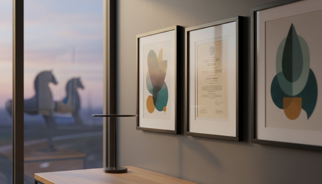
Traditional dark wood frames often suit Victorian portraits, yet they can feel heavy in a bright, 2026-style interior. Distressed finishes work beautifully to mirror the weathered character of sepia tones without feeling dated. We apply a similar logic when framing Jolomo prints, where the frame must support the vibrant Scottish landscapes without overpowering the art itself. If your photograph is from the mid-century era, a clean-lined silver or black frame provides a sophisticated, modern edge that respects the original artist’s style.
Small snapshots often get lost on large walls. We use multiple mounts to add physical depth, which gives a tiny 2×3 inch photo the sense of importance it deserves. For items that tell a larger story, such as a grandfather’s war medal or a handwritten letter, we recommend a memorabilia-style deep box frame. This turns flat images into a tactile, three-dimensional piece of history that commands attention.
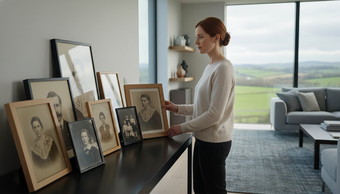
Creating a Family History Gallery Wall
Mixing black and white, sepia, and early colour photography can feel chaotic if not handled correctly. The secret to a professional look is consistency. Use the same mount colour across the entire collection to provide a visual anchor for the eye. Many of our customers combine their personal archives with professional pieces from our fine art gallery to create a curated narrative. Plan your layout on the floor before making any holes in the wall. Place the largest or oldest image in the centre and build outwards to tell your story chronologically.
Our team brings a passionate, artisan approach to every project, backed by excellent Google and Trustpilot ratings. Whether you need a bespoke frame for a fragile original at www.first4frames.co.uk or want to use our “print and frame” service for digital copies, we ensure your memories are handled with professional care. We source only the best materials to ensure your display remains a focal point for decades.
Preserving Your Legacy with First4Frames Gallery
Your family history shouldn’t stay hidden in a dusty box or a dark drawer. At our Falkirk workshop, we’ve spent over 20 years perfecting the art of preservation. We treat every image with the respect it deserves, combining traditional artisan skills with modern technology. Whether you visit our Scottish gallery in person or work with us online, you’re accessing two decades of professional expertise. Our top-rated reviews on Trustpilot and Google reflect a deep commitment to excellence, showing why families across the UK trust us with their most precious memories. We aren’t just a framing shop; we’re a team of passionate creators who believe a frame acts as the bridge between your room décor and your most cherished moments.
We’ve built a reputation as a one-stop-shop for fine art and bespoke displays. By integrating our three specialized platforms, we ensure every customer finds exactly what they need. While our main hub handles professional framing, our gallery site showcases incredible work from local and national artists, proving that we understand the aesthetic weight of a truly great piece of art. This expertise is exactly what we bring to the task of framing antique family photographs, ensuring your history is presented with the same prestige as a gallery masterpiece.
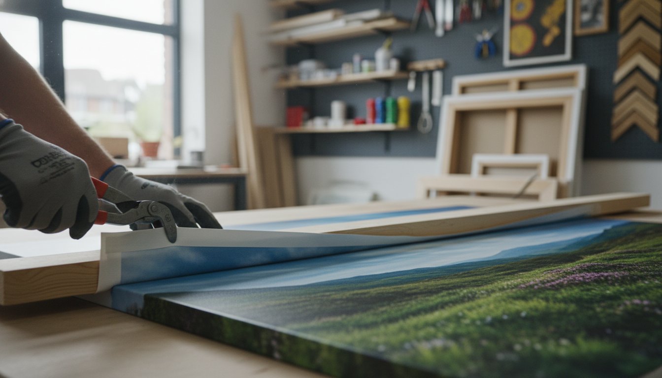
Our “Print and Frame” Service for Fragile Items
The First4Frames Quality Guarantee
We source only premium materials to ensure your legacy lasts for generations. From acid-free mounts that prevent yellowing to high-quality wood mouldings, our craftsmanship does the heavy lifting in protecting your art. We invite you to contact us for a personal consultation if you have specific requirements or a particularly unique project. Our team provides a hassle-free, bespoke, and speedy service for customers throughout the UK. Whether you’re looking to frame a single heirloom or create a gallery wall of ancestors, we’re here to help you embark on a journey of artistic discovery. Let us help you turn those old snapshots into spectacular focal points that pull you into the picture every time you walk past.
Secure Your Family’s Legacy for Future Generations
Your family’s history shouldn’t stay hidden in a dark drawer where time and humidity cause irreversible damage. Choosing archival-grade mounts and UV-filtering glass ensures your ancestors’ stories remain vivid for decades. Professional framing antique family photographs acts as a vital bridge between your room’s style and your personal heritage. It’s about more than aesthetics; it’s about survival.
With over 20 years of bespoke framing expertise in Scotland, we understand the delicate nature of these heirlooms. We bring the same level of craftsmanship to your personal photos that we provide for the spectacular Giclée prints and fine art found in our online gallery. Our excellent ratings on Google and Trustpilot prove our dedication to quality. While our main site offers dedicated framing services and our print shop handles professional reproductions, the First4Frames Gallery showcases the high standards we maintain for every client. We’re a trusted one-stop-shop, treating your heritage with the same passion we show for professional art. Take the first step toward protecting your past today.
Preserve your family history with a Bespoke Frame from First4Frames
Frequently Asked Questions
Is it safe to frame an original 100-year-old photograph?
Framing antique family photographs is safe if you use conservation-grade materials. Our team brings 20 years of expertise to ensure your 100-year-old heirlooms remain protected. You must use acid-free backing boards and mounts to prevent chemical burn that turns paper yellow. Check our 5-star Google reviews to see how we’ve handled thousands of delicate historical items for UK families since we started.
How do I stop my old photos from sticking to the glass?
You stop photos from sticking to glass by installing a mount to create an essential air gap. Without this 1.4mm space, humidity causes the emulsion to fuse with the glass, often resulting in permanent damage. If you’re worried about an original, our print and frame service at prints.first4frames.co.uk can create a perfect Giclée replica. This keeps your original safe in a dark archive while the copy hangs beautifully on your wall.
What is the best glass to use for framing antique photos?
The best glass for framing antique family photographs is 99% UV-protective conservation glass. Standard 2mm float glass allows harmful rays to penetrate, which can cause 50% of fading within just a few years. We recommend Artglass or similar premium options available through our bespoke service at www.first4frames.co.uk. This protects the delicate silver gelatine or albumen prints from the light levels found in typical British homes.
Can I frame a photo that is already torn or damaged?
You can frame damaged photos, but we suggest creating a digital restoration first. Our experts at prints.first4frames.co.uk specialise in Giclée printing, which produces an identical copy of your torn original. You can then frame the restored version using our professional bespoke service. This approach is similar to how we display works by artists like A.R. Quinton at gallery.first4frames.co.uk, ensuring the visual story remains intact without further degrading the fragile original.
Should I use a mount (mat) when framing old family pictures?
You should always use a mount when framing old family pictures to provide both aesthetic depth and physical protection. A mount acts as a bridge between your room décor and the artwork, a philosophy we apply to every piece in our gallery. Beyond looking spectacular, it prevents the photo from touching the glazing. You can browse our various mounting options and frame styles on our website to find the perfect match for your interior.
How do I clean the glass on a frame containing an antique photo?
Clean the glass by spraying a small amount of ammonia-free cleaner onto a soft microfibre cloth rather than the frame itself. This prevents liquid from seeping under the rebate and soaking into the 100-year-old paper. Our customers often mention our attention to detail in their Trustpilot reviews, and we want your home maintenance to be just as professional. Always support the frame on a flat surface during cleaning to avoid putting pressure on the joints.
Is it better to frame the original or a copy of an old family photo?
It’s usually better to frame a high-quality Giclée copy and keep the original in acid-free storage. This protects the primary heirloom from light damage and accidental knocks. Our print and frame service at prints.first4frames.co.uk uses premium inks that won’t fade over time. This ensures your family history stays vibrant for the next 75 years, while the original remains a master copy safely tucked away.
Where is the best place in my house to hang old framed photographs?
The best place to hang old photographs is on an internal wall away from direct sunlight and radiators. Avoid hanging them in kitchens or bathrooms where humidity levels fluctuate by more than 30% daily. For inspiration on how to arrange your collection, look at the curated displays at gallery.first4frames.co.uk. Our 20 years of experience shows that stable temperatures are the secret to keeping your framed memories in perfect condition.