beach wall art should answer a practical need in the room, not simply fill an empty wall. Idyllic Seilebost Beach on the Isle of Harris is a useful example because the sweeping shore, turquoise water and distant hills offer a genuine landscape with enough visual space to work beyond a conventionally coastal scheme.
Choose beach wall art for horizon and space
Focus first on what the composition does. The long meeting point between beach and water carries the eye across the photograph, while the hills stop the scene becoming empty. That structure can help a compact living room or bedroom feel more open without pretending that the picture is a window.
Room element
Useful response
Natural timber
Connect it with the sand rather than adding driftwood ornaments.
Soft linen
Use texture to support the landscape’s quiet character.
Turquoise water
Repeat one small blue-green note, not the entire palette.
Open horizon
Leave clear wall around the frame so the breadth remains visible.
Avoid shells, anchors and wording around the picture. They reduce a specific Harris landscape to a generic theme. One confident framed photograph can carry place and coastal character without extra explanation.
Frame beach wall art as landscape, not decoration
A carefully judged frame can separate pale sand and bright water from the wall while preserving the photograph’s breadth. First 4 Frames handles colour-managed printing and bespoke framing in-house, keeping the subtle coastal colours clear and the finish controlled.
Beach wall art feels more lasting when it is rooted in a real place. Seilebost Beach brings light and distance into the room without requiring a seaside theme.
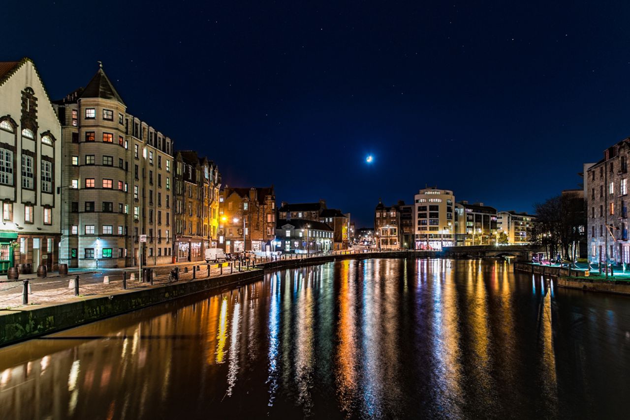
blue wall art should answer a practical need in the room, not simply fill an empty wall. Night shot by Water of Leith is a useful example because its moonlit blue setting is balanced by glowing windows and reflections, giving the scene depth without leaving it visually cold.
Balance blue wall art with warmer points of light
Keep the blue varied
Night colour is rarely one flat navy. Water, sky and building shadows should remain separate, giving the eye several quiet layers to explore.
Echo the warm light once
A warm lamp or a small brass detail can answer the riverside glow. Avoid repeating blue across every cushion, curtain and accessory.
This photograph suits a sitting room, dining area or hallway used in the evening. Position it away from a lamp reflected directly in the glazing. Soft light from the side will reveal the buildings and water while protecting the calm night atmosphere.
Successful blue wall art needs contrast and tonal depth, not a room filled with matching blue objects.
Preserve the difference between water, sky and shadow
Colour-managed Giclée production helps keep neighbouring dark tones readable instead of allowing them to merge. A restrained bespoke frame provides a clean boundary, while the hand-finished presentation gives the illuminated details suitable presence after dark.
Blue wall art can make an evening room feel settled rather than chilly. Night by the Water of Leith achieves that balance through moonlight, architecture and warm reflections.
preview artwork before buying should answer a practical need in the room, not simply fill an empty wall. Old Man of Storr is a useful example because the bright sunrise, dark rock and reflected light create a strong focal point whose impact is worth testing at the intended viewing distance.
How to preview artwork before buying for a stronger result
Begin with the usable wall, then mark the likely outside edge of the finished frame with low-tack tape or a paper template. Stand at the doorway, the main seat and any route through the room. The Old Man of Storr has a powerful central landform, so it should feel deliberate from each important sightline rather than squeezed between furniture.
Photograph the empty wall straight on in even daylight.
Mark a realistic framed outline rather than the image alone.
Check that the horizon does not clash with shelves or a television.
Compare the dark rock with the visual weight of furniture below.
Repeat the check after lamps are switched on.
A digital mock-up helps with broad proportion, while a physical template confirms height and clearance. Use both as decision aids. Screen colour is not a reliable substitute for seeing the finished colour-managed print.
Let the preview guide the frame, not replace it
The final frame adds real width, depth and material character that a flat screen cannot reproduce. First 4 Frames completes colour-managed Giclée production and bespoke framing in-house in Falkirk, so the photograph becomes one resolved, hand-finished object.
When you preview artwork before buying, concentrate on proportion, position and visual weight. Old Man of Storr can then command the wall without overwhelming the room around it.
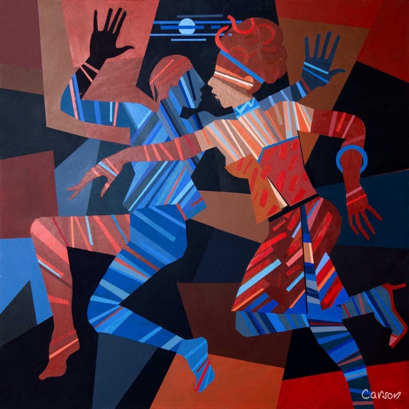
A meaningful gift for a contemporary dancer should recognise more than costume or performance night. It can celebrate discipline, physical conversation, creative risk, and the joy of moving with another person. Dance Till Dawn by Fred Carson captures those ideas through two interlocking figures, strong geometric shapes, and lines that behave almost like beats. It feels connected to dance without resorting to a slogan or a literal studio scene.
Why this works as a gift for a contemporary dancer
Dancers spend a great deal of time with objects chosen for function: shoes, warm layers, tape, bottles, and bags. Those things matter, but they rarely mark the imaginative side of the work. Framed art offers a different kind of recognition. It can live at home, remain useful after a production ends, and reflect the recipient’s creative identity without pretending to choose specialist equipment for them.
In Dance Till Dawn, the figures do not hold a fixed classical pose. Bent knees, open hands, crossed arms, and opposing diagonals imply motion between moments. Blue and red stripes travel across bodies and clothing, while the dark ground makes each gesture clearer. The pair feels coordinated but not symmetrical, which gives the composition the tension and responsiveness associated with contemporary performance.
Match the occasion to the message
The title makes the print celebratory, yet the image is not limited to one milestone. It can suit a dancer completing professional training, joining a company, returning after injury, making a first independent work, or finishing a demanding run. It may also be a thoughtful thank-you for someone who has created a duet or supported a partner through rehearsals.
For graduation: focus the card on persistence, growth, and the start of a creative career.
For a première: mention the courage required to bring new movement in front of an audience.
For a partnership: connect the two figures to trust, listening, and shared timing.
For a personal milestone: let the artwork carry the dance reference while the written message stays specific to the person.
A short personal note will do more than extra themed wrapping. Name the performance, teacher, company, or moment that prompted the gift. That detail makes the choice feel observed rather than selected simply because it contains dancers.
Look for movement, not a perfect likeness
Contemporary dance covers many practices and body languages. A picture does not need to reproduce the recipient’s exact technique or costume to feel relevant. Often, rhythm, weight, counterbalance, and spatial relationship are the stronger connection. The stylised figures here leave room for interpretation, so the artwork can suggest rehearsal, performance, social energy, or an improvised exchange.
The square shape reinforces that flexibility. It avoids the formal stage-like width of a theatre scene and keeps attention on the figures’ interaction. The moon and horizontal blue marks offer a small pause above them, while the angular background pushes the action forward.
Plan a home for the artwork before gifting
The available 265 by 265 millimetre print format can work in a bedroom, home practice corner, hallway, or living space without requiring a vast wall. Remember that mounting and framing will increase the finished dimensions. If possible, ask indirectly about the recipient’s wall colours and whether they prefer dark, light, or natural timber frames.
Possible setting
Why the print can work
Home practice area
Strong movement adds energy without giving technical instruction
Quiet bedroom wall
The compact square adds identity without dominating the room
Hall or landing
Bold colour reads clearly from a passing viewpoint
Living-room gallery group
The geometric edges provide structure among looser pieces
Choose presentation that respects the strong colour
A slim black frame can sharpen the angular background and stage-like darkness. A deep blue moulding may connect to the cooler figure without copying every stripe. A warm wood can soften the graphic quality for a more relaxed home. The final choice should respond to the print in person and to the recipient’s interior, not to a generic idea of dance decor.
First 4 Frames uses colour-managed Giclée production and completes bespoke framing in-house in Falkirk. That care matters here because the red, rust, coral, and several blues need to remain distinct. A hand-finished frame also turns the gift into something ready to display rather than another task for the recipient after a busy performance period.
Contemporary energy from an Edinburgh artist
Fred Carson is an Edinburgh-based artist whose work combines bold colour, stylised figures, and geometric form. Explore the wider Fred Carson collection at First 4 Frames. For further connection to dance in Scotland, Scottish Ballet shares performances, films, classes, and insight into the art form.
The best gift for a contemporary dancer feels personal without becoming predictable. View the framed Dance Till Dawn print for an image that honours movement, partnership, and creative confidence through colour and lasting craftsmanship.
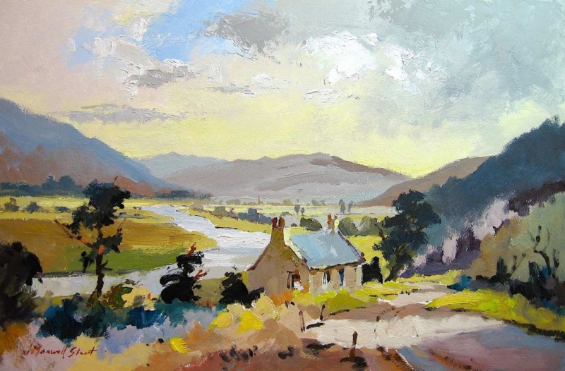
Scottish landscape wall art above a dining bench can make an informal eating area feel broader, calmer, and more connected to its setting. Walkerburn Retreat by Joseph Maxwell Stuart is especially well suited to the job. Its long valley, pale river, cottage roof, and open sky create a clear outward view. The landscape adds depth behind the seating without making the wall feel busy or heavily decorated.
Why Scottish landscape wall art above a dining bench works
A dining bench creates a strong horizontal line. Artwork that ignores that line can look detached, while a cluster of small frames may compete with people, cushions, tableware, and pendant lights. A single landscape gives the seating a visual destination. It also establishes a horizon that helps the whole arrangement feel settled.
Walkerburn Retreat has more than a distant view. The foreground path leads past the cottage and towards the River Tweed. Dark trees hold the two sides, while the brighter central valley keeps the composition open. Loose, expressive marks stop the scene from feeling photographic or overly formal. That balance suits a bench used every day rather than a dining room reserved for occasions.
Size the artwork to the bench, not the whole wall
Begin with the width of the bench or banquette. The finished frame should feel clearly related to the seating but should not extend beyond it. Mark the likely frame dimensions with low-tack tape or a paper template. Then sit down, stand at the table, and enter from the adjoining room. This reveals whether the picture feels properly centred from the viewpoints that matter.
Check seated headroom. Leave a comfortable gap above the tallest regular user, including room for relaxed movement.
Allow for cushions. Deep back cushions can change the usable wall and push people closer to the frame.
Read the full composition. The cottage, river, and pale sky should remain visible above the table setting.
Open nearby doors. Confirm that a door, blind, or cupboard does not cut across the finished frame.
The available print sizes include a broader 550 by 365 millimetre option and a compact 350 by 230 millimetre option. Finished dimensions will increase once the mount and moulding are added, so plan around the complete framed piece rather than the image size alone.
Use the valley colours without creating a country theme
The painting combines yellow-green fields, soft blue, chalky cloud, warm stone, and near-black trees. Those colours give several decorating routes, but they do not all need to be repeated. One warm timber table may connect to the cottage. A muted blue cushion can pick up the river and roof. Plain linen or wool adds texture without copying the landscape literally.
Dining-area feature
Helpful response
Painted bench
Choose one quieter blue, green, or stone tone from the image
Natural timber table
Let the wood echo the warm path and cottage without exact matching
Patterned cushions
Keep the frame and surrounding wall restrained
Open-plan kitchen
Repeat one artwork colour in a small ceramic or textile only
This controlled approach keeps the room contemporary. The recognisable Scottish subject supplies place and character, while the furniture can remain simple. Avoid adding several tartan, stag, or thistle motifs around it. They would turn a nuanced landscape into part of a decorating theme.
Protect the picture from dining-area conditions
A bench near a kitchen may receive steam, grease, and rapid temperature changes. Keep framed work away from a hob, kettle station, radiator, or wall that regularly becomes damp. If the bench sits below a window, watch direct sun and check whether the blind hardware leaves enough clearance.
Pendant lighting can help the picture after dusk, but the bulb should not create a bright reflection in the glazing. View the proposed position from the opposite chair at the hour when the table is normally used. A small shift in hanging height or light angle often solves glare before any fixing is made.
Frame the open view with enough definition
A slim dark moulding can relate to the trees and give the pale sky a crisp edge. A warm timber frame may sit more softly with an oak table or built-in bench. A measured mount can add breathing space, especially when the surrounding wall carries shelves or strong paint colour.
First 4 Frames produces colour-managed Giclée prints and completes bespoke framing by hand at its Falkirk workshop. This in-house approach helps the subtle sky, bright valley, and darker foreground retain their balance. It also allows the moulding, mount, glazing, and final dimensions to be considered for the actual dining area.
A real Tweed Valley setting behind the view
Joseph Maxwell Stuart studied drawing at the Ruskin School and fine art at Edinburgh College of Art. His direct, energetic landscape painting gives this view atmosphere without losing its structure. Browse the wider Joseph Maxwell Stuart collection at First 4 Frames. For local context, the Walkerburn community website introduces the village, its history, and its Tweed Valley surroundings.
Well-placed Scottish landscape wall art above a dining bench can turn an everyday bench into a properly resolved part of the room. View the framed Walkerburn Retreat print for a broad, lively landscape that brings depth, Scottish character, and hand-finished quality to informal dining.
The right botanical print can make a room feel more like yours, rather than simply following a trend. Choosing among modern botanical prints for sale uk homes can feel tricky when style, scale and colour all need to work together, and an online image doesn’t always show how a piece will look on your wall.
Start with the room: consider its colours, the available wall space and whether you’re drawn to delicate leaves, bold forms or atmospheric florals. This guide will help you choose botanical wall art that feels personal, compare print and frame options, and preview the artwork at home with a wall art visualiser. First4Frames Gallery offers a large online selection of artwork and frames, bespoke framing, and Giclée prints that can be ordered ready to hang. Each frame is individually crafted for the order using high-quality materials, with 2mm float glass for a clear view of the artwork.
Key Takeaways
Explore modern botanical prints for sale uk and compare contemporary interpretations with traditional botanical illustration to find a style that suits your home.
Use your room’s palette and available wall space to narrow down artwork and choose a print size that feels balanced.
Giclée printing reproduces artwork with attention to colour and detail, while a frame crafted for your order completes its presentation.
Preview your selection with the wall art visualiser, then use the online process to create framed art ready to display.
Modern botanical prints for sale in the UK: choose a style that suits your space
Botanical art brings natural forms, colour and a sense of life into everyday spaces. Modern prints range from carefully observed leaves to simplified shapes and expressive compositions. Traditional botanical illustration often records plants in precise detail, while contemporary work may interpret them more freely. Both approaches have their own appeal: choose according to the room and the atmosphere you want to create. For background, explore the history and purpose of Botanical illustration.
When looking at modern botanical prints for sale uk, begin with the room rather than a passing trend. A delicate plant study can bring quiet detail to a bedroom, while graphic foliage can turn a plain living-room wall into a focal point. Think about how much visual activity the room already has. A detailed print may stand out in a simple setting, while a restrained design can balance patterned furnishings.
For creative inspiration, watch this watercolour and linework demonstration.
Which botanical print style works in your room?
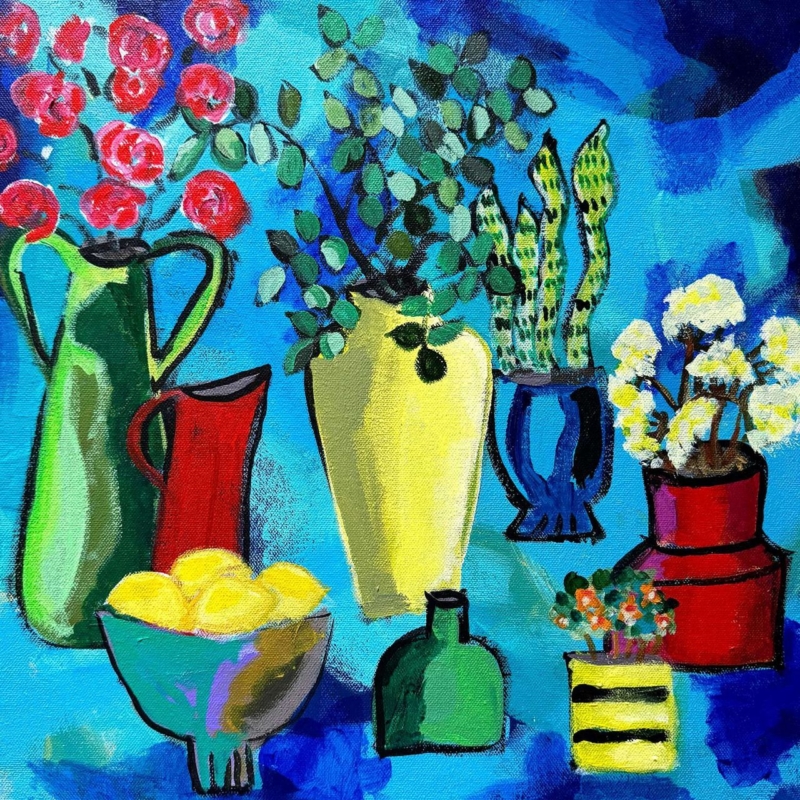
Delicate plant studies and soft greens work well with an existing restful palette. Bold foliage or saturated colours make a more deliberate focal point, especially against simpler décor. Contemporary compositions may use unusual cropping or open space to keep the image feeling light. Botanical prints can also complement modern framed wall art, including works by best-selling artists and famous artists, alongside Coastal wall art or Landscape wall art.
How can you judge scale and colour before buying?
Measure the available wall width and consider the distance from which you’ll usually view the print. Compare its proportions with nearby furniture: a small piece above a broad sofa may feel lost, while a large image can overwhelm a narrow wall. Notice whether the artwork’s colours echo or contrast with cushions, paint and other nearby pieces. Use the wall art visualiser to visualise art on your wall and see artwork before you buy.
For a cohesive display, match the botanical subject to the room, the palette to its surroundings and the print size to the wall.
What makes a quality modern botanical print and frame?
A botanical image’s fine lines, layered greens and subtle changes in tone deserve a print that reproduces the artwork faithfully. Giclée is a fine-art printing method that captures the original image with careful attention to colour and detail. It offers a considered way to enjoy botanical work alongside other gallery categories, including Fine art, Contemporary art prints and Photography prints.
When comparing modern botanical prints for sale uk, look beyond the image alone. With online picture framing, you can consider how a frame will sit with the print. A slim profile can keep a small, delicate study feeling light, while a bolder frame may give a larger composition a stronger presence. Colour matters too: a frame that picks up a tone in the leaves or provides a quiet contrast can help the print feel at home in its setting.
How does bespoke framing change the finished print?
Each frame is individually crafted for its order using high-quality materials, rather than relying on a cheap, standard frame that may not fit the artwork properly. This bespoke approach lets the frame complement the print’s scale, palette and presentation. For an overview of available framed artwork, explore the online art gallery and its custom framed art prints.
Framed artwork uses 2mm float glass, selected for its clarity. Compared with the perspex used by many competitors, float glass offers a clearer view of the image, so fine details and colours are easy to appreciate. The glazing is an important part of the finished presentation, not just a final detail.
The print carries the image, the frame shapes its presentation, and the glazing provides a clear view. Together, these choices turn a botanical print into a finished piece of framed art, thoughtfully suited to its subject and setting.
How to choose modern botanical wall art for your home
A thoughtful choice starts with the room, not the frame. Decide where the artwork will hang, then note the wall colour, textiles and nearby furniture. A print that picks up a quiet green in your cushions can bring the room together; a contrasting leaf or flower colour can add a purposeful accent.
How do you match botanical art to colour and interior style?
Compare the artwork’s dominant colours with the tones already around it. Soft botanical hues can sit easily in calm, traditional rooms, while graphic foliage can bring energy to a modern interior. In a mixed space, use one shared colour to connect different styles. Botanical subjects can also sit alongside Scottish landscape art or Coastal wall art, creating a varied display without making every piece match.
How should you plan the frame and wall placement?
Measure the available display area and consider how the artwork will relate to a sofa, sideboard or other nearby furniture. Check the space from your usual viewing position, not just up close. Then choose your frame online: a frame that echoes a furnishing can create harmony, while a gentle contrast can help the print stand out. Use the option to design your framed artwork and consider the complete presentation. If you’re comparing modern botanical prints for sale uk, a wall art visualiser can help you preview the artwork in your room and visualise art on your wall before deciding.
Keep the process simple: choose the room, compare colours, measure the wall, then select the artwork and frame. Explore framed art in the gallery to find a piece that suits your space.
Buy framed modern botanical prints online with confidence
Buying framed art online can feel uncertain if you can’t picture the finished piece in your room. A straightforward process helps: browse the artwork, use the wall art visualiser to preview your choice, select a frame and complete your framed-art design. Seeing the print and frame together makes it easier to judge the whole composition, rather than choosing a print and hoping the frame suits it later.
What should you expect from online picture framing?
With a wide online selection of artwork and frames, you can choose your frame online and design your framed artwork around the print’s subject, colour and scale. Bespoke framed wall art comes from these choices working together. Each frame is individually crafted for its order using high-quality materials, giving the artwork a considered fit and finish instead of a cheap, standard frame that may not suit it. Custom framing options let the presentation be tailored to the piece.
An art print framing service brings the print and frame together as one considered order. Finished frames are fully packaged to help prevent damage and shipped via professional couriers, so your artwork is prepared for its journey to your home.
Can you frame your own digital botanical photograph?
Yes. A print-and-frame service for digital photographs offers a straightforward route from your own image to finished wall art. The photograph is printed to a high quality to match its bespoke framing. Explore online photo printing and framing to turn a botanical image of your own into a framed piece.
Whether you’re choosing a gallery print or framing a personal photograph, the process brings artwork, presentation and practical delivery together. Browse modern botanical and framed wall art to find a piece that feels right for your home.
Bring botanical art home with confidence
The right botanical print is more than a pleasing image. Consider how its subject, colours and scale will sit in your room, then use the wall art visualiser to preview the finished look before choosing your frame. As you explore modern botanical prints for sale uk, remember that thoughtful framing is part of the artwork’s overall character.
Each frame is individually crafted for its order using high-quality materials. The 2mm float glass provides a clear view compared with the perspex used by many competitors, while finished frames are fully packaged to help prevent damage and shipped via professional couriers. Together, these details carry your choice from screen to wall with care.
How do I choose a modern botanical print for my living room?
Start with the room’s colour palette and the wall space available. Compare the print’s dominant tones with your walls, textiles and nearby furniture, then consider how its size will look above a sofa or sideboard. Delicate plant studies can add quiet detail, while bold foliage can create a focal point. A wall art visualiser can help you preview the effect before choosing a frame.
Are botanical prints still in style in 2026?
Botanical prints remain a versatile choice because natural forms can suit many interior styles. Choose soft colours for a calmer feel, or expressive foliage to bring colour and energy to a wall. The key is finding a print that feels right in your room rather than following a trend. Modern botanical prints for sale uk range from delicate studies to contemporary, graphic interpretations.
What is the difference between a Giclée print and a standard art print?
Giclée is a fine-art printing method used to reproduce artwork with attention to its original detail and colour. “Standard art print” is a broader term and doesn’t describe one specific printing method, so production and finish can vary. First4Frames Gallery offers Giclée fine art prints from a range of artists, primarily from Scotland, which can be paired with a selected frame.
Can I choose a frame online for a botanical print?
Yes, you can browse artwork and frames online, then choose a frame to suit your print and room. A wall art visualiser lets you preview the artwork in your space, helping you consider the overall presentation before completing your framed design. Each frame is individually crafted for its order using high-quality materials, bringing a considered fit and finish to the artwork.
How are framed art prints packaged and delivered in the UK?
Finished frames are fully packaged to help prevent damage during their journey and shipped via professional couriers. Framed artwork uses 2mm float glass for clarity, rather than the perspex used by many competitors. These practical details support a carefully finished piece from framing through delivery.
archival ink prints becomes more useful when the artwork answers a real feature of the room. Over the Meadow offers a clear example because a nature-led image intended for daily enjoyment still benefits from informed choices about printing, paper, framing and placement.
What archival ink prints need beyond the word archival
Longevity is a chain rather than one specification. Ink and paper matter, but so do colour control, handling, mounting, glazing and the wall where the finished piece hangs. Ask how the image is produced and framed instead of relying on a single reassuring label.
Four practical questions
Is the file printed through a colour-managed workflow?
Is the paper suitable for fine-art reproduction?
Will the mount and frame support the work without crowding it?
Can the finished piece avoid direct sun, damp and abrupt temperature changes?
Placement does not need to become anxious. Choose a stable interior wall, keep the frame away from persistent moisture and use curtains or blinds when direct sun is strongest. Normal, thoughtful care lets the artwork remain part of everyday life.
Join print quality to careful presentation
First 4 Frames combines certified colour-managed Giclée production with bespoke framing completed in-house at its Falkirk workshop. That joined-up process helps the print, mount and frame function as one hand-finished object rather than unrelated components.
Archival ink prints are best understood through process and care, not a promise in isolation. Over the Meadow can be enjoyed as everyday artwork while informed production, framing and placement support its presentation over time.
abstract landscape art becomes more useful when the artwork answers a real feature of the room. Upside Down II offers a clear example because its 265 mm, 500 mm and 800 mm square print choices allow the same composition to move from an intimate accent to a substantial focal point.
Judge abstract landscape art by distance as well as dimensions
Print size
Likely role
Planning priority
265 × 265 mm
Close-view accent
Keep nearby objects sparse.
500 × 500 mm
Independent focal point
Align with a cabinet or chair grouping.
800 × 800 mm
Room anchor
Confirm viewing distance and finished frame size.
Square artwork creates a stable visual centre, but that does not mean it should be centred on every wall. Relate it to the furniture group used most often. An offset position above a sideboard may feel more balanced than the mathematical middle of a long open-plan wall.
At larger scale, remove small competing pictures from the immediate area. At compact scale, leave enough blank wall that the piece does not look like an afterthought among shelves and switches.
Use the frame to clarify an open composition
Abstract work benefits from accurate colour separation and a frame chosen for the whole composition, not one isolated tone. Colour-managed Giclée production and bespoke in-house framing give Upside Down II a precise square boundary at each available scale.
Abstract landscape art can shift role dramatically as it grows. Upside Down II makes that choice practical: decide whether the room needs a detail, a focal point or a true anchor before choosing the size.
art size guide for every room becomes more useful when the artwork answers a real feature of the room. The Attic Room offers a clear example because its portrait proportions and 230 × 322 mm or 360 × 500 mm print options suit the kinds of vertical spaces that standard sofa-wall advice often overlooks.
An art size guide for every room starts with usable wall space
Do not measure only the total wall. Record the rectangle that remains after skirting, sloping ceiling, door swing and furniture are considered. That usable area determines whether the framed work can breathe and whether its centre will sit near a comfortable eye line.
Measure the narrowest width along the intended hanging area.
Mark the expected outer frame, not just the print dimensions.
Open doors and drawers to check clearance.
View the paper outline from the room entrance and usual seat.
Confirm where a hook can be fixed safely before ordering.
The smaller print can suit a wall return or reading corner. The larger option needs more uninterrupted height, but it may feel better balanced beside a chest or low chair. A paper template makes that difference visible before the frame arrives.
Treat the finished frame as the true measurement
Bespoke framing adds mount, moulding and glazing around the listed print size. First 4 Frames can bring those elements together in-house, creating a proportioned outer edge that looks intentional even on a difficult wall.
A useful art size guide for every room must account for awkward architecture. The Attic Room offers portrait flexibility, but the final decision should always be based on the complete framed outline.
dance wall art becomes more useful when the artwork answers a real feature of the room. Dance Till Dawn offers a clear example because its title carries a clear sense of movement and shared energy, making it suitable for a space used for music, meals or conversation.
Place dance wall art where the room becomes social
Movement in an artwork is most effective when the room leaves it space to continue.
Choose a wall seen as people enter or gather, not one hidden behind a tall speaker or open door. The compact 265 × 265 mm print format can create a deliberate beat above a drinks cabinet, beside record shelving or within a dining corner.
Keep cables and audio equipment visually tidy beneath the picture.
Use warm ambient light, but avoid placing a bright fitting directly opposite the glazing.
Repeat one energetic line or colour in a small object rather than adding dance-themed signs.
Leave clear wall around the frame so the square shape reads confidently.
The artwork should support the atmosphere even when no music is playing. That is why a resolved framed presentation matters more than a collection of literal decorative references.
Give movement a disciplined frame
A hand-finished frame provides a still boundary around an energetic subject. Combined with colour-managed Giclée production, that clean edge helps Dance Till Dawn hold its own among furniture, lighting and the activity of a social room.
Dance wall art can suggest sound and movement without dictating the whole scheme. Dance Till Dawn gives a social space rhythm, while its compact framed form keeps the result controlled.