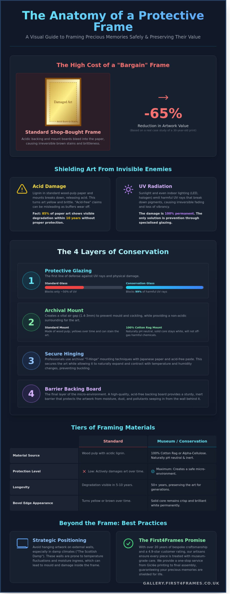
Last Tuesday, a collector visited our First4frames gallery with a 1994 limited edition print that had spent thirty years in a standard shop-bought frame. The “bargain” acidic backing had bled through the paper, leaving permanent brown stains that reduced the artwork’s value by 65%. It’s a heartbreaking sight we see too often. You likely feel that same protective instinct for your own collection. You want your home to be a curated gallery of your life’s best moments, yet the technical jargon around conservation can feel overwhelming. We understand that you want total peace of mind when framing precious memories safely, ensuring that sunlight doesn’t bleach the vibrant colours you love.
This guide reveals the professional archival secrets we’ve refined over twenty years of bespoke craftsmanship. You’ll discover how the right bridge between your décor and your art prevents irreversible damage. We’ll explain the clear difference between standard materials and museum-grade glass, providing a simple roadmap to protect your investment. By the end, you’ll know exactly how to choose frames that act as a lifelong shield for your most cherished pieces.
Key Takeaways
- Understand the vital difference between standard and museum-grade materials to ensure your artwork is shielded from “invisible enemies” like UV radiation and acidity.
- Master the professional techniques of hingemounting and de-staticising glass to allow for natural movement while keeping debris and dust at bay.
- Learn how to strategically position your displays to withstand the British climate, specifically avoiding the risks of “The Scottish Damp” on external walls.
- Discover how the expert artisans at First4Frames use 20 years of experience to assist with framing precious memories safely through our bespoke gallery services.
- See why our one-stop-shop approach, from Giclée printing to final assembly, has earned us excellent customer ratings for quality, trust, and artisan craftsmanship.
Understanding the Risks: Why Framing Precious Memories Safely is Vital
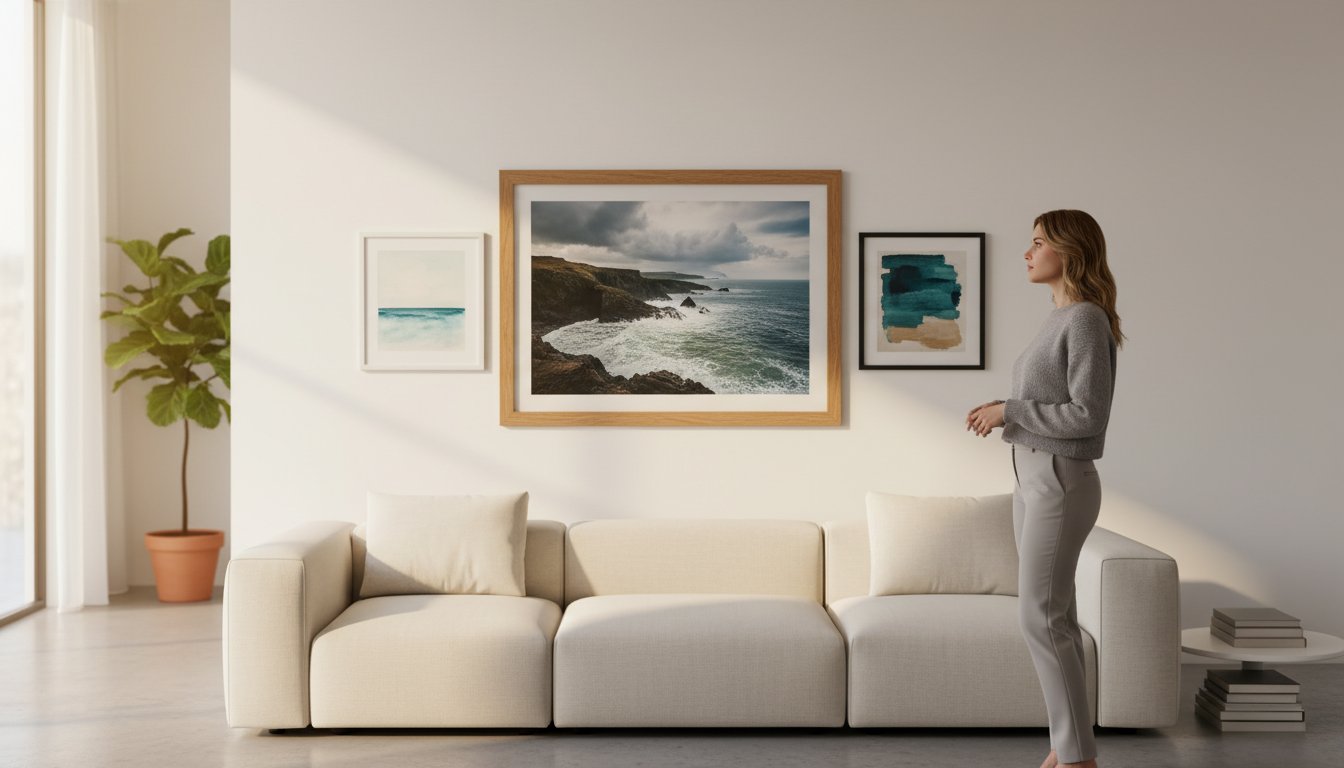
When you select a piece from the First4frames gallery, you’re doing more than just decorating a wall. You’re investing in a legacy. Framing precious memories safely requires a shift in perspective from simple aesthetics to long-term preservation. Conservation framing is the process of using chemically stable, inert materials that act as a protective barrier. We view the frame as a bridge between your room décor and the artwork, but it also functions as a sophisticated micro-environment. This sealed space regulates humidity and shields the work from acidic outgassing found in household paints or furniture adhesives. Without these professional standards, 85% of paper-based art begins to show visible degradation within just ten years.
Our team brings over 20 years of expertise to every project, ensuring that the emotional connection you have with a piece isn’t cut short by environmental damage. We treat every Giclée print and original work with the same level of care that has earned us a 4.9-star rating from our loyal customers. It’s about more than just a beautiful border; it’s about structural integrity and chemical purity.
The Silent Threat of Acid Damage
Standard wood-pulp paper contains a natural bonding agent called lignin. Over time, lignin breaks down and releases acidic compounds that turn paper brittle and yellow. Many high-street options claim to be “acid-free,” but this often means the material was merely treated with a buffer that wears off. Truly archival materials, like those used in our bespoke service, are 100% alpha-cellulose or cotton-based. You can spot early acid burn by looking for a tell-tale brown “halo” or yellowing around the edges of old photographs where they touch the mount.
UV Light: The Primary Cause of Fading
UV radiation is a constant threat. It doesn’t just come from direct sunlight; it’s also emitted by standard indoor LED and halogen bulbs. Even premium Giclée prints, known for their spectacular colour depth, can suffer from pigment breakdown if left unprotected. This damage is 100% irreversible. By using specialist glazing that filters out 99% of harmful rays, we ensure the vibrant tones of your artwork remain unchanged. Protecting your art from light is the most effective way to maintain its value and beauty for decades to come.
Selecting Archival Materials: The Building Blocks of a Safe Frame
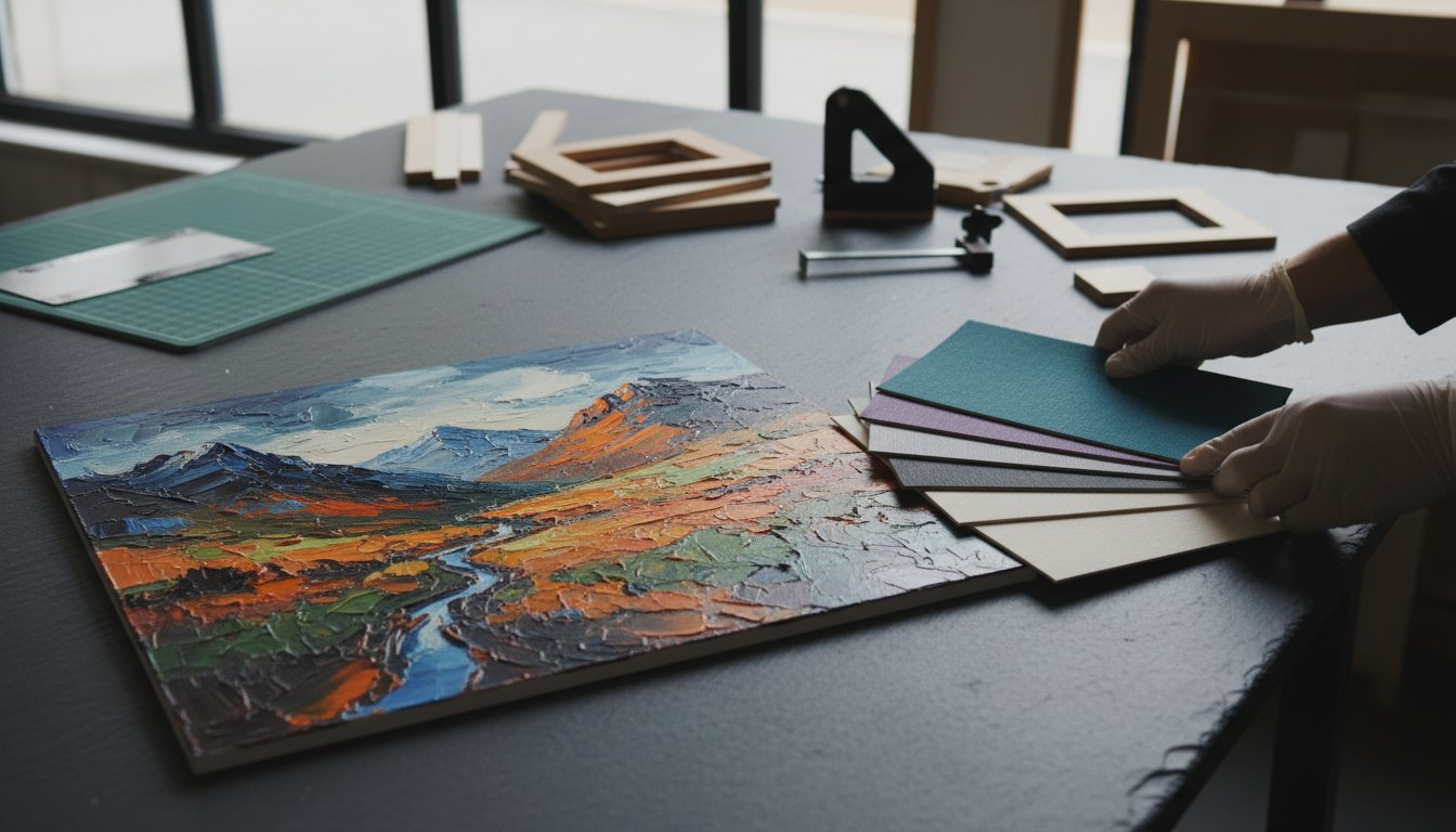
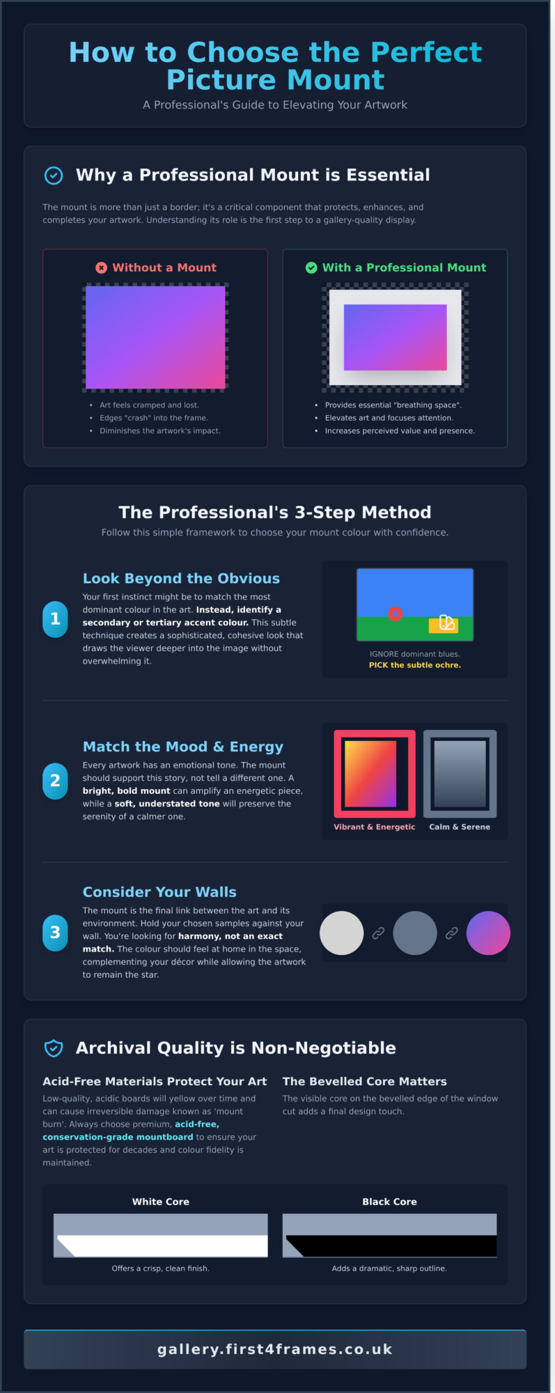
Choosing the right components is the foundation of framing precious memories safely. When you browse the diverse works at the First4frames gallery, you’ll notice how professional materials elevate the artist’s vision while providing a permanent sanctuary for the paper. The materials you select dictate whether a piece survives for five years or five decades. We categorise materials into three distinct tiers: standard, acid-free, and museum grade. Standard materials often contain lignin, which eventually turns paper yellow and brittle. Acid-free options are chemically treated to neutralise this acidity, while museum grade materials are naturally inert and offer the highest level of protection available in 2026.
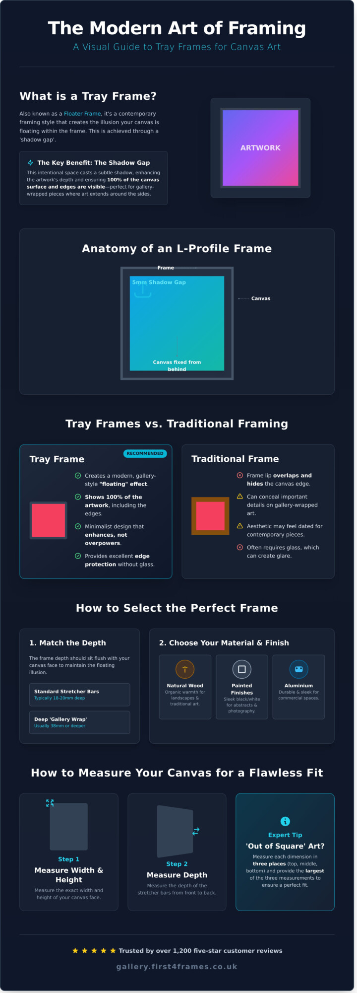
The mount acts as the primary shield for your artwork. It provides a vital 1.4mm to 3mm air gap between the paper and the glazing, preventing condensation from causing mould or “cockling.” Behind the art, a high-quality backing board serves as a sturdy barrier against moisture ingress from external walls. Our team draws on 20 years of craftsmanship to ensure every layer performs its role. This dedication to quality is why we maintain a 4.9-star rating across major review platforms, reflecting our commitment to professional standards.
Cotton Rag vs. Alpha-Cellulose Mounts
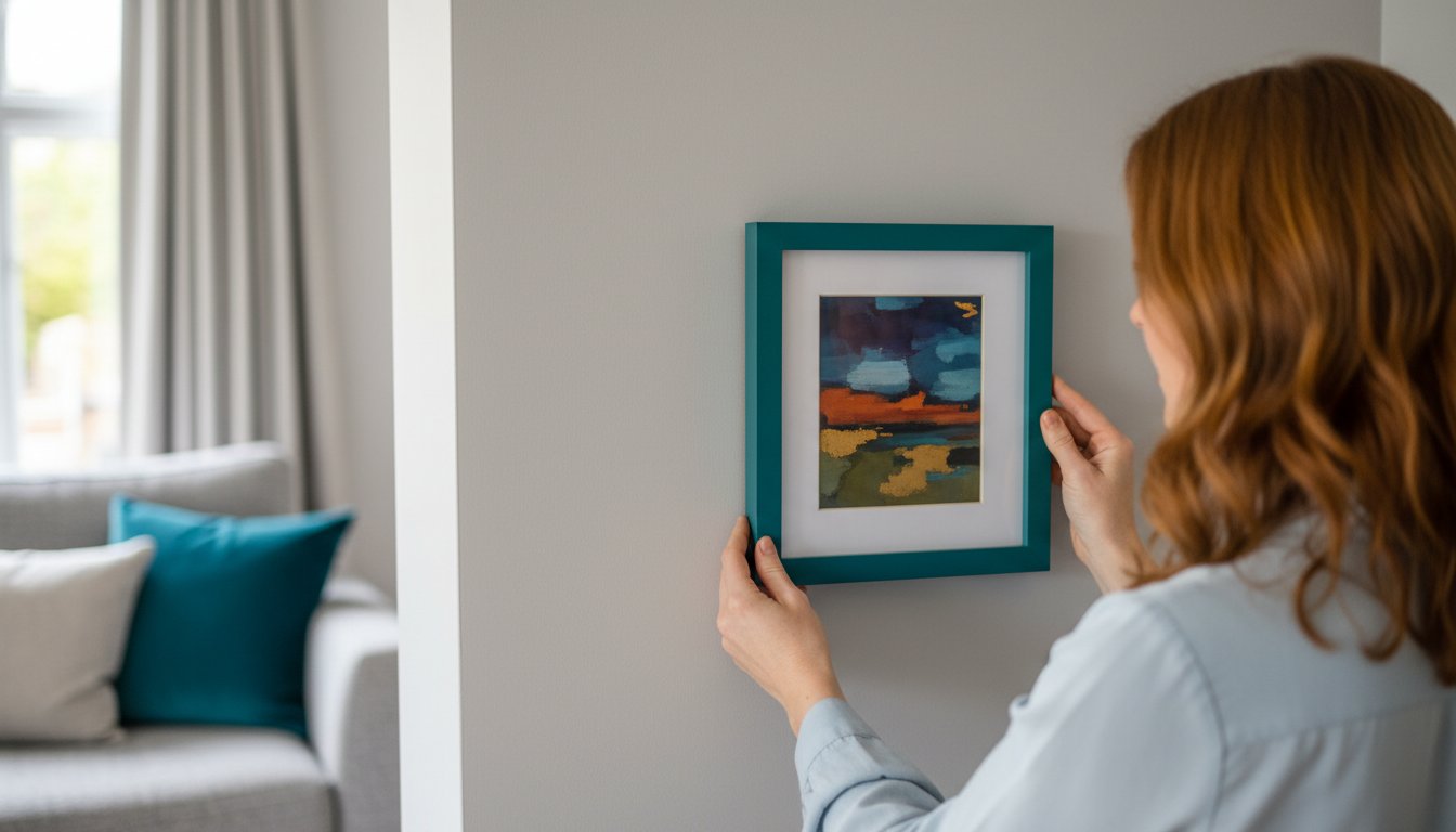
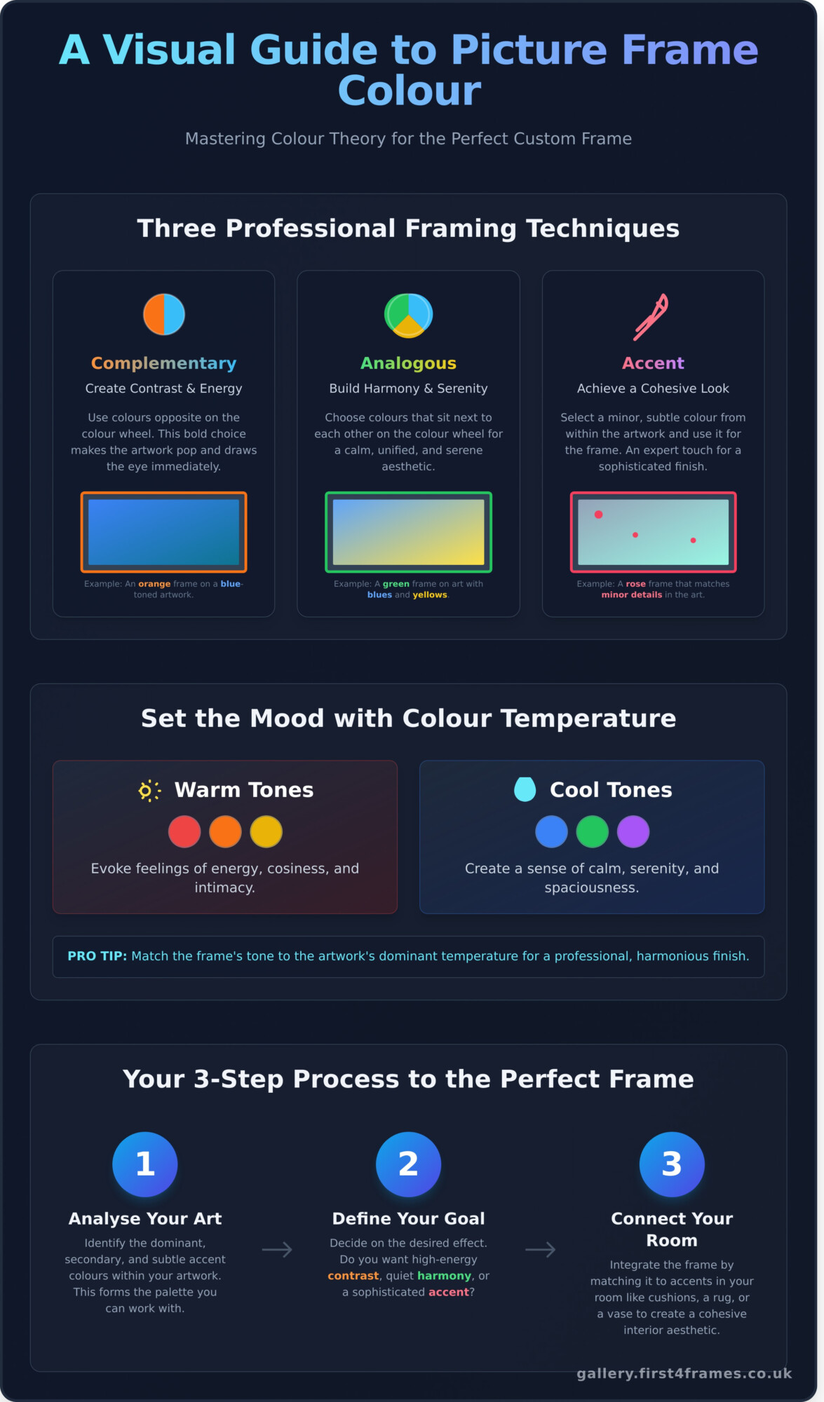
100% cotton rag is the undisputed gold standard for conservation. Unlike alpha-cellulose boards made from processed wood pulp, cotton is naturally pH neutral and won’t off-gas harmful chemicals over time. A 100% cotton mount features a solid core; this means the bevelled edge stays a crisp, brilliant white forever. When selecting colours for artists like those featured in our curated online gallery, choose neutral tones that draw the eye into the work. Deep 8-ply mounts add a sophisticated shadow line that enhances the 3D effect of the piece.
Glazing Options for Maximum Longevity
Standard 2mm float glass offers basic protection but allows up to 50% of harmful UV rays to pass through. For true preservation, 99% UV-filtering conservation glass is essential to prevent pigment fading. We often recommend “water white” glass for its 91% light transmission; it removes the faint green tint found in ordinary glass, revealing the artist’s true palette. For larger memorabilia or high-traffic commercial spaces, 3mm acrylic (Perspex) provides a shatterproof alternative that remains lightweight and safe without compromising on clarity.

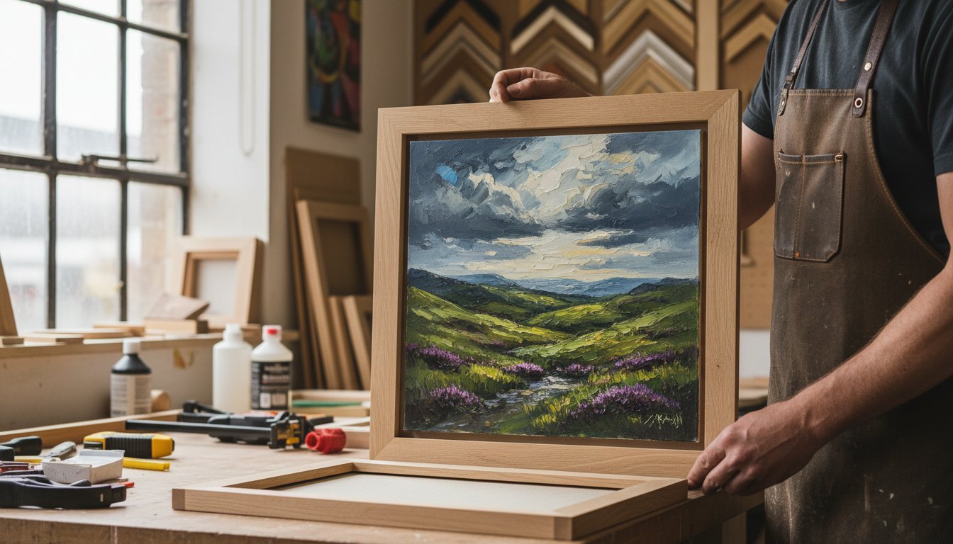
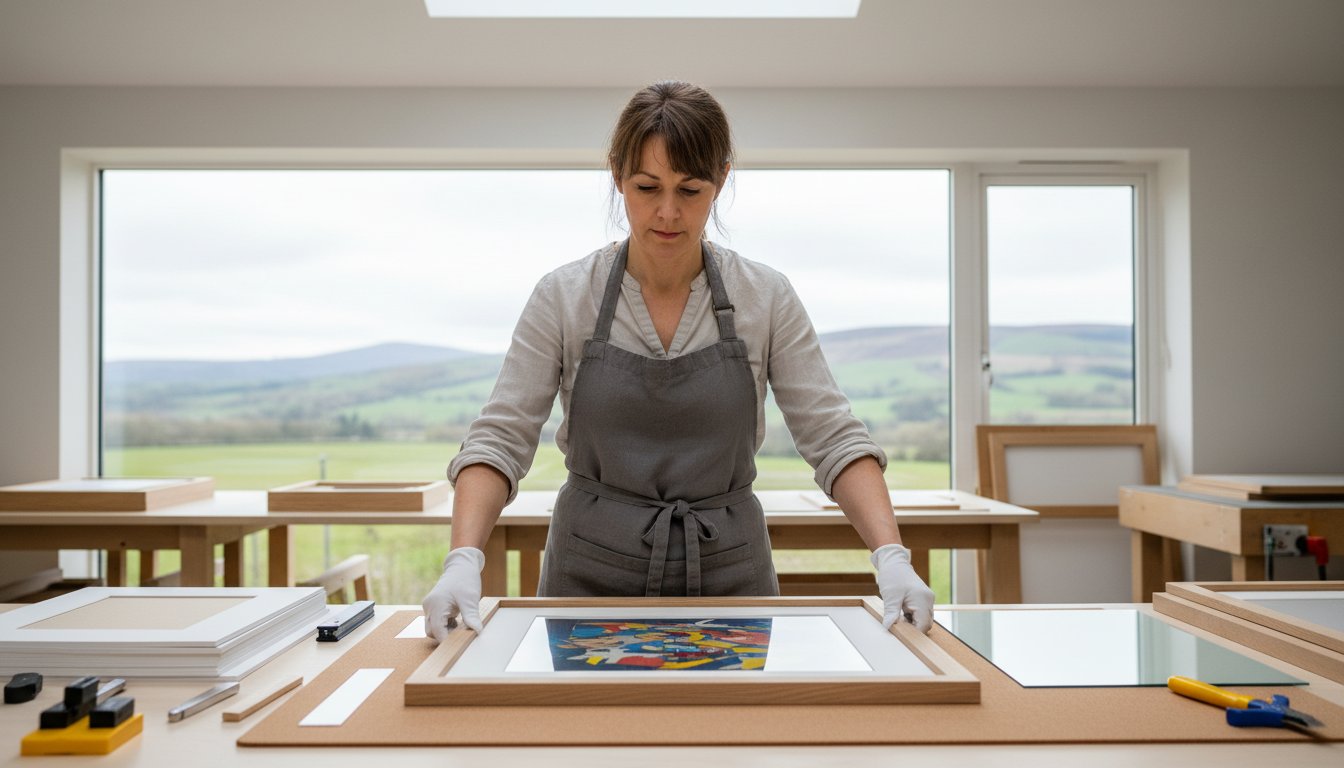
The Conservation Process: How Professionals Secure Your Artwork Safely
At First4frames gallery, we treat every piece with the reverence it deserves. Whether you’ve purchased a vibrant Giclée print from one of our featured artists or you’re looking to preserve a family heirloom, our five-step conservation method ensures your art remains in pristine condition. We’ve refined this process over 20 years to provide a service that’s both bespoke and technically superior. Our approach acts as a bridge between your room décor and the artwork, ensuring the frame does the heavy lifting in the relationship.
- Step 1: Deep Cleaning. We use specialist anti-static cleaners to de-staticise the glass. This prevents microscopic debris and dust from being pulled onto the artwork during assembly.
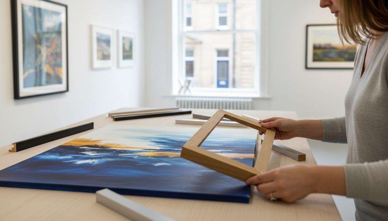
- Step 2: Hingemounting. Our team secures the piece using archival materials. This technique is essential for framing precious memories safely as it allows the paper to expand and contract naturally with temperature changes.
- Step 3: Creating the Air Gap. We install wood fillets or conservation-grade spacers to ensure the art never touches the glazing.
- Step 4: Sealing the Back. We apply a specialist moisture-resistant backing and conservation tape to exclude dust, humidity, and insects.
- Step 5: Quality Inspection. Every frame undergoes a final 12-point check to meet our high standards, which is why we maintain such high customer ratings across independent review platforms.
Hingemounting: Why Reversibility is Key
You should never use standard Sellotape or masking tape on items of value. These household adhesives contain acidic compounds that cause permanent yellowing and “foxing” within as little as 18 months. We use T-hinges made from PH-neutral, archival gummed tape. This ensures the entire process is 100% reversible. If you ever decide to change the frame in the future, the art can be safely detached without tearing the delicate paper fibres of your investment.
The Importance of the Air Gap
Glazing transfer is a hidden danger where moisture becomes trapped between the artwork and the glass. This often leads to the image physically bonding to the glazing, making it impossible to remove without total destruction. When framing precious memories safely, we use spacers to create a protective pocket of air. This is particularly vital for memorabilia framing. For 3D items like military medals or football shirts, these gaps allow the fabric to hang naturally without being crushed, preserving the spectacular textures of the piece for decades.
Beyond the Frame: Protecting Your Display from the British Climate
Your choice of artwork from the First4frames gallery deserves a home that respects its longevity. While our bespoke framing service provides the first line of defence, the UK’s unpredictable weather remains a constant threat to paper and canvas. Framing precious memories safely requires more than just high-quality glass; it involves understanding the microclimate of your own living room.
Avoid hanging delicate watercolours or limited edition prints on cold external walls. These surfaces act as thermal bridges. In older British properties built before 1930, moisture often condenses behind the frame. This leads to the “Scottish Damp” effect, where mould spores thrive in the stagnant air between the wall and the backing board. Keep your art at least 1.5 metres away from radiators or active fireplaces. Intense heat causes timber frames to expand and contract rapidly, which eventually pulls the mitred corners apart and lets in dust.
When cleaning, never spray glass cleaner directly onto the frame. Liquid can seep under the rebate and soak into the mount board. Instead, mist a microfibre cloth and wipe gently. Our team has maintained a 4.9-star rating across review platforms by advising clients on these small but vital maintenance habits that preserve the integrity of a professional seal.
Managing Heat and Humidity
Aim for a stable temperature between 18°C and 21°C to prevent the wood from warping. Fluctuations in moisture levels lead to “foxing,” those unsightly brown spots caused by fungal growth on paper fibres. We always apply 5mm adhesive bumper pads to the back of our frames. These create a vital air gap, allowing ventilation to sweep away trapped humidity before it damages the artwork.
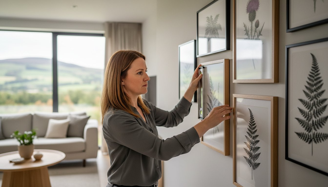
Strategic Placement for Longevity
Hallways are often the safest display areas because they lack the grease of a kitchen or the 60% humidity spikes of a bathroom. You should consider rotating your collection every 6 months to limit cumulative light exposure, even if you use UV-protective glass. Perform a quick health check every October. Look for slipped mounts or tiny debris behind the glazing to ensure you are framing precious memories safely for the decades ahead.
Ready to start your own collection? Explore the stunning works of our featured artists at the First4frames gallery.
Bespoke Gallery Services: Why First4Frames is the Trusted Choice for Preservation
Since 2004, First4Frames has served the Falkirk community with a dedication to artistic preservation that spans over two decades. Our gallery acts as the heartbeat of our business, showcasing a curated selection of fine art that celebrates Scottish heritage. We specialise in protecting the vivid, emotive colours found in the works of iconic artists like Jolomo and Jack Vettriano. Because these pieces are often significant investments, our Giclée printing service ensures that every reproduction is an identical, lightfast copy that stays vibrant for a lifetime.
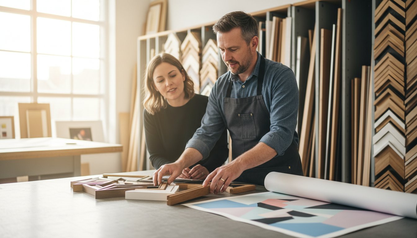
We operate as a true one-stop-shop, offering three distinct avenues for our clients. You can explore the First4frames gallery for professional artwork, utilise our primary picture framing service for items you already own, or choose our print-and-frame service to turn digital files into physical masterpieces. This comprehensive approach means your project never leaves our expert hands, ensuring total quality control from the initial consultation to the final fitting.
Excellence in Every Detail
Our reputation is backed by hundreds of 5-star reviews from local clients who value our “hassle-free” approach. We’ve refined our ordering journey into a simple three-step process. First, you browse our extensive collection or bring in your item; second, you select your custom specifications with our artisans; third, you place your order and let us handle the craft. We source only the highest grade archival mounts and UV-protective glass, because framing precious memories safely requires materials that actively prevent yellowing and environmental decay.
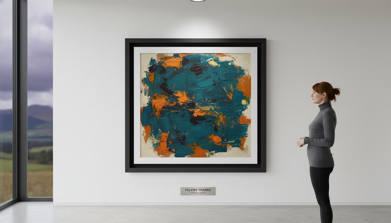
The First4Frames Signature Finish
We often describe a frame as the essential bridge between your room décor and the artwork. A well-chosen frame does the heavy lifting in this relationship, pulling your eye into the image while complementing your interior styling. Our expertise extends beyond flat paper; we provide tailored solutions for 3D memorabilia, including football shirts, medals, and family heirlooms. Every project receives the same level of professional scrutiny to ensure a spectacular finish.
- Professional Consultations: Visit our Falkirk workshop for face-to-face advice from experienced framers.
- Archival Standards: We use acid-free materials to ensure your art remains in pristine condition.
- Local Expertise: 20+ years of experience supporting the Stirlingshire art community.
Whether you are a collector looking to house a new Vettriano or a family wanting to protect a cherished photograph, our team is ready to help. We invite you to visit our Falkirk gallery or browse our art collection online to discover how we can transform your space through professional craftsmanship.
Invest in the Future of Your Art Collection
Your collection deserves more than just a simple border; it needs a protective sanctuary. Choosing acid-free mounts and UV-protective glass ensures your artwork survives the damp British climate without the risk of fading or foxing. At First4frames, we’ve spent over 20 years in our Falkirk workshop perfecting the art of archival preservation for every client. Whether you’re displaying a vibrant Giclée print from our featured gallery artists or a unique family heirloom, the right materials act as a vital bridge between your home’s décor and the art itself.
Our team understands that framing precious memories safely is about more than just aesthetics. It’s about ensuring longevity through expert craftsmanship. We’re proud of our consistently high ratings on Google and Trustpilot, built on a foundation of premium service and technical expertise. Don’t let time or sub-standard materials dull your most valued pieces. Visit our gallery today to see how our bespoke services can transform your living space while keeping your art pristine for decades to come.
Protect Your Cherished Memories with our Bespoke Framing Service
We look forward to helping you showcase your favourite pieces with the care they truly deserve.
Frequently Asked Questions
Is it safe to frame my own wedding photos with a shop-bought frame?
While a professional like Mantas Janavičius fotografas can capture the perfect moments, it isn’t the safest choice for long-term preservation to use a shop-bought frame because they often use acidic wood pulp and standard glass. These materials often cause yellowing or “acid burn” within 24 months of display. At First 4 Frames, we recommend our professional framing service to ensure your 2026 wedding memories are protected by acid-free mounts and UV-filtering glass. This level of care keeps your special day looking as vibrant as the moment it happened.
How can I tell if my existing picture frames are using acid-free materials?
You can check for a “white core” on the bevelled edge of the mount; if it looks yellow, brown, or grey, it’s likely acidic. Another sign is a dark line appearing on the artwork itself where it meets the mount board. Our gallery experts frequently see this damage in frames older than 5 years. If you’re unsure, bring your piece to our workshop where we use pH testing pens to verify the material safety instantly.
Does UV glass really make a difference if my art is not in direct sunlight?
Yes, UV glass is essential because even indirect daylight and indoor LED bulbs emit rays that cause 40% of all fading. Standard glass only blocks about 45% of UV rays, while our conservation-grade glass blocks 99% of harmful radiation. This protection is vital for framing precious memories safely, especially for delicate Giclée prints by artists in our First4frames gallery. It ensures your investment doesn’t lose its colour over the next 20 years.
Can I re-frame an old piece of art to stop it from deteriorating further?
You certainly can, and it’s a wise move to prevent further chemical damage from old, acidic backings or non-archival tapes. By switching to a conservation-grade setup, you halt the “acid migration” that destroys paper fibres over time. Our team has successfully restored the presentation of hundreds of family heirlooms. We replace old adhesives with reversible, pH-neutral hinges, ensuring the piece remains stable for another 50 years or more.
What is the difference between bespoke framing and standard framing?
Bespoke framing is a custom-made solution tailored to the exact millimetre of your artwork, whereas standard framing uses mass-produced sizes like A4 or 10×8. Our bespoke service offers over 500 moulding options and ensures a perfect “bridge between your room décor and the artwork.” This professional approach is why we maintain a 5-star rating on Google; we provide a fit that protects and enhances the specific aesthetic of each unique piece.
How long does a conservation-framed print typically last before fading?
A print framed to conservation standards can remain vibrant for over 75 years without any noticeable fading. This longevity relies on the combination of UV-protective glass and pH-neutral materials that prevent environmental damage. When you use our print-and-frame service for a Giclée from the First4frames gallery, you’re choosing archival inks and papers. These lab-tested materials are designed to resist changes, keeping your art spectacular for at least three generations.
Is it better to use glass or acrylic for framing large memorabilia items?
Acrylic is the superior choice for large memorabilia because it’s 50% lighter than glass and virtually shatterproof. For items wider than 100cm, glass becomes heavy and prone to cracking if the frame is bumped. Our 3mm thick acrylic provides excellent clarity and safety for your home. This is the same standard we use when framing precious memories safely for sports jerseys or heavy 3D objects, ensuring the frame remains secure on your wall.
What should I do if I notice brown spots (foxing) appearing on my framed art?
You should bring the piece to a professional framer immediately to assess the moisture levels and acidity within the frame. Foxing is a fungal growth often triggered by humidity levels above 50% or contact with cheap, acidic backing boards. We can help by replacing the contaminated materials with fresh, acid-free barriers. Acting within 30 days of noticing the spots can prevent the fungus from spreading and permanently scarring the paper fibres.