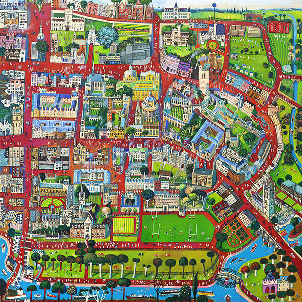
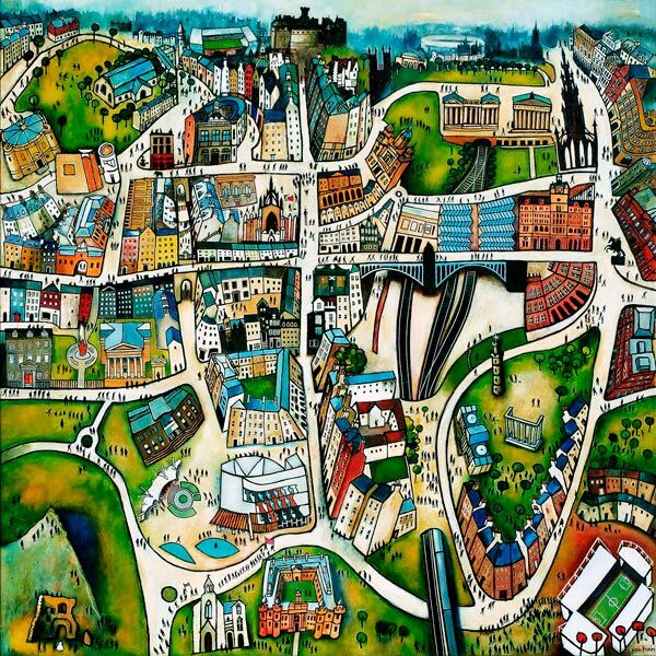
An Oxford graduation gift should mark more than the ceremony. The strongest choice reflects the streets, buildings, green spaces, friendships, and routines that made the years in the city distinctive. Oxford by Rob Hain brings those elements together in a colourful illustrated cityscape. Its broad view can hold many memories at once without becoming a formal university emblem or a disposable novelty.
Begin an Oxford graduation gift with the graduate’s story
Two people can complete similar degrees and remember Oxford very differently. One may think first of college architecture and libraries. Another may remember rowing, cycling, parks, favourite cafés, or the route between accommodation and lectures. A city-wide composition is useful because it leaves room for those personal associations instead of deciding that one landmark must represent the entire experience.
Oxford combines historic buildings, winding rivers, green areas, sports grounds, roads, trees, and bridges. The view is detailed, but it is not rigidly cartographic. Rob Hain’s lively treatment gives the city movement and warmth, making it suitable for someone whose strongest memories include people and everyday life as well as architecture.
Match the present to the moment after graduation
Graduation is often followed by change. The recipient may move to a first flat, return to a family home, begin a new job, or set up a workspace in another city. That uncertainty should shape the gift. A framed print offers a finished focal point, but its scale and presentation still need to be adaptable enough for the next stage.
For a new home: choose a presentation that can work in a hall, living room, or study rather than matching one temporary bedroom.
For a first office: keep the frame polished and versatile so the artwork feels personal without looking informal.
For an international move: confirm transport arrangements and the finished dimensions before ordering.
For a group gift: let the artwork remain untouched and collect messages in a separate card or small book.
The picture does not need an engraved explanation to carry meaning. A handwritten note can name the dates, course, shared memory, or part of the city that prompted the choice. Keeping that message separate protects the print and lets the graduate place it in different settings over time.
Decide whether city art suits the recipient
Question
What a yes suggests
Do they connect strongly with Oxford itself?
A city view may feel more personal than a generic graduation symbol
Do they enjoy discovering small visual details?
The illustrated buildings, roads, parks, and figures will reward repeat viewing
Are they likely to move several times?
A versatile framed piece can carry continuity between homes
Do several people want to contribute?
One substantial artwork can give a group present a clear purpose
If the recipient prefers minimal, almost empty interiors, the detailed composition may need a generous mount and a quiet wall. If they enjoy books, travel, architecture, or collected objects, its layered city narrative may settle naturally into their space. The aim is to reflect their taste, not only the significance of the event.
Frame a detailed cityscape without making it feel formal
The artwork already contains many colours and routes for the eye. A frame does not need to add another decorative statement. A clean dark moulding can sharpen the illustrated lines, while a restrained timber can warm the presentation. A well-proportioned mount separates the busy city from the wall and helps the smaller landmarks remain legible.
Consider where the graduate is most likely to pause and look closely. Above a desk, beside bookshelves, or near a dining area can work better than a high position on a large wall. Leave enough space around the finished frame so the composition reads as one city rather than another item within a crowded display.
Make craftsmanship part of the milestone
A graduation present is often intended to outlast the flowers, cards, and ceremony photographs. First 4 Frames uses colour-managed Giclée production and completes bespoke framing in-house in Falkirk. This supports the fine city detail and varied colour while giving the gift a hand-finished, ready-to-hang presentation.
A thoughtful Oxford graduation gift can recognise academic achievement while preserving the broader experience around it. View the framed Oxford print for a colourful record of buildings, parks, waterways, and city life that can follow the graduate into a new home or career.
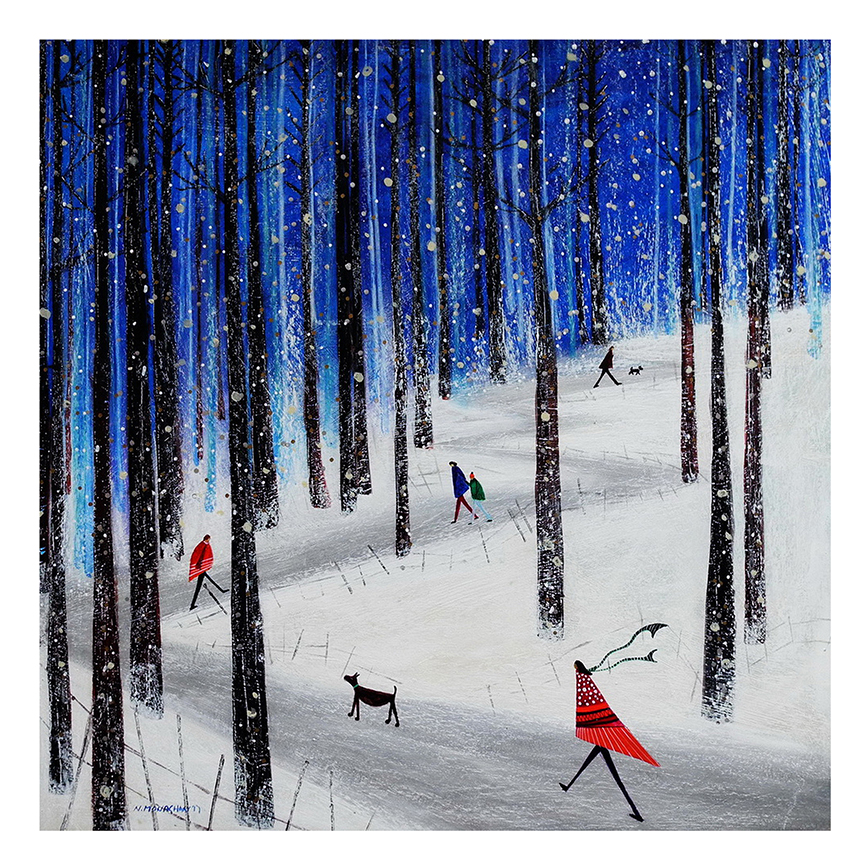
winter entryway wall art can make the step from a cold, dark day into the home feel more considered. The challenge is finding a winter subject that still looks natural after decorations have been packed away. Winter Estate by Nikki Monaghan meets that brief through a snowy woodland, four warmly dressed walkers, and a dog beneath a deep evening sky. It suggests a shared winter walk rather than a single holiday.
Why winter entryway wall art should work after Christmas
An entrance often carries the practical signs of winter: coats, boots, scarves, wet umbrellas, and shorter daylight. Artwork can give that activity a visual centre, but obvious festive lettering or decorations may feel out of place by January. A landscape-led image has a longer life because weather, walking, companionship, and evening light remain relevant throughout the colder months.
Winter Estate uses recognisable seasonal details without depending on holly, gifts, or a Christmas colour scheme. The figures and dog add warmth to the snow. Tall trees create a strong rhythm, while small areas of red, yellow, blue, and green prevent the scene from becoming monochrome. It can therefore support a seasonal entrance without requiring the rest of the room to follow a theme.
Give the artwork one clear job in a busy entrance
Before choosing a position, identify what the entryway lacks. A long corridor may need a stopping point. A coat-heavy wall may need a calmer feature opposite it. A small vestibule may need colour at the far end to draw the eye inward. Let the picture answer one of those needs rather than asking it to compete with every practical fitting.
Entryway condition
Useful placement response
Coat hooks dominate one side
Hang the print on the facing wall to restore balance
A bench creates a natural pause
Centre the finished frame above it with clear headroom
The hall receives little daylight
Use a well-lit wall where the deep blue and bright coats remain visible
The entrance opens into a living space
Position the picture so its colours relate to the next room
Keep the immediate area edited. Keys, post, dog leads, and shoes are necessary, but they should not form a second composition around the frame. A tray, closed basket, or simple rail can contain smaller items and leave the artwork readable from the doorway.
Build a winter palette that remains welcoming
Snow scenes do not have to make a room feel cold. In this image, the darker sky and tree trunks provide depth, while the coats introduce lively points of warmth. Against soft white or pale grey paint, the deep blues can feel crisp. Beside timber, woven storage, or a warm runner, the same colours gain a more sheltered quality.
Repeat only one or two notes from the picture. A muted red cushion on the bench, a navy runner, or a yellow ceramic bowl may be enough. Avoid assembling a full set of snowflake accessories around it. The scene is strongest when it supplies the winter atmosphere and the surrounding objects remain practical.
Check the view, traffic, and light before hanging
Start at the front door. Check whether the proposed position is visible as soon as someone enters.
Walk the normal route. Make sure bags, shoulders, and an opening door will not brush the frame.
Test the evening light. Entrances are often used most when daylight is weak, so glare and dark corners matter.
Mark the finished size. Use a paper template that includes mount and moulding, not only the printed image.
A secure hanging method matters in a high-traffic area. The frame should sit firmly rather than tilt whenever the door closes. If the wall is narrow, enough empty space on each side will make the presentation feel deliberate and reduce the chance of knocks.
Choose framing for an in-between space
An entryway connects outdoor weather with the materials and colours used throughout the home. A darker frame can define the trees and evening sky. A lighter timber may relate to a bench or floor and soften the overall mood. A calm mount gives the detailed scene breathing room, especially when hooks and storage already add strong lines nearby.
First 4 Frames produces colour-managed Giclée prints and completes bespoke framing in-house at its Falkirk workshop. That careful process supports the contrast between snow, dark branches, coloured clothing, and night sky. It also allows the final presentation to be considered alongside the real wall, available light, and daily movement through the entrance.
Well-chosen winter entryway wall art can acknowledge the season while keeping the first view of the home calm, useful, and personal. View the framed Winter Estate print for a snowy scene with companionship, colour, and enough restraint to remain on display beyond the festive weeks.
The artwork above your sofa shouldn’t feel like an afterthought. Knowing how to choose art for above a sofa starts with scale: aim for a piece or arrangement around two-thirds to three-quarters of the sofa’s width, then leave roughly 15 to 25 cm between the sofa back and the frame’s bottom edge. These proportions help the art feel connected to the furniture without overwhelming it.
It’s easy to focus on a favourite image and overlook how it will sit on the wall. When considering how to choose art for above a sofa, think about the room’s focal point, the sofa’s shape and the balance you want to create.
This guide covers four practical decisions: measuring the available space, setting a comfortable hanging height, choosing a single print or a group, and selecting a focal point that brings the room together. You’ll also find simple ways to preview the arrangement before committing, so the art feels considered and at home above your sofa.
Key Takeaways
Aim for artwork or an arrangement around two-thirds to three-quarters of your sofa’s width, and centre it over the seating.
Leave roughly 15 to 25 cm between the sofa back and the frame’s bottom edge, adjusting the layout to suit nearby windows and the room.
Choose a statement print, a coordinated set or a gallery wall to suit the wall’s proportions and the look you want.
Build the display around a piece you love, then use its colours and framing to create a focal point that feels at home in the room.
1. Artwork placement for sectionals and window-adjacent sofas
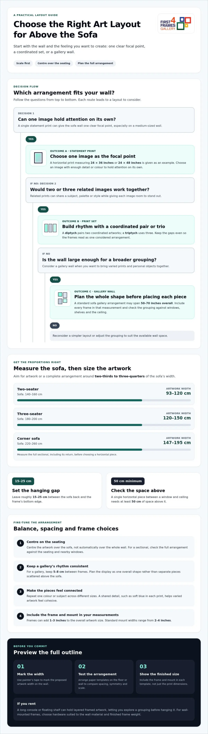
For balanced proportion, choose artwork or a complete arrangement around two-thirds to three-quarters of your sofa’s width. A 140-160 cm two-seater suits artwork 93-120 cm wide; a 180-200 cm three-seater suits 120-150 cm. For a 220-260 cm corner sofa, aim for 147-195 cm. Measure the full sectional, including its return, before choosing a horizontal piece.
Above a sofa, position the frame’s bottom edge 15-25 cm above the back. Centre the artwork over the seating, not automatically over the whole wall. If a window sits beside the sofa, keep the artwork visually balanced with the window rather than squeezing it into a narrow strip. A single horizontal piece between a window and ceiling needs at least 50 cm of space above it.
For a visual guide to scale and balance, watch this short video:
Artwork costs in the UK vary by image, size and framing. Decide on your preferred format and the space available first, then compare pieces that suit both your room and budget.
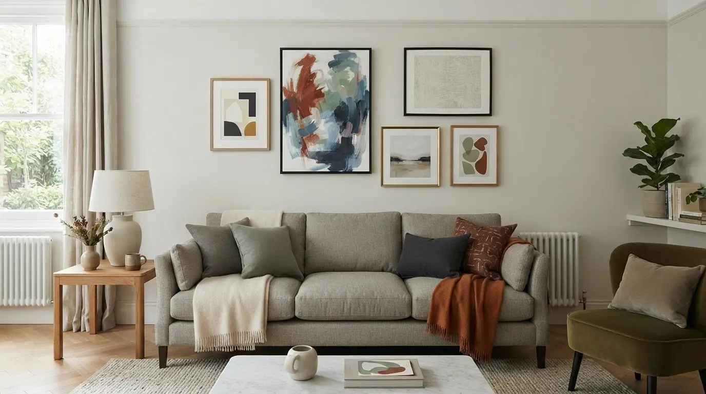
Coordinate the artwork with your sofa without matching every colour exactly. A neutral sofa can anchor a vivid abstract print, while a patterned sofa may work better with art that picks up one subtle shade. Consider visual weight too: a dark, detailed image can feel heavier than a pale landscape of the same size.
Common mistakes include choosing a print that looks too small, hanging it too close to the sofa, or letting its colours compete with the room. Use painter’s tape to mark the proposed artwork’s width on the wall. For a sectional sofa, outline the full arrangement and check how its horizontal shape relates to the seating and nearby windows.
Using symmetry, frames and cohesive themes
Symmetry gives a sofa wall a composed feel, especially when the room already has strong patterns. Try a pair of prints with matching outer dimensions, or arrange four pieces in a 2-by-2 grid. For a more relaxed gallery, repeat one colour or subject across different sizes. A shared detail, such as soft blue in each print, helps varied artwork feel connected.
Plan the gallery as one visual shape, rather than separate frames scattered above the sofa. Keep 5-8 cm between frames for a consistent rhythm, then check the arrangement’s full outline against the seating. A 2-by-3 grid creates a clear rectangular layout, while a looser cluster can suit an informal living interior. Leave enough space between the arrangement and the ceiling.
Choose frames that echo the room’s existing materials. A slim, simple frame can complement a contemporary interior; a more decorative profile can suit traditional furnishings. Matching every frame creates order, while mixing profiles works best when another detail, such as colour or finish, ties them together. Remember that frames can add 1-3 inches to the overall artwork size.
Framed prints and canvas create different visual effects. A framed print gives the image a defined edge, and a mount can add breathing space around the artwork. Standard mount widths range from 2-4 inches. Canvas presents the image without a separate frame, creating a more continuous surface. Choose the format that supports the image and the balance you want above the sofa.
Before committing, arrange paper templates on the floor or wall to compare spacing, symmetry and overall scale. Include the frame and mount in each template, not just the print dimensions. This makes it easier to see whether a balanced grid or varied gallery suits the room. Explore framed artwork and print options for ideas that could bring your chosen theme together.
3. Selecting a statement print, print set or gallery wall
A single statement print gives the sofa wall one clear focal point. It suits a medium-sized wall, especially when the image has enough detail or colour to hold attention on its own. Examples include a horizontal print measuring 24 × 36 inches or 24 × 48 inches. Part of how to choose art for above a sofa is deciding whether one image can carry the room’s visual story.
A set of prints creates rhythm across the wall. Two or three related pieces can share a subject, palette or style while giving each image room to stand out. A diptych pairs two coordinated artworks; a triptych uses three. Keep the gaps even so the frames read as one considered arrangement rather than competing pieces.
For a larger wall, a gallery wall can bring together varied prints and personal objects. Plan the full outline first: arrange templates on the floor, then test the shape above the sofa. A standard sofa gallery arrangement may span 50-70 inches overall. Include each frame in that measurement, and consider how the grouping relates to nearby windows, shelves and the ceiling.
Renters can lean framed artwork on a long console or floating shelf, layering smaller pieces in front of a larger print. If you’re weighing how to choose art for above a sofa, this flexible approach lets you explore a grouping before hanging it. For wall-mounted frames, choose hardware suited to the wall material and finished frame weight. Plasterboard and masonry need different fixings. Adhesive strips offer another option for lightweight artwork, with heavy-duty strips described as supporting prints up to around 3 kg. Follow the strip maker’s stated limits for the surface and load.
Compare the visual impact of one large image with several smaller frames. A bold abstract can anchor a simple interior, while a gallery wall adds personality. Choose the arrangement that gives the sofa a focal point without crowding the wall.
4. Choosing a focal point above the sofa
Abstract art, landscapes and photographic prints can all work above a sofa. Choose a style that suits your living room, then let one artwork lead the arrangement. A vivid abstract, a calm coastal scene or a diptych can each create a focal point, in a different way.
First decide what should catch the eye. If your sofa has a distinctive shape or colour, choose art that complements it without copying every detail. In a neutral room, a clear subject or rich colour can become the anchor. In a patterned room, a quieter image may keep the wall from feeling crowded.
Think about how the image connects with the rest of the room. Pick one or two colours from a rug, cushion or nearby wall, then look for artwork that repeats them naturally. A blue landscape, for example, can link a pale sofa with a patterned rug. This creates a visual connection without making the art feel like a matching accessory.
Scale affects whether the focal point feels connected to the sofa. A single framed print measuring 70 × 100 cm can suit a standard three-seater; a panoramic artwork measuring 150 cm wide offers another option. Artwork that feels too small can look detached, so consider the full composition and its frame against the furniture before choosing.
Choose the image because you want to live with it, not simply because it matches the sofa. Then decide whether surrounding objects support its role or distract from it. A clear focal point gives the room a visual centre, while carefully chosen colours and subject matter help the artwork feel beautifully connected to its setting. Explore artwork for your living room and find a piece that could anchor your space.
First4Frames Gallery: Ready-to-Hang Framed Art
First4Frames Gallery offers Ready-to-Hang Framed Art, Custom Picture Framing and Giclée Fine Art Prints. Its artwork can inspire choices from coastal wall art and landscape wall art to Scottish landscape art, contemporary art prints and fine art by best-selling artists or famous artists. For a personal image, photography prints can be paired with framing to create custom framed art prints and bespoke framed wall art.
With online picture framing, you can choose your frame online and design your framed artwork to suit your room. Before deciding, visualise art on your wall or use a wall art visualiser to see artwork before you buy. Consider the art print framing service when selecting a finished piece of framed wall art for above your sofa.
Choose a piece you’ll love living with
Before settling on a design, imagine seeing it every day. When deciding how to choose art for above a sofa, look beyond matching colours and ask whether the image means something to you. It might recall a favourite landscape, bring energy to a quiet room or simply make you pause and look again.
Give yourself time to compare subjects and moods. Notice which artwork feels right alongside your furniture and suits the atmosphere you want to create. The strongest choice isn’t necessarily the most dramatic; it’s the one that feels at home and continues to speak to you.
Let your preferred image guide the next decision, then explore the available styles and subjects at First4Frames Gallery. Browse artwork and find your favourite, and take the next step towards a wall that feels distinctly yours.
Frequently Asked Questions
How big should wall art be above a sofa?
A useful starting point is artwork around two-thirds to three-quarters of the sofa’s width. Measure the complete framed piece or arrangement, not just the image, so its visual footprint feels proportionate. For instance, a 200 cm sofa can suit a composition around 130-150 cm wide. The room’s layout and the artwork’s visual weight can help you refine that starting size.
Single Painting or Diptych?
Choose a single painting for an uninterrupted image and a clear, simple focal point. A diptych, or pair of coordinated artworks, can suit a wide landscape or abstract composition. Consider the wall’s shape and the image itself: splitting a scene can create rhythm, while one piece keeps the subject visually whole.
What Size Art Should I Get for My Wall?
Start with the wall’s usable area, then consider nearby furniture, doors and windows. A large, open wall can take artwork measuring 36 × 48 inches or larger, while a small nook may call for a more modest scale. In rooms with ceilings under 2.4 m, horizontal artwork can preserve a sense of space. Include the frame in your measurements.
What size should art be above a sofa?
For a 200 cm sofa, a composition about 130-150 cm wide is a practical reference. That composition could be one piece or several arranged together, with gaps included in its total width. Check the artwork’s height as well as its width: a tall image can feel imposing above low seating, while a very shallow one may seem visually slight.
How wide should artwork be compared with the sofa?
Aim for artwork or a grouped display roughly two-thirds to three-quarters as wide as the sofa. Measure from the outside edge of the leftmost frame to the outside edge of the rightmost. This is more accurate than adding print dimensions alone, especially when the arrangement includes several pieces and gaps.
Should you choose one large artwork or a gallery wall above a sofa?
Choose one large artwork for a clean, simple display or when a single image deserves attention. A gallery wall suits a broader space or a collection of personally meaningful images. Consider how much detail is already in the room: a quieter interior can support a varied collection, while patterned furnishings may work better with one focused image.
retirement gift art for an angler works best when the subject answers the room rather than simply filling a gap. Salmon Pair offers a useful example because two bronze salmon drive upwards against the current, turning the familiar migration story into a compact sculpture with genuine movement.
Make retirement gift art for an angler specific to the person
Begin with memory rather than occupation. Think about the river they return to, the friends they fish with and the stories they tell after a day outdoors. Salmon Pair is strongest for someone who recognises the effort and direction in the fish, not simply anyone with a general country interest.
Gift question
Why it matters
Do salmon connect to a favourite river?
A real place makes the subject personal.
Do they collect sculpture?
The bronze should suit how they already display objects.
Is there a secure shelf or cabinet?
The 16 cm high piece needs a stable, visible position.
Will colleagues contribute?
A lasting limited edition can suit a shared presentation.
The sculpture measures about 16 cm high, 12 cm wide and 9.5 cm deep. Mark that footprint on the proposed shelf. Allow room to see both fish and the water-like base from more than one angle, and avoid balancing it on a narrow mantel edge.
What should the presentation card say?
Record the river, trip or shared memory that prompted the choice. The personal explanation belongs on the card, leaving the sculpture free of an engraved slogan.
Let lost-wax craft carry the sense of occasion
Salmon Pair is made in solid foundry bronze using lost-wax casting, then finished through patination to create its rich surface. The limited edition of 150 and Keith Sherwin’s energetic modelling give the retirement gift substance beyond novelty fishing décor.
Retirement gift art for an angler becomes memorable when it recognises a real connection. Salmon Pair combines river movement, careful bronze craft and a story that can follow the recipient into their next chapter.
city wall art for a hotel lounge works best when the subject answers the room rather than simply filling a gap. Perth By Night offers a useful example because Lesley Anne Derks turns the illuminated Australian skyline, full moon and reflected street light into a broad social view rather than a corporate city record.
Plan city wall art for a hotel lounge from the occupied seats
A hospitality space should be measured when it is set for guests. Arrange chairs, lamps and side tables first. Then test the framed outline from the entrance, reception route and each main seating group. A cityscape deserves enough distance for its skyline to read as one connected view.
Arrival view
Use the picture to signal the lounge before guests reach the seating. Keep signs outside its skyline.
Seated view
Check that chair backs do not cut across the brightest buildings. A slightly longer sightline will preserve the panorama.
Evening view
Dim decorative lighting to its normal level and look for glazing reflections before installation.
The picture contains many points of light, so surrounding fittings should not imitate every one. A small number of warm lamps can support the atmosphere. Plain upholstery and a clear frame line will stop the room becoming visually noisy.
A hotel lounge needs a shared view, not another instruction. Let the artwork establish the evening mood.
Specify a finish that works for repeated guest viewing
Commercial artwork is seen under changing light and from many positions. Colour-managed Giclée production protects the subtle movement between dark sky and illuminated streets, while in-house framing provides a consistent, professional finish for a guest-facing room.
City wall art for a hotel lounge can create identity without a slogan or oversized sign. Perth By Night offers colour, movement and a generous shared horizon for guests settling into the evening.
botanical wall art for a high ceiling hallway works best when the subject answers the room rather than simply filling a gap. Touch/ Peonies offers a useful example because two red peony blooms rise diagonally across a clean ground, creating vertical direction without filling the composition from edge to edge.
Hang botanical wall art for a high ceiling hallway at human height
A tall wall tempts people to hang art near the architectural centre. That usually disconnects it from the route below. Instead, establish the centre from normal standing eye level. Let the portrait composition create the upward movement; do not ask an excessive hanging height to do that work.
Open nearby doors before marking the frame outline.
Keep the lower edge clear of consoles and coat hooks.
Check the view from both directions of travel.
Leave quiet wall above the frame rather than trying to fill the full height.
The red flowers and purple shadows already have clear contrast. Neutral runners and simple storage will allow the print to act as a pause in the hallway. If another colour is repeated, choose the leaf green rather than adding several more floral patterns.
Think in vertical zones
Keep practical activity low, artwork in the middle viewing zone and open wall above. This makes ceiling height feel generous instead of unfinished.
Give sculptural flowers a crisp architectural edge
Greer Ralston treats peonies as individual floral portraits rather than domestic decoration. Colour-managed reproduction preserves the red blooms, green stems and purple shadows, while precise in-house framing connects the organic subject to the hallway’s architecture.
Botanical wall art for a high ceiling hallway should remain easy to encounter as people pass. Touch/ Peonies supplies upward energy from a sensible viewing height and leaves the tall wall room to breathe.
colourful wall art for a grey living room works best when the subject answers the room rather than simply filling a gap. Howl offers a useful example because its textured silver, pink, white and gold marks radiate from the centre, concentrating energy inside a balanced square format.
Build colourful wall art for a grey living room around one focal point
Grey can be a useful background, but too many small accents may make it feel restless. Start with Howl as the strongest colour event. Then choose one quieter note from the image for a cushion, vase or throw. The other colours can remain inside the frame.
Existing element
Practical response
Pale grey wall
Use enough frame contrast to hold the square outline.
Dark grey sofa
Leave visible wall between upholstery and artwork.
Metallic lighting
Echo the silver note without choosing a glittering frame.
Pink accent
Repeat it once and at a lower intensity.
The radiating composition creates movement, so it benefits from clear space around all four sides. Avoid placing a tall plant across one corner. A centred position above low furniture will let the image expand visually without competing with shelves or a television.
Check the room after dark
Warm lamps may strengthen the gold and pink marks. Test the planned position at the time the room is used most, then adjust glare before fixing the final height.
Use framing to contain energy without muting it
Dynamic abstract marks need clean reproduction so silver, white and warm colour do not collapse into one tone. Colour-managed Giclée output and a hand-finished frame give Howl both movement and a controlled boundary.
Colourful wall art for a grey living room works when colour has a clear job. Howl can supply the energy, while measured spacing and limited repetition keep the wider room composed.
abstract photography for a calm bedroom works best when the subject answers the room rather than simply filling a gap. Last Breath offers a useful example because the ancient tower appears through intentional movement and soft blue, cream and gold, creating atmosphere without a sharply literal view.
Place abstract photography for a calm bedroom away from glare
Calm does not require an empty-looking image. It can come from a composition that allows the eye to move slowly. In Last Breath, the tower remains an anchor while the surrounding forms blur into a painterly field. That balance suits the wall opposite a bed or a quiet side wall seen at the end of the day.
Choose the viewing wall from the pillow and the doorway.
Make a paper template using the complete framed dimensions.
Keep bedside lamps outside the image outline.
Test reflections with evening lighting switched on.
Repeat only one blue or warm neutral elsewhere.
The photograph is offered in several landscape sizes, from 400 x 300 mm to 700 x 525 mm before framing. A wider wall may support the larger choice, but scale should follow the bed and available wall. It should not be chosen from room size alone.
Does abstract photography need an abstract interior?
No. Its softened movement can sit comfortably with timber, linen and familiar furniture. The frame can provide the clear structure that connects it to the room.
Preserve the photograph’s soft movement without losing definition
An image built from controlled blur still depends on accurate tonal separation. Colour-managed printing protects the blue, cream and muted gold transitions, while in-house framing gives the atmospheric photograph a stable outer line.
Abstract photography for a calm bedroom can offer more than a neutral backdrop. Last Breath creates a slow, ambiguous view that rewards looking while allowing the room to remain restful.
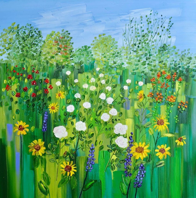
floral wall art for a cottage dining room works best when the subject answers the room rather than simply filling a gap. Summer Border with Roses and Sunflowers offers a useful example because Sheila Fowler gathers roses and sunflowers into one square composition, giving the room colour and abundance within a disciplined outline.
Give floral wall art for a cottage dining room breathing space
A cottage room may already contain timber grain, ceramics and patterned cloth. Count those details before adding another motif. This picture can carry the floral story alone, allowing plain napkins, simple crockery and an unpatterned runner to keep the table calm.
For a compact wall
The 265 mm square print can settle beside a dresser or on a short return. Mark the finished frame before ordering.
For the main sightline
The 500 mm option has more presence beyond the table. Check it from every regular dining chair, not only from the doorway.
Take one colour cue rather than copying the whole palette. A muted green chair cushion or a warm yellow ceramic can create a link. Leave the red and pink notes concentrated in the artwork, where they will keep their impact.
Let the picture provide the garden. The dining room only needs to give it a well-measured place.
Choose a square frame that feels settled beside cottage detail
Square artwork makes uneven mount widths easy to notice. Colour-managed Giclée production helps the flower colours remain distinct, while bespoke framing completed in-house gives the busy subject a precise and dependable edge.
Floral wall art for a cottage dining room should feel generous, not crowded. Summer Border with Roses and Sunflowers supplies the colour, while simple surrounding choices keep shared meals relaxed.
A farewell gift for someone leaving Edinburgh has to acknowledge two things at once: the excitement of a new chapter and the value of the place being left behind. Welcome to Edinburgh by Rob Hain does that with warmth. Its busy city composition focuses on buildings, streets, and people, making it a reminder of lived experience rather than a formal record of one monument.
What makes a farewell gift for someone leaving Edinburgh feel personal?
The most useful starting point is not the recipient’s job title or the distance of the move. Think about how they experienced Edinburgh. Perhaps they studied in the city, built a career there, raised a family, made close friends, or returned to the same streets every weekend. A cityscape can hold several of those associations without asking everyone in a group to agree on one private memory.
Welcome to Edinburgh is especially suitable because Rob Hain treats people as the spirit of a city. The figures bring activity and scale to the architecture. That makes the artwork feel connected to ordinary days, shared outings, and familiar journeys rather than only to Edinburgh’s grand public image.
Use four questions to decide whether the print fits
Does Edinburgh matter to their story? The gift works best when the city represents real time and relationships, not just a recent visit.
Will they have a place to display it? A framed print is practical for a new home, office, or study, but the finished scale should match the likely wall.
Do they enjoy lively detail? The busy scene suits someone who likes discovering small figures, buildings, and visual stories over time.
Can the group add context? A card signed with specific memories makes the reason for choosing the image clear.
These questions help distinguish a meaningful leaving present from a last-minute city-branded object. The artwork can stand on its own, while the written message records the relationships behind it.
A group gift that still feels individual
Colleagues, neighbours, or friends often need one present that represents several people. Artwork is useful because contributors do not need to choose clothing sizes, hobbies, or practical equipment for the recipient’s next stage. The city itself becomes the shared reference.
Keep signatures and messages on a separate card rather than writing on the print or mount. This protects the presentation and lets the recipient display the picture in any room. If a longer collection of memories matters, place them in a small book or envelope to accompany the framed piece.
Help the artwork settle into the next home
A detailed city scene can bring energy to a simple interior. In a living room, it can give a quiet wall a strong conversation point. In a home office, it can sit behind or beside the desk as a reminder of the city. In a hallway, it can make the route into a new home feel more personal from the start.
Allow breathing room around the frame, particularly if the new space already has bookshelves, photographs, or patterned textiles. Pick one or two colours from the image to connect with nearby objects rather than trying to match the entire palette. A well-proportioned mount can also give the lively composition a calmer boundary.
Craftsmanship for a gift intended to last
First 4 Frames uses colour-managed Giclée production and completes bespoke framing in-house in Falkirk. That careful process preserves the many small shifts of colour and detail that give the scene its character. It also means the frame can be chosen as part of the gift, with a finish suited to the recipient rather than a generic ready-made presentation.
The right farewell gift for someone leaving Edinburgh should carry recognition without becoming sentimental clutter. View the framed Welcome to Edinburgh print for a colourful reminder of the streets, buildings, and shared city life that can travel into the recipient’s next chapter.