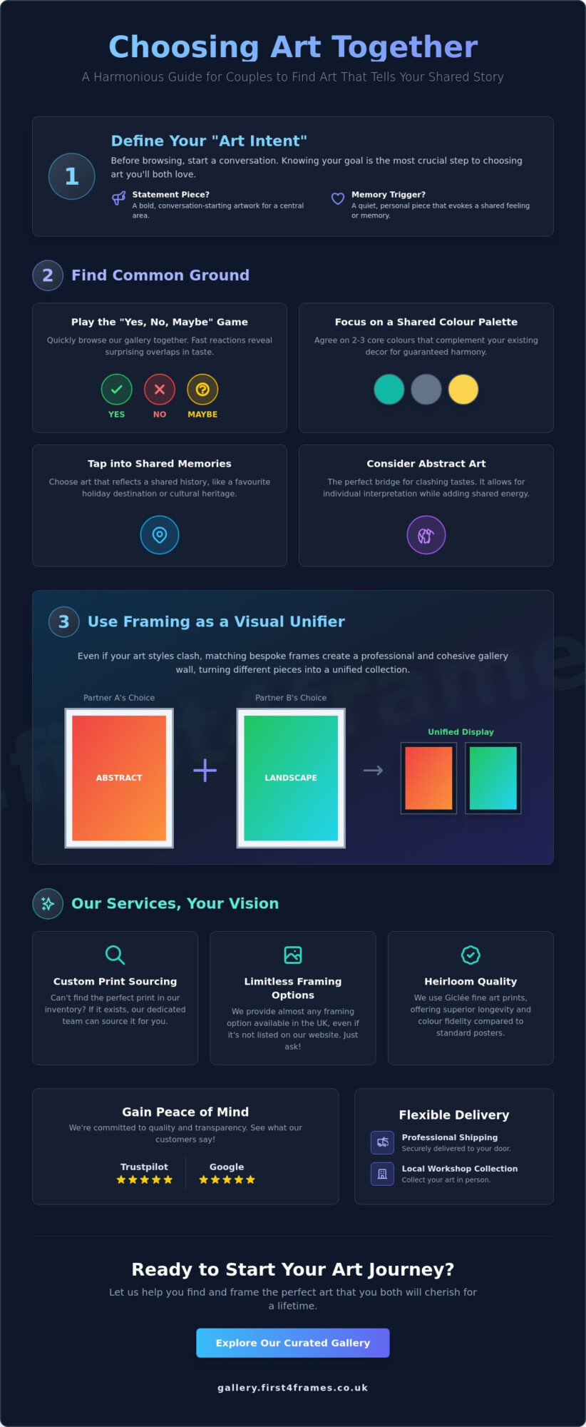
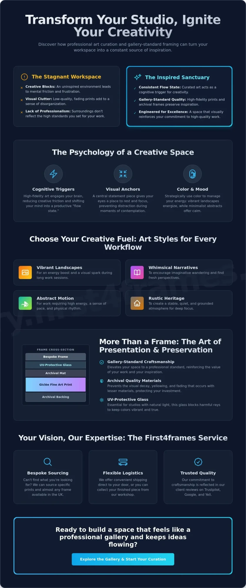
What if the cure for your next creative block isn’t a new set of tools, but the very walls you’re staring at? Finding the right art that inspires creativity in a studio is about more than just filling empty space; it’s about engineering an environment that triggers a consistent flow state. You’ve likely felt the frustration of a stagnant workspace where low-quality, fading prints only add to the sense of clutter rather than clarity. It’s difficult to feel like a professional when your surroundings don’t reflect that same high standard of excellence you bring to your own work.
We believe your creative sanctuary deserves better than off-the-shelf solutions that lack soul. This guide will show you how to transform your studio into a wellspring of inspiration using professional art curation and gallery-standard framing. You’ll learn how to select pieces that resonate with your aesthetic and how bespoke craftsmanship preserves those images for a lifetime. From sourcing rare prints to choosing the perfect frame, we’ll walk through the steps to build a space that feels like a professional gallery and keeps your ideas flowing.
Key Takeaways
- Understand how specific visual triggers and color theory can effectively reduce creative friction in your daily workspace.
- Explore diverse art styles, from vibrant Scottish landscapes to whimsical narratives, that serve as energetic anchors for your studio.
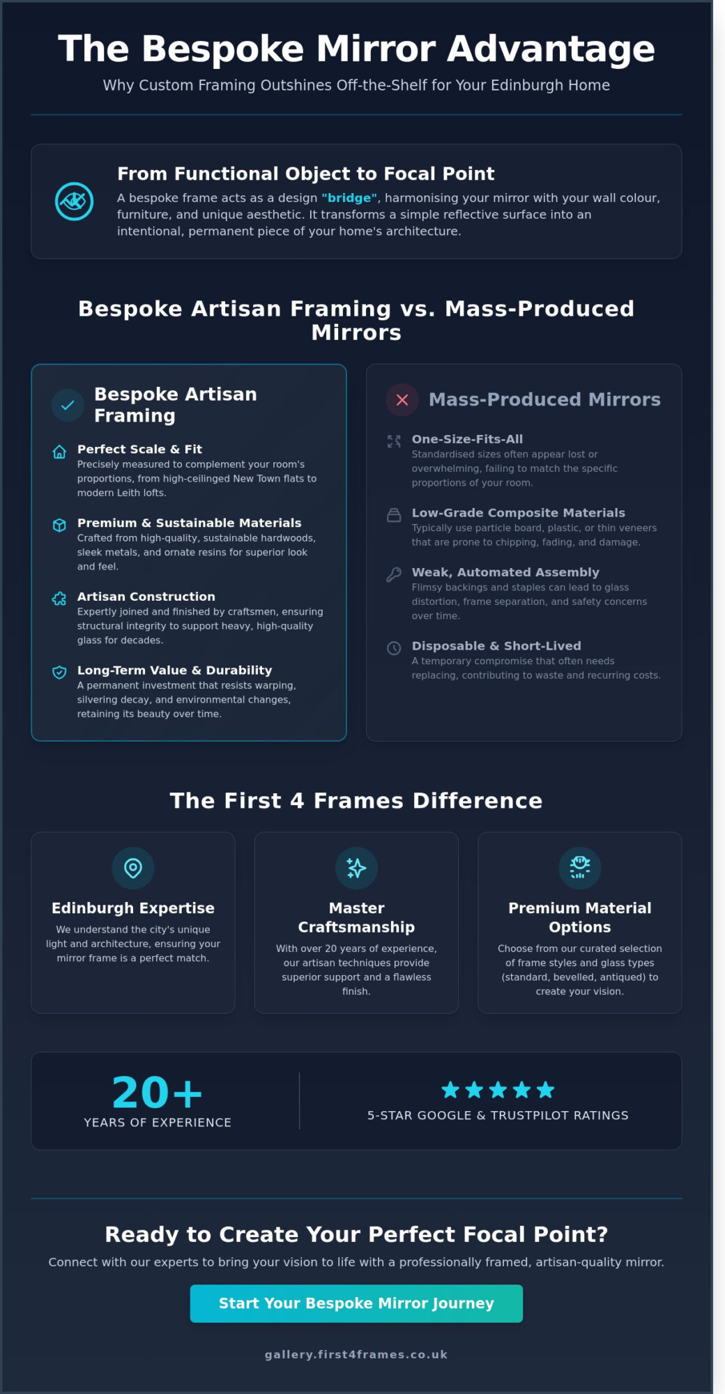
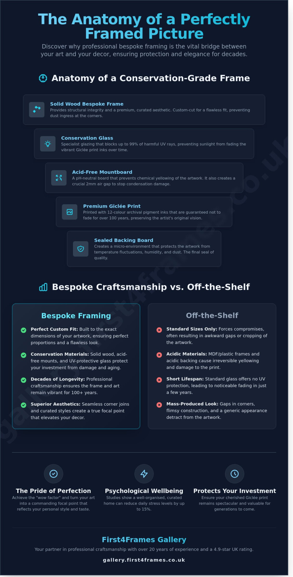
- Learn why gallery-standard framing acts as a vital “window” that focuses your vision and protects your investment with UV-protective glass.
- Discover how to curate art that inspires creativity in a studio to consistently induce a productive flow state and eliminate stagnant environments.
- Find out how to access comprehensive sourcing and shipping services to bring professional-grade craftsmanship directly to your creative sanctuary.
The Psychology of Art That Inspires Creativity in a Studio
Surrounding yourself with high-fidelity art isn’t just about decoration; it’s about reducing creative friction. When you look at art that inspires creativity in a studio, your brain isn’t just seeing colors. It’s engaging with a cognitive trigger. This engagement helps shift your mind into a flow state, where the distance between an idea and its execution disappears. Our psychological understanding of creativity suggests that environmental stimuli play a massive role in how we solve problems and generate new concepts.
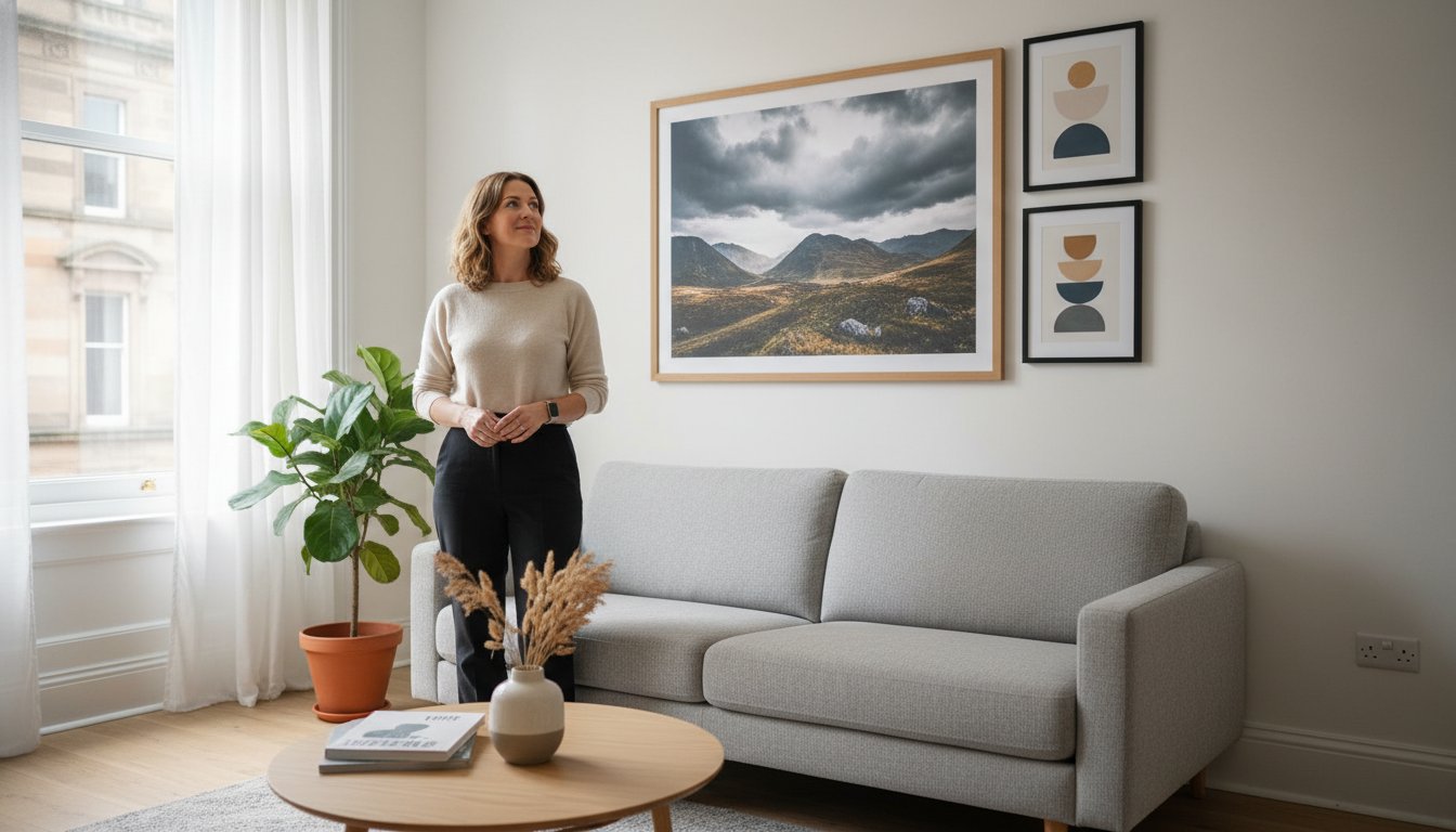
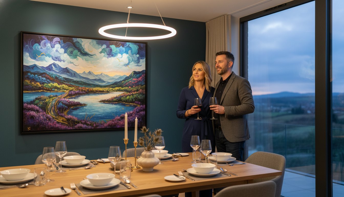
The choice of color and style is equally vital to your mental energy. A vibrant landscape can provide a needed jolt of energy during a morning slump, while a minimalist abstract piece offers a sense of calm when a project becomes overwhelming. Unlike mass-produced posters that often feel hollow, a bespoke framed print from First4Frames Gallery carries a weight of intentionality. It signals to your subconscious that this space is dedicated to serious, high-standard work, mirroring the professional environment of a gallery.
To better understand how a workspace layout influences your output, watch this helpful video on studio setup:

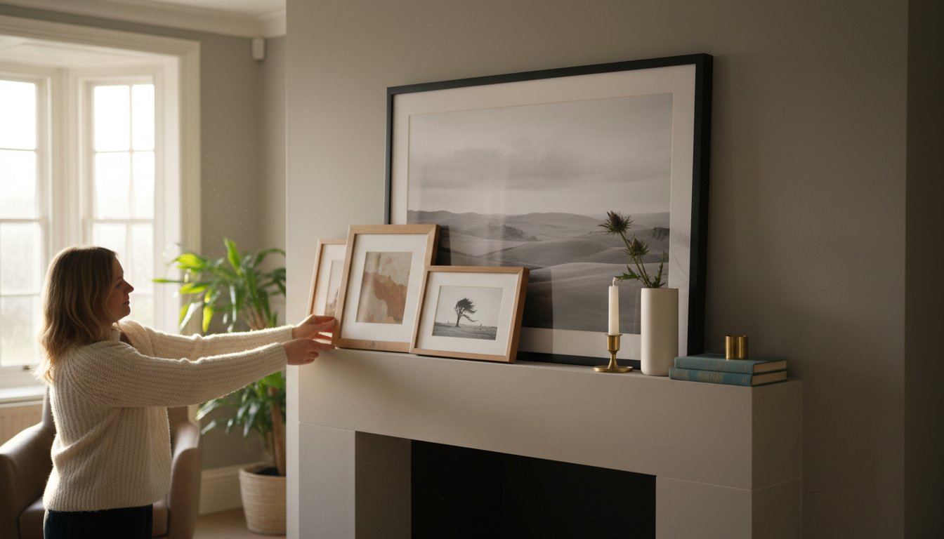
Visual Anchors and Creative Focus
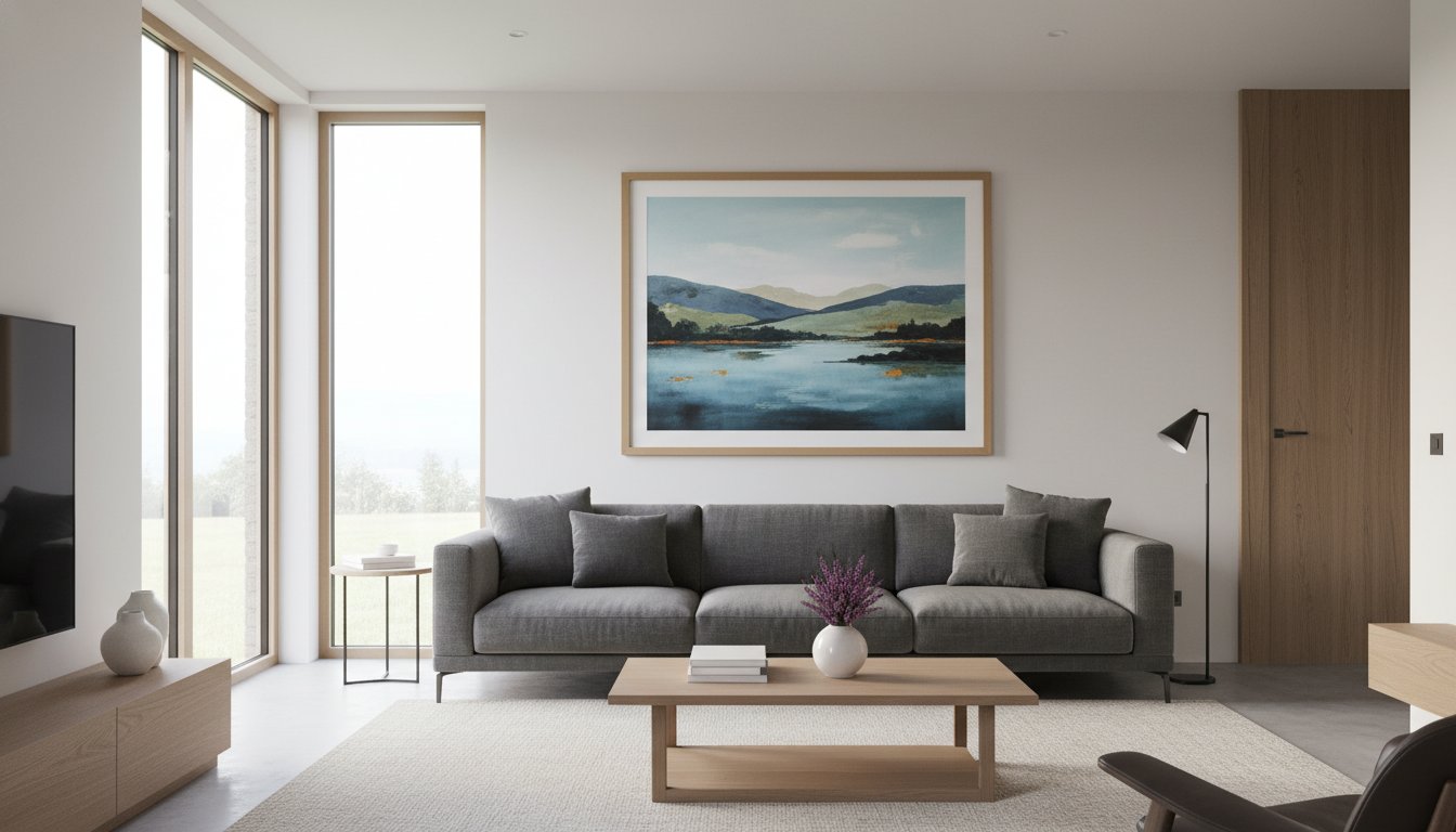
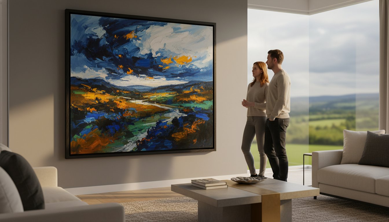
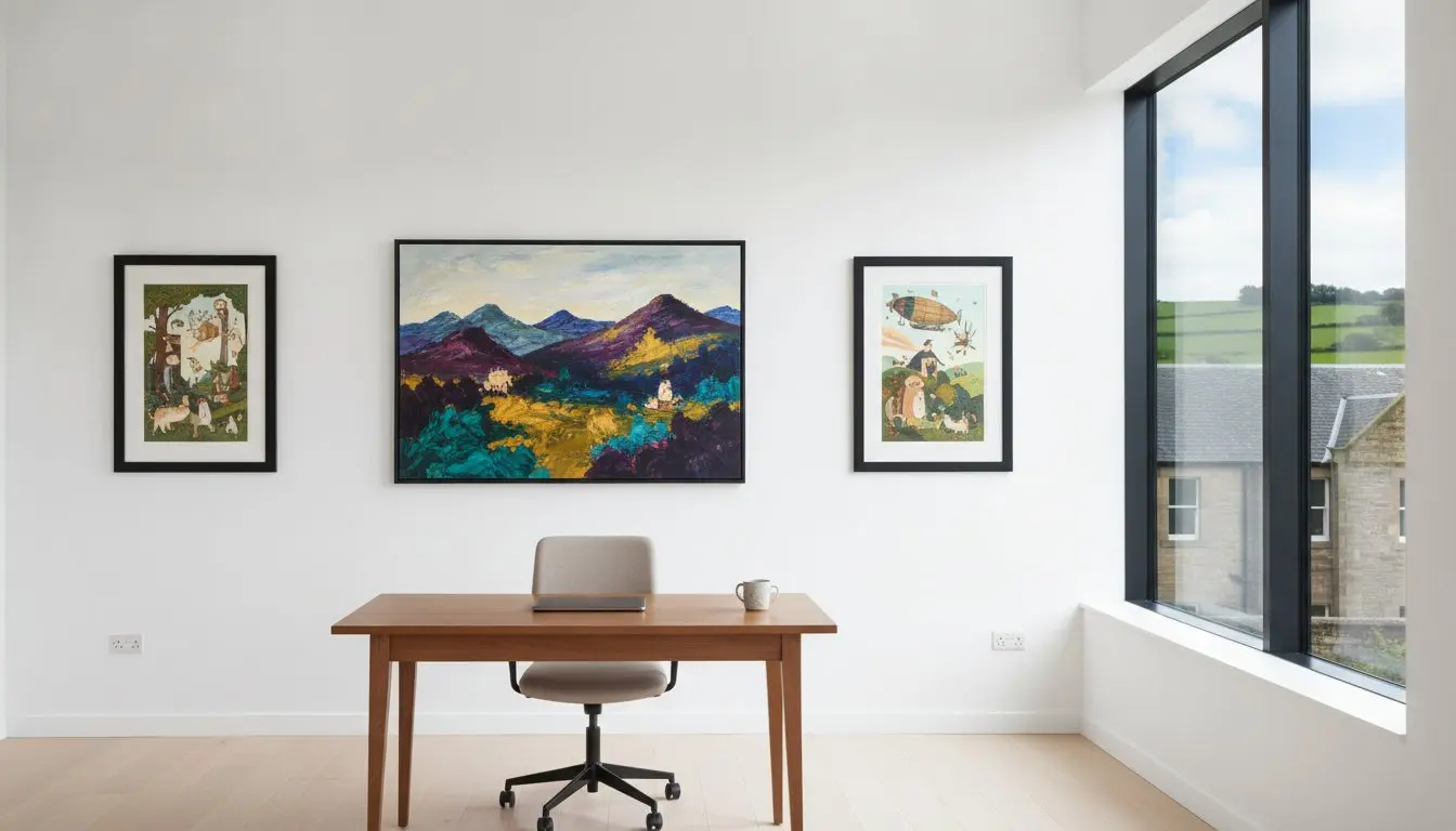
A central statement piece acts as a visual anchor for your thoughts. When you step back from your work to think, your eyes need a place to rest that doesn’t lead to distraction. High-fidelity Giclée fine art prints provide the visual clarity required to keep your mind sharp. Because these prints capture every brushstroke and subtle hue, they offer a depth that invites repeated contemplation. This level of detail ensures that your art that inspires creativity in a studio remains a fresh source of ideas rather than fading into the background.
The Importance of Material Quality
The tactile quality of a professional frame is a silent partner in your creative process. It reflects the same level of craftsmanship you strive for in your own output. Archival quality materials are essential because they prevent the visual decay that occurs when art is exposed to the bright, natural light found in many productive workspaces. Choosing gallery-standard materials from First4Frames Gallery ensures your inspiration remains as vivid and impactful as the day you first hung it on your wall.
Examples of Art Styles That Fuel the Creative Process
Choosing the right visual energy is essential for maintaining momentum. Scientific research into The Psychology of Art and Creativity indicates that specific aesthetic qualities can profoundly impact our cognitive flexibility and mood. For instance, the bold, saturated colors found in Jolomo’s vibrant landscapes can energize a dim studio corner, acting as a visual spark during long work sessions. These pieces don’t just sit on the wall; they radiate a warmth that can push back against the fatigue of a demanding project.
Scottish Contemporary Art as a Studio Staple
Scottish artists bring a unique blend of ruggedness and sophistication. This makes them an ideal choice for UK based creatives looking for art that inspires creativity in a studio without resorting to generic, mass-produced decor. You can explore many of these evocative styles in our Scottish art gallery at First4Frames Gallery to find a piece that speaks directly to your specific workflow and professional aesthetic.
Sourcing the Perfect Print
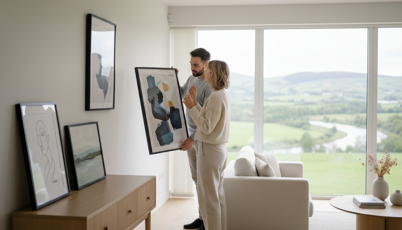
Selecting the right piece involves balancing detailed fine art with bold, simple compositions. While we maintain a curated selection online, the team at First4Frames Gallery can source specific prints for you even if they aren’t currently featured on our website. Whether you need a specific narrative piece or a rare landscape, we act as your dedicated partner in curation. Once you’ve selected your art that inspires creativity in a studio, we provide flexible logistics, including secure UK wide shipping or local collection from our Falkirk workshop. This ensures your journey from inspiration to a finished, framed masterpiece is entirely seamless.

The Role of Bespoke Framing in Studio Motivation
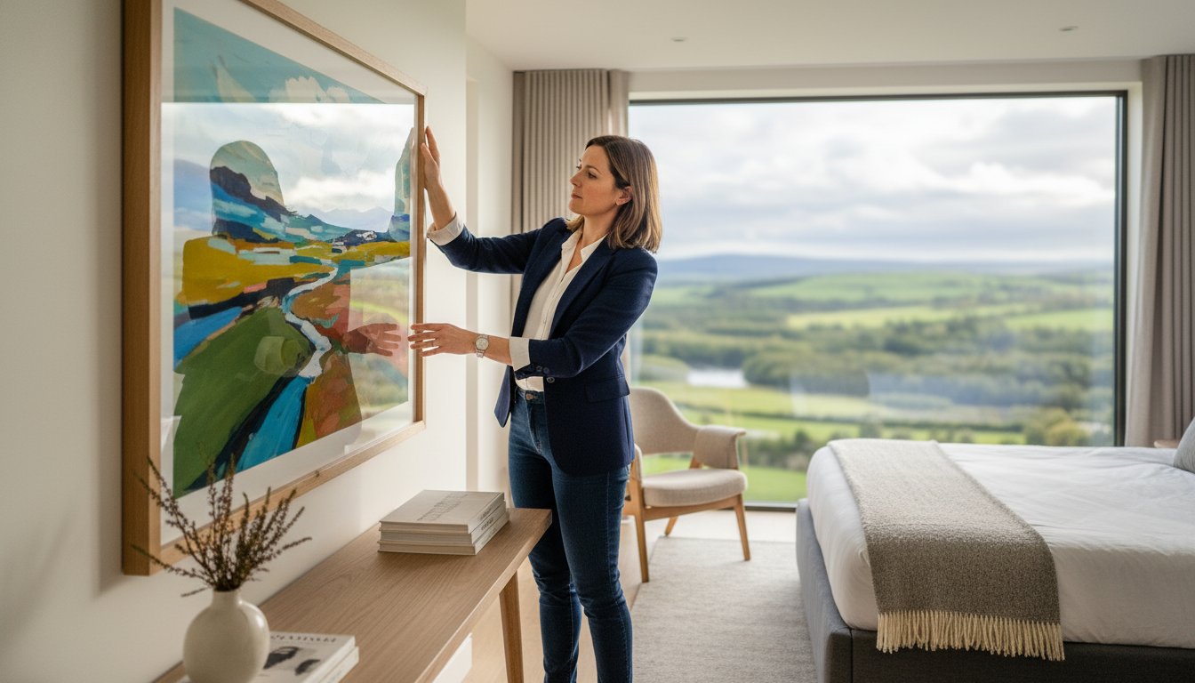
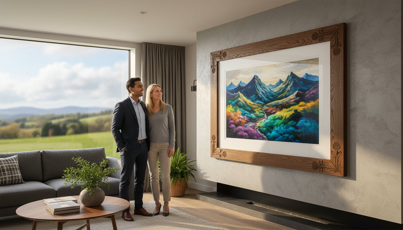
A frame is far more than a simple border. It functions as a visual window, focusing your eyes on the work and stripping away the distractions of the room. When you install art that inspires creativity in a studio, the presentation dictates how you interact with that inspiration. A flimsy, mass-produced frame can undermine a masterpiece; conversely, gallery-standard craftsmanship elevates even simple sketches. Seeing professional-grade framing every day reinforces your identity as a serious practitioner, signaling to your brain that your environment is a place of high standards and intentional work.
Protection is another practical necessity for any active creator. Creative studios often benefit from large windows and natural light, but UV rays cause visual decay over time. At First4Frames Gallery, we use UV-protective glass to ensure your investment doesn’t fade or lose its fidelity. You can also customize every detail to match your workspace, whether that’s natural wood to complement rustic furniture or sleek black for a modern digital suite. This level of personalization ensures your environment feels cohesive and reflects the same pride you take in your own craftsmanship.
Bespoke vs. Off-the-Shelf Frames
Standard shop-bought frames often lack the structural integrity required for long-term display. They frequently use acidic materials that can damage your prints over time. Choosing bespoke options from First4Frames Gallery allows for a perfect fit and superior longevity. If you’re unsure about dimensions, our guide on Standard Photo & Picture Sizes explains why custom work is often necessary to achieve that professional, gallery-standard look.
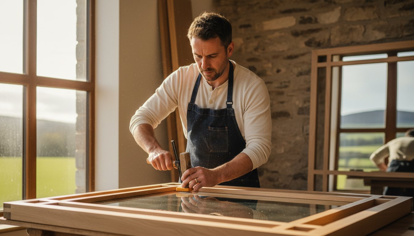
First4Frames Gallery Bespoke Capabilities
Our Falkirk workshop is the heart of our traditional craftsmanship. We take pride in being a comprehensive solution for UK creatives. If you don’t see a specific style online, don’t worry. We can source almost any frame available in the UK to meet your specific aesthetic needs. This flexibility ensures your art that inspires creativity in a studio is housed in a frame as unique as your work. We encourage you to check our reviews on Trustpilot, Google, and Yell to see the high standards we maintain for every artisan and professional we serve.
Ready to elevate your workspace? Browse our collection of ready-to-hang framed art and see the difference professional craftsmanship makes.
Curating Your Studio: Logistics and Sourcing with First4Frames
Transforming your workspace into a professional gallery shouldn’t be a logistical headache. While finding the perfect art that inspires creativity in a studio is a vital first step, the final execution is what truly defines the space. We provide a seamless path from selection to installation, ensuring your chosen pieces arrive ready to hang and inspire. Whether you’re outfitting a home office or a large commercial workspace, we offer the flexibility of secure UK wide shipping or local collection from our Falkirk workshop.
Building a creative sanctuary requires a partner you can trust. We take immense pride in our craftsmanship and encourage you to explore our reputation on platforms like Google, Yell, and Trustpilot. Our commitment goes beyond what you see on our website. If you’re searching for a specific print or a bespoke frame that isn’t currently listed, our team has the industry connections to source almost any frame or artwork available in the UK. This personalized consultation ensures your art that inspires creativity in a studio is exactly what you envisioned.
From Digital to Physical
Sometimes the best inspiration comes from your own portfolio. Our online photo printing and framing service allows you to turn your digital creations into physical masterpieces. By selecting Giclée fine art prints and professional framing for your own work, you create a feedback loop of excellence within your studio. This process bridges the gap between your digital files and a tangible, gallery standard environment that honors your creative output.
Contacting the Experts
As a family run Scottish business, we’re deeply dedicated to the fine art community. We understand that every studio has unique requirements, from specific lighting conditions to unconventional wall spaces. If you’re planning a custom project or need expert advice on curation, please reach out via our contact page. We’re here to act as your knowledgeable artisan partner, helping you build an environment where your best work can flourish.
Elevate Your Workspace Today
Your studio is the engine room of your imagination. We’ve explored how high-fidelity Giclée prints and bespoke framing work together to eliminate creative friction and protect your vision from visual decay. Choosing art that inspires creativity in a studio is an investment in your daily flow state. It sets a professional standard that mirrors the quality of your own work. Our team is ready to help you source rare prints and custom frames from across the UK, ensuring every piece is a perfect fit for your aesthetic.
We’re proud to be a trusted partner for creatives. This reputation is backed by our highly rated reviews on Trustpilot, Google, and Yell. Whether you need a specific Scottish landscape or a custom-built frame from our Falkirk workshop, we provide the craftsmanship and logistical flexibility you deserve. It’s time to stop settling for mass-produced decor. Start building a space that truly fuels your process.
Browse our curated gallery of Scottish art and bespoke frames and take the first step toward a more inspired workspace. We’re excited to help you transform your environment.
Frequently Asked Questions
What type of art is best for a creative studio?
The most effective art for a creative workspace is work that aligns with your desired mental state, such as energetic landscapes for motivation or calming abstracts for deep focus. Selecting art that inspires creativity in a studio often involves choosing high-fidelity pieces like Giclée prints. These professional-standard reproductions invite closer inspection and keep the mind engaged during long work sessions, helping to maintain a consistent flow state.
How do I choose the right frame colour for my studio walls?
You should choose a frame colour that either complements your existing studio furniture or provides a clean contrast to your wall paint. Natural wood tones work beautifully in rustic, traditional spaces, while sleek black or white frames suit modern digital environments. If you can’t find the perfect match online, we can source almost any frame available in the UK to ensure your choice fits your professional aesthetic perfectly.
Can I get a custom frame if I have a non-standard print size?
Yes, we specialize in bespoke framing for any non-standard print size through our dedicated workshop in Falkirk. Unlike high-street ready-made frames, our custom service ensures your artwork is perfectly centered and protected with archival-quality materials. This tailored approach is essential for preserving unique creative works that don’t fit into traditional UK paper sizes, providing a professional finish that off-the-shelf options simply cannot match.
Why are Giclée prints better for artists than standard digital prints?
Giclée prints are superior because they use archival-quality inks and acid-free papers that offer significantly better colour fidelity and longevity than standard digital prints. For those looking for art that inspires creativity in a studio, Giclée ensures the piece won’t fade or lose its impact when exposed to natural light. This professional standard is why galleries and serious collectors prefer Giclée for fine art reproduction and long-term display.
Does First4Frames offer bulk framing for commercial studios or galleries?
We provide comprehensive commercial artwork curation and bulk framing services for galleries, commercial studios, and office spaces across the UK. Our team handles the entire process from sourcing specific prints to delivering ready-to-hang pieces via our flexible shipping and workshop collection options. We encourage commercial clients to check our reviews on Trustpilot, Google, and Yell to see our track record of delivering high-standard craftsmanship for large scale projects.