
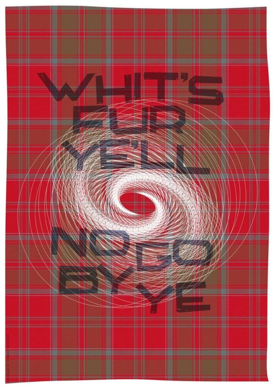
choose your frame online with more confidence when you judge the words from across the room, compare tonal separation and measure the complete framed outline. Whit’s Fur Ye’ll No Go By Ye gives the decision a real subject, format and finished product.
Choose your frame online by protecting the lettering
Read it from the doorway
Typography must stay clear where people first meet it. View the product at several screen sizes, then step back. The frame should define the edge without taking attention from the phrase.
Compare contrast
A pale frame can create breathing room. A darker direction may add a firmer graphic boundary. Compare both against the artwork and wall instead of repeating every tone.
The print comes in 420 × 594 mm and 594 × 840 mm image sizes. Mark the image first. Add a realistic allowance for mount and moulding, so the completed frame does not surprise you on the wall.
- Pick the normal reading distance.
- Mark the full proposed outline.
- Compare a quiet and a stronger border.
- Check that letter edges stay crisp.
- Remove nearby signs that compete.
The useful frame helps the words arrive before the border is noticed.
Choose your frame online, then check the real wall
Online comparison narrows the direction, but the room decides the final balance. First 4 Frames produces the Giclée print in a colour-managed workflow and completes the framing in-house. That hand-finished process gives large typography a clean edge.
For background on Scots language, writing and current use, visit the Scots Language Centre. Browse the Stewart Bremner collection, or compare the exact product, sizes and framing choices.
When you choose your frame online, treat the phrase as the focal point and the frame as support. Careful contrast and full-size measuring let the humour and meaning hold the wall without extra slogan décor.