Posted on

Glasgow Wall Art for an Industrial Office: Frame the Finnieston Crane

The Finnieston Crane stands by the river amidst modern curved buildings and a city skyline, with a dramatic sky of swirling blue and white patterns enhancing this striking, artistic scene.

Glasgow wall art for an industrial office should do more than fill a convenient gap. Finnieston Crane offers a specific starting point because Esther Cohen places the landmark beside the River Clyde and modern curved buildings, connecting Glasgow’s industrial history with its changing contemporary skyline.

Glasgow wall art for an industrial office - Finnieston Crane

Use Glasgow wall art for an industrial office where people meet

Choose a wall that clients and staff can see without placing the picture behind a bright monitor. A meeting room, reception seating area or project library gives the landmark context and time to be noticed. A back corridor may waste both its local identity and its strong structure.

Industrial memory

The crane speaks to shipbuilding, heavy lifting and the working Clyde without requiring a wall of historic photographs.

Contemporary place

Modern buildings stop the subject feeling like a purely nostalgic office display.

Test the full framed outline against meeting tables, acoustic panels and video-call views. Keep safety information and corporate graphics on their operational walls. One framed landmark can communicate location more confidently than repeated logos.

Should the frame copy exposed steel?

Not automatically. Compare restrained painted, timber and metal-effect samples against the artwork and actual interior. A literal industrial match can make the room feel staged.

Check daylight from office glazing and evening ceiling lights separately. A persistent reflection across the crane weakens the very line and detail chosen for the space.

Specify Glasgow wall art for an industrial office carefully

The crane, river atmosphere and modern architecture require accurate line and colour relationships. Colour-managed Giclée printing keeps them distinct, while bespoke in-house framing can coordinate with workplace finishes without reducing the image to corporate décor.

For historical context on the landmark and its role on the Clyde, read this history of the Finnieston Crane. You can also browse the Esther Cohen collection and inspect the exact product and framing options.

Glasgow wall art for an industrial office can communicate both heritage and forward movement. Finnieston Crane gives engineering, property and design teams a recognisable local subject, while measured presentation keeps the message professional.
Posted on

Botanical Wall Art for Woven Blinds: Keep the Texture Balanced

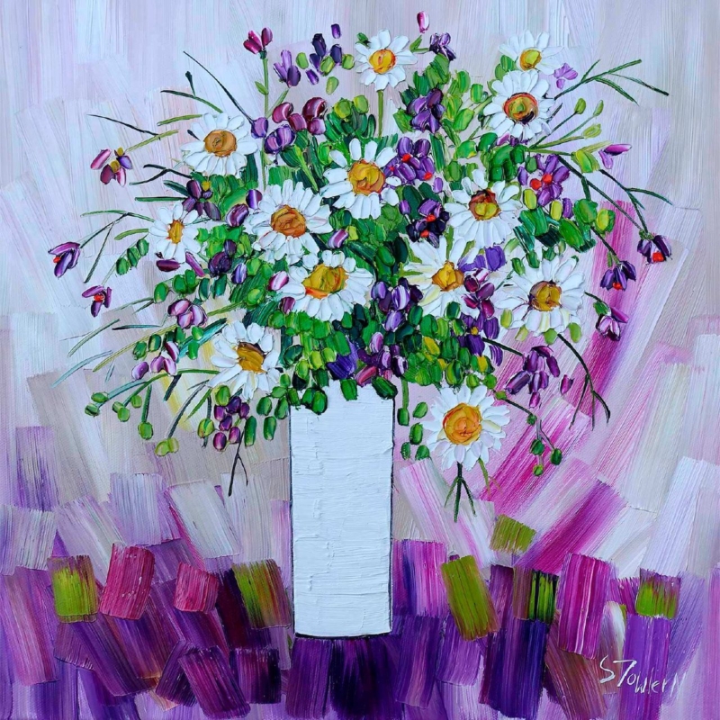
Image of Daisies and Campanula by Sheila Fowler

botanical wall art for woven blinds should do more than fill a convenient gap. Daisies and Campanula offers a specific starting point because Sheila Fowler’s square flower study introduces garden colour while the frame can provide a cleaner geometric counterpoint to soft, irregular woven fibre.

botanical wall art for woven blinds - Daisies and Campanula

Balance botanical wall art for woven blinds with daylight

Woven blinds filter light, but they do not make every nearby wall safe from direct sun. Watch the intended position through the day. A return wall beside the window often receives useful ambient brightness without a sharp moving beam crossing the print.

  • Use the 265 mm square print for a compact breakfast corner or narrow wall beside the window.
  • Test the 500 mm square option above a sideboard or between two windows.
  • Include mount and moulding when marking the final outline.
  • Lower the blind at different heights to check shadows and reflected light.

The blind already provides a strong natural texture. Let the artwork add flower form and colour, then keep cushions, table linen and ceramics simpler. Repeating daisies across every fabric would flatten the distinction between a painted focal point and ordinary pattern.

Connect without matching

A timber or quiet painted frame can relate to the blind. It does not need to copy the exact fibre tone, which changes as the daylight moves.

Judge the picture with the blind both open and lowered. The square should remain a deliberate focal point when the outdoor view disappears in the evening.

Frame botanical wall art for woven blinds with clarity

Petals, foliage and expressive painted texture need clear colour separation. Colour-managed Giclée output preserves those distinctions. Precise square mounting and hand-finished framing give the softer window material a useful architectural counterpart.

For botanical context on one of the flowers in the painting, visit the Royal Horticultural Society’s campanula guide. You can also browse the Sheila Fowler collection and inspect the exact product and framing options.

Botanical wall art for woven blinds should enrich natural texture rather than multiply it everywhere. Daisies and Campanula adds a defined square of colour, while restrained fabrics and tested daylight keep the room fresh.

Posted on

Railway Wall Art for a Hobby Room: Caledonian Railway No 419

A detailed illustration of Caledonian Railway No 419 Built 1907 at St Rollox, a vintage blue steam locomotive with black and red accents labeled C & R, shown on railway tracks against a white background.

railway wall art for a hobby room should do more than fill a convenient gap. Caledonian Railway No 419 Built 1907 at St Rollox offers a specific starting point because Rod Harrison identifies a real locomotive built at St Rollox in 1907, giving an enthusiast a subject with engineering and regional history rather than generic steam nostalgia.

railway wall art for a hobby room - Caledonian Railway No 419 Built 1907 at St Rollox

Place railway wall art for a hobby room above a calm zone

A workbench wall usually carries tools, plans and active projects. Place the framed print above a low cabinet, reading chair or completed-model display instead. That separation protects the glazing from knocks and lets the locomotive remain readable rather than becoming another item in visual storage.

Room pressurePractical response
Small detailed modelsKeep one clear strip of wall around the picture.
Task lightingAngle lamps onto the bench, then check reflections in the glazing.
Reference booksLet the framed work sit above closed storage or an edited shelf.
Dust and toolsAvoid the active cutting, sanding or paint zone.

The exact locomotive matters. A collector may value its Caledonian Railway connection, St Rollox origin or relationship to preserved railway history. Confirm that interest rather than assuming every railway enthusiast wants the same engine.

Keep the history visible

A small label on the cabinet can record the name and 1907 build date if useful. Avoid surrounding the print with reproduction station signs that dilute the specific subject.

Finish railway wall art for a hobby room precisely

Locomotive illustration depends on clean line, controlled tone and readable engineering detail. Colour-managed Giclée production supports that precision. Bespoke in-house framing then creates a stable boundary between the artwork and an equipment-rich room.

For background on the locomotive class and the preserved No 419, read this history of the Caledonian Railway 439 Class. You can also browse the Rod Harrison collection and inspect the exact product and framing options.

Railway wall art for a hobby room works best when it respects the enthusiast’s knowledge and the room’s practical purpose. Caledonian Railway No 419 supplies an exact historic subject while careful placement protects concentration and display space.

Posted on

Anniversary Wall Art Without Names or Dates: Don’t Go Breaking My Heart

Image of Don't Go Breaking My Heart by David Short

anniversary wall art should do more than fill a convenient gap. Don’t Go Breaking My Heart offers a specific starting point because David Short’s playful title leaves room for a couple’s own memory, music reference or private joke instead of prescribing a standard romantic message.

anniversary wall art - Don't Go Breaking My Heart

Make anniversary wall art personal before it is decorative

Ask why this title belongs to the couple. It may recall a song, a first home or simply a shared sense of humour. If there is no genuine association, choose another work. Meaning grows from recognition; it cannot be created by labelling any colourful print an anniversary present.

265 mm square

Suitable for a close-view corner, compact shelf wall or smaller home where a broad statement would overwhelm.

500 mm square

A flexible focal size above a cabinet or between two pieces of furniture.

800 mm square

A room anchor that should be checked from the complete framed outline and normal viewing distance.

Do not guess the couple’s décor from a social photograph. Ask about the available wall, note nearby furniture width and offer a frame consultation if possible. The gift should fit their life rather than require a room redesign.

  1. Confirm the title has a positive shared meaning.
  2. Measure the intended wall and furniture below it.
  3. Choose the print size before selecting a frame.
  4. Add a private note explaining the connection.

Give anniversary wall art a lasting finish

A contemporary square composition needs accurate colour and disciplined geometry. Colour-managed Giclée production keeps David Short’s relationships clear, while hand-finished bespoke framing turns the chosen size into a complete, ready-to-hang gift.

For a useful explanation of how non-literal art can communicate through form and colour, see Tate’s introduction to abstract art. You can also browse the David Short collection and inspect the exact product and framing options.

Anniversary wall art does not need names, dates or stock romantic text. Don’t Go Breaking My Heart can hold a couple’s own association, while thoughtful sizing and in-house craftsmanship make the gesture useful at home.

Posted on

A Barn Owl Bronze Gift for a Woodland Anniversary

The Barn Owl with Hawthorne figurine features a detailed owl perched on a tree stump with green leaves and red berries, set against a white background.

barn owl bronze gift should do more than fill a convenient gap. Barn Owl with Hawthorne offers a specific starting point because Keith Sherwin’s solid foundry bronze combines a poised bird with hawthorn leaves and berries, giving the gift both a wildlife story and carefully finished detail.

barn owl bronze gift - Barn Owl with Hawthorne

Choose a barn owl bronze gift from a real connection

Begin with the person rather than the anniversary number. Perhaps the couple hears barn owls near home, walks in hawthorn country or has a long-standing interest in birds. That shared link makes the sculpture meaningful without engraved dates or generic romantic wording.

Check the object before choosing

  • Height: 13.5 cm; width: 11.5 cm; depth: 6 cm.
  • Weight: 950 g.
  • Solid foundry bronze made by lost-wax casting.
  • Hawthorn leaves and berries delicately hand-painted with artists’ oils.
  • Limited edition of 150 with a matching signed certificate.
  • Presented in a printed box.

Plan the display position before wrapping it. A stable shelf, glazed cabinet or broad mantel gives the 950 g bronze secure support and enough light to reveal the owl and foliage. Avoid a narrow ledge, a shelf struck by doors, or a crowded group of woodland ornaments.

What should the gift note explain?

Mention the place, sighting or shared memory that led to the owl. A short personal explanation adds more value than a list of technical claims.

Understand the craft in a barn owl bronze gift

Lost-wax casting creates the solid bronze form. Acids and heat develop its rich brown patina, protective wax seals the surface, and hand-painted hawthorn adds controlled colour. The engraved signature and edition number correspond with the certificate.

To learn more about the animal and its habitat, visit the Barn Owl Trust’s species facts. You can also browse the Richard Cooper Bronze collection and inspect the exact product and framing options.

A barn owl bronze gift becomes an anniversary keepsake through personal relevance, not sentiment added afterwards. Barn Owl with Hawthorne brings a clear species, traceable edition and detailed foundry craft to that story.

Posted on

Scottish Typography Wall Art for a Kitchen: Use One Phrase Well

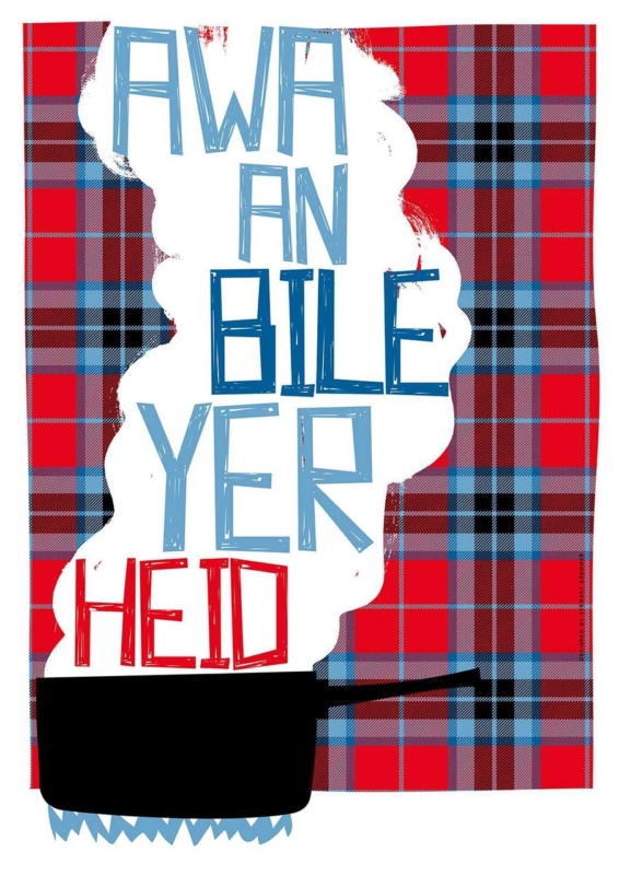
Image of Awa An Bile Yer Heid by Stewart Bremner

Scottish typography wall art for a kitchen should do more than fill a convenient gap. Awa An Bile Yer Heid offers a specific starting point because Stewart Bremner’s bold Scots phrase brings humour and regional character to the place where family and friends naturally talk.

Scottish typography wall art for a kitchen - Awa An Bile Yer Heid

Plan Scottish typography wall art for a kitchen sightline

Choose the wall from the conversation, not from an empty-space photograph. The phrase should be readable from the table, breakfast bar or main entrance without sitting behind steam, grease or an opening cupboard door. A dry dining-side wall is more practical than the splashback area.

Print optionUseful test
420 × 594 mmTemplate it above a compact bench or on a wall return near the table.
594 × 840 mmCheck the complete framed outline against a broad dining wall and pendant lights.
Both sizesRead the phrase from seated and standing positions before ordering.

The wording already supplies the personality. Avoid adding several more sayings, tartan plaques or novelty utensils around it. One painted cabinet colour or timber frame can connect the picture to the room while leaving enough quiet wall for the letters to register.

One well-placed phrase can become part of family conversation; a wall full of phrases becomes background noise.

Frame Scottish typography wall art for a kitchen cleanly

Graphic lettering exposes weak alignment and uneven borders quickly. Colour-managed Giclée printing keeps the design crisp, while accurate mounting and bespoke in-house framing give the portrait format a confident edge away from food preparation zones.

For language context behind the wording, read this introduction to the Scots language. You can also browse the Stewart Bremner collection and inspect the exact product and framing options.

Scottish typography wall art for a kitchen feels most personal when the phrase suits the household and the placement supports daily use. Awa An Bile Yer Heid can prompt a smile without turning a practical room into a novelty display.

Posted on

Contemporary Framed Art Prints for a Dressing Room: Scarlet Kimono

A person with dark curly hair stands with arms outstretched, seen from behind, wearing the Scarlet Kimono adorned with gold and white birds, flowers, and swirling patterns against a dark background.

contemporary framed art prints works best when the picture answers a practical question about the room. Scarlet Kimono is useful because Stephanie Rew’s figure emerges through strong light and shadow while the scarlet garment creates one concentrated moment of colour.

contemporary framed art prints - Scarlet Kimono

Place contemporary framed art prints beyond the mirror

A mirror wall can double glare and fragment the figure. A solid wall beside the dressing table or opposite closed storage gives the work a calmer field. Stand at the mirror, doorway and usual dressing position to check reflected lamps.

Let one red note lead

Use scarlet once in a stool, tray or textile. Repeating it across boxes, curtains and flowers would weaken the garment’s impact.

  1. Mark the complete frame, including mount and moulding.
  2. Open wardrobe doors and drawers to test clearance.
  3. Switch on task and ambient lights separately.
  4. Remove temporary accessories before judging the wall.

Avoid perfume advertisements, mannequin ornaments and several costume prints. One figurative piece can give the daily routine ceremony while the room remains functional.

Preserve depth in contemporary framed art prints

The chiaroscuro influence depends on subtle dark transitions as much as vivid scarlet. Colour-managed Giclée production keeps that depth legible, while bespoke framing provides a clean edge against mirrors.

For useful context, visit the V&A’s introduction to kimono history and design. Browse the Stephanie Rew collection, or inspect the exact product and framing choices.

Contemporary framed art prints can make a dressing room feel considered without physical clutter. Scarlet Kimono supplies pattern, figure and atmosphere; disciplined placement gives each room to register.

Posted on

Office Wall Art With Local Engineering: Forth Bridges

The Forth Bridges artwork depicts the iconic bridge at sunset, with swirling pink, blue, and purple skies reflected on the water and the structure glowing in warm orange and red tones.

office wall art works best when the picture answers a practical question about the room. Forth Bridges is useful because Lee Scammacca’s design-led image combines an iconic structure with sunset colour, linking technical achievement to a warmer sense of place.

office wall art - Forth Bridges

Use office wall art where discussion happens

A meeting room gives the subject more purpose than a forgotten corridor. Position it behind participants or opposite the main seats, then test video-call framing and projector sightlines. The bridge should be recognisable without sitting directly behind a bright screen.

Signal place

The landmark communicates a Scottish base without a large printed location statement.

Signal practice

Line and span suit technical teams, while sunset keeps the room from feeling clinical.

Keep safety notices and branding on a separate operational wall. One repeated sunset tone and a defined frame allow the work to carry identity with confidence.

Specify office wall art as part of the interior

Architectural lines and graduated sunset colour need accurate reproduction. Colour-managed Giclée output maintains both, while bespoke framing coordinates with workplace finishes without copying branding.

For useful context, visit the official Forth Bridges information site. Browse the Lee Scammacca collection, or inspect the exact product and framing choices.

Office wall art works harder when it carries a connection to place and profession. Forth Bridges gives a Scottish engineering practice an assured reference without a slogan.

Posted on

Scottish Coastal Art for a Garden Room: Canty Bay

A large Canty Bay Bass Bird and Bass soars with outstretched wings above a rocky island, set against a sky filled with abstract, colorful swirls and circles.

Scottish coastal art works best when the picture answers a practical question about the room. Canty Bay Bass Bird and Bass is useful because Esther Cohen combines an outstretched seabird, rocky island and dramatic light into a view distinct from planted scenery outside.

Scottish coastal art - Canty Bay Bass Bird and Bass

Give Scottish coastal art a stable garden-room wall

Start with the wall, not the view. A solid return beside glazing or behind seating offers more visual stability than a narrow pier surrounded by glass. Observe direct sun through the day and avoid any position where a moving beam falls on the finished piece.

FeatureResponse
GreeneryLet plants remain foliage; avoid shells and nautical ornaments.
DaylightCheck contrast in overcast, sunny and evening conditions.
Outdoor viewMake the art an alternative destination, not an imitation window.

The flying bird adds direction, so leave room in front of it. A tall plant or pendant cutting into that route can make the composition feel cramped.

Protect the atmosphere in Scottish coastal art

Cloud light, collage detail and the distinction between bird, sea and rock rely on controlled colour. Giclée production and careful in-house framing help the atmosphere remain layered.

For useful context, visit the Scottish Seabird Centre’s Bass Rock guide. Browse the Esther Cohen collection, or inspect the exact product and framing choices.

Scottish coastal art can connect a garden room to the wider landscape without copying the view. Canty Bay introduces flight and coastal weather while careful placement protects the work.

Posted on

Bedroom Wall Art for a Teen Skiing Fan: Downhill Racers

“Downhill Racers” depicts a whimsical winter scene with skiers racing snowy slopes, friends by a cottage with smoke from the chimney, snow-covered peaks and bare trees in the background beneath a blue sky and crescent moon.

bedroom wall art works best when the picture answers a practical question about the room. Downhill Racers is useful because Rob Hain’s crowded snowy slope turns skiing into a lively community scene rather than a posed athlete or generic slogan.

bedroom wall art - Downhill Racers

Place bedroom wall art beside the active zone

A fast, detailed image does not need to face the bed. Try it near the desk, equipment storage or entry wall. That position connects the energy with daytime activity and leaves the sleeping sightline calmer. Keep the frame clear of cupboard doors, jackets and bags.

Make the room personal, not themed

  • Repeat one snow, sky or clothing colour in a plain textile.
  • Store goggles and helmets instead of displaying every item.
  • Leave wall around the picture so the figures read clearly.
  • Ask the young person which viewpoint fits their experience.

The work can mature with the room because its subject is an activity and social story, not an age-specific cartoon. Avoid piste signs, slogan cushions and multiple skiing posters around it.

Choose bedroom wall art with durable presentation

Small racers, tracks and winter colours need clarity rather than exaggerated contrast. Colour-managed Giclée printing preserves the detail, while bespoke framing gives a busy image a controlled edge.

For useful context, visit Snowsport Scotland’s participation resources. Browse the Rob Hain collection, or inspect the exact product and framing choices.

Bedroom wall art for a teenage skiing fan should acknowledge the interest and still support a usable room. Downhill Racers supplies movement; thoughtful zoning keeps sleep and study settled.