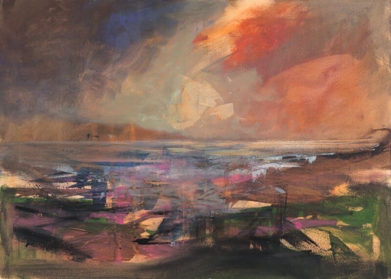
Posted on

Welcome to Harris and the Challenge of Art for a Room With Skylights

Image of Welcome to Harris by Arie Vardi

Choosing art for a room with skylights can be surprisingly difficult. Overhead daylight gives a room wonderful openness, but it can also leave walls feeling visually thin if the artwork does not carry enough shape and colour. Welcome to Harris works beautifully in that setting because it brings clarity and calm without feeling heavy.

Why skylit rooms still need a clear focal point

Rooms with roof windows often change character across the day. Morning light can feel crisp, while afternoon light can flatten softer tones. This piece holds its presence through those shifts and helps the room stay visually grounded.

  • It gives a brighter room structure without darkening it.
  • It keeps a light scheme feeling calm rather than empty.
  • It suits bedrooms, loft rooms, and upper-floor living spaces especially well.

Why the colour balance matters

In a room where light arrives from above, balanced colour usually works better than anything too faint or too sharp. Welcome to Harris brings enough movement to be noticed, but it still feels easy to live with in a restful space.

That makes it useful above a bed, opposite a window wall, or in the section of the room that needs one stronger visual anchor.

Why a hand-finished framed print helps

At First 4 Frames, each piece is completed in-house in Falkirk with bespoke framing, colour-managed Giclée printing, and hand-finished craftsmanship. In a skylit room, that superior finish helps the artwork hold its own against stronger natural light.

This artwork is by Arie Vardi, and you can view the exact framed product here.

If you are looking for art for a room with skylights that feels settled, luminous, and professionally finished, Welcome to Harris is a very strong option.

Posted on

How Rock Pools Can Make Window Seat Wall Art Feel More Considered

Image of Rock Pools by Arie Vardi

The best wall art for a window seat should support the feeling that draws people to that spot in the first place. A window seat is usually about pause, light, and a little retreat within the room. Rock Pools works beautifully there because it feels reflective and textured without becoming sleepy or flat.

Why these smaller corners matter

A window seat can easily become an almost-finished part of a room. The cushions are there, the light is lovely, but the wall can still feel underused. One framed piece nearby often does more than people expect. It turns the seat into a destination rather than just a practical ledge or tucked-away perch.

  • It helps the corner feel properly styled.
  • It supports a calmer, slower mood without looking empty.
  • It works well in reading nooks, bedrooms, and garden-facing sitting rooms.

Why Rock Pools is a strong fit

The sense of texture and reflection feels very natural beside changing daylight. That makes it especially suitable for spaces where the view and the light already do part of the work. It brings enough interest to hold the wall, but it still leaves the corner feeling restful.

Why the framed finish matters

At First 4 Frames, every artwork is completed in-house with bespoke framing, colour-managed Giclée printing, and hand-finished craftsmanship. In a smaller corner, quality becomes even more noticeable. A superior framed finish helps the whole seating area feel more intentional and more refined.

This artwork is by Arie Vardi, and you can view the exact framed product here.

If you are searching for wall art for a window seat that feels calm, textural, and properly finished, Rock Pools is well worth considering.

Posted on

Why Light Breeze Works So Well as Wall Art for a Room With Sheer Curtains

Image of Light Breeze by Arie Vardi

Choosing wall art for a room with sheer curtains is often about balance. Soft window treatments let in beautiful light, but they can also leave a room feeling slightly insubstantial if the artwork does not have enough presence. Light Breeze solves that problem with a calm sense of movement and just enough structure to hold the wall properly.

Why this pairing works

Sheer curtains soften edges, blur stronger daylight, and make a room feel relaxed. The artwork beside them needs to support that gentler atmosphere without disappearing into it. Light Breeze does that well because it feels airy, but not vague. It keeps the room feeling open while still giving the eye a clear focal point.

  • It suits rooms where daylight is an important part of the mood.
  • It helps softer textiles feel intentional rather than unfinished.
  • It adds calm colour without making the space feel visually heavy.

Where it can sit naturally

This kind of piece works especially well in a sitting room, bedroom, or guest space where curtains, voiles, and lighter fabrics already shape the atmosphere. If the room feels bright but slightly loose, one well-chosen framed print can give it far more definition.

Why the finish matters

At First 4 Frames, each piece is completed in-house with bespoke framing, colour-managed Giclée printing, and hand-finished craftsmanship. In a light-filled room, those details matter. A superior quality finish helps the artwork feel settled and considered rather than temporary.

This artwork is by Arie Vardi, and you can view the exact framed product here.

If you want wall art for a room with sheer curtains that feels calm, polished, and easy to live with, Light Breeze is a very good fit.

Posted on

Why Northern Light Works Beautifully as Wall Art for a West Facing Room

Image of Northern Light by Arie Vardi

Choosing wall art for a west facing room is often about understanding what late-day light actually does to a space. Afternoon sun can make some prints feel washed out, while evening light can turn others too heavy. Northern Light sits in a very helpful middle ground, bringing atmosphere and clarity without fighting the changing light.

Why west facing rooms need balance

Rooms with this aspect often feel different hour by hour. That means the artwork needs enough presence to hold up in brighter light, but enough softness to stay comfortable later in the day. This piece manages that balance beautifully, which is one reason it is so easy to live with.

  • It helps warm evening light feel intentional rather than overpowering.
  • It adds a focal point without making the room feel darker.
  • It works well in living spaces, bedrooms, and dining rooms that catch the setting sun.

Where it tends to work best

Northern Light would sit well above a sofa, opposite a window, or on the wall that catches the richest late-day glow. Because the composition feels expansive rather than busy, it helps the room feel calmer as the light shifts across the evening.

That makes it especially useful when you want a brighter room to feel grounded instead of visually unsettled.

Why the framed finish matters

At First 4 Frames, each piece is completed in-house in Falkirk with bespoke framing, colour-managed Giclée printing, and hand-finished craftsmanship. In a room where light changes so much, that superior quality really helps the artwork keep its presence throughout the day.

This artwork is by Arie Vardi, and you can view the exact framed product here.

If you want wall art for a west facing room that feels calm, balanced, and beautifully finished, Northern Light is a very strong choice.

Posted on

Choosing Art for Pale Wood Furniture, Why Reaching For The Sky Works So Well

Image of Reaching For The Sky by Arie Vardi

Choosing art for pale wood furniture is often about stopping a room from drifting into the washed-out middle. Light oak, ash, and similar finishes can make a space feel airy and modern, but they still need artwork with enough presence to anchor everything. Reaching For The Sky does that beautifully without making the room feel heavy.

Why pale timber rooms still need definition

When furniture and flooring sit in lighter tones, the eye benefits from one element that adds shape, rhythm, and a little more depth. This piece brings exactly that. It has atmosphere and movement, but it still sits comfortably within a calmer interior.

  • It adds contrast without looking stark.
  • It helps a pale scheme feel layered rather than flat.
  • It works especially well in rooms where natural materials already set the tone.

Where it tends to work best

This sort of framed print suits sitting rooms, bedrooms, and dining spaces where pale timber is doing much of the visual work. It can sit above a sideboard, opposite a dining table, or on the wall that needs a stronger focal point to stop the room feeling too quiet.

Because the colour and composition feel balanced rather than busy, the artwork supports a lighter interior instead of competing with it.

Why the finish matters

At First 4 Frames, every piece is completed in-house in Falkirk with bespoke framing, colour-managed Giclée printing, and hand-finished craftsmanship. That superior quality matters in a more pared-back room, where details are easier to notice and a polished finish helps the artwork feel deliberate.

This artwork is by Arie Vardi, and you can view the exact framed product here.

If you are looking for art for pale wood furniture that feels warm, grounded, and professionally finished, Reaching For The Sky is a very strong option.

Posted on

Choosing Art for Navy Walls, Why On Route To Oban Works So Well

Image of On Route To Oban by Arie Vardi

Choosing art for navy walls is often a question of balance. Deep blue can look elegant and cocooning, but it can also make the wrong artwork disappear into the background. On Route To Oban works especially well because it brings movement, light, and a gentle lift without breaking the mood of the room.

Why navy walls need contrast with warmth

Very pale artwork can feel too sharp against a darker wall, while something equally heavy can make the whole scheme feel flat. This piece sits in a more useful middle ground. It has enough brightness to stand clear of the wall colour, but it still feels calm and collected rather than stark.

  • It helps a navy room feel layered rather than one-note.
  • It adds a clearer focal point without making the wall feel busier.
  • It suits both modern furniture and more classic timber pieces.

Where it can work particularly well

This is the kind of framed print that can sit comfortably in a sitting room, bedroom, or study where navy has been used to add depth. Because the scene carries a sense of distance and atmosphere, it stops the darker wall from feeling closed in.

That makes it especially helpful when you want a deeper colour scheme to feel polished and settled, but still welcoming enough for everyday living.

Why the finish matters with stronger wall colours

First 4 Frames completes each piece in-house in Falkirk with bespoke framing, colour-managed Giclée printing, and hand-finished craftsmanship. Against a darker wall, those details matter even more. A superior quality frame gives the artwork enough definition to feel deliberate and properly resolved.

This artwork is by Arie Vardi, and you can view the exact framed product here.

If you are looking for art for navy walls that feels balanced, atmospheric, and beautifully finished, On Route To Oban is a very strong option.

Posted on

Choosing Wall Art for Walnut Furniture, Why Low Cloud at Melvich beach Sutherland Works

Image of Low Cloud at Melvich beach Sutherland by Arie Vardi

Finding the right wall art for walnut furniture is often about preventing a room from feeling too visually heavy. Low Cloud at Melvich beach Sutherland works beautifully because it brings air, movement, and coastal light into a scheme shaped by richer timber tones.

Walnut furniture has depth and warmth, but it can dominate if everything around it is equally dark or dense. This piece helps counter that. The landscape feel introduces breathing space, while the framed presentation still has enough presence to sit comfortably alongside more substantial furniture.

  • It softens deeper wood tones without making the room feel washed out.
  • It works well with walnut sideboards, dining furniture, shelving, and occasional tables.
  • It helps a scheme feel layered and intentional rather than simply brown-on-brown.

Where it works best

This kind of piece suits a dining room, living room, or study where walnut furniture already gives the space structure. It is especially effective when the room also uses neutral upholstery, stone, or soft blue-grey accents that benefit from one connecting focal point.

Why the print quality matters

At First 4 Frames, the artwork is completed in-house with colour-managed Giclée printing and bespoke hand-finished framing. That superior quality matters when the piece is sitting near better furniture, because the presentation needs to hold its own.

The artwork is by Arie Vardi, and you can view the exact framed product here.

If you are choosing wall art for walnut furniture and want the room to feel lighter, richer, and more resolved, Low Cloud at Melvich beach Sutherland is a very good option.

Posted on

What Makes Earth Wind and Tide Such a Good Choice for a Room With Large Windows

Image of Earth Wind and Tide by Arie Vardi

Choosing art for a room with large windows can be harder than it sounds. Natural light is a gift, but it can also make artwork feel visually thin if the piece does not have enough presence. Earth Wind and Tide works especially well because it brings movement, colour, and structure without making the room feel weighed down.

Why bright rooms need a little visual weight

In a room with generous glazing, the eye is constantly drawn outward. That often means the artwork needs enough depth to hold its own. Earth Wind and Tide has exactly that quality. It feels open and atmospheric, but it still gives the wall a clear focal point.

  • It works well in spaces with full-height windows or wide patio doors.
  • It adds energy without fighting the natural calm of the light.
  • It helps a brighter room feel finished rather than slightly underdressed.

Where this kind of piece earns its place

This sort of artwork suits a main sitting room, a garden-facing family room, or a dining area with strong daylight. Because the subject has both horizon and movement, it helps connect the inside of the room with the sense of openness beyond the glass.

That balance matters. In brighter rooms, the best artwork usually does not shout. It simply has enough confidence to stay present throughout the day as the light changes.

Why the framed finish matters here

At First 4 Frames, each piece is completed in-house in Falkirk with bespoke framing, colour-managed Giclée printing, and hand-finished craftsmanship. In a bright room, those cleaner details really show. A superior quality finish helps the artwork feel deliberate and well judged rather than temporary.

This artwork is by Arie Vardi, and you can view the exact framed product here.

If you are looking for art for a room with large windows that feels expansive, balanced, and properly finished, Earth Wind and Tide is a very strong option.

Posted on

Why Blushing Heather Works Beautifully as Art for Blush Pink Walls

Image of Blushing Heather by Arie Vardi

Finding the right art for blush pink walls is often about control. Soft pink can feel warm and flattering, but it needs artwork that keeps the room grounded. Blushing Heather is a very good fit because it echoes that warmth while still adding enough contrast and structure to stop the scheme from drifting into something too sugary.

Why this colour pairing feels balanced

Pink walls work best when the artwork supports the softness but also introduces a little depth. Blushing Heather does that naturally. The palette feels sympathetic, yet the landscape mood gives the room more maturity and calm.

  • It suits blush, dusty rose, and warmer neutral pinks.
  • It stops a soft colour scheme from feeling flat.
  • It adds interest without turning the room too pretty or over-styled.

Rooms where it earns its place

This kind of framed print works especially well in a bedroom, dressing area, or sitting room where pink is being used with restraint. Because the artwork feels airy but not insubstantial, it helps the room stay elegant and settled.

That makes it a strong option for people who like soft colour, but still want the room to feel polished rather than theme-led.

Why the First 4 Frames finish helps

At First 4 Frames, each piece is completed in-house with bespoke framing, colour-managed Giclée printing, and hand-finished craftsmanship. In a softer room, those details matter. A cleaner finish gives the artwork definition and helps the whole scheme feel more deliberate.

This artwork is by Arie Vardi, and you can view the exact framed product here.

If you want art for blush pink walls that feels calm, refined, and easy to place, Blushing Heather is an excellent choice.

Posted on

Choosing Art for Terracotta Walls, Why Low Tide Morar Feels So Balanced

Image of Low Tide Morar by Arie Vardi

Finding the right art for terracotta walls is often about balance. Warm wall colours can feel rich and inviting, but they need artwork that keeps the room from becoming too visually dense. Low Tide Morar does that beautifully, bringing in coastal light and softer tonal contrast while still sitting comfortably with a warm scheme.

Why this pairing works

Terracotta has a natural grounded warmth, so it often benefits from artwork that introduces air, horizon, and a little visual breathing room. Low Tide Morar has that quality. It complements warmth rather than repeating it too heavily, which helps the room feel layered instead of overloaded.

  • It suits earthy interiors with clay, rust, or burnt orange accents.
  • It can stop a warm room from feeling visually closed in.
  • It works well with timber, linen, and natural textures.

How to use it in the room

This kind of piece works especially well above a sofa, over a sideboard, or on the main wall of a dining space where the décor already carries warmth. Because the image brings a softer coastal mood, it helps create contrast without making the scheme feel disconnected.

It is also a useful reminder that warm interiors do not always need more red or orange in the artwork. Sometimes the best result comes from choosing a piece that steadies the palette and lets the wall colour do its work.

Why the finish matters

First 4 Frames produces every piece in-house with bespoke framing, colour-managed Giclée printing, and hand-finished craftsmanship. That superior quality helps the artwork hold its own against stronger wall colour and makes the finished room feel far more considered.

This artwork is by Arie Vardi, and you can view the exact framed product here.

For anyone choosing art for terracotta walls that feels calm, polished, and easy to place, Low Tide Morar is an excellent fit.