Posted on

Why The Village Square, Culross Works Beautifully as Tearoom Wall Art

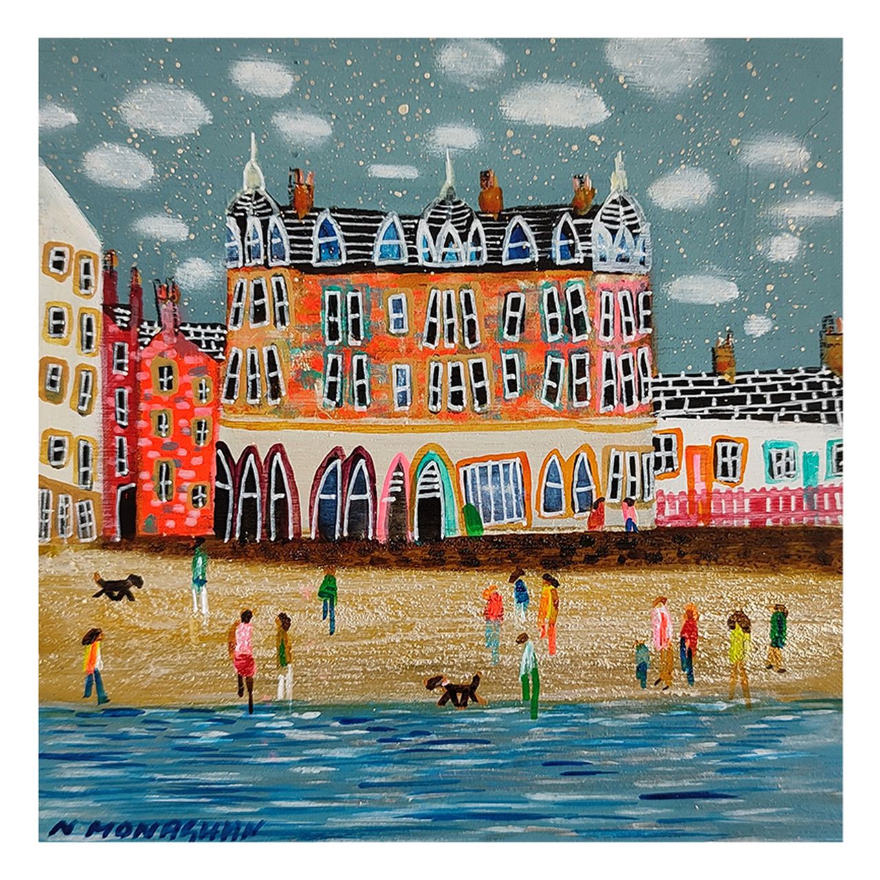
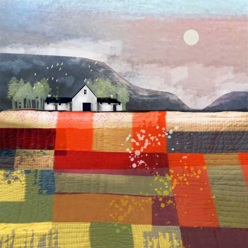
Image of The Village Square, Culross by Nikki Monaghan

The best tearoom wall art should make the space feel welcoming before anyone has even sat down. In a good tearoom, atmosphere matters nearly as much as the menu. The Village Square, Culross is a lovely choice because it adds place, warmth, and personality without making the room feel overly themed.

Why hospitality spaces benefit from art with character

People remember tearooms that feel distinctive. The artwork helps create that memory. A framed piece with local flavour and visual charm can make a seating area feel more considered and more inviting, especially when the room itself is relatively simple.

This piece works particularly well because it feels friendly and story-led while still looking polished enough for a commercial setting.

What makes it such a useful tearoom choice

  • It gives the wall a stronger sense of place.
  • It suits independent cafés and tearooms that want warmth.
  • It helps smaller tables and corners feel more intentional.

Why a bespoke framed finish matters in customer spaces

First 4 Frames produces each piece in-house in Falkirk with bespoke framing, colour-managed Giclée printing, and hand-finished craftsmanship. In a public-facing room, that superior quality helps the art contribute to the overall experience rather than simply decorating around it.

This artwork is by Nikki Monaghan, and you can view the exact framed product here.

If you are looking for tearoom wall art that feels warm, local, and easy for customers to enjoy, The Village Square, Culross is an excellent option.

Posted on

Afternoon Waves, The Bass Rock and the Challenge of Art for Pebble Grey Walls

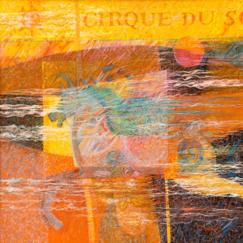
Image of Afternoon Waves, The Bass Rock by Colin Robertson

Finding the right art for pebble grey walls is often about giving the room enough contrast without breaking its calmer mood. Pebble grey is a useful, elegant wall colour, but it can also make the wrong artwork disappear. Afternoon Waves, The Bass Rock works beautifully because it adds movement and depth while still feeling completely at ease in a softer neutral scheme.

Why softer greys still need a clear focal point

Grey often appeals because it feels easy to live with. The risk is that a whole room can become a little too quiet if the art does not bring enough structure. This piece avoids that problem by introducing a stronger horizon and a little more energy without losing the room’s calm.

It is especially useful in living rooms, bedrooms, and hallways where the wall colour is doing a lot of the background work already.

Why this piece pairs so naturally with pebble grey

  • It keeps the scheme soft but not flat.
  • It adds movement without looking busy.
  • It suits both modern and more traditional interiors.

Why the print quality matters

First 4 Frames completes every piece in-house with bespoke framing, colour-managed Giclée printing, and hand-finished craftsmanship. In a neutral room, subtle differences in print quality and finish become easier to notice, so superior presentation really counts.

This artwork is by Colin Robertson, and you can view the exact framed product here.

If you need art for pebble grey walls that feels calm, layered, and properly finished, Afternoon Waves, The Bass Rock is a very strong option.

Posted on

Why Dunnottar Castle Works So Well as Wall Art for Marble Surfaces

Image of Dunnottar Castle by Esther Cohen

Choosing wall art for marble surfaces is often about preventing a refined room from feeling slightly cold. Marble can look luxurious and timeless, but it still needs artwork that brings warmth, character, and a clearer sense of place. Dunnottar Castle is a particularly good fit because it adds structure and atmosphere without fighting the room’s cleaner materials.

Why stone-led rooms need some visual warmth

Marble often appears in kitchens, bathrooms, fireplaces, side tables, and decorative accessories. It gives a room instant polish, but too much hard surface can leave the space feeling slightly distant. This artwork helps counter that with colour, story, and a stronger emotional pull.

  • It suits dining spaces, hallways, and sitting rooms beautifully.
  • It works especially well near marble mantels or tabletops.
  • It adds depth without disturbing a more elegant scheme.

Why this subject suits marble better than something flatter

A room with marble usually benefits from artwork that has a little history and presence to it. Dunnottar Castle delivers that sense of character while still feeling composed enough for a more polished interior. The result feels layered, not forced.

Why bespoke framing keeps the room looking resolved

First 4 Frames produces each piece in-house in Falkirk with bespoke framing, colour-managed Giclée printing, and hand-finished craftsmanship. In a room already shaped by quality materials, that superior finish helps the artwork belong properly rather than feel like an afterthought.

This artwork is by Esther Cohen, and you can view the exact framed product here.

If you want wall art for marble surfaces that feels warm, grounded, and well judged, Dunnottar Castle is an excellent choice.

Posted on

Choosing a Milestone Birthday Gift for a Horse Lover, Why Leo’s Soft Steps Stands Out

Image of Leo's Soft Steps by Diana Hand

A thoughtful milestone birthday gift for a horse lover should feel more lasting than the usual present. Big birthdays often call for something that can stay in the home and continue to mean something long after the day itself. Leo’s Soft Steps is an excellent option because it feels elegant, personal, and easy to live with.

Why milestone gifts deserve more than novelty

Horse-themed presents can sometimes lean too obvious, especially when the recipient already has years of cards, mugs, and small keepsakes. Framed artwork offers something much stronger. It respects the subject while still feeling grown-up enough for a well-finished home.

That makes it especially suitable for a fortieth, fiftieth, sixtieth, or any other birthday where the present should feel memorable rather than tokenistic.

What gives this piece its gifting appeal

  • It feels calm and graceful rather than sentimental.
  • It suits bedrooms, studies, and sitting rooms easily.
  • It has enough presence to feel like a real occasion gift.

Why the framing standard strengthens the gift

First 4 Frames completes every piece in-house with bespoke framing, colour-managed Giclée printing, and hand-finished craftsmanship. That superior quality matters in a birthday gift because it helps the present feel properly considered from the first glance.

This artwork is by Diana Hand, and you can view the exact framed product here.

If you need a milestone birthday gift for a horse lover that feels elegant, lasting, and genuinely personal, Leo’s Soft Steps is a beautiful choice.

Posted on

What Makes Having a Get Together Such a Good Family Dining Nook Wall Art Choice

Image of Having a Get Together by Hillary Barker

The best family dining nook wall art should make the space feel enjoyed, not just used. Small dining corners do a lot of work in everyday life, from quick breakfasts to evening chats and homework in between. Having a Get Together is a lovely fit because it adds warmth and personality without making the nook feel cluttered.

Why smaller dining areas benefit from one strong focal point

A dining nook usually does not have room for lots of decoration. That makes one framed piece far more effective than several smaller items competing for attention. The right artwork helps the whole area feel more settled and more intentional.

This piece is especially useful in kitchen diners and family homes where you want a little humour and warmth, but still want the finished room to look polished.

Why this subject suits the room so naturally

  • It brings friendliness to an everyday eating space.
  • It works well with painted cabinetry, timber tables, and bench seating.
  • It gives a compact wall genuine presence.

Why the First 4 Frames finish matters here

First 4 Frames produces each piece in-house in Falkirk with bespoke framing, colour-managed Giclée printing, and hand-finished craftsmanship. That superior quality helps an informal dining spot feel looked after rather than improvised, which makes a real difference in the rooms people use most.

This artwork is by Hillary Barker, and you can view the exact framed product here.

If you want family dining nook wall art that feels warm, sociable, and easy to live with, Having a Get Together is a very appealing option.

Posted on

Fall and the Appeal of Wall Art for Smoked Glass Accents

Image of Fall by Stuart Roy

Choosing wall art for smoked glass accents is usually about getting the mood right. Smoked glass can make a room feel rich, contemporary, and beautifully layered, but it can also turn slightly heavy if the artwork does not bring enough warmth or movement. Fall works especially well because it deepens the atmosphere without making the space feel closed in.

Why richer interiors still need softness

Rooms with darker reflective details often benefit from artwork that has mood but also a little lift. This piece gives you that middle ground. It feels dramatic enough to belong in the room, yet it still stops the scheme from becoming too sharp or too cold.

  • It suits contemporary living rooms and dining rooms.
  • It works well near darker sideboards or drinks cabinets.
  • It helps reflective finishes feel more grounded.

Why this pairing feels more balanced than obvious

The point is not to match every surface exactly. It is to create a room where the materials speak to each other. Fall does that by echoing depth and atmosphere while still adding a natural softness that glass alone cannot provide.

Why framing quality stands out in this kind of room

First 4 Frames completes every piece in-house with bespoke framing, colour-managed Giclée printing, and hand-finished craftsmanship. In a more design-led room, those finer details are easier to notice, which makes superior presentation especially worthwhile.

This artwork is by Stuart Roy, and you can view the exact framed product here.

If you need wall art for smoked glass accents that feels warm, composed, and beautifully finished, Fall is an excellent option.

Posted on

Why Low Tide Works Beautifully as Salon Waiting Area Wall Art

On cracked earth, "Low Tide" features a giant turtle carrying a green island with a castle on its shell. In the foreground, a gnome-like figure in a red hat holds a bucket and paintbrush, gazing at the turtle.

Good salon waiting area wall art should do more than fill a blank wall. It should help clients feel settled from the moment they arrive. Low Tide is a strong choice for that kind of space because it brings personality and atmosphere without making the room feel busy.

Why waiting spaces benefit from calmer focal points

In a salon, people are often sitting for a few minutes with little else to do except look around. That means the artwork matters more than in many commercial spaces. A well-chosen framed print can make the room feel polished and cared for rather than purely functional.

Low Tide works particularly well because it has character, but it does not ask for too much attention. That balance helps a client area feel thoughtful rather than staged.

What makes this piece useful in a salon setting

  • It adds interest without visual fuss.
  • It helps a smaller seating area feel more finished.
  • It suits spaces that want a calm but creative feel.

Why bespoke framing helps the impression last

First 4 Frames produces each piece in-house in Falkirk with bespoke framing, colour-managed Giclée printing, and hand-finished craftsmanship. In a client-facing business, that superior quality matters because details around presentation quietly shape how professional the whole room feels.

This artwork is by Matylda Konecka, and you can view the exact framed product here.

If you are looking for salon waiting area wall art that feels welcoming, polished, and quietly distinctive, Low Tide is a very smart option.

Posted on

Choosing Art for Pale Blue Walls, Why White Horses, Lewis Works So Well

Image of White Horses, Lewis by Arie Vardi

Choosing art for pale blue walls is often about making sure the room keeps its freshness without tipping into feeling chilly or visually thin. White Horses, Lewis is a particularly good answer because it brings movement and coastal atmosphere while still holding enough warmth to stop the scheme feeling washed out.

Why pale blue needs the right kind of contrast

Soft blue walls can look calm and elegant, but they often need artwork with a little more life in it. Too close a colour match and the whole room can drift into one flat note. This piece helps avoid that by adding texture, rhythm, and a stronger focal point.

  • It keeps a cool room feeling airy rather than cold.
  • It suits bedrooms, sitting rooms, and quieter hallways.
  • It adds energy without making the scheme feel louder.

Where it tends to work best

This kind of piece sits especially well above a sofa, chest of drawers, or bed where the room needs one clearer anchor. It also works well in spaces with daylight from more than one side, where pale wall colour can otherwise feel a little diffuse.

Why the finish matters in a lighter scheme

First 4 Frames completes every piece in-house in Falkirk using bespoke framing, colour-managed Giclée printing, and hand-finished craftsmanship. In a pale room, those details matter because cleaner print quality and a well-judged frame help the artwork feel deliberate rather than faint.

This artwork is by Arie Vardi, and you can view the exact framed product here.

If you need art for pale blue walls that feels fresh, balanced, and easy to live with, White Horses, Lewis is an excellent choice.

Posted on

How Light On Loch Faskally Can Soften a Room With Woven Pendant Lighting

Inspired by Light On Loch Faskally, this Impressionist painting depicts a calm river reflecting autumn trees with orange and red leaves beneath a partly cloudy sky and distant blue mountains.

Choosing art for a room with woven pendant lights is often about balance. Natural pendants made from rattan, cane, or similar materials add welcome texture overhead, but they can also make a room feel slightly busy unless the walls bring some calm back into the scheme. Light On Loch Faskally is a particularly good match because it introduces colour and atmosphere in a gentle, composed way.

Why textured lighting benefits from calmer artwork

Woven pendants naturally draw attention because of their shape and shadow. That is part of their appeal, but it means the wall art needs a different job. Instead of adding more texture for the sake of it, it should steady the room and give the eye a quieter place to rest. This piece does that very well.

  • It works beautifully in dining spaces, bedrooms, and relaxed sitting rooms.
  • It complements natural materials without looking theme-led.
  • It helps a textured room feel layered rather than visually restless.

Why this pairing feels easy to live with

The softer reflected light in the artwork sits comfortably with the filtered shadows that woven pendants cast. Together they create warmth without making the scheme feel crowded. That makes the room feel more resolved and more restful from day into evening.

It can work especially well on the wall nearest the dining table, above a chest of drawers, or anywhere the pendant lighting already creates a strong overhead feature.

Why a bespoke framed print belongs in this kind of room

First 4 Frames produces each piece in-house in Falkirk with bespoke framing, colour-managed Giclée printing, and hand-finished craftsmanship. In rooms built around natural materials and considered details, that superior finish helps the artwork feel intentional from the outset.

This artwork is by Kate Philp, and you can view the exact framed product here.

If you need art for a room with woven pendant lights that feels calm, warm, and professionally finished, Light On Loch Faskally is an excellent option.

Posted on

Canty Bay Bass (Vertical) and the Appeal of Wall Art for a Narrow Wall Between Windows

Image of Canty Bay Bass (Vertical) by Esther Cohen

Finding the right wall art for a narrow wall between windows can be surprisingly difficult. The space is often too slim for standard artwork, yet too visible to leave undecorated. Canty Bay Bass (Vertical) is a very strong answer because its shape suits the proportions naturally while the subject keeps the wall feeling calm rather than crowded.

Why awkward gaps still matter to the whole room

A narrow section between windows can easily look like a leftover strip of wall. When it is handled well, though, it can become one of the details that makes a room feel thoughtful. The key is choosing a piece that works with the height and rhythm of the glazing rather than fighting it.

This artwork does that beautifully. It gives the eye something graceful to land on, but it does not make the space feel boxed in.

Why a vertical piece is often the right answer

  • It echoes the proportions of the window lines.
  • It helps a slim wall look intentional.
  • It adds interest without crowding the surrounding light.

That makes it especially useful in dining rooms, stair landings, and garden-facing spaces where windows already define the architecture.

Why the First 4 Frames approach suits this kind of placement

First 4 Frames completes each piece in-house with bespoke framing, colour-managed Giclée printing, and hand-finished craftsmanship. In a tighter wall position, neat presentation matters even more because the frame and proportions are seen very clearly.

This artwork is by Esther Cohen, and you can view the exact framed product here.

If you want wall art for a narrow wall between windows that feels elegant, balanced, and professionally finished, Canty Bay Bass (Vertical) is an excellent choice.