Posted on

Why Sanna Bay Works So Well as Wall Art for a Room With Built-In Seating

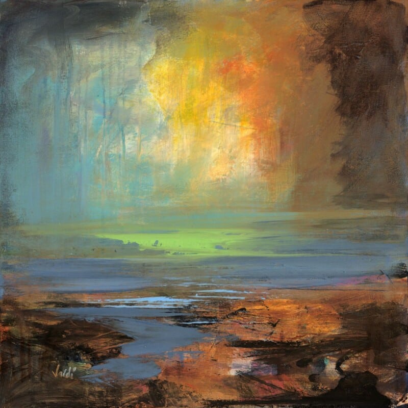
Image of Sanna Bay by Arie Vardi

Choosing wall art for a room with built-in seating is often about balance. Fitted benches, alcoves, and window seats bring lovely structure to a room, but they can also make the space feel slightly rigid if the wall above them stays too quiet. Sanna Bay works especially well here because it introduces softness, atmosphere, and a clear focal point without fighting the joinery.

Why fitted seating benefits from a gentler focal point

Built-in seating often makes a room feel tidy and intentional from the start. That is one of its strengths. The next step is making sure the space still feels welcoming rather than overly planned, and that is where the right framed print can make a real difference.

  • It suits window seats, breakfast nooks, and alcove benches.
  • It softens straighter lines without losing a room’s sense of order.
  • It helps a practical seating area feel more finished and restful.

Why Sanna Bay feels so well placed

The openness in the scene gives the eye room to rest, which is useful in a space already shaped by cabinetry or fitted detail. Instead of making the area feel busier, the framed print loosens the mood and helps the seating zone feel more inviting.

Why the finish matters

First 4 Frames completes every piece in-house in Falkirk using bespoke framing, colour-managed Giclée printing, and hand-finished craftsmanship. That superior quality helps the artwork look considered alongside permanent fitted features rather than added as an afterthought.

This artwork is by Arie Vardi, and you can view the exact framed product here.

If you need wall art for a room with built-in seating that feels calm, polished, and easy to live with, Sanna Bay is a very strong choice.

Posted on

Why Temple Makes Such a Strong Architect Studio Wall Art Choice

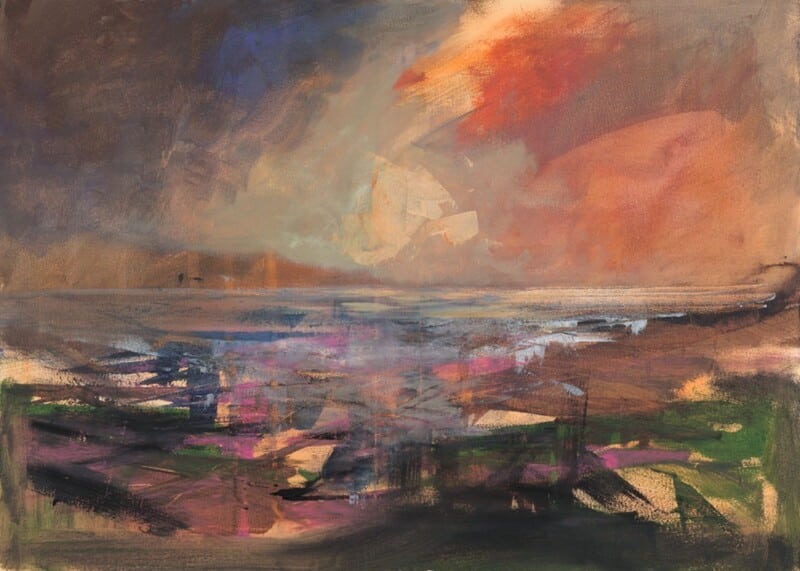
Image of Temple by Arie Vardi

The best architect studio wall art should support creative thinking rather than dominate it. In a workspace shaped by drawings, samples, materials, and clean lines, the artwork needs enough presence to justify its place while still leaving room for the work itself. Temple is a particularly strong option because it feels structural, atmospheric, and confidently composed.

Why design-led workspaces need the right tone

Studios often risk going one of two ways. They can feel overly bare, or they can become visually crowded once projects gather pace. One well-chosen framed piece can help set the tone of the room without making it feel staged or overly branded.

  • It suits architecture studios, design offices, and creative workspaces with a calmer aesthetic.
  • It adds atmosphere without distracting from active project work.
  • It helps a professional room feel thoughtful rather than sparse.

Why Temple works so well in that context

The piece carries a sense of form and spatial presence that feels especially relevant in a studio environment. It has enough structure to belong in a design-led room, yet enough softness to stop the space feeling too hard or technical.

Why in-house framing matters for commercial presentation

First 4 Frames produces each piece in-house in Falkirk using bespoke framing, colour-managed Giclée printing, and hand-finished craftsmanship. For a professional workspace, that superior quality helps the finished piece feel intentional and credible rather than merely decorative.

This artwork is by Arie Vardi, and you can view the exact framed product here.

If you are choosing architect studio wall art and want something with structure, atmosphere, and professional polish, Temple is a very strong candidate.

Posted on

Why Islay in the Light Works So Well as Wall Art for a Room With Glass Balustrades

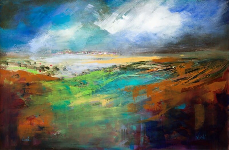
Image of Islay in the Light by Arie Vardi

Choosing wall art for a room with glass balustrades is often about adding enough presence without making the space feel heavier than it should. Glass keeps a room open, bright, and contemporary, but it can also leave the scheme feeling slightly under-anchored if the walls do not carry enough atmosphere. Islay in the Light works especially well because it brings warmth and painterly depth while still respecting that sense of openness.

Why open architecture still needs a focal point

Glass balustrades help light move through a room and keep sightlines clean. That is part of their appeal. The trade-off is that the surrounding walls often need a stronger visual anchor so the room feels fully resolved rather than slightly transient.

  • It works well in split-level living spaces, stair landings, and brighter extensions.
  • It adds atmosphere without fighting the cleaner architecture.
  • It helps a more open room feel warmer and more complete.

Why Islay in the Light suits that setting

The colour and movement in the piece give the eye somewhere to settle, which matters in interiors where glazing and reflective surfaces already do a lot of the visual work. Instead of interrupting the space, the framed print helps steady it.

Why the finish matters in a light-filled room

First 4 Frames completes every piece in-house in Falkirk using bespoke framing, colour-managed Giclée printing, and hand-finished craftsmanship. In a room shaped by glass and daylight, that superior quality helps the artwork hold its character from morning through evening.

This artwork is by Arie Vardi, and you can view the exact framed product here.

If you need wall art for a room with glass balustrades that feels calm, substantial, and easy to live with, Islay in the Light is a very strong choice.

Posted on

Why First Light 2 Works So Well as Wall Art for a Room With Roof Lanterns

Image of First Light by Arie Vardi

Choosing wall art for a room with roof lanterns is often more complicated than it first appears. Overhead glazing brings beautiful natural light, but it can also leave a room feeling slightly exposed if the walls do not carry enough visual weight. First Light 2 works especially well because it adds warmth and atmosphere without fighting the openness that makes that kind of room appealing in the first place.

Why overhead daylight needs the right balance

Rooms with roof lanterns often feel airy and generous, which is a real strength. The risk is that lighter walls and strong daylight can make artwork disappear unless the piece has enough presence. This print helps by offering colour and mood that still feel calm rather than heavy.

  • It works well in garden rooms, kitchen extensions, and brighter open-plan spaces.
  • It adds a steadier focal point without making the room feel enclosed.
  • It suits customers who want warmth as well as light.

Why First Light 2 feels so natural in that setting

The gentle shift in tone gives the eye somewhere to settle, which matters in a room where the ceiling already draws attention upward. Instead of competing with the architecture, the framed print helps balance it and makes the whole scheme feel more resolved.

Why the finished presentation matters

First 4 Frames completes every piece in-house in Falkirk using bespoke framing, colour-managed Giclée printing, and hand-finished craftsmanship. In a room shaped by strong daylight, that superior quality matters because the artwork needs to keep its character throughout the day rather than fade into the background.

This artwork is by Arie Vardi, and you can view the exact framed product here.

If you are looking for wall art for a room with roof lanterns that feels warm, composed, and easy to live with, First Light 2 is a very confident choice.

Posted on

Choosing Art for Maple Furniture, Why Crimson Night Feels So Well Judged

Image of Crimson Night by Arie Vardi

Choosing art for maple furniture often comes down to balance. Maple has a clean, lighter look that keeps a room fresh, but it can also leave the overall scheme feeling a little weightless if the artwork is too faint. Crimson Night works especially well because it introduces depth and atmosphere without fighting the calm character of the timber.

Why lighter timber rooms need a little grounding

Maple furniture tends to suit people who like a room to feel bright, modern, and uncluttered. The challenge is making sure the space still feels layered rather than slightly bare. This piece helps by giving the eye somewhere more substantial to rest, while still keeping the scheme refined.

  • It sits comfortably with pale timber, warm neutrals, and soft grey tones.
  • It adds visual depth without making the room feel heavy.
  • It suits living rooms, bedrooms, and quieter dining spaces alike.

Where this piece tends to look strongest

Crimson Night works beautifully above a sideboard, on the wall opposite a bed, or behind a sofa in a lighter sitting room. In each case, the framed presentation helps the space feel more finished and less dependent on furniture alone for character.

Why the framed finish matters

First 4 Frames completes every piece in-house in Falkirk using bespoke framing, colour-managed Giclée printing, and hand-finished craftsmanship. In a room built around lighter materials, that superior finish matters because the artwork needs enough presence to anchor the space properly.

This artwork is by Arie Vardi, and you can view the exact framed product here.

If you need art for maple furniture that feels warm, balanced, and easy to live with, Crimson Night is a very confident choice.

Posted on

Why Time to Create a Splash, Brims Ness Works So Well as Art for Ash Wood Furniture

Image of Time to Create a Splash, Brims Ness by Arie Vardi

Choosing art for ash wood furniture can be harder than it first appears. Pale timber gives a room a calm, modern base, but it can also leave the whole scheme feeling slightly light in weight if the artwork is too timid. Time to Create a Splash, Brims Ness works especially well because it adds movement and warmth without fighting the cleaner character of ash.

Why ash wood interiors need a little visual depth

Ash furniture often brings brightness, neat grain, and an easy contemporary feel. The risk is that walls can seem underplayed beside it. This piece helps by adding a stronger point of focus while still keeping the room calm and breathable.

  • It works beautifully with pale oak, ash, and light flooring.
  • It adds energy without making the room feel busy.
  • It suits sitting rooms, bedrooms, and open-plan spaces alike.

Where this piece tends to look most settled

It is particularly effective above a sideboard, over a sofa, or on the main wall of a dining space where pale wood already sets the tone. In those places, the framed finish helps the room feel more complete and less reliant on furniture alone for character.

Why presentation matters in a lighter scheme

First 4 Frames completes every piece in-house in Falkirk using bespoke framing, colour-managed Giclée printing, and hand-finished craftsmanship. In a pale timber interior, those quality details matter because the print and frame need enough presence to anchor the room properly.

This artwork is by Arie Vardi, and you can view the exact framed product here.

If you need art for ash wood furniture that feels warm, balanced, and easy to live with, this is a very confident choice.

Posted on

Why Secluded Sands Works Beautifully as Art for Sandy Beige Walls

Image of Secluded Sands by Arie Vardi

Choosing art for sandy beige walls is usually less about contrast for its own sake and more about stopping a soft neutral room from becoming too quiet. Secluded Sands is a particularly good fit because it keeps the scheme calm while adding more depth, movement, and coastal character.

Why beige rooms still need a clear focal point

Sandy beige can make a room feel warm and easy to live with, but it can also leave the walls slightly underpowered if the artwork is too timid. This piece brings enough atmosphere to hold the eye without breaking the restful feel that makes the colour appealing in the first place.

  • It works well with natural timber, linen, and woven textures.
  • It adds flow to a room that already leans soft and understated.
  • It suits living rooms, bedrooms, and quieter hallways equally well.

Where this kind of piece tends to shine

Secluded Sands sits especially well above a sofa, over a bed, or on a main wall where the room needs one stronger visual anchor. In a neutral scheme, that framed focal point helps everything else feel more deliberate.

Why the finish matters in a subtle room

First 4 Frames completes each piece in-house in Falkirk using bespoke framing, colour-managed Giclée printing, and hand-finished craftsmanship. In softer interiors, those quality details matter because the presentation has to carry the room without shouting for attention.

This artwork is by Arie Vardi, and you can view the exact framed product here.

If you need art for sandy beige walls that feels calm, warm, and beautifully resolved, Secluded Sands is a very strong choice.

Posted on

Choosing Art for Pale Blue Walls, Why White Horses, Lewis Works So Well

Image of White Horses, Lewis by Arie Vardi

Choosing art for pale blue walls is often about making sure the room keeps its freshness without tipping into feeling chilly or visually thin. White Horses, Lewis is a particularly good answer because it brings movement and coastal atmosphere while still holding enough warmth to stop the scheme feeling washed out.

Why pale blue needs the right kind of contrast

Soft blue walls can look calm and elegant, but they often need artwork with a little more life in it. Too close a colour match and the whole room can drift into one flat note. This piece helps avoid that by adding texture, rhythm, and a stronger focal point.

  • It keeps a cool room feeling airy rather than cold.
  • It suits bedrooms, sitting rooms, and quieter hallways.
  • It adds energy without making the scheme feel louder.

Where it tends to work best

This kind of piece sits especially well above a sofa, chest of drawers, or bed where the room needs one clearer anchor. It also works well in spaces with daylight from more than one side, where pale wall colour can otherwise feel a little diffuse.

Why the finish matters in a lighter scheme

First 4 Frames completes every piece in-house in Falkirk using bespoke framing, colour-managed Giclée printing, and hand-finished craftsmanship. In a pale room, those details matter because cleaner print quality and a well-judged frame help the artwork feel deliberate rather than faint.

This artwork is by Arie Vardi, and you can view the exact framed product here.

If you need art for pale blue walls that feels fresh, balanced, and easy to live with, White Horses, Lewis is an excellent choice.

Posted on

Why Mist on Loch Assynt Works Beautifully as Art for a South Facing Room

Image of Mist on Loch Assynt by Arie Vardi

Choosing art for a south facing room is often less straightforward than people expect. The room may already feel bright and welcoming, but strong daylight can flatten weaker artwork and leave the whole wall looking slightly bleached by midday. Mist on Loch Assynt works beautifully in that setting because it keeps its atmosphere while still feeling light and easy to live with.

Why bright rooms still need visual calm

South facing spaces usually have plenty of natural energy already. That means the artwork does not have to shout. It is often better when it introduces softness, depth, and a little restraint. This piece does exactly that, helping a sunny room feel settled rather than overexposed.

  • It works well in bright sitting rooms and bedrooms.
  • It keeps a sunlit wall feeling composed rather than bare.
  • It adds presence without making the room feel heavier.

Where this kind of piece can help most

It suits the wall opposite a window especially well, where glare and changing light can expose poor print quality very quickly. It can also work above a sofa, sideboard, or bed where the room needs one calmer focal point to balance all that daylight.

Why the finish matters in strong natural light

First 4 Frames produces each piece in-house in Falkirk with bespoke framing, colour-managed Giclée printing, and hand-finished craftsmanship. In a south facing room, that superior quality matters because cleaner printing and a well judged frame help the artwork hold its character from morning through late afternoon.

This artwork is by Arie Vardi, and you can view the exact framed product here.

If you want art for a south facing room that feels calm, polished, and genuinely suited to brighter light, Mist on Loch Assynt is an excellent option.

Posted on

Why Coastal Path web Works So Well as Wall Art for Sliding Patio Doors

Image of Coastal Path web by Arie Vardi

Choosing wall art for sliding patio doors is often about restoring balance. Large panes of glass bring in wonderful light and a strong garden connection, but they can also leave the interior feeling visually light on one side. Coastal Path web works especially well because it gives the room a calm focal point without making it feel heavier or more enclosed.

Why wide glazing needs something steady nearby

Patio doors naturally pull the eye outward. That is part of their appeal, but it means the walls around them need a little more intention. A well-chosen framed print helps the room feel finished even when the view outside changes with the weather and the time of day.

  • It suits sitting rooms, dining spaces, and garden rooms with broad glazing.
  • It adds structure without competing with the outdoor view.
  • It helps the room feel styled indoors rather than defined only by the doors.

Why this piece feels right in a brighter room

Coastal Path web has enough movement and colour to hold its place, yet it still keeps the room relaxed. That matters in spaces with large glass openings, where artwork needs presence but should not feel too dense. The result is a more settled room that still feels open and easy to live with.

Why the finish matters

First 4 Frames completes each piece in-house in Falkirk with bespoke framing, colour-managed Giclée printing, and hand-finished craftsmanship. In a light-filled room, that superior presentation makes a real difference because better framing and print quality stop the artwork from looking washed out beside the glass.

This artwork is by Arie Vardi, and you can view the exact framed product here.

If you want wall art for sliding patio doors that feels calm, balanced, and professionally finished, Coastal Path web is an excellent choice.