
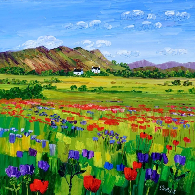
wall art for black window frames needs enough presence to answer the dark, precise lines around the glass without making the whole room feel harder. Poppies and Thistles, Perthshire by Sheila Fowler offers a useful balance. Its red poppies, purple thistles and bright green field bring warmth to the foreground. White Perthshire cottages, layered hills and a wide blue sky then carry the eye into the distance. The square composition feels ordered, but the lively brushwork keeps that order from becoming rigid.
Why dark window lines change the artwork decision
Black-framed windows give an interior a strong graphic rhythm. Their mullions divide the view into panels, while the dark outline draws attention even on a bright day. Artwork placed nearby has to relate to that architecture, yet simply choosing another black-and-white object can leave the room feeling stark. A picture with natural colour and visible movement provides a softer counterpoint.
This print does that through contrast rather than imitation. Small dark roofs and tree marks acknowledge the window frames. They are surrounded by greens, reds, violets and open sky, so the eye receives both structure and release. The distant cottages also connect the framed artwork to the idea of looking out across a real landscape.
Place wall art for black window frames with breathing room
Start with the solid wall beside the glazing rather than squeezing a picture into the narrowest available strip. The complete framed work should read as a deliberate companion to the window, not as an afterthought caught between glass and a doorway. Mark the proposed outline with low-tack tape and view it from the room’s normal entrance, main seat and dining position.
| Room condition | Useful response | Reason |
|---|---|---|
| Tall glazed doors | Align the picture centre with normal eye level | It stops the artwork following the full door height |
| Wide corner glazing | Use one square focal point on the adjoining solid wall | The compact shape gives the eye somewhere to settle |
| Strong daylight | Check the position for reflections before fixing | Colour and brushwork remain easier to enjoy |
| Dark metal details | Repeat black sparingly in the frame or furniture | The connection feels intentional without dominating |
Do not line up every edge mechanically. A picture does not need to match the top of a window or copy each mullion. What matters is that its scale feels confident beside the glazing. A calm margin around the frame will separate the painted landscape from the moving outdoor view.
Use meadow colour without over-matching the room
The foreground contains several strong colours, but they are held together by repeated green and a broad horizon. Treat that hierarchy as a decorating guide. Choose one secondary note to repeat elsewhere, perhaps a muted berry cushion, a green ceramic or a small blue textile. Copying the red, purple, yellow and green across many accessories would compete with the painting.
- Keep furniture nearest the artwork relatively simple in outline.
- Let the black window frames remain the main architectural dark.
- Use natural timber or a warm neutral to soften metal and glass.
- Allow the white cottages to provide a small, bright pause within the colour.
- Recheck the arrangement in evening light when the windows become more reflective.
The landscape also helps a glazed room when the outside outlook is urban or enclosed. It supplies a separate long view, with meadow, houses, trees and hills arranged in clear stages. That depth can make the solid wall feel less abrupt beside a large area of glass.
Choose a frame that mediates between art and architecture
A dark moulding can acknowledge the window frames, but it need not be heavy. A fine profile may be enough to sharpen the square outline. A lighter timber or painted finish can work when the room already contains plenty of black. The mount, wall colour and final print size should be considered together rather than chosen in isolation.
First 4 Frames produces colour-managed Giclée prints and completes bespoke, hand-finished framing in-house at its Falkirk workshop. A one-to-one consultation makes it possible to compare mouldings against the bright foreground, pale cottages and darker hill marks. It also helps ensure the finished scale is strong enough for the architecture without overwhelming the wall.
Explore Sheila Fowler’s colour-led Scottish landscapes
Sheila Fowler is known for energetic colour and recognisable Scottish places. Visit Sheila Fowler’s official website for more about her work, then browse the Sheila Fowler collection at First 4 Frames to compare floral, coastal and landscape subjects.
Well-chosen wall art for black window frames can make dark glazing feel more welcoming while preserving its clean architectural character. View the framed Poppies and Thistles, Perthshire print for a square Scottish landscape with vivid foreground colour and a generous sense of distance.