
Posted on

Teal Wall Art for a Compact Cloakroom: Look Out to St Andrews Harbour

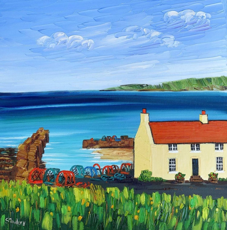
Image of St Andrews Harbour by Sheila Fowler

teal wall art should answer a real question about the room or recipient. St Andrews Harbour is useful here because a harbour scene adds visual distance to a small room while blue-green water provides a focused colour cue.

teal wall art - St Andrews Harbour

Place teal wall art safely in a compact cloakroom

Start with the driest wall. Keep the frame beyond the basin splash zone, away from persistent condensation and clear of the opening door. Ventilation matters more than a coastal theme. If the room remains damp, choose another location for framed art.

  1. Open the door fully and mark its swing.
  2. Stand at the basin and identify splash areas.
  3. Check the extractor and normal ventilation.
  4. Mark both square sizes at framed dimensions.
  5. View the template from the doorway and close range.

The 265 x 265 mm print may suit a narrow wall beside a mirror. The 500 x 500 mm option needs more breathing room. Do not add teal towels, shells, anchors and stripes together. One plain textile can acknowledge the water; the harbour can carry the coastal identity.

Can framed art go in every cloakroom?

No. Reliable extraction, a dry wall and distance from direct splashes are essential checks before hanging any framed print.

Frame the view for close-range looking

Small rooms reveal mounting and corner finish immediately. Colour-managed printing keeps harbour tones clear, while precise in-house framing gives the square image a resolved edge. Suitable placement remains essential near water.

For context about the town and harbour behind the picture, explore the official St Andrews visitor guide. Browse the Sheila Fowler collection, or view the exact product and framing choices.

Teal wall art can make a cloakroom feel larger when the colour belongs to a real view. St Andrews Harbour supplies distance and identity, while sensible moisture checks protect the piece.
Posted on

Teal Wall Art That Feels Balanced, Why Blue Arran Works

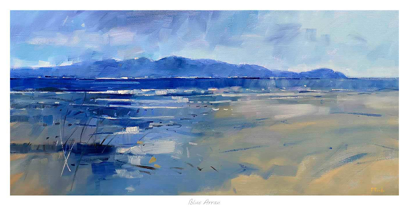
Inspired by Blue Arran, this landscape painting features a tranquil sea with gentle waves and distant mountains under a cloudy sky, blending blue and beige tones in an impressionistic style.

Choosing teal wall art can be tricky because the wrong piece makes a blue-green scheme feel colder or too deliberate. Blue Arran works especially well because the colour comes through landscape and atmosphere rather than as a flat decorative statement.

That gives the room more depth. Instead of simply matching the palette, the artwork helps the scheme feel layered and more naturally finished.

Why This Colour Feels Easier To Live With

Teal tends to work best when it shifts through several tones. In this piece, the coastal setting allows blue, green, and softer neutral notes to sit together in a calmer, more believable way.

  • It supports blue-green rooms without overmatching them.
  • It keeps the wall airy rather than dense.
  • It adds colour with a more grown-up coastal feel.

Rooms Where It Can Really Help

Blue Arran would work beautifully in a living room, bedroom, hallway, or dining area where the scheme already leans into blue, green, brass, or pale timber. It is particularly helpful when the room wants colour continuity without looking overdesigned.

Why The Bespoke Finish Makes A Difference

A colour-led print needs careful tonal control to stay elegant. First 4 Frames completes the framing and colour-managed Giclee production in-house, helping the finished piece keep its subtle shifts and room presence.

You can view the exact framed product here, and browse more from Peter Foyle if you enjoy coastal work with the same layered use of colour.

For buyers exploring teal wall art that feels natural, balanced, and properly finished, Blue Arran is a strong contender.