
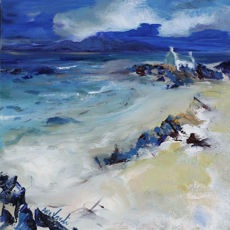
The right wall art for fluted wood panels needs to soften texture rather than compete with it. Fluted panelling already creates a strong rhythm on the wall, which can look striking but also slightly rigid if the surrounding elements are not handled carefully. Colours of Argyll works particularly well because it introduces movement and colour that loosen the look without losing the room’s refinement.
Why vertically textured walls need a different kind of artwork
With fluted wood, the backdrop already has direction and repetition. The art does not need more stiffness. It is often better when it offers a broader sweep of colour and a more relaxed sense of form. That gives the room balance and stops the panelling from becoming the only thing you notice.
- It works well with oak, walnut, or painted fluted joinery.
- It helps a more architectural scheme feel warmer and easier to live with.
- It suits dining areas, hallways, and sitting rooms that rely on texture.
Why this pairing feels sophisticated
Colours of Argyll brings visual flow, which is exactly what fluted surfaces benefit from. The room keeps its structure, but it gains a softer centre. That makes the design feel more complete and less dependent on the panelling alone.
This sort of piece can work beautifully above a bench, over a sideboard, or on a main wall where joinery and finish already play a big part in the room’s character.
Why a bespoke framed finish completes the look
First 4 Frames produces every piece in-house in Falkirk with bespoke framing, colour-managed Giclée printing, and hand-finished craftsmanship. That level of finish matters in a room where materials and joinery have already been chosen with intention.
This artwork is by Arie Vardi, and you can view the exact framed product here.
If you are looking for wall art for fluted wood panels that feels warm, composed, and professionally finished, Colours of Argyll is a very smart option.