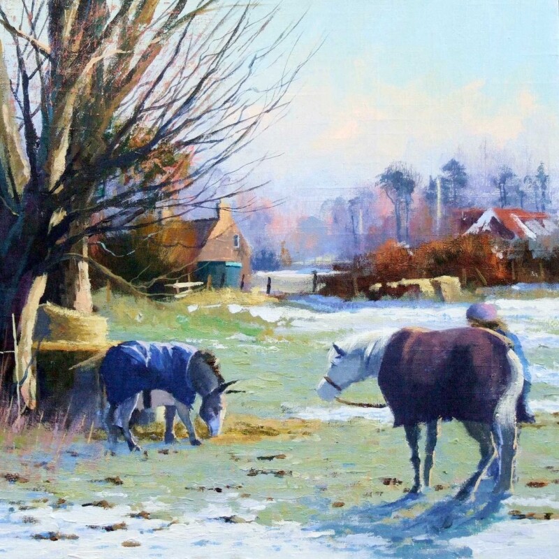
Choosing wall art for a room with wall panelling is often about restraint. Panelling already gives a room structure, rhythm, and a stronger sense of finish, so the artwork has to add atmosphere without making the wall feel overworked. Sheltered in the Glen suits that job especially well because it brings depth and calm while still feeling entirely at home in a more characterful interior.
Why panelled rooms need artwork with balance
Wall panelling can make a room feel beautifully settled, but it also means every visual decision carries a little more weight. If the artwork is too busy, the wall can begin to feel crowded. If it is too slight, it can disappear into the detail. The strongest choice usually brings presence, softness, and a clear focal point without fighting the lines of the room.
Sheltered in the Glen works on exactly that level. Its landscape mood gives the room breathing space, while the composition and colour provide enough substance to hold their place against timber detail, painted mouldings, or more traditional joinery. The result feels considered rather than simply decorative.
It softens the structure of panelled walls without losing definition.
It suits rooms that mix craftsmanship, texture, and quieter colour palettes.
It helps a more formal space feel warmer and easier to live with.
Why the framed finish matters in a detailed room
In a room with panelling, trim, and other considered finishes, presentation matters. First 4 Frames completes each piece in-house in Falkirk using bespoke framing, colour-managed Giclee printing, and hand-finished craftsmanship. That superior quality helps the artwork feel properly integrated with the room rather than added as an afterthought.
You can explore more work by Colin Robertson and view the exact framed print here.
If you are looking for wall art for a room with wall panelling that brings atmosphere without overwhelming a more textured interior, Sheltered in the Glen is a very well judged choice.
Choosing wall art for heritage paint colours is often about protecting the character of the room while making sure it does not become too visually dense. Deeper greens, blues, reds, and earthier neutrals can look beautiful, but they need artwork that brings light, atmosphere, and enough movement to stop the scheme feeling closed in. Afternoon Reverie, Haddington is a particularly good fit for that job.
Why this kind of room needs balance rather than more visual weight
Heritage shades usually carry presence on their own. They make a room feel settled, thoughtful, and full of character, but they also ask more of the artwork. A piece that is too stark can feel disconnected, while one that is too dark can make the whole scheme feel heavier still.
Afternoon Reverie, Haddington works well because it brings a softer sense of light across the wall. The landscape mood helps the room feel layered and calm, while the colour handling keeps everything sympathetic to a more traditional palette.
It softens richer paint colours without flattening them.
It adds atmosphere while still letting the room feel composed.
It gives a deeper scheme a more finished and liveable focal point.
Why craftsmanship matters in a more considered interior
Rooms built around heritage colour often rely on detail. That makes presentation especially important. First 4 Frames completes each piece in-house in Falkirk using bespoke framing, colour-managed Giclee printing, and hand-finished craftsmanship, so the final result feels in keeping with a room that has been chosen with care.
You can explore more work by Colin Robertson and view the exact framed print here.
If you are looking for wall art for heritage paint colours that feels warm, balanced, and genuinely well judged, Afternoon Reverie, Haddington is well worth considering.
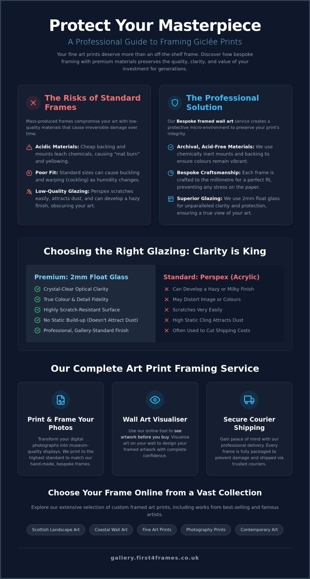
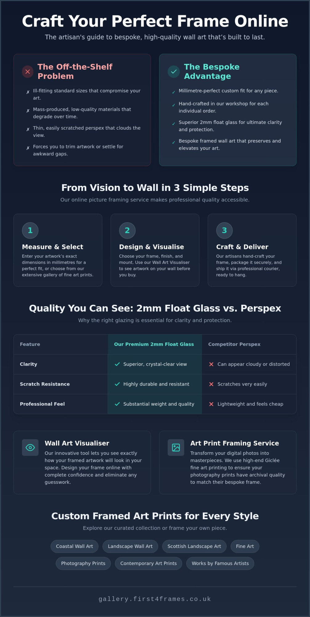
A Giclée print is a masterpiece of precision, but without the right protection, it’s merely a ticking clock of fading pigments and warping paper. You’ve likely invested in Scottish landscape art or a contemporary photography print because of its stunning fidelity and archival promise. It’s frustrating to imagine that vibrant detail lost to a cheap, off-the-shelf frame or distorted by the milky haze of low-quality Perspex glazing. We believe your fine art deserves a partner that works as hard as the artist did to create the image.
In this professional guide to Framing Giclée Prints, you’ll discover how to preserve the life of your artwork using bespoke techniques and premium materials. We’ll show you why 2mm float glass is the gold standard for clarity and how individually crafted frames prevent the structural damage common in mass-produced alternatives. You’ll also learn how to use our online tool to visualise art on your wall before you buy, ensuring your Scottish landscape art or contemporary photography prints fit your space perfectly. From high-quality craftsmanship to secure, professional shipping, we’ll walk you through the journey of turning a digital photograph into a protected heirloom.
Key Takeaways
Learn why professional Framing Giclée Prints requires acid-free materials and bespoke construction to protect your investment from environmental damage.
Understand the technical benefits of 2mm float glass over standard Perspex to ensure your bespoke framed wall art maintains perfect clarity.
Discover how to use a wall art visualiser to see artwork before you buy, allowing you to design your framed artwork with complete confidence.
Explore how our artisan “print and frame” service transforms photography prints into museum-quality Scottish landscape art or contemporary displays.
Gain peace of mind with our professional courier shipping process that uses specialized packaging to deliver your hand-made frames safely.
Why Framing Giclée Prints Requires a Professional Touch
You’ve chosen a beautiful piece of art. Perhaps it’s a vibrant piece of Coastal wall art or a moody piece of Scottish landscape art. To understand the value of your acquisition, you first need to know What is a Giclée Print? and why it differs from a standard poster. These are archival-quality reproductions using pigment-based inks, designed to last for generations. However, their longevity depends entirely on their environment. If you place a high-end print in a low-quality frame, you’re essentially putting a masterpiece in a microwave.
Many high-street retailers sell “standard” frames that look fine on the shelf but act like a slow-motion trap for your art. These mass-produced options often use acidic backing boards and cheap adhesives. Over time, these chemicals leach into the paper, causing yellowing and permanent damage. Framing Giclée Prints isn’t just about aesthetics; it’s about creating a protective micro-environment that shields the paper from light, moisture, and chemical decay.
To better understand these preservation concepts, watch this helpful video:
Archival Quality vs. Standard Photo Prints
Giclée prints use pigment inks that offer incredible depth and fidelity. Standard photography prints often use dye-based inks which fade quickly when exposed to UV light. To protect this investment, our Art print framing service uses acid-free mounts. Without them, you risk “mat burn,” a dark, unsightly line that appears where the mount board touches the print. Every layer of our Bespoke framed wall art is selected to be chemically inert, ensuring the colours stay as vivid as the day they were printed.
The Role of Bespoke Framing in Art Preservation
Every frame we create in our Falkirk workshop is individually crafted to the millimetre. This precision is vital. A frame that’s slightly too tight can cause the paper to buckle or “cockle” as humidity changes in your home. Professional framing also ensures there’s a necessary gap between the print and the glass. If your print touches the glazing directly, moisture can become trapped, leading to mould or the ink sticking to the glass. Before you commit, you can use our Wall art visualiser to See artwork before you buy, ensuring the final product matches your vision and your room’s environment perfectly.
Choosing the Right Components: 2mm Float Glass vs. Perspex
Selecting the right materials is where your vision truly takes shape. While many online retailers opt for Perspex to save on shipping costs, we believe that Framing Giclée Prints requires the uncompromising clarity of 2mm float glass. Acrylic glazing, often called Perspex, carries a hidden cost for art lovers. It’s prone to static, which attracts dust like a magnet, and it scratches far too easily. Over time, these plastic sheets can develop a dull, hazy finish that robs your Scottish landscape art of its natural depth and vibrant colour.
Real glass provides a level of fidelity that acrylic simply can’t match. In a professional gallery setting, clarity is king. 2mm float glass doesn’t bow or distort the image, ensuring that the intricate details in your contemporary art prints remain sharp from every angle. We understand the concern about fragility. That’s why we use professional couriers and full protective packaging to ensure your bespoke framed wall art arrives in pristine condition. When you choose your frame online, you’re investing in a display that stays clear for decades.
Glazing Options: Why 2mm Float Glass Wins
The technical superiority of float glass lies in its manufacturing process, which creates a perfectly flat, uniform surface. This results in superior light transmission compared to standard acrylic. For vibrant Coastal wall art or fine art, this means the colours you see on the paper are exactly what the artist intended. While acrylic is lighter, it’s also highly susceptible to “crazing” or micro-cracking if cleaned with the wrong chemicals, a risk you don’t want to take with custom framed art prints.
Bespoke Mouldings and Frame Styles
The frame itself should be as high-quality as the glazing. We avoid cheap plastic veneers and instead focus on solid wood mouldings that are individually crafted for your order. Whether you are looking for Custom Framing Styles: From Minimalist to Ornate, the material matters. A hand-made frame provides the structural integrity needed to support larger landscape wall art without warping. You can use our wall art visualiser to See artwork before you buy, making it easier to decide if a sleek black frame suits your photography prints or if a traditional wood grain better complements works by best-selling artists.
How to Design Your Framed Artwork Online
Designing your own gallery-quality display shouldn’t feel like a guessing game. While some services require you to wait days for a manual quote, our interactive system allows you to Choose your frame online with immediate results. This seamless workflow brings the artisan workshop to your screen. You can experiment with different combinations of mounts and mouldings, ensuring every element of your Bespoke framed wall art is tailored to your taste. When Framing Giclée Prints, the digital tools provide total creative control, allowing you to see exactly how your contemporary art prints or landscapes will look before they are hand-made.
The process is further simplified through our “print and frame” service. You don’t need to be a technical expert to get professional results. Simply upload your photography prints, and we’ll ensure they are produced using high-fidelity pigment inks on archival paper. This all-in-one solution guarantees that your digital files receive the same craftsmanship as works by famous artists, ensuring your Custom framed art prints stand the test of time.
The Wall Art Visualiser: Matching Art to Your Space
One of the biggest hurdles in Online picture framing is imagining how a piece will look in your home. Our Wall art visualiser removes this uncertainty. You can Visualise art on your wall by adjusting the wall colour and lighting settings within the tool. This is particularly helpful when choosing between vibrant Coastal wall art or atmospheric Scottish landscape art. It allows you to See artwork before you buy, confirming that the frame width and mount colour perfectly complement your existing decor.
Designing Your Custom Framed Art Prints
When you start to Design your framed artwork, follow these simple steps for the best results:
Select your print size based on the specific dimensions of your wall space.
Choose a mount width; a wider mount often adds a dramatic, gallery-style feel to fine art.
Pick your moulding from our extensive range of solid wood options.
Opt for our signature 2mm float glass for unmatched clarity.
For those looking to turn their own memories into masterpieces, our Online Photo Printing and Framing service provides a straightforward path from digital file to finished product. Once you’re happy with your design, our Falkirk-based team gets to work hand-crafting your order. Ready to begin? Explore our full collection and design your custom framed art prints today.
The First4Frames Gallery Experience: From Falkirk to Your Wall
At First4Frames, we don’t just assemble components. We bring a piece of Falkirk craftsmanship into your home or office. Whether you’re an individual collector or a business owner looking for commercial artwork curation, we act as your dedicated partner. Our goal is to ensure that Framing Giclée Prints results in a finished product that is as durable as it is beautiful. Every frame we build is a testament to our pride in workmanship and our selection of premium materials.
Supporting Local and Best-Selling Artists
We take immense pride in our collaborations with local Scottish talent. By working directly with creators, we bring exclusive Custom framed art prints to the market that you won’t find anywhere else. From moody Scottish landscape art to vibrant Contemporary art prints, our collection is curated to include both Famous artists and rising stars. You can Explore the First4Frames Gallery to find the perfect piece for your collection. This expertise also extends to commercial spaces. We provide tailored solutions for staging properties, hotels, and offices across the UK, ensuring every environment feels inspired and professional.
The Logistics of Fine Art: Shipping and Delivery
One of the biggest worries with Online picture framing is the risk of damage during transit. We’ve solved this through a rigorous protective packaging process. Every piece of Bespoke framed wall art is encased in specialized materials designed to absorb impact and prevent scratches to the 2mm float glass. We partner with professional couriers who understand the value of what they’re carrying. This allows us to offer a “no-damage” guarantee, providing peace of mind from our workshop to your door. We treat every shipment with the respect a piece of fine art deserves.
When your order arrives, it’s truly Ready-to-Hang. There’s no need to hunt for specialized hardware or worry about complex assembly. You’ve already used our Wall art visualiser to Design your framed artwork, so you know exactly how it will transform your space. It’s a hassle-free journey from your initial inspiration to a stunning, hand-made display that you’ll enjoy for years to come.
Elevate Your Space with Professional Preservation
Protecting your investment starts with the realization that Framing Giclée Prints requires more than just a standard, off-the-shelf solution. By choosing individually crafted frames from our Falkirk workshop, you’re ensuring your art isn’t just displayed; it’s actively preserved. We use premium 2mm float glass as standard to provide the absolute clarity your fine art deserves. This professional choice eliminates the static and distortion common with cheap Perspex, allowing the true colours of your Scottish landscape art or contemporary photography prints to shine through.
Our online tools make the creative process effortless and inspiring. You don’t have to worry about whether a frame will match your decor when you can use our wall art visualiser to see the final result instantly. We’re trusted by local Scottish artists and UK commercial clients because we never compromise on materials or craftsmanship. Every order is a unique partnership between our artisans and your creative vision. Design your bespoke framed wall art today at First4Frames Gallery and experience the peace of mind that comes with gallery-standard protection. We’re excited to help you transform your space with art that’s built to last.
Frequently Asked Questions
What is the difference between a Giclée print and a standard art print?
A Giclée print is a high-resolution reproduction created using pigment-based inks and archival-quality paper, unlike standard prints that typically use dye-based inks. This technical difference ensures your art remains vibrant for over 100 years. Because of this archival nature, Framing Giclée Prints requires acid-free materials to prevent chemical degradation. Standard prints often lack this longevity and are usually produced on thinner, non-archival stock.
Is it better to use glass or Perspex for framing fine art prints?
We always recommend using 2mm float glass because it provides significantly better clarity and longevity than Perspex. Unlike acrylic alternatives, real glass doesn’t attract dust through static or suffer from surface scratches that dull the image over time. It provides a rigid, perfectly flat surface that ensures your Framing Giclée Prints look professional from every angle. While Perspex is lighter, it often bows in larger frames, distorting your fine art.
Can I upload my own photos for the art print framing service?
Yes, you can easily use our “print and frame” service to turn your digital photography prints into gallery-quality displays. Simply upload your high-resolution files, and we’ll print them using the same pigment-based inks used for works by famous artists. Our Art print framing service ensures your personal memories receive the same bespoke, hand-made treatment as our professional gallery collections, including our signature 2mm float glass glazing for superior clarity.
How do I use an online wall art visualiser to see artwork before I buy?
Our Wall art visualiser allows you to see exactly how your chosen frame and artwork will look in a real-world setting. To use it, simply select a piece of art or upload your own photo, then Choose your frame online from our extensive range. You can even adjust the wall colour and lighting to match your specific room. This interactive tool helps you See artwork before you buy, removing any anxiety about the final aesthetic.
How are large framed Giclée prints shipped to prevent glass breakage?
We protect every piece of Bespoke framed wall art using specialized, multi-layered packaging designed specifically for glass-fronted frames. Our team in Falkirk custom-builds protective crates for larger items to absorb shocks during transit. We never use standard postal services for framed art; instead, we ship via professional couriers who specialize in handling fragile items. This ensures your Coastal wall art or Scottish landscape art arrives ready to hang and in perfect condition.
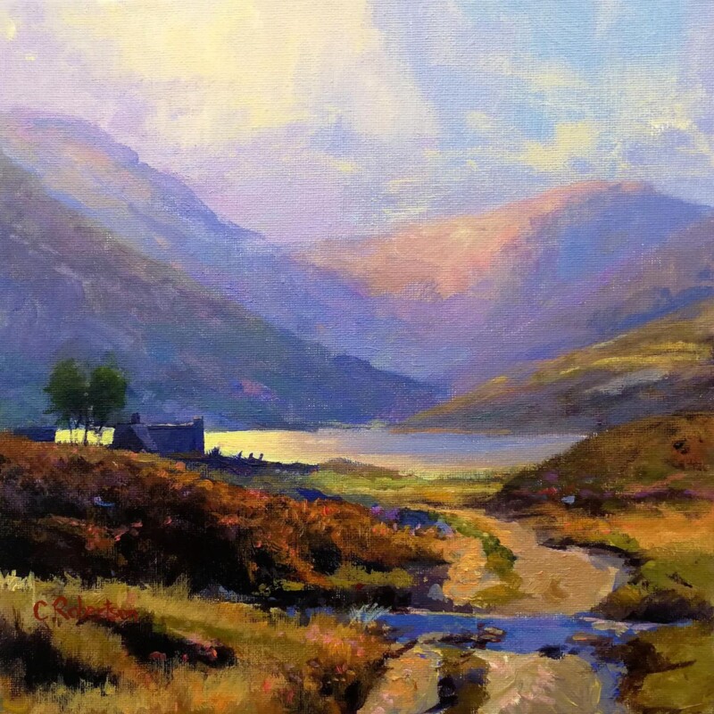
Well-chosen boutique hotel hallway wall art can change the feel of a guest property more than people expect. Corridors are often treated as purely functional, yet they shape first impressions and the sense of care that runs through the whole stay. Winter Watch works especially well because it brings atmosphere and local character while still feeling calm enough for a shared space.
Why hotel hallways benefit from artwork with a quieter sense of place
A boutique hotel usually aims to feel thoughtful from the moment guests arrive, not only when they reach the bedroom. Hallway artwork helps connect those in-between spaces to the overall standard of the property. Winter Watch is a particularly good choice because it offers mood, landscape, and a clear Scottish identity without feeling loud or overdone.
That balance matters in corridors, where the artwork should enrich the experience without becoming visually tiring. A piece like this can help a passageway feel more settled, more considered, and more aligned with the quality of the rooms beyond it.
It gives a guest corridor more atmosphere without making it feel darker or heavier.
It adds local identity in a way that feels refined rather than themed.
It supports a more polished impression across the full guest journey.
Why craftsmanship matters in hospitality spaces
First 4 Frames completes each piece in-house in Falkirk using bespoke framing, colour-managed Giclee printing, and hand-finished craftsmanship. In a hospitality setting, that level of finish matters. It helps the artwork feel like part of the property standard rather than an afterthought placed simply to fill a wall.
You can explore more work by Colin Robertson and view the exact framed print here.
If you are looking for boutique hotel hallway wall art that feels calm, rooted, and properly finished, Winter Watch is a very strong option.
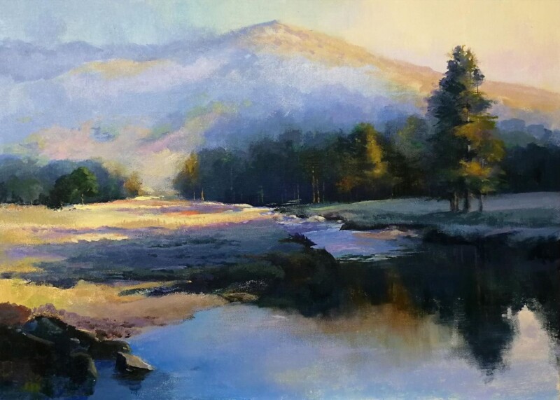
The best big art for living room walls does more than cover space. It gives the seating area a clearer centre of gravity. Chasing the Light works especially well because the landscape has room to breathe, which helps a larger wall feel intentional rather than merely filled.
That sense of breadth matters in a living room where the sofa, coffee table, and lighting already create several visual points. One wider framed piece can pull them together more calmly than a cluster of smaller artworks that never quite settle.
Why Scale Matters More Than People Think
A larger wall behind a sofa or sideboard often needs artwork with enough spread to look related to the furniture below it. Chasing the Light has the kind of open movement that can hold that relationship without feeling heavy.
It helps the living room feel anchored rather than slightly fragmented.
It brings atmosphere without crowding a calmer decorating scheme.
It suits buyers who want one confident answer instead of several smaller fillers.
Where This Kind of Piece Works Best
This sort of landscape makes particular sense above a sofa, along a longer wall opposite the seating area, or in an open-plan living space where the art needs to give the room a stronger focal pause. It also works well with timber, stone, wool, and softer neutral palettes because the image adds distance and light rather than visual fuss.
When a living room already has plenty going on, that calmer sense of structure is often more useful than extra detail.
Why the Framed Finish Helps It Land Properly
Larger artwork needs a finish that feels properly resolved. First 4 Frames handles the bespoke framing and colour-managed Giclee production in-house, which helps a piece like this keep both its tonal depth and its presence on the wall.
You can view the exact framed product here, and browse more from Colin Robertson if you want Scottish landscapes with the same spacious, easy-to-live-with character.
If you are looking for big art for a living room that feels expansive, calm, and genuinely room-shaping, Chasing the Light is a very strong option.
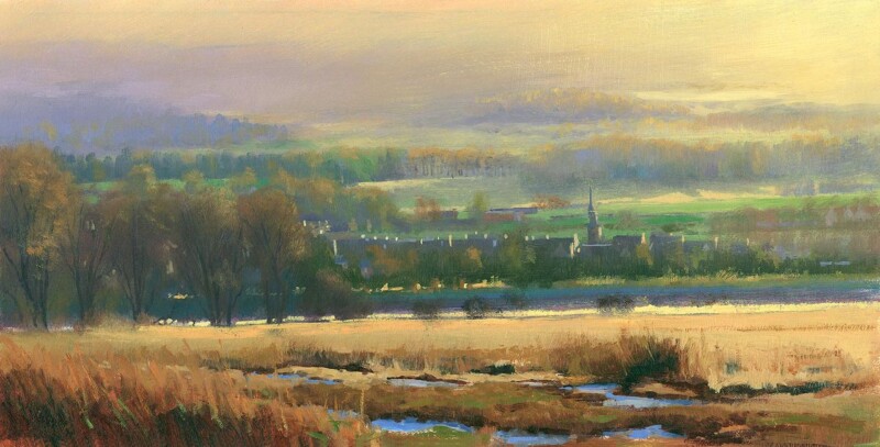
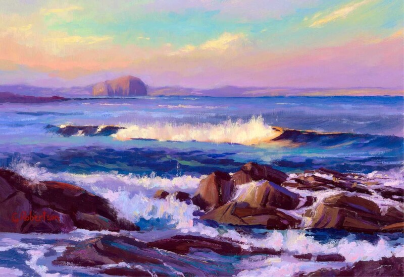
The best Scottish landscape art does more than show scenery. It gives a room a stronger sense of place while still feeling calm enough to live with every day. Afternoon Waves, The Bass Rock does that particularly well because the recognisable landmark is balanced by soft movement, distance, and a quietly tide-led rhythm.
That combination stops the piece from feeling either overly formal or purely souvenir driven. Instead, it feels rooted and atmospheric, which is exactly what many buyers want from a framed Scottish landscape.
Why The Bass Rock Gives This Piece Real Identity
A familiar coastal landmark can anchor a room more confidently than a generic scene because it carries memory, place, and visual structure at the same time. Here, the Bass Rock gives the composition a clear focal point while the surrounding water keeps the mood relaxed.
It brings recognisable Scottish character without feeling heavy handed.
It suits interiors that need calm movement rather than busy detail.
It works well for buyers who want local identity with a polished finish.
Where It Sits Most Naturally
This kind of piece works especially well in a living room, hallway, or dining space where one framed landscape can settle the wall without taking over the whole scheme. It also suits homes that already use natural light, pale timber, or coastal colours and need artwork with a stronger sense of destination.
Because the image feels spacious rather than crowded, it can add character without making the room feel visually busier.
Why The Framed Finish Matters
Landscape art depends heavily on tone and presentation. If the print handling feels flat, much of the atmosphere can disappear. First 4 Frames produces work like this in-house with bespoke framing and colour-managed Giclee quality, helping the finished piece feel more substantial and better judged on the wall.
You can view the exact framed product here, and browse more by Colin Robertson if you want Scottish scenes with the same mix of place and calm.
For buyers searching for Scottish landscape art that feels spacious, rooted, and quietly expressive, Afternoon Waves, The Bass Rock is a very strong option.
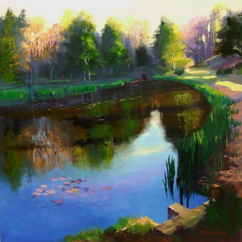
Choosing wall art for bay windows often means solving a balance problem. Bay windows bring welcome daylight and a sense of openness, but they can also make the surrounding walls feel visually lighter than the rest of the room. Parkland Reflections is a particularly good answer because it adds atmosphere and structure without making the space feel heavy.
Why bay window rooms benefit from artwork with calm presence
A room with a bay window usually has several sightlines at once. Light moves across the walls differently throughout the day, and furniture often sits at angles rather than in one straightforward line. That means the artwork needs enough presence to hold the room together while still feeling relaxed. Parkland Reflections does that beautifully. It gives the eye a natural place to settle, which helps the wider space feel more composed.
This is especially useful in sitting rooms, bedrooms, or reading areas where the bay window is one of the room’s best features. Instead of competing with the architecture, the print works with it, adding a quieter focal point that supports the light already coming in.
It helps a bright room feel more anchored without darkening it.
It suits spaces with multiple angles and changing daylight.
It offers a calmer, more lasting finish than generic decorative wall pieces.
Why hand-finished presentation matters in a light-filled room
Brighter rooms reveal finish more clearly, so quality presentation matters. First 4 Frames completes each piece in-house in Falkirk using bespoke framing, colour-managed Giclee printing, and hand-finished craftsmanship. That gives the print the refinement it needs to sit confidently in a room shaped by natural light.
You can explore more work by Colin Robertson and view the exact framed print here.
If you are looking for wall art for bay windows that feels calm, well judged, and easy to live with, Parkland Reflections is a very strong choice.
The appeal of extra large framed wall art is not just size for its own sake. Often, the real benefit is clarity. A longer or emptier wall can look more settled with one expansive statement than with several smaller pieces trying to do the same job. Islands in the Tide, Clachan Bridge is a strong example of that principle in practice.
The composition has enough movement and distance to spread comfortably across a larger visual field, which helps a bigger wall feel intentional rather than merely filled.
When Bigger Is The Better Choice
There are rooms where multiple small frames only underline the awkwardness of the space. A single larger landscape can create calm, anchor furniture more convincingly, and stop the wall from feeling bitty.
It suits longer walls above sideboards, sofas, and larger beds.
It gives open-plan rooms a stronger centre of gravity.
It creates more calm than several unrelated pieces competing for attention.
Why This Landscape Has The Right Reach
Islands in the Tide, Clachan Bridge has the scale-friendly qualities you want in a bigger framed piece: open space, layered distance, and enough tonal variation to stay interesting across the room. It can make a living area feel more complete or help a hallway wall feel more considered from the first glance.
Because the image is spacious rather than busy, the larger presentation reads as confident rather than overwhelming.
Why Presentation Counts More At This Size
Once a framed piece becomes larger, every weakness in print handling or framing becomes more obvious. First 4 Frames completes work like this in-house with bespoke framing and colour-managed Giclee production, which is exactly what helps a bigger piece feel premium and settled rather than oversized for the sake of it.
You can view the exact framed product here, and explore more from Colin Robertson if this kind of expansive Scottish landscape feels right for your space.
If your wall needs extra large framed wall art that brings scale and calm in equal measure, Islands in the Tide, Clachan Bridge is a very strong option.
The phrase premium framed artwork only means something if the finished piece genuinely looks and feels better on the wall. That is why Blue Thunder, The River Dee is such a useful example. It has colour, movement, and atmosphere, but what really makes it convincing is how strongly the image benefits from a well judged framed presentation.
A lively landscape can quickly lose impact if the print looks flat or the frame feels like an afterthought. Here, the richness of the blues and greens needs proper support. Without that, the work would not carry the same confidence once it reaches the room.
What Premium Should Actually Mean
When buyers invest in premium framed artwork, they are usually paying for three things at once: a stronger image, a better print, and a more complete presentation. The point is not just to own the picture. It is to have a finished piece that looks settled and durable in a real interior.
The print needs believable depth and clean colour handling.
The frame should feel matched to the artwork rather than generic.
The final piece should arrive ready to hold the wall with confidence.
Why This Piece Rewards Better Presentation
Blue Thunder, The River Dee has enough energy to work as a focal point, but it also has enough calm to live comfortably in a home long term. That balance is exactly what makes premium presentation worthwhile. The artwork has something to say, and the framing helps it say it more clearly.
It would sit particularly well in a sitting room, study, or hallway where you want one piece to add depth without making the room feel visually crowded.
In-House Craftsmanship Matters
First 4 Frames completes the framed finish in-house in Falkirk, using colour-managed Giclée production and bespoke framing rather than a generic off-the-shelf treatment. That extra care is where the premium difference becomes visible. The result is more polished, more substantial, and much easier to place with confidence.
You can view the exact framed product here, and see more work by Colin Robertson if you want the same sense of colour and landscape atmosphere elsewhere in the home.
If you are looking for premium framed artwork that earns the label through quality and finish rather than sales language, Blue Thunder, The River Dee is a strong place to start.
What if you could access the expertise of a master artisan workshop from the comfort of your own home? You might feel hesitant to Design Your Frame Online because you fear the quality won’t match a local shop or that the piece will arrive damaged. It’s a common concern, especially when many competitors rely on thin perspex and mass-produced materials that fail to protect your work. At First4Frames Gallery, we believe your Scottish landscape art and fine art photography deserve the clarity and weight of genuine, hand-crafted quality.
In this guide, you’ll discover how to use professional tools to eliminate the guesswork of measuring and styling. We’ll show you how to use a wall art visualiser to see exactly how your piece looks before you buy. You’ll also learn about the benefits of our 2mm float glass, which offers superior clarity compared to cheap plastic alternatives. We’ll walk you through our simple three-step process for creating bespoke framed wall art that’s individually crafted, fully protected for shipping, and delivered by professional couriers straight to your wall.
Key Takeaways
Learn how to achieve millimetre-perfect precision for any artwork, ensuring a fit that mass-produced frames simply can’t provide.
Discover how to use a wall art visualiser to Design Your Frame Online, allowing you to see exactly how your piece complements your decor before you order.
Understand why 2mm float glass is essential for professional clarity and why it’s a superior choice over the easily scratched perspex used by competitors.
Explore our specialized art print framing service that transforms your digital photography into high-quality, hand-crafted gallery pieces.
Gain peace of mind with insights into our professional courier shipping and protective packaging that ensures your bespoke frame arrives in perfect condition.
Why Design Your Frame Online? The Benefits of Bespoke Customisation
Choosing to Design Your Frame Online isn’t just about convenience; it’s about giving your artwork the home it deserves. While a standard Picture frame from a high-street shop might seem like a quick fix, these mass-produced items often fail to provide the exact dimensions or material quality required to preserve art. Bespoke framed wall art ensures your piece is protected by high-quality materials, such as 2mm float glass, which offers clarity that cheap alternatives can’t match. This professional approach allows you to tailor every detail to suit specific styles, whether you’re highlighting the cool tones of Coastal wall art or the rugged textures of Scottish landscape art.
To see how simple it is to bring your creative vision to life, watch this helpful overview of the process:
Moving Beyond Standard Store-Bought Sizes
Many people feel frustrated when a beautiful piece of art doesn’t fit into a “standard” frame. You shouldn’t have to trim your art or settle for an oversized mount just to make it work. Bespoke framing is the precise art of creating a unique housing for a specific piece based on its exact dimensions and preservation needs. This millimetre-perfect sizing is vital for everything from photography prints to delicate fine art. If you’re curious about typical dimensions, you can explore our guide to standard photo and picture sizes to see where custom work truly shines.
The Wall Art Visualiser: See Artwork Before You Buy
One of the biggest hurdles in Online picture framing is wondering if the final product will actually suit your room. Our wall art visualiser removes that uncertainty. It allows you to Design Your Frame Online and see the result in a real-world setting, helping you decide if a specific mount colour enhances your Contemporary art prints or if a wider frame width is needed for an impactful Landscape wall art display. This tool makes it easy to see artwork before you buy with total confidence, whether you’re framing a piece from our gallery of best-selling artists or a personal digital photograph.
How to Use an Online Picture Framing Tool for Professional Results
Creating a gallery-quality display doesn’t require a trip to a physical shop. When you Design Your Frame Online, you’re following a tradition of craftsmanship aided by modern precision. The process is straightforward but requires attention to detail to ensure your Bespoke framed wall art looks its best. Start by accurately measuring your artwork’s width and height in millimetres. Once you’ve entered these dimensions, you can choose your frame online, selecting from a vast library of styles that range from sleek modern profiles to traditional ornate textures.
The final step in the configuration is choosing your mount. A well-chosen mount provides breathing room for the art and prevents the glass from touching the surface of your print. Our Online picture framing tool allows you to experiment with different border widths and colours, ensuring the final result perfectly complements your home’s colour palette. If you’re feeling inspired by the work of famous artists, you can browse our gallery for inspiration before starting your own project.
The Print and Frame Service for Digital Photographs
If your masterpiece is currently sitting on a hard drive or smartphone, our Art print framing service provides the perfect solution. You can upload your digital files directly to our platform for a seamless experience. We use high-end Giclée fine art printing, which utilizes archival-quality inks to ensure your photography prints don’t fade like standard high-street versions. Using our service for photo printing and framing online ensures that the print quality is a perfect match for the hand-crafted frame it sits within.
Choosing Your Frame Online: Materials and Finishes
The material of your frame is just as important as the style. Unlike budget competitors who often use plastic or MDF alternatives that can warp or peel, we use real wood for our Custom framed art prints. This provides a structural integrity and aesthetic warmth that mass-produced frames lack. For Scottish landscape art or rustic Landscape wall art, a natural wood grain often works best. Conversely, Contemporary art prints often shine in minimalist black or white finishes that allow the artwork’s bold lines to remain the focal point.
Quality Matters: 2mm Float Glass vs. Competitor Perspex
When you Design Your Frame Online, the components you can’t see in a digital preview are just as vital as the frame’s style. Many online retailers use acrylic or perspex glazing because it’s lighter and cheaper to ship. However, perspex is a magnet for static, which pulls dust onto your artwork. It also scratches easily and can develop a cloudy appearance over time. First4Frames Gallery uses 2mm float glass as the standard for every Bespoke framed wall art order. This professional-grade glass provides a level of clarity and fidelity that plastic simply cannot match.
Every piece we produce is individually crafted in our UK workshop. We believe that hand-finished quality is the only way to ensure a frame fits the artwork properly. Cheap, mass-produced frames often rely on standard sizes that leave gaps or put pressure on the art. By choosing premium components, we ensure your Custom framed art prints are preserved for the long term, rather than just displayed temporarily.
Why Glazing Choice Impacts Clarity and Longevity
Safe Transit: Professional Packaging and Courier Delivery
We understand the hesitation people feel about shipping glass. It’s a common objection when you Design Your Frame Online. To address this, First4Frames Gallery has refined a multi-layered packaging process that cocoons your frame in protective materials. We don’t rely on standard postal services for our bespoke work. Instead, we use professional couriers who are experienced in handling fragile, hand-made items. This rigorous process ensures your order arrives in gallery condition, no matter how delicate the contents.
Transforming Your Space with Custom Framed Art Prints
Framing is the final step in an artistic partnership. It’s the moment where a piece of Bespoke framed wall art truly settles into its environment. Whether you’re looking to showcase Coastal wall art or a moody Scottish landscape art piece, the frame choice dictates how the art interacts with your furniture and lighting. Our online gallery features curated works from best-selling and famous artists, making it easy to find a focal point that reflects your personality and style.
When you Design Your Frame Online, you have the creative freedom to build a cohesive gallery wall. Mixing different Custom framed art prints can turn a blank hallway into a personal museum. Try grouping Photography prints with Contemporary art prints to add visual texture to your room. Using our Wall art visualiser allows you to Visualise art on your wall and See artwork before you buy, ensuring that even a diverse collection feels unified before you commit to a purchase.
Matching Frames to Scottish Landscape and Contemporary Art
Vibrant scenes of the Highlands or the coast often benefit from natural wood frames that echo the organic beauty of the subject. These rustic finishes provide a warmth that complements Landscape wall art perfectly. For Coastal wall art, a clean white frame or a driftwood finish can enhance the breezy, light-filled atmosphere of the seaside. If you’re framing Contemporary art prints, consider using a deep mount. This technique adds physical distance between the art and the 2mm float glass; it creates a shadowbox effect that turns even a simple print into a sophisticated statement piece.
Designing Your Bespoke Framed Wall Art Today
We’ve combined the convenience of a digital Art print framing service with the uncompromising standards of a traditional artisan workshop. You don’t have to choose between the ease of being able to Choose your frame online and the durability of hand-crafted materials. Every order is individually handled by our team in the UK. This ensures your art arrives fully packaged and ready to hang in gallery condition.
Visit the First4Frames homepage to start your journey. It’s time to Design your framed artwork and see how professional, bespoke framing can transform your living space into an inspiring environment.
Bring Your Artistic Vision to Life
Choosing to Design Your Frame Online is about more than just selecting a border; it’s about giving your art the protection and presence it deserves. You’ve seen how millimetre-perfect sizing and digital visualisation tools remove the uncertainty from the creative process. By moving away from mass-produced, standard frames that often fail to fit, you ensure your Scottish landscape art or fine art photography is showcased with professional precision.
We take pride in the fact that every frame is individually hand-crafted in the UK using superior 2mm float glass as a standard. This commitment to quality ensures lasting clarity that competitor perspex cannot provide. Your bespoke order is fully packaged to prevent damage and delivered by professional couriers, ensuring it arrives in gallery condition. It’s time to turn your digital memories or new art acquisitions into heirloom pieces that define your home.
Can I design a frame for an odd-sized piece of art online?
Yes, you can Design Your Frame Online for any unique dimensions. Our system allows for millimetre-perfect precision, which means we can accommodate specific sizes that standard high-street frames simply can’t handle. This bespoke approach ensures your art fits its housing perfectly without the need for trimming. It’s the ideal solution for unique Scottish landscape art or vintage photography prints that don’t follow modern standard dimensions.
Is 2mm float glass better than the perspex used by other online framers?
Yes, 2mm float glass is the superior choice for clarity and long-term preservation. Unlike the perspex often used by budget competitors, real float glass doesn’t attract dust through static and is highly resistant to scratches. It provides a crystal-clear window that maintains the true colours of your fine art. While perspex can become cloudy over time, float glass remains transparent, ensuring your contemporary art prints look gallery-fresh for years.
How do I measure my artwork correctly for an online framing tool?
To use our tool to Design Your Frame Online, simply measure the width and height of your artwork in millimetres. It’s best to use a metal tape measure for accuracy. You don’t need to add any extra space for the frame or mount; our system calculates those tolerances for you based on the dimensions of the art itself. This ensures your bespoke framed wall art arrives with a precise, professional fit every time.
Does First4Frames Gallery offer a print and frame service for my own photos?
First4Frames Gallery provides a comprehensive art print framing service for your personal digital photography. You can upload your files directly to our site, and we’ll print them using high-quality Giclée methods before framing them by hand. This end-to-end service ensures the print quality matches the premium standards of our hand-crafted frames. It’s a perfect way to transform your photography prints into professional-looking wall art without managing multiple suppliers.
How is my custom framed art protected during shipping?
We protect your custom framed art using a multi-layered packaging system specifically designed for fragile items. Each frame is cocooned in shock-absorbing materials to prevent any movement or impact damage during transit. We don’t use standard postal services for these delicate orders. Instead, we partner with professional couriers who specialise in handling hand-crafted goods. This ensures your piece arrives in perfect condition, ready to hang on your wall.