
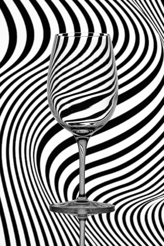
Questions about the best frame colours for black and white photography are rarely just technical. They change how the artwork behaves in the room. Trippy makes that easy to see because the image is already full of movement, contrast, and distortion, so the framing choice has a direct effect on whether it feels sharper, calmer, or more dramatic.
What Trippy shows about the best frame colours for black and white photography
With simpler black and white pictures, a frame can quietly support the image. With Trippy, the frame has a more active job. A darker frame can intensify the drama and keep the piece feeling crisp, while a lighter or softer finish can introduce more breathing space around the pattern. The right answer depends on whether the room needs energy, restraint, or a more gallery-like presentation.
- Darker frames can make graphic black and white work feel bolder and more architectural.
- Softer finishes can stop a high-contrast piece from overwhelming a smaller room.
- The mount and frame need to work together so the image feels intentional rather than busy.
This is exactly where First 4 Frames stands out. Because the framing is completed in-house, customers can approach the final presentation as a design decision rather than an afterthought. Bespoke guidance, hand-finished workmanship, and colour-managed production make it easier to land on a result that feels right for the room as well as the image.
For more on the photographer, visit Noel Fenech. You can also browse more work by Noel Fenech Photography and view the exact framed product here.
If you are weighing up the best frame colours for black and white photography, Trippy is a particularly helpful product-led example because presentation makes such a visible difference to the final mood.