Posted on

Large Coastal Wall Art Needs Calm as Much as Scale, Why Bay of A Thousand Names Works

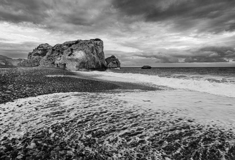
Image of Bay of A Thousand Names by Noel Fenech Photography

The best large coastal wall art does not rely on size alone. Bay of A Thousand Names is a strong example because it gives the wall breadth and atmosphere together, rather than trying to make impact through louder colour or cluttered detail.

That distinction matters on a bigger wall. If the artwork only shouts, it can quickly become tiring. If it carries calm as well as scale, the room stays easier to live with over time.

Why Scale Feels Better With Space And Atmosphere

A panoramic coastal image naturally opens the room, but this piece still feels grounded enough to anchor furniture and longer sightlines. It has presence without feeling aggressive.

  • It fills a larger wall without making the room feel busier.
  • It keeps coastal styling sophisticated rather than obvious.
  • It suits buyers who want statement and calm in the same piece.

Where It Can Make The Most Difference

This kind of artwork is particularly effective above a sofa, along a dining wall, or in an open-plan room where one broader piece can do the job of several smaller accents. It works well with muted blues, stone shades, oak, and linen textures because the photographic finish stays clean and spacious.

Why The Framed Finish Matters At This Size

Larger pieces reveal weak print and framing decisions very quickly. First 4 Frames handles the bespoke framing and colour-managed production in-house, helping the final work feel substantial, balanced, and properly resolved at scale.

You can view the exact framed product here, and browse more from Noel Fenech Photography if you enjoy coastal photography with the same expansive, atmospheric quality.

For buyers looking at large coastal wall art that feels spacious instead of overpowering, Bay of A Thousand Names is a very persuasive choice.

Posted on

Why Bay of A Thousand Names Works Beautifully as Wall Art for Whitewashed Interiors

Image of Bay of A Thousand Names by Noel Fenech Photography

Choosing wall art for whitewashed interiors is often less straightforward than it seems. Whitewashed rooms can feel calm and spacious, but they can also end up looking slightly unfinished if the artwork does not bring enough depth, atmosphere, and visual weight. Bay of A Thousand Names is especially effective because it adds presence while keeping the room airy and easy to live with.

Why lighter interiors need warmth as well as simplicity

Whitewashed walls usually work best when the rest of the room relies on texture, daylight, and a few carefully judged focal points. That means the artwork has an important role. It should add character and help anchor the space, but it should not disrupt the quieter palette that makes the room feel restful in the first place.

Bay of A Thousand Names does that beautifully. The coastal subject matter keeps the mood open and relaxed, while the tones and movement stop the wall from feeling too flat or too stark. It is the kind of piece that helps a pared-back room feel designed rather than merely minimal.

  • It adds atmosphere without making the room feel visually heavy.
  • It suits spaces built around natural light, pale woods, and simple finishes.
  • It helps a cleaner interior scheme feel warmer and more complete.

Why a hand-finished framed piece makes the difference

In a restrained room, presentation matters even more. First 4 Frames completes each piece in-house in Falkirk using bespoke framing, colour-managed Giclee printing, and hand-finished craftsmanship. That level of finish gives the artwork the polish it needs to hold its place in a room where every detail is more noticeable.

You can explore more work by Noel Fenech Photography and view the exact framed print here.

If you are looking for wall art for whitewashed interiors that feels calm, warm, and properly considered, Bay of A Thousand Names is a very strong choice.

Posted on

Framed Photography Prints With Presence, Why Greenan Castle Works

Image of Greenan Castle by Noel Fenech Photography

The best framed photography prints tend to do two things at once. They give the wall structure, and they carry enough atmosphere to feel more than simply documentary. Greenan Castle does exactly that, using coastline, sky, and architectural silhouette to create a focal point that feels clear but never dry.

That makes it especially appealing for buyers who want photography on the wall without relying on brighter colour for impact.

Why This Kind Of Image Has Lasting Strength

A strong photographic print often succeeds because it is pared back to the right essentials. Here, the castle form, open coast, and controlled light give the room definition without visual clutter.

  • It adds atmosphere without messiness.
  • It gives a wall shape and authority.
  • It feels coastal, but not overly themed.

Where It Can Sit Most Naturally

Greenan Castle would work beautifully in a study, living room, hallway, or bedroom where one print needs to bring place and quiet drama. It pairs especially well with pale walls, charcoal details, natural linen, and timber because the photograph adds tension and calm in equal measure.

That combination helps the finished room feel sharper without becoming colder.

Why The Framed Finish Matters So Much

Photography with this much tonal control needs thoughtful presentation. First 4 Frames produces and frames work like this in-house, using colour-managed processes that help the final piece retain detail, contrast, and a more polished presence.

You can view the exact framed product here, and browse more by Noel Fenech Photography if you enjoy photography-led pieces with the same strong sense of place.

For buyers comparing framed photography prints that feel architectural, atmospheric, and easy to live with, Greenan Castle is a very strong choice.

Posted on

Nature Wall Art That Feels Restorative, Why First Morning Rays Works

Image of First Morning Rays by Noel Fenech Photography

The strongest nature wall art tends to do more than add greenery to a scheme. It changes how the room feels to spend time in. First Morning Rays is especially effective because the woodland setting is carried by early sunlight, long shadows, and a sense of stillness that feels restorative rather than merely decorative.

That balance makes it a useful choice for interiors that need calm and warmth together.

Why Morning Light Makes The Difference

Nature scenes can sometimes feel generic when the lighting is flat or the image is only loosely connected to the room mood. Here, the sunrise creates direction, warmth, and a more hopeful atmosphere, which gives the artwork far more presence.

  • It feels fresh and calming rather than heavy or rustic.
  • It adds warmth without relying on louder colour.
  • It helps a room feel more restorative from the first glance.

Rooms That Suit It Best

This kind of woodland image works especially well in a bedroom, breakfast room, reading space, or home office where the goal is to create a steadier pace. It also suits interiors with oak, linen, softer neutrals, or garden-facing windows because the artwork extends that natural feel without blending into the background.

One framed piece like this can often do more for the room than several smaller decorative touches.

Why A Proper Finish Keeps It Clear

Subtle light is easy to lose if the print and framing are not handled well. First 4 Frames produces work like this in-house with bespoke framing and colour-managed Giclee quality, helping the morning tones stay crisp and the final piece feel complete on the wall.

You can see the exact framed product here, and browse more by Noel Fenech Photography if you enjoy nature-led photography with the same calm, luminous character.

If you are looking for nature wall art that feels light, restorative, and quietly uplifting, First Morning Rays is a very strong fit.

Posted on

Contemporary Art Prints, Why Going Up Feels So Architectural

Image of Going Up by Noel Fenech Photography

Some contemporary art prints rely on colour to feel current. Going Up takes a different route. Its strength comes from architectural rhythm, black and white contrast, and the subtle presence of one ascending figure, which gives the image movement without turning it into visual noise.

That makes it a strong option for rooms that want a clearer edge and a more design-led focal point.

Why Architecture Works In Cleaner Schemes

In a pared-back interior, contemporary artwork often needs to add shape rather than decoration. The sweeping lines in Going Up do exactly that, giving the wall direction and energy while still feeling controlled.

  • It sharpens a room without adding extra colour clutter.
  • It creates momentum, which helps static spaces feel more alive.
  • It suits buyers who prefer contemporary work with real structure.

Rooms That Benefit Most

This piece would work especially well in a home office, hallway, stair landing, or study where a more architectural image can support focus and polish. It also makes sense in interiors with black metal, pale walls, glass, or cleaner-lined furniture because it speaks the same visual language without feeling too severe.

The human figure keeps the image from becoming purely abstract, which helps it feel more approachable in everyday spaces.

A Good Finish Stops It Feeling Cold

Monochrome work depends on tonal precision. If the printing and framing are weak, the contrast can either flatten or feel harsh. First 4 Frames handles the Giclee production and bespoke framing in-house, helping the finished piece keep its depth and authority.

You can view the framed product here, and see more by Noel Fenech Photography if you want photography with the same architectural clarity.

For buyers exploring contemporary art prints that feel disciplined, modern, and visually confident, Going Up is a strong place to start.

Posted on

Why Peter’s Pool Is Such a Calm Coastal Wall Art Choice

Image of Peter's Pool by Noel Fenech Photography

A lot of coastal wall art leans too hard on obvious nautical signals. Buyers often want something calmer and more refined than that. Peter’s Pool stands out because it uses stone, water, and evening light to create openness without relying on a decorative seaside formula.

The result feels expansive and clean, which makes it easier to place in a home that wants coastal influence without becoming themed.

What Makes This Piece Feel Different

The sculpted limestone gives the image shape and texture, while the still water keeps the whole composition settled. That balance is useful in interiors that need a little more air and movement, but not a louder focal point.

  • It brings coastal character through mood and material rather than novelty.
  • It helps lighter rooms feel more spacious and resolved.
  • It keeps the wall fresh without becoming overstyled.

Best Rooms For This Sort Of Coastal Piece

Peter’s Pool would sit naturally in a bathroom, bedroom, landing, or relaxed sitting room where pale finishes and daylight already do much of the visual work. It is also useful in rooms with stone, linen, or sand-toned textiles because the artwork echoes those materials without blending away.

When the room needs calm rather than more activity, one framed image like this often works better than several smaller coastal accents.

Why Bespoke Framing Keeps It Polished

Subtle coastal photography can look underpowered if the finish is generic. First 4 Frames completes the framing and colour-managed Giclee production in-house, which helps quieter work like this retain presence once it is on the wall.

You can see the exact framed product here, and explore more from Noel Fenech Photography if you enjoy coastal photography with the same calm, sculptural feel.

If you want coastal wall art that feels airy, grown up, and easy to live with, Peter’s Pool is a very convincing choice.

Posted on

How Tree on the Loch Can Work Beautifully Above a Fireplace

Image of Tree on the Loch by Noel Fenech Photography

Choosing fireplace wall art usually means finding a piece with enough presence to anchor the room without making it feel too weighty. Tree on the Loch works beautifully in that role, bringing atmosphere, colour, and a strong focal point to the wall above a mantel or chimney breast.

Why this piece suits the space

A fireplace naturally draws the eye, so the artwork above it has to feel confident enough to hold that attention. Tree on the Loch does that without feeling overbearing. Its softer movement and layered colour keep the room calm, while the central subject gives the wall enough structure to feel properly finished. That makes it especially useful in living rooms where the fireplace is already one of the main visual anchors.

  • It gives a chimney breast a clear focal point without looking too formal.
  • It suits both contemporary rooms and more traditional interiors with character.
  • It adds atmosphere while still feeling easy to live with every day.

Where it works best

This kind of piece works especially well centred above a fireplace, on the main wall of a sitting room, or anywhere the décor needs one calm but confident feature. It is particularly effective when the room already includes natural textures, softer neutral colours, or timber details that benefit from one framed piece pulling everything together.

Why the framed finish matters

Because First 4 Frames completes the work in-house in Falkirk, the final piece benefits from bespoke framing, colour-managed Giclee production, and hand-finished craftsmanship. That higher standard of presentation matters above a fireplace, where the artwork is expected to look settled, polished, and worthy of its position in the room.

This artwork is by Noel Fenech Photography, and you can view the exact framed product here.

If you want fireplace wall art that feels balanced, atmospheric, and professionally finished, Tree on the Loch is well worth considering.

Posted on

Why Whispering Woods Is a Lovely Choice for Reading Nook Wall Art

Image of Whispering Woods by Noel Fenech Photography

The best reading nook wall art should support the mood of the space rather than interrupt it. Whispering Woods is a particularly good fit when you want a quiet corner to feel calmer, softer, and more settled.

Why this piece suits the space

A reading nook rarely needs loud colour or a dramatic focal point. What it benefits from is artwork that brings atmosphere without making the area feel busier than it is. Whispering Woods has that balance. The woodland subject feels restful, the composition has depth without fuss, and the overall tone suits slower parts of the day when the room is meant for reading, reflection, or simply switching off.

  • It works well in a corner with an armchair, lamp, and side table.
  • It adds personality without overwhelming a smaller wall.
  • It suits homes where softer natural subjects help a room feel more restorative.

Where it works best

This kind of piece can sit beautifully above a reading chair, beside a bookcase, or on the wall you face when you settle down with a book. If the nook already includes timber shelving, textured fabrics, or neutral paint, the artwork helps tie those elements together in a way that feels deliberate rather than decorative for its own sake.

Why the framed finish matters

At First 4 Frames, the piece is completed in-house with colour-managed Giclee printing, bespoke framing, and hand-finished craftsmanship. That quality-led finish matters in a smaller space, where details are easier to notice and a well-framed print helps the corner feel fully resolved rather than improvised.

This artwork is by Noel Fenech Photography, and you can view the exact framed product here.

If you want reading nook wall art that feels calm, characterful, and professionally finished, Whispering Woods is a very good option.

Posted on

Why Silent Morning Feels Like Luxury Wall Art Without Trying Too Hard

Image of Silent Morning by Noel Fenech Photography

People looking for luxury wall art are not always searching for something louder or bigger. Quite often, they want the opposite. They want artwork that gives a room more composure, more breathing space, and a stronger sense that every visible detail has been chosen on purpose. Silent Morning works beautifully in that kind of interior because it feels settled, spacious, and quietly assured from the first glance.

This is the kind of piece that earns its place by mood rather than by noise. The softer palette and open horizon help a room feel more expansive, which is especially useful in living spaces, bedrooms, or hallways where you want a premium finish without pushing the scheme into something over-styled.

Why It Feels More Refined

Luxury interiors usually rely on proportion, texture, and restraint. Artwork needs to support those qualities rather than interrupt them. Silent Morning brings depth and atmosphere, but it still leaves room for natural materials, upholstery, and architectural detail to do their work.

  • It adds calm visual weight without making the wall feel busy.
  • It suits layered neutral rooms that need finish, not more clutter.
  • It helps a quieter scheme feel intentional rather than plain.

Where It Works Best

This piece is particularly effective where the room already has quality materials and a gentle palette. Think linen, brushed timber, pale stone, or upholstery with a soft matte finish. In those settings, the artwork becomes part of the atmosphere rather than a separate decorative gesture.

It would work especially well above a sofa, on the wall opposite a bed, or in a stair hall where you want the house to feel composed before you even enter the main living space.

Why The Framed Finish Matters

At First 4 Frames, pieces like this are completed in-house with bespoke framing and colour-managed Giclée production, which is a major part of why the final result feels premium rather than temporary. Good luxury wall art does not stop at the image. The frame, finish, and overall presentation are what make the piece feel fully resolved on the wall.

You can view the exact framed product here, and explore more from Noel Fenech Photography if you want the same calm, photographic character carried through a wider collection.

If you want luxury wall art that feels spacious, polished, and easy to live with for years, Silent Morning is a very strong choice.

Posted on

Why Out of Reach Works So Well as Large Wall Art in a Brighter Room

Image of Out of Reach by Noel Fenech Photography

Good large wall art should feel confident on the wall without making the whole room heavier. That matters especially in brighter spaces, where blank areas can feel more obvious and smaller pieces can disappear. Out of Reach works particularly well because it brings vertical energy, rich natural colour, and enough presence to hold a broader surface properly.

Why larger walls need movement as well as scale

A bigger wall is not solved by size alone. The artwork still needs rhythm, shape, and enough interest to stop the room feeling static. Out of Reach has that sense of lift, which helps a taller room feel more alive while still staying calm and easy to live with.

  • It suits rooms with higher ceilings or broader uninterrupted wall space.
  • It adds scale without relying on a dark or overpowering image.
  • It helps a lighter room feel finished rather than simply open.

This can be especially useful where daylight already plays a big part in the room. Artwork that is too slight can get lost there, while something too dense may feel out of proportion. Out of Reach keeps the balance far better.

Why the framed finish matters at a larger scale

First 4 Frames completes each piece in-house in Falkirk with bespoke framing, colour-managed Giclee printing, and hand-finished craftsmanship. That superior finish gives the image the authority larger walls need, rather than leaving it feeling temporary or underpowered.

You can explore more from Noel Fenech Photography and view the exact framed print here.

If you are weighing up large wall art for a room that needs scale, lift, and atmosphere, Out of Reach is a very strong option.