
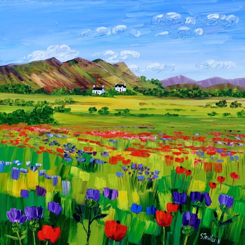
art by colour becomes more useful when the artwork answers a real feature of the room. Poppies and Thistles, Perthshire offers a clear example because its floral subject and rooted Perthshire identity make it possible to draw out colour without turning the whole interior into a matching botanical scheme.
Use art by colour as a starting point, not a formula
Start with the picture rather than a handful of paint cards. Identify the colour that catches your eye first, then decide whether it should lead the room or remain a small accent. With a floral work, repeating every petal and leaf tone can feel forced. One flower colour in a cushion or lamp base is often enough.
Choose a lead note
Let one poppy or thistle tone provide energy. Keep the repeat smaller than the framed work so the picture remains the source.
Add a quiet support
Use foliage, field or earth colours in timber, linen or ceramics. These supporting notes connect the artwork without obvious copying.
The square 265 × 265 mm and 500 × 500 mm print choices can serve different rooms. Mark the finished frame outline before deciding how much colour to repeat nearby.
Let framing give the palette a clean boundary
A considered frame separates concentrated floral colour from wall paint and furnishings. Colour-managed Giclée production helps retain distinctions between neighbouring tones, while bespoke in-house framing gives the square composition a calm edge.
For a useful explanation of colour relationships, see the V&A’s introduction to the colour wheel. You can also browse the Sheila Fowler collection or view the exact framed product.
Art by colour should create connection rather than perfect coordination. Poppies and Thistles, Perthshire can lead a layered interior while still keeping its own visual identity.