

Posted on

Art by Colour: Build a Room Palette Around Poppies and Thistles

Image of Poppies and Thistles, Perthshire by Sheila Fowler

art by colour becomes more useful when the artwork answers a real feature of the room. Poppies and Thistles, Perthshire offers a clear example because its floral subject and rooted Perthshire identity make it possible to draw out colour without turning the whole interior into a matching botanical scheme.

art by colour - Poppies and Thistles, Perthshire

Use art by colour as a starting point, not a formula

Start with the picture rather than a handful of paint cards. Identify the colour that catches your eye first, then decide whether it should lead the room or remain a small accent. With a floral work, repeating every petal and leaf tone can feel forced. One flower colour in a cushion or lamp base is often enough.

Choose a lead note

Let one poppy or thistle tone provide energy. Keep the repeat smaller than the framed work so the picture remains the source.

Add a quiet support

Use foliage, field or earth colours in timber, linen or ceramics. These supporting notes connect the artwork without obvious copying.

The square 265 × 265 mm and 500 × 500 mm print choices can serve different rooms. Mark the finished frame outline before deciding how much colour to repeat nearby.

Let framing give the palette a clean boundary

A considered frame separates concentrated floral colour from wall paint and furnishings. Colour-managed Giclée production helps retain distinctions between neighbouring tones, while bespoke in-house framing gives the square composition a calm edge.

For a useful explanation of colour relationships, see the V&A’s introduction to the colour wheel. You can also browse the Sheila Fowler collection or view the exact framed product.

Art by colour should create connection rather than perfect coordination. Poppies and Thistles, Perthshire can lead a layered interior while still keeping its own visual identity.
Posted on

Art by Colour Works Better When Cloud Break, Bass Rock Leads the Scheme

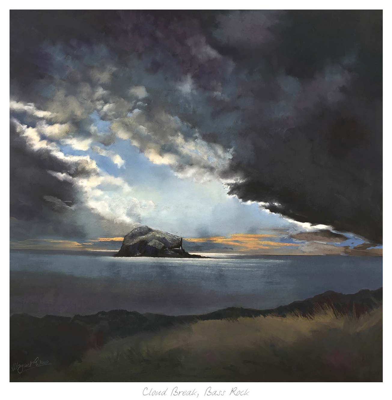
Cloud Break, Bass Rock" depicts dark storm clouds parting to reveal sunlight shining on Bass Rock island. Calm waters surround the rocky outcrop, and grassy land features in the foreground.

Shopping for art by colour can be useful, but it works best when the artwork still feels like art rather than a decorated colour sample. Cloud Break, Bass Rock is a very good example because the blues and warmer light help shape the room while the scene still keeps atmosphere, movement, and a clear sense of place.

art by colour - Cloud Break, Bass Rock

Why art by colour should still feel expressive

Colour-led shopping is often how decorating decisions begin, especially when you already have paint, upholstery, or rugs in place. The risk is ending up with something too literal. Cloud Break, Bass Rock avoids that because the palette is only part of its appeal. The scene also brings weather, light, and structure.

  • The blue tones connect naturally to cooler schemes and painted joinery.
  • The warmer breaks of light stop the room feeling flat or overly cold.
  • It works in a bedroom, sitting room, hallway, or office where colour needs some atmosphere behind it.

Why Cloud Break, Bass Rock gives a palette more life

Instead of just matching the room, the artwork gives the scheme a little more movement and depth. First 4 Frames finishes the piece in-house with bespoke framing and colour-managed Giclee printing, helping the final result feel superior quality, balanced, and easier to build a room around.

You can browse more work by Margaret Evans, learn more about the artist at Margaret Evans, and view the exact framed product here.

If you are exploring art by colour and want something more expressive than a simple match, Cloud Break, Bass Rock is a strong place to start.