
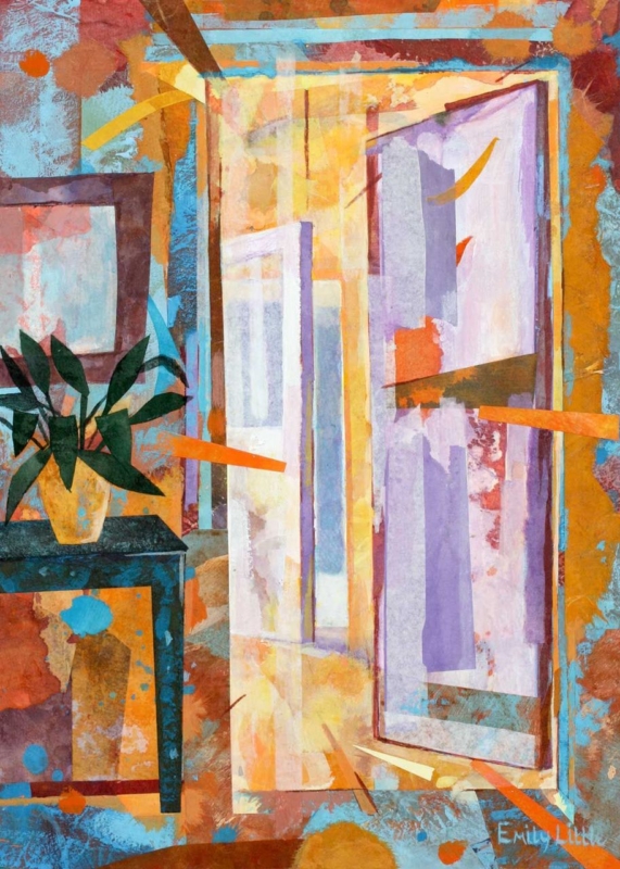
abstract wall art for a room with glass partitions can make transparent boundaries feel intentional rather than purely practical. The Other Room by Emily Little is especially relevant because its layered doorways, panels and glimpsed spaces echo the way internal glazing changes a view. Warm orange, yellow and terracotta soften the harder architectural lines. Turquoise and violet keep the composition open, while the tall format gives the eye a clear place to settle.
Why abstract wall art for a room with glass partitions needs visual depth
Glass partitions preserve light and long sightlines, but they can also leave a room feeling exposed or visually repetitive. Door frames, mullions and reflections create several layers at once. Artwork needs enough structure to hold its own within that activity. A very faint image may disappear. A rigid geometric print can make every line feel harder.
The Other Room offers a useful middle ground. Its rectangular forms relate to doors and glazing without looking mechanically precise. Painted edges overlap and shift. A plant on the left introduces an organic note, while a bright route through the centre suggests another space beyond. The image acknowledges the architecture and then makes it warmer.
Choose the sightline before choosing the wall
A glass-walled room is seen from more than one position. Before deciding where the print belongs, stand on both sides of the partition. Check the approach from a corridor, the view from a desk or sofa and the angle seen through an open door. The strongest wall is usually the one that lets the picture act as a destination across several spaces.
- Check the long view. The central doorway motif should remain readable from outside the room.
- Check the close view. Leave enough clear wall to appreciate the layered marks and colour changes.
- Check both door positions. Sliding or hinged panels should not cover the frame or interrupt the main composition.
- Check evening reflections. Switch on task lights and ceiling lights before fixing the final position.
The portrait format suits a narrow wall beside a glazed door, a short return at the end of a partition or a vertical section between two openings. It can also provide a useful counterpoint to a long horizontal run of glass. Make a paper template using the finished frame dimensions, not the print dimensions alone.
Use colour to soften an architectural interior
Internal glazing often appears beside black metal, pale walls and smooth floors. Those materials can look crisp, yet the combination may feel impersonal when every surface is cool. The Other Room introduces warmth without relying on a soft-focus landscape. Its ochre, orange and rust marks can connect with timber, leather or warm lighting. Aqua and blue can relate to cooler glass reflections.
| Existing feature | Colour connection to try | Useful restraint |
|---|---|---|
| Black-framed glazing | Use a slim dark frame to repeat the finest architectural lines | Avoid another broad black border that feels heavy |
| Pale timber floor | Relate it to the yellow and ochre passages | Do not force the moulding to match the floor exactly |
| Grey upholstery | Add one rust or turquoise textile as a quiet bridge | Keep the rest of the seating palette calm |
| Large green plant | Echo the painted leaves on the left of the image | Leave space so foliage does not cover the artwork |
Manage reflections without hiding the artwork
Glazing can multiply bright windows, screens and spotlights. View the proposed position at the brightest and darkest times of day. If a strong reflection crosses the centre, moving the frame a short distance may be more effective than changing the whole lighting scheme. Angled task lights are often easier to control than a spotlight aimed directly at the wall.
Keep the artwork away from the edge of a frequently used door. Finger marks and cleaning spray from the partition should not reach the frame. In a workspace, also check that the picture does not sit directly behind a monitor, where only its top edge will remain visible.
Frame layered colour with a calm boundary
The image already contains strong edges, broken shapes and energetic marks. Its presentation should clarify rather than compete. A measured mount can separate the work from a busy sightline. A slim charcoal moulding may connect with dark metal glazing. A warm timber can make a residential room feel softer and can pick up the ochre passages in the print.
First 4 Frames uses colour-managed Giclée production and completes bespoke framing in-house at its Falkirk workshop. That care matters here because the picture depends on fine differences between pale lavender, turquoise, yellow and warm red. It also preserves the textures and translucent-looking overlaps that create the sense of looking from one room into another.
Emily Little creates mixed-media work shaped by colour, landscape and personal response. Explore more of her work at Emily Little’s official website, or compare the wider Emily Little collection at First 4 Frames.
Well-placed abstract wall art for a room with glass partitions can give an open interior a point of focus without sacrificing its light or connection. View the framed The Other Room print for a tall, layered composition that turns doorways, colour and glimpsed space into the subject itself.