wall art for marble surfaces should earn its place by answering a real question about the room or recipient. Red Vase is a useful starting point because its portrait format and concentrated warm subject can answer cool polished stone without placing another decorative object on the worktop.
Balance wall art for marble surfaces with warmth and texture
Marble makes a strong visual field through veining, reflection and a cool tactile finish. Hang the print on the wall above or beside it, leaving a clear gap so the artwork and stone remain separate materials rather than merging into one busy display.
Build contrast in three layers
Colour: let the red vase provide the warm focal note.
Surface: set painterly variation against the stone’s polish.
Shape: use the portrait frame to rise above a long horizontal counter or console.
Avoid repeating red through appliances, flowers and several accessories. One smaller echo, perhaps in a chair textile or table detail, is sufficient. Timber can soften the transition, while black or pale framing can define the print according to the marble’s veining.
Reflections deserve a practical check. View the proposed position under pendants and task lights, then shift the frame or fitting angle if bright points appear across the glazing.
Separate painterly colour from polished stone
A portrait still life needs clean mounting and colour that does not flatten into one red note. First 4 Frames uses colour-managed production and bespoke in-house framing, creating a precise boundary between the expressive picture and harder architectural finishes.
Wall art for marble surfaces can make a polished room feel more human without sacrificing clarity. Red Vase provides warmth, vertical emphasis and visual texture while leaving the stone surface practical and open.
tall narrow abstract wall art can solve a part of the room that standard landscape and square pictures leave untouched. Golden Cloud by Emily Little is composed as a slim vertical stack of colour. Ochre, violet, rust, blue, and dark earth tones rise through the image in irregular bands, giving a narrow wall both height and visual depth without trying to disguise its proportions.
Why tall narrow abstract wall art suits difficult gaps
Many homes contain slim wall sections beside a doorway, at the end of a short corridor, between fitted furniture, or on a return beside a chimney breast. Leaving every one empty can make the room feel unfinished. Filling one with a picture designed for a wider wall usually creates the opposite problem: the frame looks squeezed and the wall feels even narrower.
A vertical image accepts the architecture instead of fighting it. In Golden Cloud, the eye moves upward through a sequence of layered forms. Some read like hills, fields, cloud, or distant horizons, while others remain purely textural. That uncertainty rewards a closer look and gives the compact position more interest than a simple decorative strip.
Measure the complete framed shape
The print is available at 120 by 280 millimetres and 240 by 560 millimetres before framing. Both versions are markedly taller than they are wide. The mount and moulding will increase those dimensions, so measure the finished presentation rather than treating the print size as the space required.
Wall position
What to measure
What to protect
Beside a doorway
The clear width with the door fully open
Enough separation from handles and passing shoulders
Between cupboards
The actual plaster width, not the furniture gap
A balanced margin on both sides of the frame
Short corridor end
The view from the approach as well as close range
Clear circulation and freedom from door swing
Chimney-breast return
Depth, sightline, and any nearby heat source
Safe conditions for paper, mount, and frame
Make a paper template for the expected outer dimensions. A margin that appears generous on a tape measure can feel tight when moulding and shadow are visible. The frame should look intentionally slim, not as though it only just fitted.
Use the vertical rhythm to guide hanging height
A tall picture can tempt people to hang its centre too high. Start from the usual sightline in the space, then account for how the wall is approached. In a corridor, the image should be comfortable to view while walking towards it. Beside furniture, it should relate to the top and side edges rather than floating independently.
Mark the outer frame. Use low-tack tape or paper so the complete silhouette is visible.
Stand at the main entrance. Check whether the picture draws the eye naturally or seems to climb towards the ceiling.
Test the nearest route. Make sure the frame does not project into a place where bags, coats, or shoulders may catch it.
Check the lower edge. It should remain clear of switches, radiators, and furniture corners.
Let layered colour connect the adjoining rooms
A narrow wall often sits at a transition. It may be visible from a hall and a sitting room, or link a kitchen to a dining space. The varied palette in Golden Cloud is helpful here. Warm gold and rust can relate to timber and brass, while blue and violet provide cooler counterpoints. Darker horizontal passages keep the brighter colours grounded.
Choose one or two connections rather than repeating every colour. An ochre chair seen from the next room or a blue ceramic on a nearby console may be enough. The picture should help the sightline feel joined, not turn the transition into a colour chart.
Frame a slim image without making it heavy
A wide or highly ornate moulding can consume the limited wall area and weaken the elegant ratio. A restrained dark frame may sharpen the deeper bands. A warm timber can respond to the gold and rust, while a pale neutral presentation can preserve breathing room on a compact wall. The actual print should lead the decision because several colours need to remain distinct.
First 4 Frames produces colour-managed Giclée prints and completes bespoke framing by hand at its Falkirk workshop. That in-house process is especially valuable with a narrow format. Mount width, moulding scale, glazing, and fixings can be considered as one finished object rather than added separately.
Layered landscape and memory from Emily Little
Emily Little creates expressive semi-abstract work shaped by colour, memory, emotion, and landscape. The stacked surfaces in this image suggest distance without fixing the viewer to one literal place. Explore more work on Emily Little’s official website, or browse the Emily Little collection at First 4 Frames.
Well-chosen tall narrow abstract wall art should make a difficult proportion feel intentional rather than merely occupied. View the framed Golden Cloud print for a slim composition that brings height, layered colour, and hand-finished craftsmanship to an often overlooked wall.
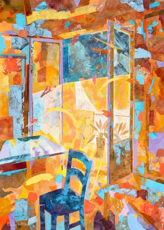
wall art for a glazed garden room should earn its place by answering a real question about the room or recipient. Summer Reflections is a useful starting point because its portrait proportions can occupy a solid return wall and its semi-abstract character can converse with garden colour without reproducing the exact view outside.
Plan wall art for a glazed garden room around movement
A conservatory often has little uninterrupted wall. Identify the solid section visible from the doorway and main chair, then make a paper template using the finished framed dimensions. A narrow return can suit a portrait composition better than several small pictures.
Run a one-day light check
Note when direct sunlight reaches the proposed wall.
Look for reflections from opposite roof and side glazing.
Check the sightline with doors open and closed.
Keep foliage from touching or covering the frame.
Do not match every colour to flowers that change through the year. Choose one connection, such as a cooler green, a warm bloom colour or the quality of reflected light. Neutral seating and a limited number of pots will let the picture remain readable in winter as well as summer.
Summer Reflections is offered in two portrait sizes, so it can be tested against the available wall rather than guessed from a screen. Leave a generous gap from glazing bars and heating controls so the frame appears intentional.
Protect colour while keeping the room bright
Colour-managed production gives nuanced colour a sound starting point, but display conditions still matter. In-house bespoke framing creates a precise edge; placement away from persistent direct sun and harsh reflections keeps the artwork comfortable to view.
Wall art for a glazed garden room should offer something the outside view cannot: a stable composition and an indoor point of pause. Summer Reflections can provide that focus without competing with every leaf beyond the glass.
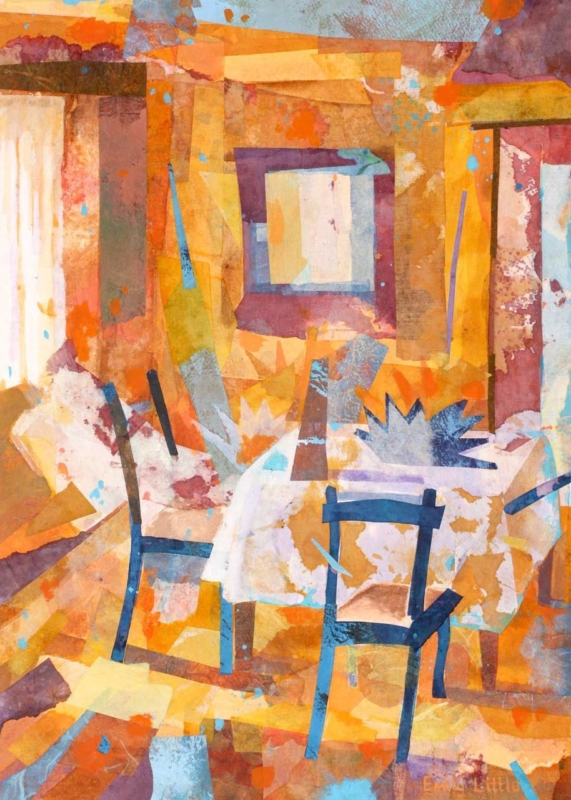
abstract wall art for mixed wood furniture can help a room containing several timber finishes feel collected rather than confused. The Unexpected Visit by Emily Little is especially useful for this task. Amber, ochre, russet, plum, pale cream, and flashes of blue overlap across the image. Those layered colours can relate to light oak, darker walnut, painted chairs, and older pieces without copying any one finish exactly.
How abstract wall art for mixed wood furniture creates unity
Matching every wooden item is rarely necessary. In fact, a room can feel flatter when the table, shelving, floor, and occasional furniture all share an identical stain. The challenge is giving different pieces a relationship. Artwork can provide that bridge by carrying several warm and cool notes in one composition.
The Unexpected Visit contains recognisable chairs and an interior, but neither is described literally. Blocks of translucent colour overlap like memories of paint, fabric, light, and timber. The near-black chair lines give the image structure. Pale areas keep it open, while burnt orange and gold connect naturally to the undertones found in many woods.
Identify undertones before trying to coordinate the room
Look past labels such as oak or walnut and notice whether each piece leans yellow, red, grey, or nearly black. Two woods with different grains can still sit comfortably together when they share a warm undertone. Conversely, furniture sold under the same broad name may look unrelated when one item is honey coloured and another is cool and washed.
Element in the room
Connection within the artwork
Honey oak or pine
Golden and amber passages across the upper and lower image
Walnut or mahogany
Plum, brown, and deep red blocks that add weight
Black-stained timber
Dark chair outlines that repeat a sharper furniture edge
Painted furniture
Small blue and cream areas that prevent an all-brown scheme
These are relationships, not colour-matching instructions. One print should not prompt a complete furniture replacement. Its role is to show that several tones can coexist within a considered whole.
Choose a position that lets the picture mediate between pieces
Placement matters when the furniture is varied. Above a console, the artwork may appear to belong only to that single item. On a wall visible between a dark dining table and a lighter cabinet, it can connect both. It may also work at the end of an open-plan room, where the portrait format provides a shared visual destination from several seating areas.
Map the sightlines. Stand at the doorway and at the main seats to see which timber finishes appear beside the proposed wall.
Test the full frame size. Use paper or low-tack tape, allowing for the mount and moulding as well as the print.
Leave a quiet margin. Clear wall around the frame stops varied furniture and accessories from merging into one busy field.
Check evening light. Warm bulbs can intensify orange, so make sure the cooler blue and pale details remain visible after dusk.
The print is available in 360 by 500 millimetres and 230 by 322 millimetres before framing. The larger option can hold a wall between substantial furniture. The smaller size can give a compact reading area or landing a layered focal point. Final dimensions will depend on the chosen mount and moulding.
Select a frame that joins the scheme without adding another mismatch
A frame does not need to imitate the nearest piece of furniture. A slim dark moulding can repeat the chair lines and provide a clean boundary. A restrained warm timber may suit a softer scheme, but it should be compared with the actual artwork and room finishes. Introducing an almost-matching wood without checking it can create more tension than a deliberate contrast.
First 4 Frames uses colour-managed Giclée production and completes bespoke framing by hand at its Falkirk workshop. That in-house approach allows the layered colour, darker linear marks, mount, and moulding to be considered together. It also turns the print into a polished, ready-to-hang piece rather than another loose element in an already varied room.
An interior image that rewards a second look
Emily Little creates paintings and mixed-media work shaped by colour, memory, landscape, and interior space. In this piece, chairs and openings emerge gradually from overlapping surfaces. Explore more at Emily Little’s official website, or browse the Emily Little collection at First 4 Frames.
Well-chosen abstract wall art for mixed wood furniture can turn difference into character. View the framed The Unexpected Visit print for a warm, layered composition that helps light, dark, old, and painted furniture share one confident visual language.
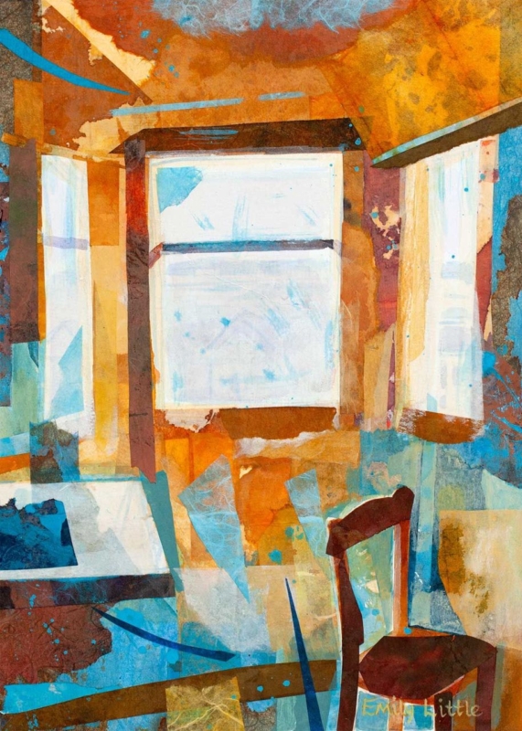
art size guide for every room becomes more useful when the artwork answers a real feature of the room. The Attic Room offers a clear example because its portrait proportions and 230 × 322 mm or 360 × 500 mm print options suit the kinds of vertical spaces that standard sofa-wall advice often overlooks.
An art size guide for every room starts with usable wall space
Do not measure only the total wall. Record the rectangle that remains after skirting, sloping ceiling, door swing and furniture are considered. That usable area determines whether the framed work can breathe and whether its centre will sit near a comfortable eye line.
Measure the narrowest width along the intended hanging area.
Mark the expected outer frame, not just the print dimensions.
Open doors and drawers to check clearance.
View the paper outline from the room entrance and usual seat.
Confirm where a hook can be fixed safely before ordering.
The smaller print can suit a wall return or reading corner. The larger option needs more uninterrupted height, but it may feel better balanced beside a chest or low chair. A paper template makes that difference visible before the frame arrives.
Treat the finished frame as the true measurement
Bespoke framing adds mount, moulding and glazing around the listed print size. First 4 Frames can bring those elements together in-house, creating a proportioned outer edge that looks intentional even on a difficult wall.
A useful art size guide for every room must account for awkward architecture. The Attic Room offers portrait flexibility, but the final decision should always be based on the complete framed outline.
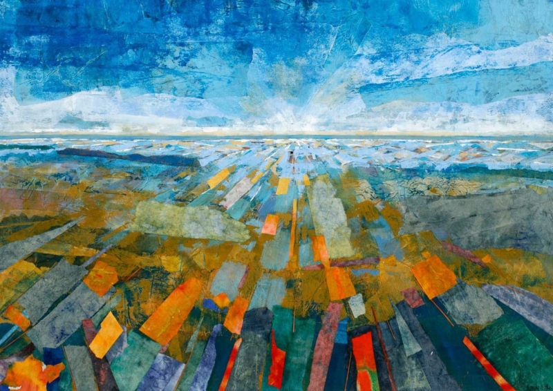
Extra large framed wall art earns its scale when it helps organise a room, rather than merely filling the biggest empty surface. Colourscape I by Emily Little is available up to 840 × 594 mm as a print. Its broad landscape format and layered colour can establish one clear visual centre in an open-plan living space without the busyness of several unrelated pictures.
Scale extra large framed wall art from the whole room
What to measure
Why it matters
The complete furniture width
The framed work should relate to the sofa or sideboard beneath it, not float as an isolated rectangle.
The proposed outer frame
A mount and moulding increase the final footprint beyond the 840 × 594 mm print.
The main viewing distance
Broad colour relationships become clearer when the work has enough space to be seen as a whole.
Mark the outer dimensions with low-tack tape before choosing the final size. Then walk through the room from each entrance. The work should feel connected to the main seating zone without crowding door frames, shelving or light fittings.
Abstract colour does not need to be repeated everywhere. Choose one quieter tone from the image for a cushion, ceramic or rug, then stop. This controlled link allows the artwork to lead while the rest of the room remains usable and calm.
Frame broad colour with a precise edge
Large colour areas reveal weak printing and imprecise presentation quickly. Colour-managed Giclée production helps preserve transitions and smaller surface details across the full image. Bespoke framing completed in-house can then provide the structural edge that a generous format needs, while keeping the moulding restrained enough for the artwork to remain dominant.
As extra large framed wall art, Colourscape I can do the work of several decorative objects. Give it sufficient wall, a measured relationship to furniture and a carefully finished frame, and the room gains order as well as colour.
art for a room with ochre furniture should carry a warm upholstery colour into the room without making every surface yellow, brown, or gold. Avant Les Ténèbres by Emily Little offers a more layered route. Ochre rises through the foreground and right-hand hillside, while teal, violet, blue, and green open the landscape around it. The result can connect a strong furniture choice to a broader, calmer palette.
What art for a room with ochre furniture needs to balance
Ochre furniture has warmth and presence. A sofa, armchair, or upholstered bench in this colour can anchor a room, yet it can also pull nearby creams and timbers towards the same warm register. Artwork is an opportunity to widen the scheme. Cooler colour and visual distance prevent the interior from feeling dense or overly coordinated.
In Avant Les Ténèbres, the warm slope does not sit alone. Deep blue-green landforms create weight on the opposite side, a pale route leads towards the centre, and cooler water and sky recede beyond the hills. Fine drawn marks and translucent-looking layers keep the broad shapes active. These relationships make the print useful as a bridge between warm seating and cooler walls or textiles.
Build the palette in three measured steps
Layer
Room element
Purpose
Warm anchor
Ochre sofa, chair, or bench
Gives the room weight and welcome
Cool counterpoint
Teal, blue, or violet artwork passages
Stops the palette becoming too warm
Quiet ground
Soft neutral wall, rug, or curtain
Allows both colour families to breathe
Repeat colours sparingly. A small teal ceramic or one muted violet cushion can link the picture to the room. Avoid matching every passage with a separate accessory. The artwork should organise the palette, not become a checklist that fills every shelf and chair.
Use the portrait format to add height
The vertical composition makes the piece useful above a low ochre chair, beside a bookcase, or on the shorter wall at the end of a sitting area. Its rising hills lead the eye upwards, while the distant opening keeps the image from feeling closed. This can help a room with substantial furniture feel lighter and more spacious.
Measure the clear wall rather than the full elevation. The frame should relate to the furniture below but retain a visible margin on each side. Test a paper template from the main doorway and seat. From farther away, the warm and cool landforms should balance; closer viewing reveals the scratches, lines, and layered textures.
Check colour in daylight and lamplight
Warm evening lamps can intensify ochre upholstery and pull orange notes forward. Cooler daylight may strengthen the teal and violet. View the intended wall at both times. A soft wall wash can preserve the darker detail after dusk, but the light should not create glare across the glazing.
A mount can provide a calm interval between the richly layered image and the room. A dark slender moulding may sharpen the composition, while a quieter timber can connect naturally to warm furniture. Compare the actual print, wall, upholstery, and flooring before making the final framing decision.
Colour-managed detail and hand-finished framing
Layered colour depends on controlled reproduction. First 4 Frames uses colour-managed Giclée production and completes bespoke framing in-house at its Falkirk workshop. The process supports the shifts between dense blue-green, glowing ochre, pale distance, and fine surface marks while giving the finished piece a polished presence.
Good art for a room with ochre furniture should expand the palette rather than simply repeat the upholstery. View the framed Avant Les Ténèbres print for a portrait landscape that brings warmth, cooler depth, and a clear route through the room’s colour.
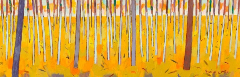
Minimalist wall art does not have to be blank or purely geometric. Birch Trees I brings the natural repetition of birch trunks into a pared-back interior. The subject offers rhythm and texture, while the woodland structure keeps the composition ordered enough for a room with few objects.
Let minimalist wall art organise a quiet wall
Placement
Useful relationship
Above a console
Align the artwork with the furniture centre, then keep objects low and sparse.
Beside a reading chair
Leave a generous margin so the tree rhythm does not collide with the lamp.
In a calm bedroom
Position it where it can be seen on entry rather than directly above a busy headboard.
Repetition is the strength of the subject, so the rest of the arrangement should avoid competing stripes. Slatted furniture, strongly ribbed wall panels and several tall vases nearby may create too many vertical beats. A smooth wall and one grounded piece of furniture give the image more clarity.
Minimal does not mean featureless; it means every line has enough space to register.
Use framing to separate woodland texture from the room
Birch imagery often relies on fine tonal shifts and repeated light-dark edges. Colour-managed Giclée production protects that detail. A slim hand-finished frame can provide a deliberate boundary, while a wider mount can add breathing room if the surrounding wall already contains architectural lines.
Birch Trees I makes a useful case for minimalist wall art with substance: it offers natural texture, measured repetition and enough quiet structure to shape the wall without filling every inch.
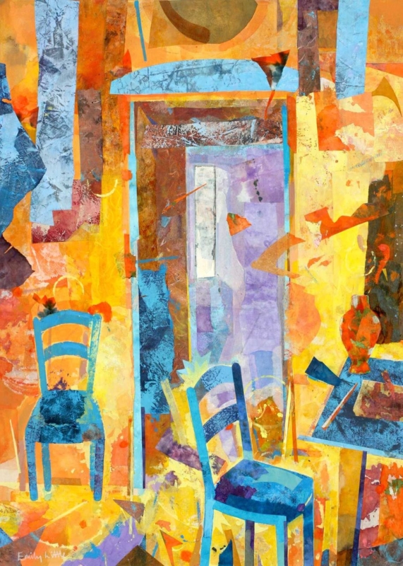
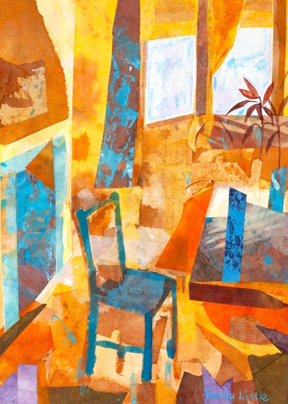
wall art for a colour-blocked interior needs to connect confident areas of colour without making the room feel like a collection of separate statements. Blue Chair by Emily Little offers a useful model. Its orange, ochre, teal, and pale blue shapes overlap within a recognisable interior, so the image feels energetic yet held together. It can give a bold room one focal point that explains the palette rather than merely adding another colour.
Why wall art for a colour-blocked interior needs a bridge
Colour blocking is most successful when each area feels intentional. A teal chair, rust-coloured curtain, blue cabinet, and warm painted wall can all look good alone. Together, however, they may seem unrelated. Artwork can act as the bridge because one composition can contain warm and cool notes while also introducing a clear rhythm of shapes.
Blue Chair is especially well suited to that role. The chair gives the eye an identifiable starting point, while the surrounding planes suggest windows, curtains, furniture, and changing light. That balance between representation and abstraction makes the picture easy to live with. It has enough subject to feel welcoming and enough visual structure to support a design-led room.
Build the room around three levels of colour
Colour role
How to use it
What to avoid
Foundation
Keep the largest wall or floor area relatively quiet
Giving every surface equal intensity
Anchor
Choose one substantial teal, blue, rust, or timber element
Scattering many small accents around the room
Echo
Repeat one picture tone in a cushion, lamp, or ceramic
Matching every colour in the artwork exactly
The print should not become a shopping list for accessories. Choose one dominant connection and perhaps one quieter echo. For example, a teal armchair could relate to the chair and cooler passages in the image, while a small rust cushion picks up a warm note. The remaining surfaces can stay calm. This gives the artwork room to carry the more complex colour relationships.
Use the vertical format to solve a narrower wall
The available print proportions are vertical, which makes the piece useful beside a doorway, at the end of a short dining wall, or above a compact side table. Measure the solid wall area rather than the whole elevation. The frame needs a clear margin on both sides so that the energetic composition does not feel squeezed.
Check the view from the main seat as well as from the entrance. From a distance, the broad orange and teal forms should read first. At closer range, the layered marks and interior details become more apparent. That change rewards repeated viewing and helps the picture work in a room used throughout the day.
Balance daylight and evening light
Strong daylight can make pale walls and brighter colours appear more separate. In the evening, warmer lamps may pull the orange and ochre forward. Test the intended wall at both times. A lamp positioned to wash the wall gently can keep the blues and layered texture visible after dusk, but it should not create a hard reflection across the glazing.
A mount can provide a quiet interval between the image and the room. A slim dark moulding may sharpen the geometry, while a warm timber can connect the ochre passages to furniture. Avoid choosing the frame from a tiny colour sample alone. Compare it with the actual print, the wall, and the room’s permanent finishes.
Let craftsmanship steady the colour
Artwork with layered colour depends on controlled reproduction. First 4 Frames uses colour-managed Giclée production and completes bespoke framing by hand at its Falkirk workshop. This in-house process supports the shifts between transparent-looking passages, stronger blocks, and smaller marks while giving the finished piece a polished, ready-to-hang presence.
Good wall art for a colour-blocked interior should make strong choices feel connected, not tame them. View the framed Blue Chair print for a vertical focal point that can unite warm and cool colour while keeping a confident room balanced.
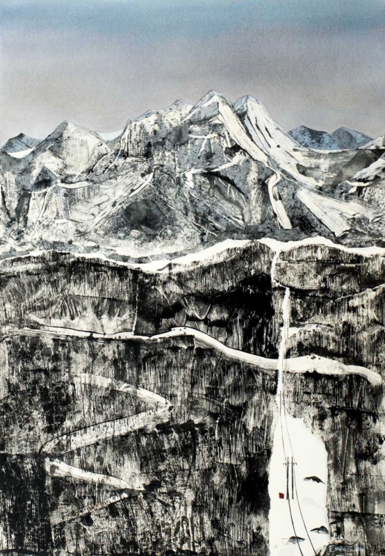
Best frame colours for art prints are chosen by studying the image as well as the room. The Clearing is nearly monochrome, with snow-lined mountains, dark rock bands, a pale winding road and one tiny red accent. That restraint makes the effect of the surrounding frame unusually easy to see.
Compare the best frame colours for art prints before deciding
Frame direction
Likely effect on The Clearing
Room relationship
Fine black
Connects to the darkest rock marks and sharpens the edge.
Useful against pale walls and simple furniture.
Soft white
Extends the snow and sky, making the image feel more open.
Works where the wall has enough contrast to retain a boundary.
Pale natural timber
Adds quiet warmth without introducing a strong new colour.
Relates well to oak, ash and textured neutral interiors.
Do not choose from a small online swatch alone. Consider the finished width, any mount, and the wall colour together. A broad black profile could overpower the delicate road, while a very bright white frame may look stark on a warm cream wall.
The frame should clarify the image’s hierarchy: mountains first, rock texture second, and the tiny red detail last.
Keep monochrome depth from becoming flat
Near-monochrome artwork depends on tonal range more than obvious colour. Colour-managed Giclée production retains the subtle steps between sky, snow, stone and ink-dark marks. Bespoke in-house framing then allows the profile and mount to be judged against the actual print.
The Clearing proves that the best frame colours for art prints are not automatically neutral choices; they are tools for protecting contrast, atmosphere and the order in which details are seen.