Posted on

Under the Castle (Loch Ness) and the Appeal of Wall Art for Built-In Bookcases

On a lush island, the castle "Under the Castle (Loch Ness)" overlooks water where a mythical sea creature with a long neck and flippers swims quietly beneath the surface.

Good wall art for built-in bookcases should do more than fill the gap between shelves. In a room already shaped by books, objects, and storage, the artwork needs to create a pause. Under the Castle (Loch Ness) does that beautifully, bringing story and colour into the room without adding more visual noise.

Why shelf-lined rooms need one stronger moment

Built-in bookcases can make a room feel intelligent and welcoming, but they also create a lot of visual detail. A framed piece with character gives the eye somewhere definite to land. That makes the whole room feel more edited and less accidental, especially when shelves are already full of varied shapes and colours.

  • It suits studies, snug sitting rooms, and reading spaces.
  • It introduces personality without competing with the shelves themselves.
  • It helps a wall of joinery feel designed rather than simply useful.

Why this subject works so naturally

Rooms with bookcases usually benefit from artwork that hints at narrative. Under the Castle (Loch Ness) has that quality. It feels distinctive and memorable, but it still leaves space for the books and the rest of the room to speak for themselves.

It can work especially well above a lower run of shelving, beside a reading chair, or on the section of wall that breaks up a longer bookcase arrangement.

Why a bespoke framed piece feels right here

First 4 Frames completes every piece in-house with bespoke framing, colour-managed Giclée printing, and hand-finished craftsmanship. In a room where books, joinery, and collected objects already suggest care, that superior finish feels especially appropriate.

This artwork is by Matylda Konecka, and you can view the exact framed product here.

If you want wall art for built-in bookcases that adds story, polish, and a more curated feel, Under the Castle (Loch Ness) is a very strong choice.

Posted on

Why Heres looking at you Isle of Bute Works So Well as Wall Art for a Room With French Doors

Image of Heres looking at you Isle of Bute by Arie Vardi

Choosing wall art for a room with French doors is often about balance. The doors bring welcome light, movement, and a strong connection to the garden, but that same openness can leave the room feeling a little visually loose unless the walls carry enough weight. Heres looking at you Isle of Bute works especially well because it keeps the room airy while still giving it a clear focal point.

Why garden-facing rooms need something steady on the wall

French doors naturally pull the eye outward. That is part of their appeal, but it also means the interior can feel underplayed if every surface is too pale or too quiet. This piece helps pull the room back together. It adds colour, shape, and enough presence to stop the space feeling unfinished once the daylight starts shifting.

  • It suits sitting rooms and dining rooms that open directly onto the garden.
  • It adds atmosphere without fighting with the view.
  • It helps the room feel styled in its own right rather than only defined by the doors.

Where it can make the biggest difference

This kind of framed piece works well on the wall perpendicular to the doors, above a sideboard, or anywhere the room needs a little more visual structure. The subject keeps things relaxed, but the framed presentation gives the space a more settled and deliberate feel.

Why the finish matters in a bright room

First 4 Frames completes each piece in-house in Falkirk with bespoke framing, colour-managed Giclée printing, and hand-finished craftsmanship. In a light-filled room, that standard matters. Cleaner framing and better print quality help the artwork hold its own rather than washing out beside the glass.

This artwork is by Arie Vardi, and you can view the exact framed product here.

If you want wall art for a room with French doors that feels light, balanced, and professionally finished, Heres looking at you Isle of Bute is an excellent option.

Posted on

Choosing Art for Copper Accents, Why Surf’s Up Feels So Lively and Balanced

Image of Surf's Up by Esther Cohen

Choosing art for copper accents is often about balance. Copper adds warmth and a little glow to a room, but if those touches are left unsupported they can feel scattered rather than intentional. Surf’s Up is a strong choice because it gives those warmer details something to connect with while still keeping the room fresh.

Why metallic highlights need a visual partner

Rooms with copper lighting, handles, or occasional furniture usually benefit from artwork that acknowledges that warmth without becoming too matchy. This piece brings energy and colour, but it still feels composed enough for everyday living.

  • It helps warmer metallic notes feel deliberate rather than random.
  • It adds movement without making the room overly busy.
  • It suits kitchens, dining spaces, and modern sitting rooms particularly well.

Why this combination feels current rather than forced

The strongest rooms usually repeat warmth in a subtle way. Surf’s Up helps do that while still bringing enough contrast to stop the room feeling one-note. It is lively, but it does not tip into looking over-styled.

Placed above a sideboard, near pendant lighting, or on the main wall of a dining area, it can make the whole scheme feel more tied together.

Why a bespoke framed print strengthens the look

First 4 Frames completes every piece in-house with bespoke framing, colour-managed Giclée printing, and hand-finished craftsmanship. That superior quality matters in a room where materials and finishes are already part of the design story.

This artwork is by Esther Cohen, and you can view the exact framed product here.

If you want art for copper accents that feels energetic, balanced, and professionally finished, Surf’s Up is a very smart choice.

Posted on

Bright and Breezy, Isle of Arran as Wall Art for Painted Floorboards, Why It Works

Bright and Breezy, Isle of Arran" is a vibrant painting of a red-roofed white cottage by the sea, set among lush green fields, wildflowers, rolling hills, and a dramatic sky inspired by the Isle of Arran.

Good wall art for painted floorboards should work with a room’s easy character while still giving it enough visual weight. Painted boards often make a space feel brighter, cleaner, and more informal, but they can also leave the room looking a little sparse if the walls are not doing their part. Bright and Breezy, Isle of Arran is a very good answer to that problem.

Why lighter flooring needs a little more lift on the wall

Painted floorboards create openness, which is exactly why people like them. The room then benefits from artwork that introduces colour and shape without making the whole scheme feel heavier. This piece keeps things fresh while still anchoring the space.

  • It suits brighter, more relaxed interiors beautifully.
  • It adds presence without disturbing the airy feel of the room.
  • It works well in bedrooms, sitting rooms, and coastal-inspired hallways.

Why the mood feels so compatible

Some artwork feels too formal for a room with painted boards. Bright and Breezy, Isle of Arran does not. It has enough energy and colour to feel uplifting, but it still sits naturally in a room where the atmosphere is relaxed and welcoming.

It can work especially well above a sideboard, along a stair run, or on the wall that benefits from one more confident element in an otherwise light scheme.

Why a hand-finished frame helps

At First 4 Frames, every piece is completed in-house in Falkirk with bespoke framing, colour-managed Giclée printing, and hand-finished craftsmanship. That superior finish gives the artwork enough presence to hold a lighter room properly.

This artwork is by Jean Feeney, and you can view the exact framed product here.

If you are looking for wall art for painted floorboards that feels uplifting, balanced, and professionally finished, Bright and Breezy, Isle of Arran is a strong option.

Posted on

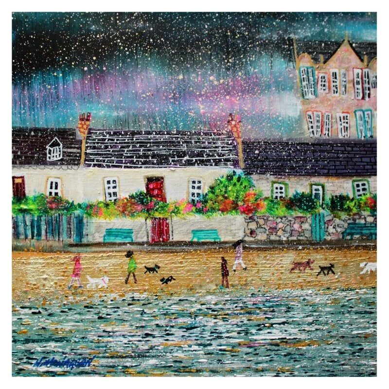
Why Tranquility, Plockton Works So Well as Wall Art for Jute Rugs

Image of Tranquility, Plockton by Colin Robertson

Finding the right wall art for jute rugs is often less straightforward than it sounds. Jute brings welcome texture and softness underfoot, but it can also leave a room feeling a little unfinished unless the walls carry enough visual interest. Tranquility, Plockton works especially well because it keeps that natural ease while giving the room a stronger focal point.

Why natural flooring needs balance above it

Jute often appears in rooms that aim for a relaxed, pared-back look. That can be beautiful, but the scheme still needs a little colour and shape on the walls if it is going to feel fully considered. This piece brings exactly that without disturbing the calm.

  • It adds atmosphere without making the room feel busier.
  • It works well with timber, linen, and woven textures.
  • It suits sitting rooms, bedrooms, and casual dining spaces particularly well.

Why this pairing feels easy to live with

The room still keeps its natural softness, but the artwork stops it from drifting into looking incomplete. Tranquility, Plockton has enough colour and distance to help the whole space breathe while still feeling anchored.

It can work beautifully above a sofa, near a favourite chair, or on the wall that frames the seating area in a more relaxed scheme.

Why the First 4 Frames finish matters

First 4 Frames completes every piece in-house with bespoke framing, colour-managed Giclée printing, and hand-finished craftsmanship. That superior finish helps the artwork feel properly at home in a room built around better materials and a quieter style of decorating.

This artwork is by Colin Robertson, and you can view the exact framed product here.

If you need wall art for jute rugs that feels calm, layered, and professionally finished, Tranquility, Plockton is an excellent choice.

Posted on

Choosing Art for Taupe Walls, Why Soul in Shadow Feels So Well Judged

Image of Soul in Shadow by Diana Hand

Choosing art for taupe walls is often about introducing depth without losing the calm that makes taupe so useful. Softer neutral rooms can feel elegant and easy to live with, but they still need something that gives the eye a little more definition. Soul in Shadow works beautifully in that role.

Why taupe schemes benefit from artwork with poise

Taupe is at its best when the room feels layered rather than flat. That usually means artwork with enough contrast and character to create a focal point, but not so much that the restful quality disappears. This piece adds exactly that sort of balance.

  • It deepens a softer palette without hardening it.
  • It feels elegant rather than overly decorative.
  • It suits bedrooms, sitting rooms, and dressing spaces especially well.

Why the subject feels so natural in a neutral room

Artwork with composure often works best against taupe because the wall colour already does some of the calming. Soul in Shadow brings presence and grace, which helps the room feel more intentional while still leaving space for fabrics, lighting, and furniture to breathe.

It can work especially well above a bed, over a console, or on the wall that needs one stronger statement in an otherwise restrained scheme.

Why a bespoke framed finish helps

At First 4 Frames, every piece is completed in-house in Falkirk with bespoke framing, colour-managed Giclée printing, and hand-finished craftsmanship. That superior finish is particularly valuable in neutral interiors, where cheaper details tend to stand out quickly.

This artwork is by Diana Hand, and you can view the exact framed product here.

If you are looking for art for taupe walls that feels elegant, balanced, and professionally finished, Soul in Shadow is a very strong option.

Posted on

How Piggies Can Bring Warmth to Laundry Room Wall Art

Image of Piggies by Hillary Barker

The best laundry room wall art does not need to be grand. It simply needs to make a hard-working room feel more human. Piggies does that brilliantly, bringing warmth and personality to a space that is often all about appliances, storage, and chores.

Why practical rooms still deserve character

Laundry rooms and utility areas can quickly feel cold if every surface is there only to serve a job. One framed print is often enough to soften the mood and make the room feel more finished. This piece adds charm without turning the space into something over-styled.

  • It brings warmth to a room full of hard surfaces.
  • It adds humour and personality without feeling childish.
  • It suits utility rooms, laundries, and boot-room style service spaces.

Where this kind of piece works best

It can sit comfortably above a countertop, opposite a washing area, or on the wall that catches your eye as you enter the room. In each case, it helps the space feel less like an afterthought and more like part of the home.

Why a better framed finish matters here too

First 4 Frames completes every piece in-house with bespoke framing, colour-managed Giclée printing, and hand-finished craftsmanship. Even in a more practical room, that superior finish makes a difference. It gives the artwork a sense of permanence and quality rather than a temporary decorative look.

This artwork is by Hillary Barker, and you can view the exact framed product here.

If you want laundry room wall art that feels warm, witty, and professionally finished, Piggies is a lovely choice.

Posted on

Why Mirror Glaze Is Such a Good Wall Art Choice for Polished Plaster Walls

Image of Mirror Glaze by Stuart Roy

Finding the right wall art for polished plaster walls can be more important than it first seems. Those softly textured finishes already bring depth and sophistication to a room, so the artwork needs to complement that richness without looking busy. Mirror Glaze works especially well because it adds atmosphere and contrast while still feeling calm.

Why smoother texture still needs a focal point

Polished plaster can make a room feel beautifully finished, but large uninterrupted walls sometimes need one stronger element to stop the space feeling too evenly toned. This piece introduces movement and colour in a way that still respects the room’s quieter surface detail.

  • It adds depth without making the wall feel cluttered.
  • It suits schemes built around softer neutrals and layered finishes.
  • It works well in living rooms, bedrooms, and calm reception spaces.

Why the balance feels right

Artwork for this kind of room usually needs presence rather than fuss. Mirror Glaze has enough atmosphere to hold the wall, but it does not overpower the subtle texture already in the scheme. That makes it easier to place and easier to live with over time.

It can work especially well above a sofa, opposite a bed, or on the main wall of a room where the finish itself already signals a quality-led interior.

Why the framing standard matters

At First 4 Frames, every piece is produced in-house in Falkirk with bespoke framing, colour-managed Giclée printing, and hand-finished craftsmanship. That superior presentation sits naturally in a room where material quality is already part of the design story.

This artwork is by Stuart Roy, and you can view the exact framed product here.

If you want wall art for polished plaster walls that feels atmospheric, balanced, and professionally finished, Mirror Glaze is an excellent fit.

Posted on

The Elephant House and the Appeal of Writing Room Wall Art With Character

A whimsical illustration of a winged elephant flying above The Elephant House café at night, as costumed people and animals, including a black cat, look up from the street below.

Good writing room wall art should support concentration without making a space feel flat. A room used for reading, journalling, or writing often benefits from a little atmosphere, but not from visual noise. The Elephant House is a lovely example of artwork that brings story and character into the room while still feeling composed.

Why a creative room needs mood as well as function

Writing spaces can easily become too practical. A desk, a lamp, and a few shelves may do the job, but the room still needs something that invites you to stay there longer. This piece helps with that. It gives the space personality without becoming distracting.

  • It adds imaginative character without feeling childish.
  • It works well in rooms used for reading, note-taking, or focused creative work.
  • It gives a quieter corner more identity and presence.

Why this sort of artwork is easy to live with

The strongest pieces for a writing room tend to suggest story without demanding too much attention. The Elephant House has that balance. It feels thoughtful and distinctive, yet it still leaves space for the room to do its real work.

Placed above a writing desk, near bookcases, or on the wall visible as you sit down to work, it can help the whole room feel more intentional.

Why a bespoke framed print suits the setting

First 4 Frames completes every piece in-house with bespoke framing, colour-managed Giclée printing, and hand-finished craftsmanship. In a smaller creative room, those details matter because the artwork is often seen up close and lived with slowly.

This artwork is by Matylda Konecka, and you can view the exact framed product here.

If you want writing room wall art that feels atmospheric, distinctive, and professionally finished, The Elephant House is a very strong choice.

Posted on

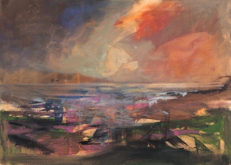
Why Sound Of Taransay Works Beautifully as Wall Art for Rattan Furniture

Image of Sound Of Taransay by Arie Vardi

Choosing wall art for rattan furniture is often about getting the balance right. Natural textures already bring warmth and character into a room, but they can start to feel a little expected if the artwork leans too heavily into a beach-house cliché. Sound Of Taransay works beautifully because it keeps the room light and relaxed while still giving it a more considered focal point.

Why it suits natural textures so well

Rattan, cane, and woven finishes tend to look best with artwork that has movement and atmosphere rather than something too rigid or overworked. This piece has that easy sense of flow, which helps a room feel collected rather than themed.

  • It adds colour without fighting the room’s lighter materials.
  • It keeps a natural scheme feeling airy rather than rustic.
  • It suits sitting rooms, sunrooms, and relaxed bedrooms especially well.

Where it can make the biggest difference

This kind of framed print works especially well above a woven bench, near occasional chairs, or on the main wall of a room where timber and natural fibres already do much of the talking. It gives the eye somewhere to settle while still keeping the overall mood easy to live with.

Why the framed finish matters

At First 4 Frames, each piece is completed in-house in Falkirk with bespoke framing, colour-managed Giclée printing, and hand-finished craftsmanship. That superior quality helps the artwork feel polished enough for a room built around quieter materials and better textures.

This artwork is by Arie Vardi, and you can view the exact framed product here.

If you are looking for wall art for rattan furniture that feels refined, restful, and professionally finished, Sound Of Taransay is an excellent option.