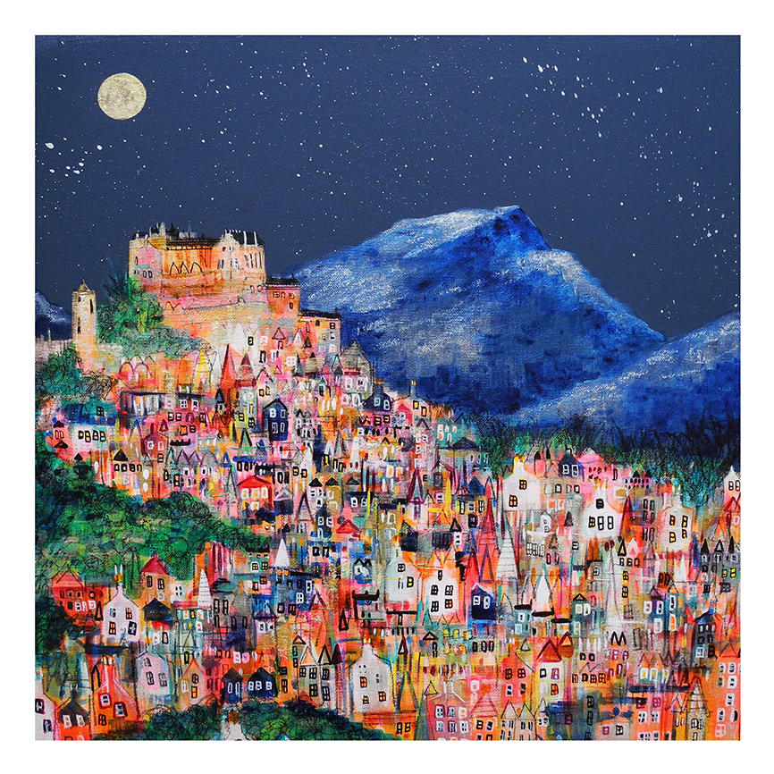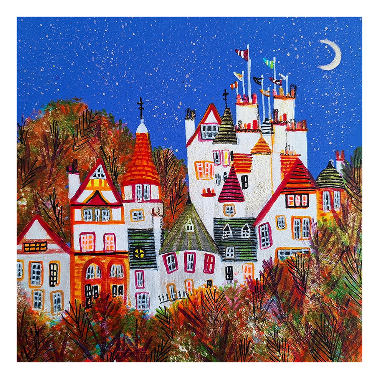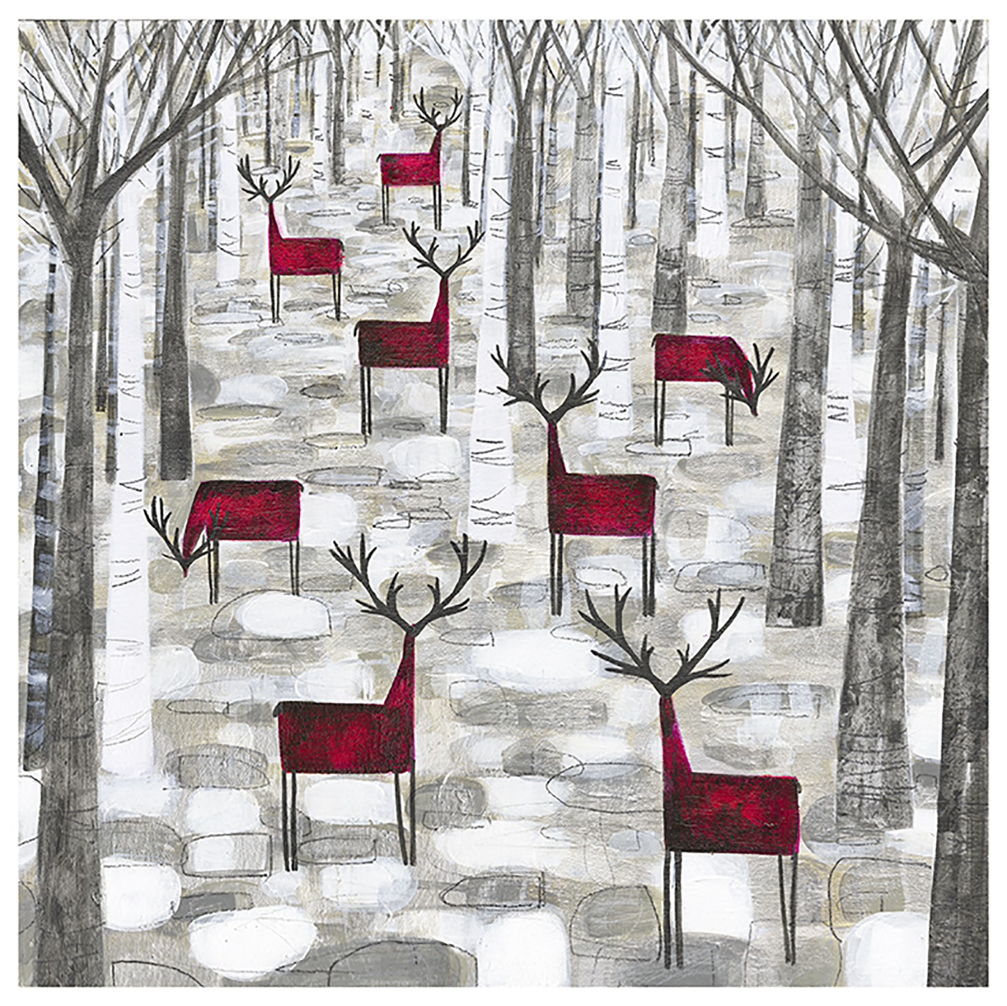
What makes a Glasgow West End print feel like home: a familiar street, a favourite local landmark, or a memory attached to a place? With so many styles and finishes to choose from, it’s easy to find an attractive image and still wonder whether it feels personal or how it will look once framed. The right choice brings both together.
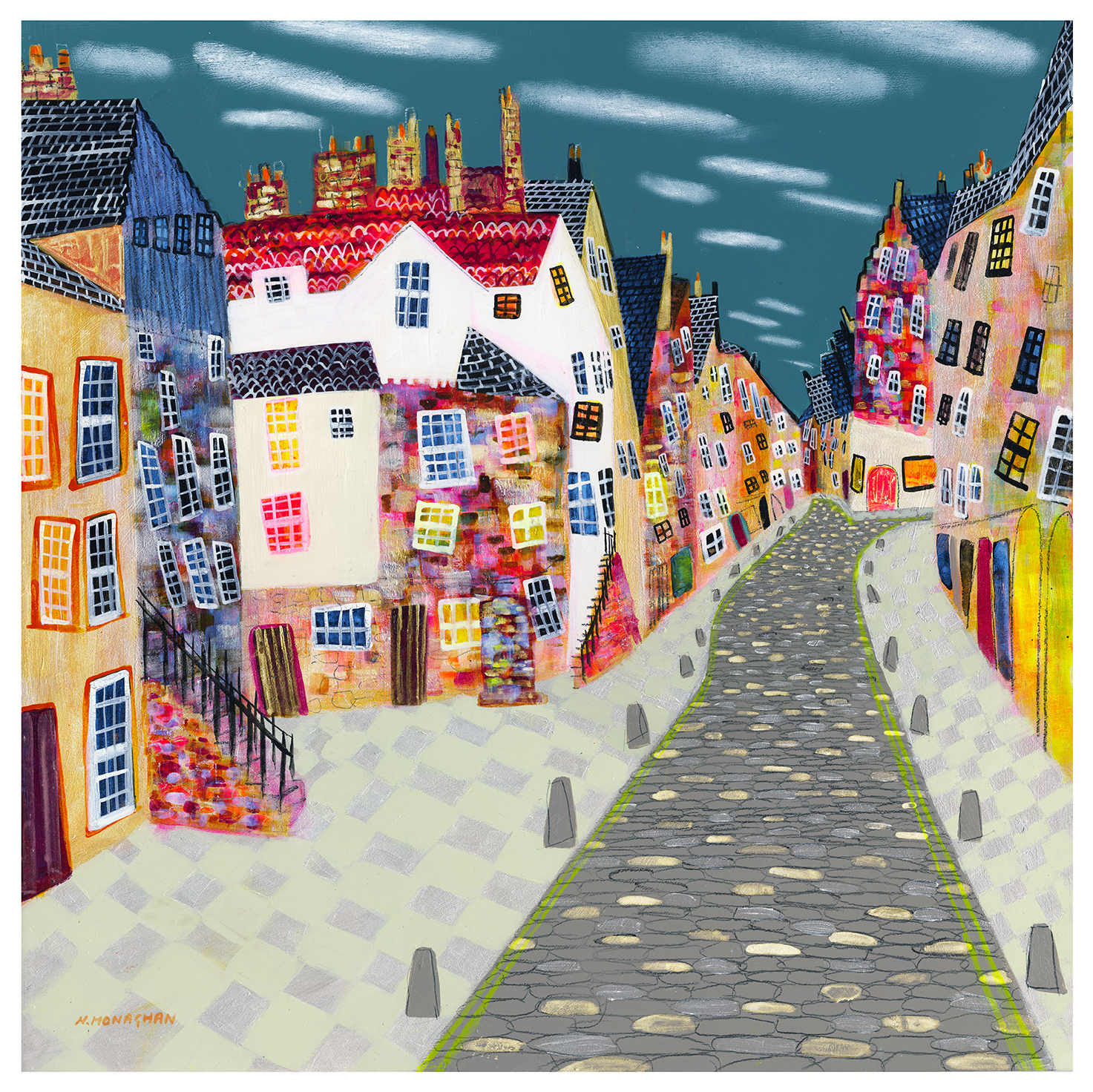
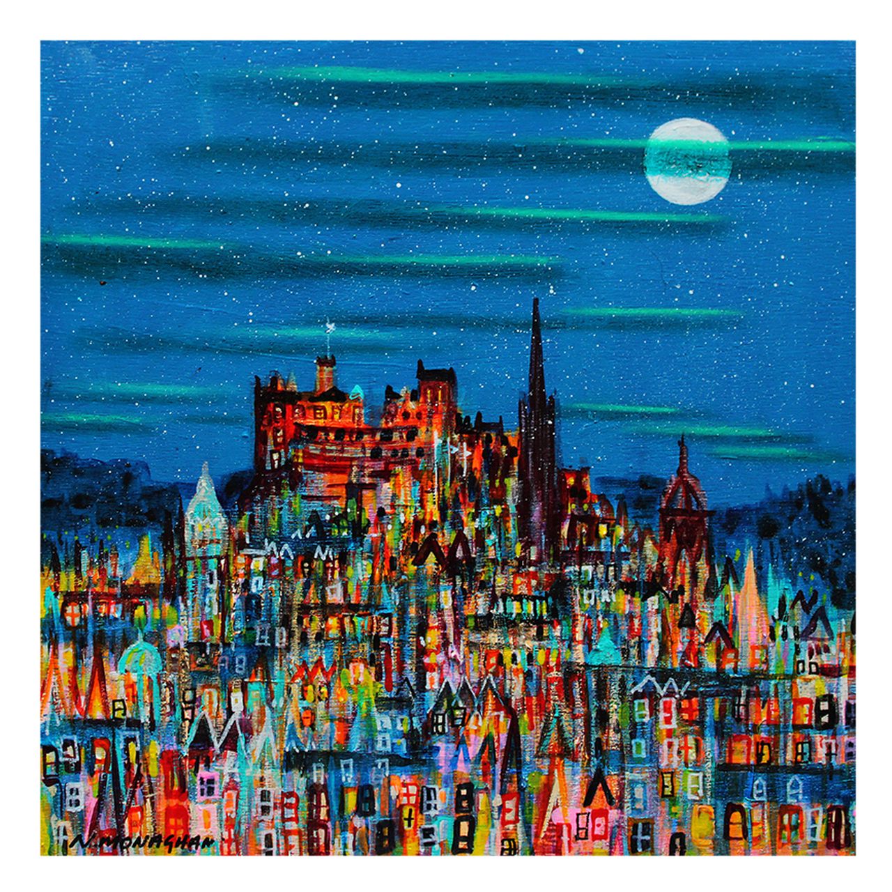
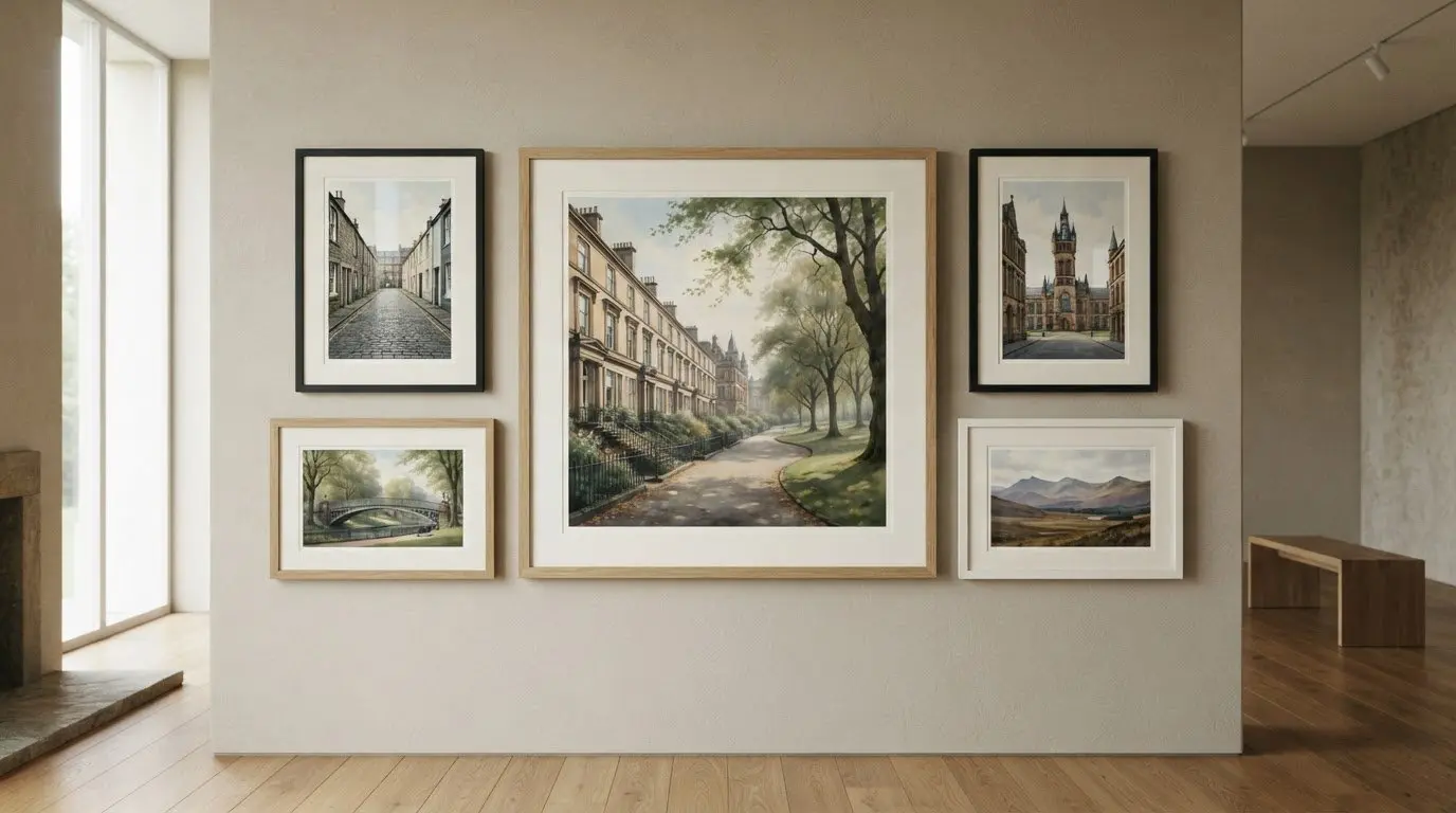
This guide explains how to compare subjects, print quality and framing options so you can choose art that connects with your favourite part of the West End and suits your space. Explore Park Circus by Falkirk-based artist Nikki Monaghan, available as a 500 × 500 mm print, or have your own Glasgow photograph printed and framed. Each frame is individually crafted for the artwork, rather than relying on a generic standard size, and glazed with float glass. With professional in-house framing, your professionally framed, premium quality print will be delivered ready to hang within two weeks.
Key Takeaways
- Choose glasgow west end prints for the place or memory they bring to mind, whether that’s familiar architecture, greenery or a cultural landmark.
- Learn what Giclée printing means and how print quality and a made-to-order frame shape the finished artwork.
- Use a four-step checklist to match the subject and style, from Scottish landscape art to photography prints, to your wall and preferred presentation.
- Explore ready-to-hang framed art from First4Frames Gallery in Falkirk, or have your own Glasgow photograph printed and framed.
How to choose Glasgow West End prints with a real local connection
A local print can hold more than a view. It might bring back a walk you love, a familiar corner or the feeling of belonging to Glasgow. Before comparing styles, decide what you want your glasgow west end prints to connect you with. The Glasgow West End has a rich mix of architecture, cultural landmarks and everyday streets to inspire your choice.
Start with a subject, not a trend. Ashton Lane, the University of Glasgow, Kelvingrove Park and the River Kelvin are ideas to explore, not promises of specific artwork imagery. Think about the place you’d most enjoy seeing every day, and whether you’re drawn to architecture, a familiar street, greenery or a cultural landmark.
For a glimpse of a Glasgow West End resident’s visit to an antique shop in Paisley, watch this short video:
Which Glasgow West End subject feels most like yours?
Ask yourself what you’d choose without considering what’s currently popular: a recognisable landmark, a street scene, striking architecture or a quieter view? Your personal link could be where you meet friends, a route you walk often or a place that reminds you of a particular time. That connection can make a print feel considered rather than simply decorative.
Match the print’s mood to its place in your home
Consider colour and detail alongside the room’s existing palette. A busy, detailed scene may draw the eye in a simple space, while a softer or more restrained image can sit comfortably among patterned furnishings and other artwork. Decide whether the print should be the room’s focal point or complement what’s already there. Then picture how its tones will look beside your walls and furniture.
The strongest choice connects a specific place with the mood you want the room to hold.
What makes a framed Glasgow West End print feel well finished?
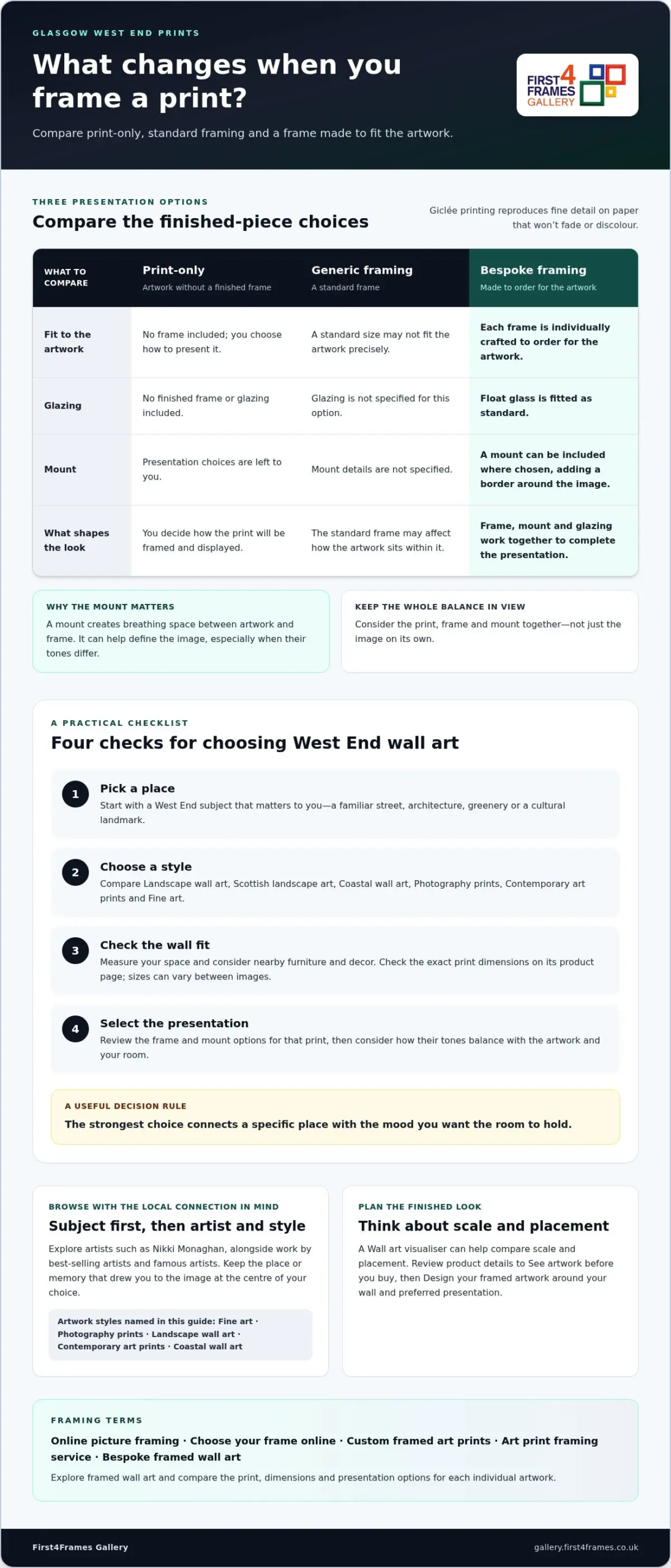
A striking image is only part of the finished piece. Giclée printing reproduces artwork in fine detail on paper that won’t fade or discolour. The frame, mount and glazing then shape how the image is presented and protected.
Unlike a generic standard frame that may not fit the artwork properly, each First4Frames frame is individually crafted to order using high-quality materials. Float glass is fitted as standard. The bespoke frame and considered presentation help glasgow west end prints feel complete, rather than like an image simply placed behind glass.
- Print-only: Offers the artwork without a finished frame, leaving presentation choices to you.
- Generic framing: Uses a standard frame that may not fit the artwork as precisely.
- Bespoke framed presentation: Pairs the print with a frame made for that order, float glass and, where chosen, a mount.
How glazing and a mount shape the finished artwork
Float glass is fitted as standard, providing a protective layer over the framed print while keeping the image clearly visible. A mount creates a border between the artwork and frame. That breathing space can help define the image, particularly if the frame and artwork have different tones. Consider how both details affect the overall balance, not just the print itself.
Design your framed artwork online
On each product page, review the frame and mount choices shown for that print, then consider which combination suits its colours and your room. The custom picture framing guide can help you think through framing decisions, while the University’s history of the University of Glasgow offers context for artwork connected with this landmark. Explore the framed art gallery to compare available prints and presentation options.
A practical checklist for choosing Glasgow West End wall art
Use this four-step checklist to narrow your choices and find glasgow west end prints that feel local and work in your room.
- Pick a place. Begin with a West End subject that matters to you, rather than choosing an image just because it’s popular.
- Choose a style. Compare Landscape wall art, Scottish landscape art, Coastal wall art, Photography prints and Contemporary art prints. Fine art and photographs each offer a distinct way to connect with a familiar place.
- Assess the wall fit. Measure the space and consider nearby furniture and other decor before choosing a print.
- Select the presentation. Review the dimensions and frame and mount options on the individual product page. Online picture framing lets you Choose your frame online as part of planning the finished look.
Check scale and placement before choosing a print
Compare the exact print dimensions on its product page with your measured wall space. Don’t assume every image is available in the same sizes. Think about whether the piece will hang alone or alongside existing decor, and use a standard UK picture sizes guide as a reference when considering proportions. Print dimensions and frame choices together determine the artwork’s presence on your wall.
Compare art styles and artists without losing the local connection
Browse artists such as Nikki Monaghan, as well as work by best-selling and famous artists. Keep the place or memory that drew you to the image at the centre of your decision. To Visualise art on your wall, try a Wall art visualiser to compare scale and placement; look at the product details to See artwork before you buy. Explore Custom framed art prints and the Art print framing service as you Design your framed artwork, including options for Bespoke framed wall art.
Browse Glasgow West End prints and framed art to compare artwork and presentation choices.
Where to buy Glasgow West End prints ready to hang
First4Frames Gallery is based in Falkirk, where its workshop provides professional in-house framing for customers across the UK. The gallery includes Park Circus by Falkirk-based artist Nikki Monaghan, available as a 500 × 500 mm print. Product pages show the artwork details and presentation options for each print.
Choose a gallery print or have your own image framed
If you have a particular Glasgow subject in mind that isn’t shown in the gallery, First4Frames can source prints on request by email. You can also provide your own Glasgow photograph or artwork to be printed and framed, bringing your chosen image together with bespoke framing. Find out more about the online photo printing and framing service.
Browse framed fine-art prints to explore the available artwork.
Order a finished print with confidence
Each frame is professionally made in-house for the artwork, with precision cutting and expert mounting. D-rings and high-quality framing wire are attached for straight wall mounting. Finished frames are fully packaged to help prevent damage and shipped via professional couriers. Your professionally framed, premium quality print will be delivered ready to hang within two weeks.
From selecting a gallery print to framing an image of your own, professional presentation brings your chosen artwork together. Explore framed artwork and find a piece for your space.
Let a favourite West End place find its place at home
The right artwork can make a room feel more distinctly yours. Let the place behind the image guide your choice, then imagine living with it: what might it bring to mind as you pass by each day, and how could it become part of the stories your home holds?
For a personal touch, consider whether a gallery print or an image of your own would mean more. First4Frames brings over 20 years of professional framing experience to its Falkirk workshop, helping turn an image into a considered piece for your wall. A meaningful print doesn’t need to follow a trend. It needs to feel right to you.
Explore the selection, notice which glasgow west end prints draw you in, and choose a piece that feels connected to your life as well as your room. Browse framed fine-art prints to find artwork for your space.
Frequently Asked Questions
Where can I buy Glasgow West End prints online?
You can buy framed fine-art prints through the First4Frames Gallery online collection. Browse the artwork, then open an individual product page to see its details and available presentation options. Use the subject or artist as a starting point, then consider which image you’d be pleased to live with every day.
Can I request a Glasgow West End print that is not shown in the gallery?
Yes. First4Frames can source prints that aren’t shown in the gallery when you request them by email. If you know the artist or title, include those details; otherwise, describe the place or subject you have in mind. A recognisable landmark or street can help explain what you’re looking for.
What is the difference between a framed print and an unframed poster?
A framed print arrives as a complete presentation, while an unframed poster is an image without its frame and must be displayed or framed separately. First4Frames professionally frames prints in-house, with each frame made for the artwork rather than chosen as a generic standard size. The product page shows the frame and mount choices for that print.
How long does it take to receive a framed print from First4Frames?
Your professionally framed, premium quality print will be delivered ready to hang within two weeks. For a Park Circus order, the process typically takes between one and two weeks. If you’re planning around a particular occasion or room refresh, keep the relevant timeframe in mind as you choose your print and presentation.
Can I have my own Glasgow West End photograph printed and framed?
Yes. You can provide your own Glasgow photograph or artwork to be printed and framed by First4Frames. Before submitting an image, view it at full size and consider the crop you want, especially if important details sit close to the edges. This helps you choose an image that suits the finished print and the place you have in mind for it.