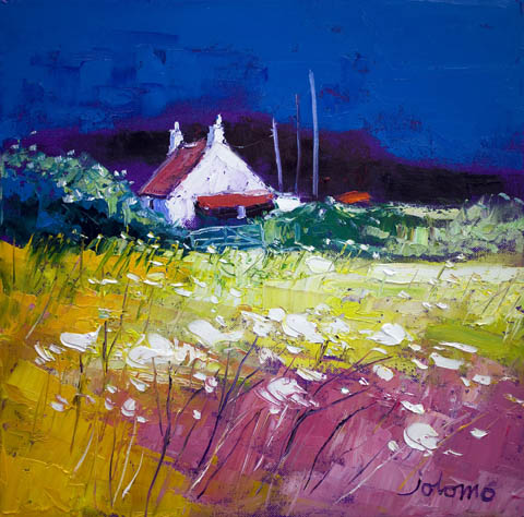
Finding the right art for stone walls is often about contrast in the best sense. Stone already gives a room texture, weight, and history, so the artwork needs to bring warmth and colour without looking flimsy beside it. Autumn Gloaming, Isle of Gigha does that beautifully.
Why colour matters against natural stone
- It lifts a wall that might otherwise feel a little too heavy.
- It adds a stronger sense of welcome to older or more rustic interiors.
- It keeps the room characterful without making it feel dark or overly serious.
That is where this piece stands out. The colour has confidence, but it still feels rooted in place. Instead of fighting the stone, it works with the room’s natural character and helps the whole space feel more alive.
Where it tends to work best
This kind of artwork suits cottages, converted farm buildings, and homes where one stone wall is being left visible as a feature. It can work above a mantel, over a sideboard, or on the main wall of a dining room where the room needs warmth as much as structure.
It is also a good reminder that characterful interiors do not always need muted artwork. Often, one richer framed piece is what stops the room from feeling too dry or too architectural.
Why the framing standard matters
At First 4 Frames, every piece is produced in-house in Falkirk with bespoke framing, colour-managed Giclée printing, and hand-finished craftsmanship. Against stone, those details matter. A superior quality frame and finish help the artwork look settled and intentional rather than tacked onto the wall.
This artwork is by John Lowrie Morrison OBE, and you can view the exact framed product here.
If you are looking for art for stone walls that feels warm, rooted, and beautifully finished, Autumn Gloaming, Isle of Gigha is an excellent choice.