
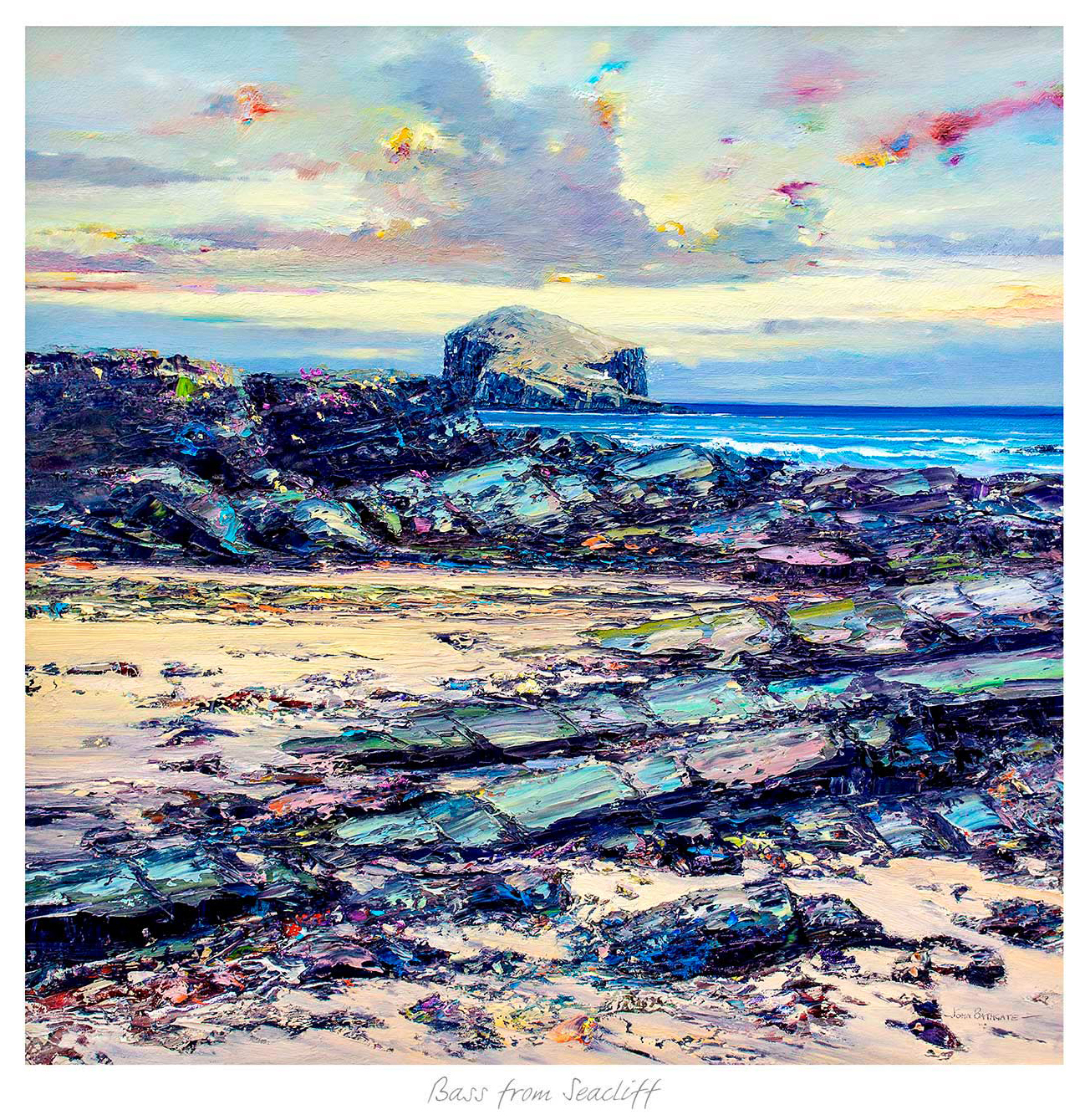
Choosing the best frame colours for art prints is often the difference between artwork that simply matches and artwork that genuinely settles into the room. Bass from Seacliffe is a helpful example because the image has enough coastal calm and tonal variation to suit more than one framing direction, but not every direction equally well.
What Bass from Seacliffe shows about the best frame colours for art prints
Bass from Seacliffe helps illustrate a simple point. Lighter frame choices can keep the piece airy and relaxed, while darker tones can make the composition feel more architectural and defined. The right answer depends on the wall, the furniture, and how much contrast the room already carries.
The best frame colours for art prints do not just echo the picture. They shape how confidently the picture sits in the room.
Because First 4 Frames handles the framing and colour-managed Giclée work in-house, customers can choose a finish that responds to the artwork properly rather than treating the frame as an afterthought. That craftsmanship is especially valuable with quieter images like this one, where subtle changes in contrast can make a bigger difference than people expect.
If the coastal subject appeals, the Scottish Seabird Centre offers more on the wildlife and shoreline character of the area. You can also browse more work by John Bathgate and see the exact framed print here.
For anyone weighing up the best frame colours for art prints and wanting a calmer image that still rewards careful framing, Bass from Seacliffe is a strong place to start.