Posted on

Limited Edition Prints: Choose Duns, Stary Night for Connection, Not Scarcity

A whimsical night street scene inspired by "Duns, Stary Night," featuring vibrant blue and pink patterned houses, tall trees, cobblestone pavement, and a crescent moon in a dark, star-studded sky.

limited edition prints should answer a specific need in the room or for the buyer. Duns, Stary Night is a useful example because its stylised Scottish place, night-time character and Nikki Monaghan’s colour-led approach offer reasons to enjoy the work before edition scarcity is considered.

limited edition prints - Duns, Stary Night

Assess limited edition prints in the right order

  1. Start with the image. Would the place, mood and colour still appeal if the edition were not mentioned?
  2. Look at the artist. Read about Nikki Monaghan’s Scottish landscapes and layered materials.
  3. Confirm the product details. Check the edition information shown with the exact product before ordering.
  4. Plan the wall. Use the stated print dimensions and add the proposed mount and frame.
  5. Choose presentation for the artwork. Avoid a frame selected merely to make the piece look collectible.

Duns gives the work a particular Scottish identity, while the night setting shifts attention towards light and atmosphere. That can suit a snug, study or evening sitting room. Keep nearby lamps from reflecting directly in the glazing, and avoid surrounding the print with several unrelated limited editions simply to form a collection.

Does limited edition mean the artwork will rise in value?

No future value should be assumed. Buy the picture because the artist, subject and finished presentation deserve a place in your home. Treat scarcity as supporting information, not an investment promise.

If the piece is intended as a gift, explain the connection to Duns or to the artist in a separate card. That story will often matter more to the recipient than edition terminology on its own.

Protect the qualities that made the image matter

Limited status does not reduce the need for sound production. Colour-managed Giclée output supports Nikki Monaghan’s expressive colour, while accurate mounting and bespoke framing protect the physical print and give it a resolved place on the wall.

To understand the artist’s wider practice and Scottish inspirations, visit Nikki Monaghan’s official website. You can also browse the Nikki Monaghan collection or see the exact framed product.

Limited edition prints are most rewarding when scarcity follows genuine connection. Duns, Stary Night offers place, colour and artist identity first; verified edition details and a carefully made frame complete the decision.

Posted on

Meaningful Gift Wall Art for a Graduate: Edinburgh University Old College

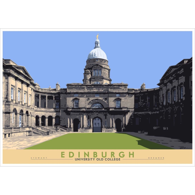
Image of Edinburgh: University Old College by Stewart Bremner

meaningful gift wall art should answer a specific need in the room or for the buyer. Edinburgh: University Old College is a useful example because Old College can mark years of study and a specific Edinburgh connection without relying on dates, slogans or short-lived graduation merchandise.

meaningful gift wall art - Edinburgh: University Old College

Choose meaningful gift wall art from a true connection

Begin with the recipient, not the occasion. Did they study in or regularly pass Old College? Does Edinburgh represent independence, friendships or a change in direction? A recognisable place becomes a stronger gift when it carries one of those personal stories.

Gift questionWhy it matters
Where might it hang?The 594 x 420 mm and 840 x 594 mm print options both need realistic wall space after framing.
Will they move soon?A versatile frame and clear landscape format can transfer more easily between homes.
Which memory matters?A short handwritten note can explain the location without adding wording to the artwork.
Is the subject personal?Choose it for a genuine university or Edinburgh link, not simply because graduation is Scottish.

Do not guess at the largest option. If possible, ask a partner or family member for a wall photograph and furniture width. Include the mount and moulding in the planned outline. Good scale makes the gift easier to enjoy immediately rather than creating a storage problem.

A graduation picture should carry the memory after the cards and ceremony have passed.

Make the presentation worthy of the milestone

Stewart Bremner’s place-led illustration gives the recipient a recognisable Edinburgh subject. Colour-managed Giclée production and hand-finished framing turn that connection into a substantial, ready-to-hang gift, with the work completed in-house in Falkirk.

For practical information about visiting the university and its city-centre sites, use the University of Edinburgh’s official visitor information. You can also browse the Stewart Bremner collection or see the exact framed product.

Meaningful gift wall art succeeds when the picture belongs to the recipient’s story. Edinburgh University Old College can honour achievement, place and memory in a form designed to remain part of the home for years.

Posted on

Music Wall Art: Set the Rhythm of a Listening Room With Take Five

Image of Take Five by David Short

music wall art should answer a specific need in the room or for the buyer. Take Five is a useful example because its rhythmic title and square format can give a listening space identity without covering the walls in sleeve reproductions or printed lyrics.

music wall art - Take Five

Arrange music wall art around listening, not equipment

Set the speakers and main chair first. Good listening positions rarely match the geometric centre of a wall, so artwork should respond to the complete arrangement. Keep it clear of speaker tops, cable routes and shelving that may grow as a collection changes.

Compact 265 mm square

Use it near a reading chair, headphone station or short record cabinet where it can be seen closely.

Flexible 500 mm square

Test it above a medium console or between equipment zones, including the full framed outline.

Bold 800 mm square

Reserve it for a broad wall with enough distance and no conflict with tall speakers or acoustic panels.

Let records and instruments remain useful objects rather than turning them into a forced backdrop. One artwork with a suggestive title creates a looser connection to music. It leaves room for changing tastes and does not make the space look like a themed bar.

  • Check reflections under evening listening light.
  • Keep turntable lids and cabinet doors clear of the frame.
  • Use one size template at a time.
  • Leave visual separation from acoustic treatment.

Give an energetic square a quiet boundary

A music room already contains strong shapes and detailed equipment. Controlled Giclée output and a precisely made frame give Take Five its own visual boundary. First 4 Frames completes the work in-house, so scale and presentation can be considered together.

For recordings, stories and wider context from Britain’s jazz heritage, explore the National Jazz Archive. You can also browse the David Short collection or see the exact framed product.

Music wall art should support the pleasure of the room rather than compete with it. Take Five can set a visual rhythm while measured placement keeps the listening chair, speakers and record collection at the centre of use.

Posted on

Framed Art Prints: Give Eilean Donan Castle a Contemporary Edge

An illustration of a castle by a lake with abstract colorful swirls overlaying the sky. By Esther Cohen

framed art prints should answer a specific need in the room or for the buyer. Eilean Donan Castle is a useful example because the recognisable castle and loch are overlaid by colourful, abstract sky marks that prevent the scene from feeling like a conventional heritage view.

framed art prints - Eilean Donan Castle

Choose framed art prints for image and interpretation

A landmark print does not have to lead to tartan, dark timber and traditional accessories. Look first at the artwork’s treatment. Here, the castle creates an anchor while the energetic colour above it introduces a modern note. Let that contrast guide the room.

DecisionUseful test
350 x 230 mm printTry it where the view will be enjoyed at closer range, such as above a console.
550 x 365 mm printTemplate it over broader furniture and include the finished frame.
Frame colourRelate it to one existing material instead of imitating castle stone.
Room accentsLift one colour from the expressive sky and stop there.

Keep surrounding Scottish references edited. A room does not need maps, antlers and souvenir objects to make the location legible. The castle supplies place; the abstract colour supplies personality. Clear wall around the landscape format allows both readings to remain visible.

Can a castle print suit a modern home?

Yes. Choose a treatment with its own visual energy, use a clean frame boundary and avoid styling the whole room around heritage motifs.

Frame the colour as carefully as the landmark

The quieter castle and more expressive sky need accurate colour relationships. Controlled Giclée production helps preserve that contrast. In-house mounting and framing can then connect the print to a contemporary interior without making it feel cold or overly formal.

For visitor information and the history of the location, explore the official Eilean Donan Castle website. You can also browse the Joseph Maxwell Stuart collection or see the exact framed product.

Framed art prints become more personal when a familiar subject is seen through an individual artist’s treatment. Eilean Donan Castle offers recognition and surprise together, while a measured frame keeps the result polished and easy to live with.

Posted on

Conservatory Wall Art: Let Bass Rock and Beach Grasses Balance the View

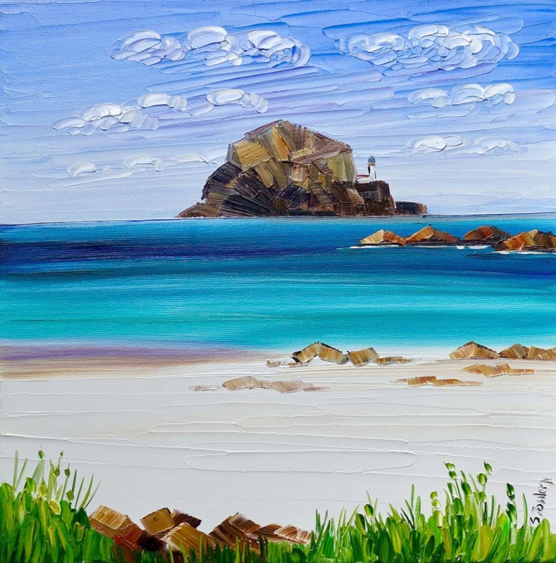
Image of Bass Rock and Beach Grasses by Sheila Fowler

conservatory wall art should answer a specific need in the room or for the buyer. Bass Rock and Beach Grasses is a useful example because its beach grasses create a foreground layer, while Bass Rock supplies a clear destination beyond them in a compact square composition.

conservatory wall art - Bass Rock and Beach Grasses

Plan conservatory wall art around the changing view

A conservatory rarely looks the same all day. Strong sun can flatten pale details, reflections can move across glazing, and the garden competes for attention. Choose the solid internal wall first. Then check it in morning, midday and evening light before deciding where the frame should sit.

Use the 265 mm square nearby

The smaller print can create an intimate pause beside a chair or compact table. Keep plants from overlapping the finished frame.

Test the 500 mm square at distance

The larger option can hold a broader wall. Mark the complete frame and judge it from the doorway as well as from a seated position.

Beach grasses can relate naturally to rattan, linen or woven blinds, but repetition needs restraint. One basket or textured shade is enough. Avoid adding shells, rope and several blue accessories, because the landscape already provides a convincing coastal reference.

  • Use an internal wall away from leaks and condensation.
  • Check glare from the normal seats before hanging.
  • Leave space between foliage and the frame.
  • Repeat one sandy or green note rather than the full palette.

Keep a coastal image clear in bright light

A light-filled room exposes weak colour and imprecise finishing. Colour-managed Giclée production helps the grasses, sky and distant rock remain distinct. A bespoke frame, completed in-house in Falkirk, gives the image a defined edge against garden views and textured furnishings.

For natural and historical context behind the landmark in the picture, read this background to Bass Rock and its remarkable seabird colony. You can also browse the Sheila Fowler collection or see the exact framed product.

Conservatory wall art works best when it holds its own without trying to outshine the garden. Bass Rock and Beach Grasses offers depth, texture and a clear horizon, giving the room one calm point of focus through changing seasons.

Posted on

Summer Machair and Cottages, Harris: Island Art for Painted Floorboards

Image of Summer Machair and Cottages, Harris by Sheila Fowler

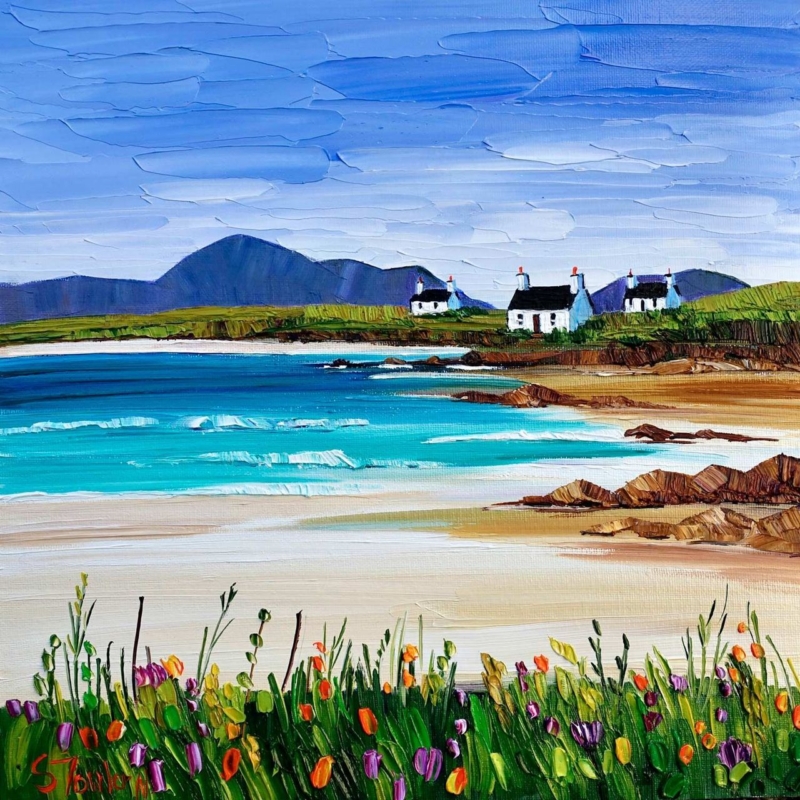
island art for a room with painted floorboards can make a relaxed interior feel connected without turning it into a coastal theme. Summer Machair and Cottages, Harris by Sheila Fowler brings together pale sand, turquoise water, white cottages, dark hills and lively machair flowers. Those layers offer several ways to relate the picture to painted timber underfoot, whether the boards are white, soft grey, blue or a gently worn neutral.

island art for a room with painted floorboards: Summer Machair and Cottages, Harris by Sheila Fowler

How island art for a room with painted floorboards creates connection

Painted boards have visible joints, changing light and a practical character that is different from fitted carpet or a perfectly smooth floor. Artwork with texture and distinct horizontal layers can belong naturally beside them. In this scene, bands of flowers, beach, sea, shore and mountains move up the image. The marks remain expressive, so the room does not feel too polished or carefully matched.

The square composition also gives the landscape stability. A very wide coastal panorama could exaggerate the direction of the boards and make a narrow room feel longer. This format balances horizontal scenery with a compact shape, making it useful above a small sofa, painted chest or simple dining bench.

Let the floor choose one colour, not the whole scheme

Begin with the actual floor colour in daylight. White boards may lean warm beside cream walls or cool beside blue-grey paint. A faded blue floor might appear stronger on a sunny day and quieter in evening light. The artwork only needs one convincing connection to feel settled.

For white or chalky boards, use the sand and cottage walls as the bridge. For blue-grey boards, look to the sky and distant hills. A deeper coastal blue can connect with the water, while softly painted green boards can relate to the machair. Do not repeat every colour elsewhere. The orange, pink, purple and yellow flowers work best as small sparks rather than a shopping list for cushions and accessories.

Read the Harris landscape from foreground to distance

The foreground is close and tactile. Individual flower marks rise from dense green grass. Beyond them, pale sand creates a broad quiet interval before turquoise water and low waves. Rocks lead towards the white cottages, and the dark mountain silhouettes give the bright coast a firm horizon.

That sequence can help a smaller room feel deeper. Hang the picture where its pale middle section is visible across the space. Avoid covering the lower flowers with a tall lamp or vase. The contrast between busy foreground and open beach is what makes the view feel generous rather than merely colourful.

A useful room does not need to copy the coast. It only needs enough shared colour, texture and breathing space for the artwork and the floor to feel part of the same conversation.

Choose placement for a floor with visible rhythm

Board lines pull the eye through a room. Use the artwork to provide a destination at the end of that movement. A wall seen from the doorway, the far end of a kitchen or the area above a low piece of furniture can work well. Centre the frame on the furniture or sightline rather than automatically centring it on the entire wall.

Make a square paper template using the finished framed size. Place it on the wall, then view it while standing and sitting. Check whether the image still feels connected to the floor when a rug, table or chair interrupts the direct view. If not, a slightly higher or more open position may restore that relationship.

Keep the coastal mood relaxed, not themed

The cottages, beach and water already establish a strong island setting. Rope accessories, shell collections and multiple nautical signs are unnecessary. Natural linen, simple ceramics and one textured wool throw can support the atmosphere without competing with the place itself. A small vase of seasonal garden flowers can echo the machair more subtly than permanent floral patterns.

Painted boards often show wear, which can be part of their appeal. The artwork’s palette-knife texture and broken colour suit that lived-in quality. Keep other wall decoration restrained so the detailed foreground and open beach retain a clear visual pause.

Frame colour and texture with a quiet edge

A light timber frame can warm a room with cool boards, while a restrained white or pale grey option may preserve the airy quality of the sand and cottages. A darker slim moulding can refer to the mountain line and black roofs. The frame should define the square without pulling attention away from the saturated turquoise water.

First 4 Frames uses colour-managed Giclée production and completes bespoke framing in-house at its Falkirk workshop. That care is valuable in a picture built from small shifts of blue, white and green, as well as bright individual flower marks. It helps retain the contrast between tactile paint effects and the calm distance of the Harris landscape.

Sheila Fowler paints Scottish landscapes, coastlines and wildflowers with expressive brushwork, palette knife and strong colour. Explore her wider work at Sheila Fowler’s official website, or compare the Sheila Fowler collection at First 4 Frames.

Thoughtfully placed island art for a room with painted floorboards can connect painted timber to the view beyond without making the room feel staged. View the framed Summer Machair and Cottages, Harris print for a layered island scene with enough colour, openness and texture to reward everyday living.

Posted on

Edinburgh: Scottish Parliament: Civic Office Wall Art With Modern Architecture

Image of Edinburgh: Scottish Parliament by Stewart Bremner

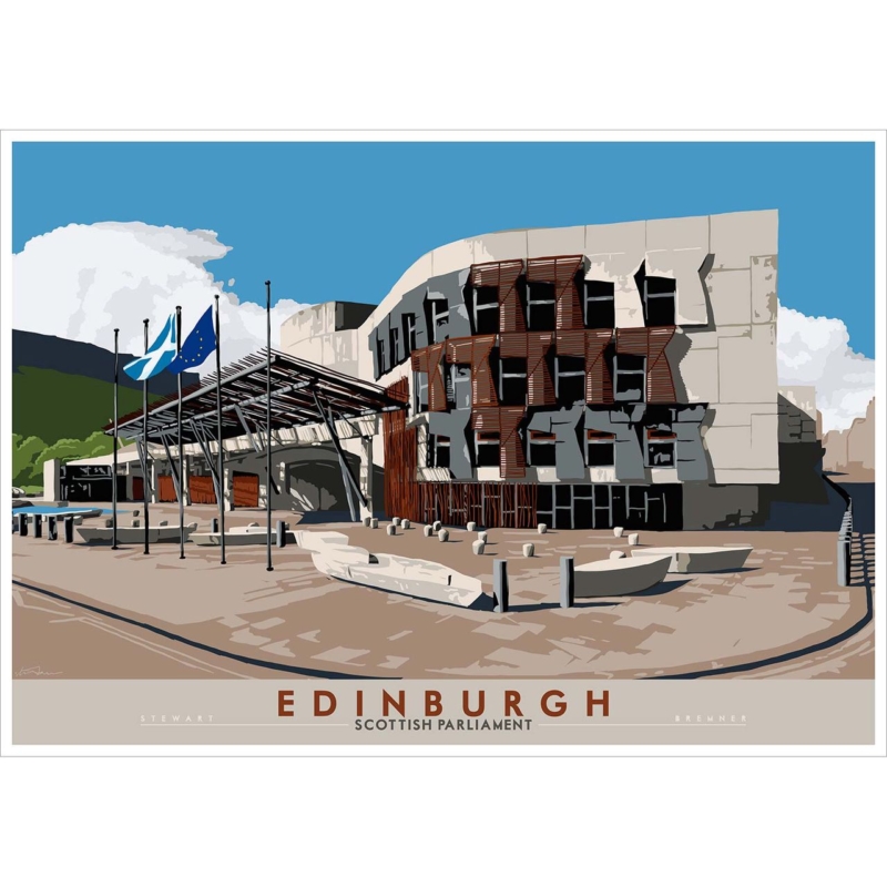
civic office wall art should tell visitors something about a workplace before a meeting begins. Edinburgh: Scottish Parliament by Stewart Bremner uses the Scottish Parliament’s recognisable forms, flags and open forecourt to create that immediate connection. The building is modern, public and unmistakably Edinburgh. Its clean graphic treatment can give a reception, consultation room or shared office a strong sense of place without falling back on a generic city skyline.

civic office wall art: Edinburgh: Scottish Parliament by Stewart Bremner

Why civic office wall art needs a clear purpose

Artwork in a civic setting is seen by many audiences. Staff pass it every day. Visitors may see it while waiting, asking for help or preparing for an appointment. A picture therefore needs to be interesting without becoming distracting, locally relevant without looking like a souvenir, and professional without feeling impersonal.

This print answers that brief through architecture. The Parliament’s pale stone, dark window openings and warm timber details create a disciplined palette. Strong shadows give the building depth, while the open blue sky stops the scene from feeling severe. The Saltire and European flag add movement near the entrance, but they do not dominate the composition.

Start with the visitor journey

Choose the wall by following the route a visitor actually takes. Begin at the entrance, pause at the reception point and then sit in the waiting area. The best position is often the first uninterrupted wall seen from two of those places. It lets the picture act as an orientation point rather than a decoration added after the furniture plan was finished.

  1. Check the entrance view. The building and the Edinburgh caption should remain legible from the doorway.
  2. Check the seated view. Avoid placing the centre of the image so high that waiting visitors look up sharply.
  3. Check the service point. Screens, leaflet holders and signs should not cut across the lower part of the frame.
  4. Check circulation. Keep the finished frame clear of door swings, queue barriers and the busiest shoulder-height route.

The available print proportions suit a wall above low seating, a credenza or a bank of visitor chairs. Mark the full framed dimensions with paper or low-tack tape. This test reveals whether the artwork is large enough to hold the wall without making a public area feel crowded.

Use modern architecture to signal local confidence

A traditional landmark can communicate heritage. The Scottish Parliament says something different. Its asymmetric windows, projecting timber elements and broad canopy speak about contemporary public life and ambitious design. That makes the image relevant to organisations working in policy, community services, planning, education or the built environment.

There is no need to turn the whole office into an Edinburgh theme. One specific architectural subject is more confident than a collection of unrelated postcards. Keep nearby signage functional and give the artwork a defined area of wall. Local identity then feels deliberate rather than promotional.

Build a calm workplace palette around the print

Existing office finishConnection in the artworkPractical approach
Blue seatingThe clear sky and flags provide a natural linkKeep other blue accessories limited
Pale wallsThe stone facade keeps the picture lightUse a mount edge if the print needs more separation
Timber reception deskWarm brown louvres repeat the material gentlyAvoid forcing the frame to match the desk exactly
Dark metal detailsWindow shadows add crisp contrastChoose a slim moulding rather than a heavy black border

The graphic style is especially useful where an office already contains screens, wayfinding and printed information. Large, simplified shapes remain readable among those practical elements. They also keep the building clear from a distance, while smaller details reward a closer look.

Plan lighting and presentation for daily use

Public offices often combine ceiling panels, window light and task lighting. Check the proposed wall at different times of day. A bright reflection across the Parliament caption or the dark windows can interrupt the design. Moving the frame slightly, adjusting a spotlight or choosing a wall at right angles to glazing may improve visibility.

First 4 Frames uses colour-managed Giclée production and completes bespoke framing in-house at its Falkirk workshop. That process helps preserve the flat blue sky, pale masonry, fine flag details and deep architectural shadows. A well-chosen frame also protects the print in a busy shared environment and gives it a suitably finished edge.

Stewart Bremner is an Edinburgh-based artist, illustrator and graphic designer whose work draws on travel-poster and mid-century influences. See more of his approach at Stewart Bremner’s official website, or browse the wider Stewart Bremner collection at First 4 Frames.

Purposeful civic office wall art can make a workplace feel rooted, approachable and contemporary before a conversation starts. View the framed Edinburgh: Scottish Parliament print for a strong architectural image that connects public space with a distinctive part of modern Edinburgh.

Posted on

How to Frame Original Artwork in the UK with the Right Glass, Mount and Frame

How to Frame Original Artwork in the UK with the Right Glass, Mount and Frame

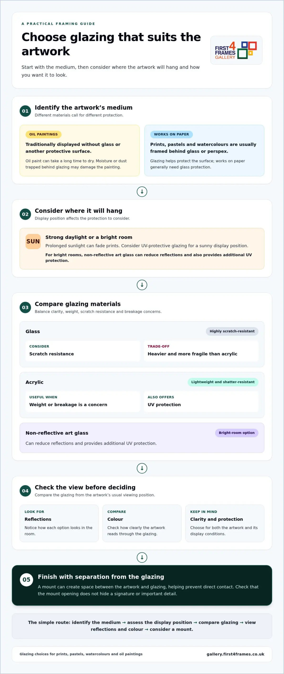
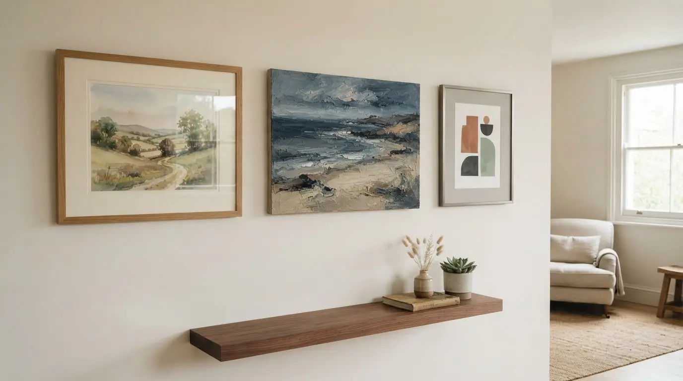
The right frame can protect an original artwork and help it feel at home on your wall. When framing original artwork in the UK, choose glazing to suit the medium: oil paintings are traditionally displayed without glass, while works on paper, such as prints and watercolours, generally need protection behind glass or perspex. A mount can create space between the artwork and the glazing.

It’s natural to focus first on how a frame looks, but the mount and protective materials matter too. A considered combination can complement the artwork, reduce the risk of contact with the glazing and support its long-term care.

This guide explains how to choose a frame that suits the artwork and your home, select suitable glazing, and consider mount colours, widths and conservation materials. You’ll also learn when it may make sense to preserve an existing frame and how careful choices can support the presentation of original artwork.

Key Takeaways

  • Match the frame’s style and proportions to both the artwork and the room, while considering whether an existing frame should be preserved.
  • Choose protective glazing with the artwork’s medium, display position and desired balance of clarity and protection in mind.
  • Select a mount colour and width that gives the artwork visual breathing space without distracting from its details.
  • For original works on paper, consider acid-free and conservation-minded materials to support their long-term care.

Choosing a frame to complement artwork style and colours

Carry artwork flat between clean protective sheets, supported by rigid board. Until it is framed, store it in a clean, dry place away from sunlight, heat and damp.

  1. Study the artwork’s palette, scale and the room’s furnishings. Simple, monotone frames can let contemporary art prints remain the focus, while a warmer finish may suit coastal wall art or a soft landscape. To visualise art on your wall, use a paper template to compare its size and placement before choosing.
  2. An exact-fit frame shows the artwork’s edges; a mount adds breathing space. Keep the artwork in proportion to the frame, and check that the mount opening won’t hide a signature or important detail. For a framed print, choose a finish that works with both the image and the room.
  3. Match the frame construction to the artwork. Standard frames suit many flat works, while box frames add depth. Floating or tray frames can show a canvas’s edges; a thin canvas may suit a canvas surround, while a thick canvas may fit a floater frame. Consider these options for framed wall art and fine art alike.
  4. Before replacing an existing frame or window mount, check its condition. Retain a sound original frame where possible, as it may contribute to the artwork’s value. If you’re considering keeping an old window mount, have a professional framer assess any potential risks to the artwork.
  5. Framing alone doesn’t determine insurance cover. The artwork’s valuation and your policy terms matter, so keep valuation records with details of the piece. This applies whether you own a Scottish landscape, photography prints or work by a well-known artist.
  6. For DIY framing, gather a ruler, suitable frame, glazing, mount and backing board, then measure carefully before cutting. Valuable or delicate originals benefit from professional attention. If comparing online picture framing or an art print framing service, review how each approach suits the medium. See artwork before you buy, and compare options such as a wall art visualiser for planning display.

Protective glazing for oil paintings, prints, pastels and watercolours

Choose glazing to suit the artwork’s medium, display position and your priorities for clarity, weight and protection. The right option can also reduce reflections while keeping the artwork clearly visible.

  1. Compare glazing types and materials

    Compare standard glass, acrylic and specialist art glass before choosing. Glass is highly scratch-resistant, but heavier and more fragile than acrylic. Acrylic is lightweight and shatter-resistant, and offers UV protection, making it useful when weight or breakage is a concern.

    For a bright room, consider non-reflective art glass, which also provides additional UV protection. Check how each option affects reflections and colour when viewed from the artwork’s usual position. To see how different colours and compositions read as wall art, explore the fine art print gallery.

  2. Match glazing to the artwork

    Start by identifying the medium. Prints, pastels and watercolour paintings are usually framed behind glass or perspex to protect the surface. Works on paper generally need glass protection. For a sunny display position, consider UV-protective glazing, as prolonged sunlight can fade prints.

    Oil paintings are traditionally displayed without glass or another protective surface. Oil paint can take a long time to dry, and moisture or dust trapped behind glazing may damage the painting. Avoid enclosing an oil painting behind glass until its condition and framing needs have been carefully considered.

Before choosing glazing, consider both the artwork and where it will hang. A print in strong daylight has different protection needs from one displayed away from direct sun. Pastels and watercolours benefit from glazing, while oil paintings are typically left unglazed. These distinctions help you choose protection to suit the artwork, rather than treating every original alike.

How to Frame Original Artwork in the UK with the Right Glass, Mount and Frame

Selecting mount colours and widths

  1. Place a paper border around the artwork to test possible mount widths. Compare the visible space on each side, then choose a balanced border that gives the image room without overwhelming it. A wider mount can create visual separation and draw attention to the print. Keep the artwork’s proportions in mind as you decide.
  2. Test mount colours beside the artwork in the room where it will hang. A soft neutral can complement a muted watercolour, while a pure white border may create a sharper contrast. Choose coloured or pure white mounts only when that effect is intentional. A print’s white border may also provide space for the artist’s signature, so make sure it remains visible.
  3. Choose a window mount when you want a border around the artwork and space between it and the glazing. The opening frames the image, while the board helps prevent direct contact with the glass. Check that the opening won’t cover a signature or important detail. Matting can enhance the presentation and create separation from the glazing.
  4. Consider float-mounting if you want a print to appear suspended inside the frame. The artwork sits within the frame rather than behind a conventional window opening, leaving its edges visible. For a print with distinctive deckled edges, this can make the paper part of the display. Decide how much of the sheet you want to show.
  5. Think carefully before dry-mounting a print. The process bonds the artwork to a board with adhesive and is irreversible, so it isn’t suitable if you may want to remove the print later. Matting and dry-mounting together can help prevent a print from warping, but the permanent bond affects future conservation. Choose this approach only after weighing that trade-off.
  6. Preview the finished effect before committing: place the artwork beneath a mount, then view it with the frame and glazing. Check the border from several angles and make sure the artwork is centred. A restrained mount can let a colourful print lead, while a wider border can give a small image greater presence.

Archival and acid-free framing

  1. Choose acid-free materials, especially for works on paper. Acid-free matting helps avoid damage from materials that can affect the artwork over time. For conservation framing, specialist acid-free museum board sits behind the artwork instead of regular mat board or foam board. This makes the backing part of the protection, not just a support.
  2. Ask for Level 1 framing when reversibility is important. Its processes are intended to be reversible, assuming the artwork is not inherently unstable. Level 1 framing should also provide protection for at least 35 years in normal conditions. Reversibility means the framing can be removed without harming the artwork.
  3. Arrange a condition report before framing an existing piece to Level 1. The Fine Art Trade Guild recommends agreeing a Level 1 condition-of-artwork report prior to framing. It records the work’s condition before framing begins, giving you a reference if its appearance or condition changes later.
  4. Address deterioration before reframing. If a work shows signs of damage or decline, arrange appropriate remedial care first. Preserve existing labels, too: they can provide provenance and useful information about the artwork’s history. Keep labels attached where possible and accessible, rather than covering them during framing.
  5. Use conservation-minded choices for valuable or meaningful works, and keep a record of the materials and condition report with the artwork’s documentation. For a paper-based print, explore fine art prints to consider how a carefully presented image might suit your collection. A framing decision should protect the work while respecting its individual history.

First4Frames Gallery offers Ready-to-Hang Framed Art for collectors seeking a finished piece, alongside Custom Picture Framing for artwork needing a tailored presentation. Each frame is made by hand to order from high-quality materials, with 2 mm float glass. This gives you a considered framing option when the artwork’s dimensions or style calls for a bespoke fit.

Explore the range of framed art, or choose Custom Picture Framing when you want a frame made for an individual artwork. Commercial Artwork Curation and Art Gifts offer further ways to bring art into a space or choose a thoughtful present.

Visit the online art gallery to explore the available artwork and framed pieces.

Give your artwork a place to grow

Let the artwork guide the room, then let the room help shape your final choice. A frame can connect a piece to its surroundings while leaving its character unmistakably its own. As your collection grows, a considered approach to framing original artwork in the UK can create a visual thread between pieces without making them all feel alike.

When you’re ready to find a work that speaks to your space, First4Frames Gallery offers Giclée Fine Art Prints alongside framed artwork. Explore the gallery to discover a piece that could become the starting point for your next display.

Explore the First4Frames Gallery and find inspiration for your walls. Let your chosen artwork lead the way.

Frequently Asked Questions

How much does it cost to frame original artwork in the UK?

There isn’t one fixed cost: the final specification shapes the price. A small, straightforward drawing needs different materials and work from a large or unusually shaped painting. The frame profile, glazing and mount design also affect the job. For a useful estimate, provide the artwork’s dimensions and medium, describe your preferred finish, and mention any details that need special care.

What types of frames are best for original paintings and drawings?

The best frame complements the artwork and suits its construction. For a drawing, consider whether the frame’s visible border competes with fine marks or delicate lines. For a canvas, check that its depth fits the frame securely. Compare frame samples beside the artwork rather than relying on a colour name alone, and consider how the finish relates to nearby pieces.

What is conservation framing and when is it recommended?

Conservation framing focuses on preservation and can be particularly useful for fragile, valuable or historically significant work. Consider it for a drawing with brittle paper, loose pastel or visible previous repairs. These details may affect how the piece should be handled during framing. If the artwork is deteriorating, arrange appropriate remedial care before reframing; a new frame won’t repair existing damage.

How should glazing be chosen for original artwork: glass, UV glass or acrylic?

Choose glazing by considering how the artwork will be displayed, moved and viewed. Lightweight acrylic may make a large framed piece easier to handle, while UV-protective glazing may help when it will be displayed near strong daylight. Think about reflections in the room, too. Glazing can help protect the surface, but it doesn’t replace careful placement away from harsh conditions.

What mount board and backing materials are safe for original artwork?

Choose materials that keep the artwork away from unsuitable adhesives and rough backing. For a valuable drawing, discuss how it will be secured before framing begins, especially if it may need to be removed later. Keep the artist’s signature, inscriptions and labels visible. These details can carry meaning and useful history beyond the image itself.

How do I choose the right frame size and mount for artwork?

Measure the entire sheet, including deckled edges or printed margins, then compare it with the frame’s internal space. The visible mount opening is smaller, so check that it won’t cover intentional details. For example, a drawing with a broad paper border may look better with more of the sheet visible. Mock up the proportions before making your final choice.

Posted on

Minimalist Wall Art for a Quiet Pause: Give Isolation Enough Space

Image of Isolation by Rikki O'Neill

minimalist wall art becomes more useful when the picture solves a real placement question. Isolation offers a clear starting point because the compact square and evocative title can reward a close sightline when surrounding objects are edited rather than removed without purpose.

minimalist wall art - Isolation

Use minimalist wall art to shape attention

Minimal does not mean placing a small picture in the centre of a large blank wall. Begin with the route and the moment of viewing. A short landing, reading-chair return or wall beside a bedroom dresser can provide the closeness that a 265 x 265 mm print needs.

Negative space works when it directs attention. Space without a viewing reason can simply make an artwork feel stranded.

  1. Stand where the picture will normally be noticed.
  2. Mark the complete framed square at eye level.
  3. Remove objects that interrupt the sightline, not every useful object.
  4. Check that a door, shade or plant does not cast a changing shadow.
  5. Use one nearby material connection, such as timber or a quiet textile.

The title can encourage reflection, but the room need not become severe. A comfortable chair, reading lamp and a few used books add life. Keep decorative objects from forming a tight halo around the frame, and let the square hold its own boundary.

Does minimalist artwork always need a white frame?

No. The frame should separate image from wall and relate to the room. A restrained timber, dark edge or soft painted finish may work better.

Use precise finishing at intimate scale

Compact art is often inspected from nearby, making clean mounting, accurate corners and controlled colour important. In-house Giclée production and bespoke framing give Isolation a resolved edge without adding visual noise around it.

For art-historical context on reduction, material and space, read Tate’s introduction to Minimalism. You can also browse the Rikki O’Neill collection or view the exact framed product.

Minimalist wall art succeeds through deliberate attention rather than emptiness. Isolation can make a quiet wall purposeful when the viewing point, clear space and frame are chosen with equal care.