
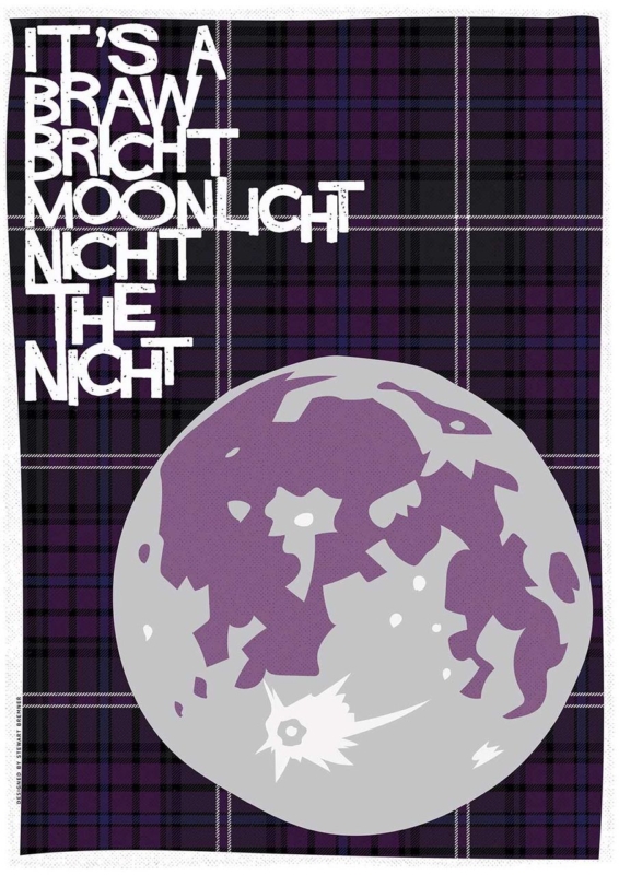
Scottish typography wall art for a landing can give a passing space a reason to pause. It’s a Braw Bricht Moonlicht Nicht the Nicht brings a familiar Scots phrase into that role. Its musical wording feels welcoming, while the portrait proportions suit a wall that may be taller than it is wide.
Give Scottish typography wall art for a landing time to be read
A landing is viewed from several directions. Walk upstairs, come out of each doorway and look back towards the proposed wall. The complete line should appear before a door leaf, banister or tall light fitting interrupts it. A paper template at the finished framed size makes that test more reliable than judging the print dimensions alone.
Use the smaller size
The 420 x 594 mm print can suit a compact return wall where the phrase is read at close range. Keep its centre connected to normal eye level.
Consider the larger size
The 594 x 840 mm option can hold a taller stair landing, provided switches, alarms and opening doors remain clear of the full frame.
Typography already supplies pattern and personality. Avoid surrounding it with several other sayings. One runner, a simple wall colour and warm, even light are enough. If the landing is dim after sunset, position a fitting so it reveals the words without throwing a hard reflection across the glazing.
Frame a familiar phrase as lasting artwork
Precise mounting and a hand-finished frame help bold lettering feel deliberate rather than temporary. First 4 Frames completes the work in-house in Falkirk, so the final proportions and finish can be judged for a narrow circulation space.
See more of the illustrator’s Scots-led work at Stewart Bremner’s printmaking website. You can also explore the Stewart Bremner collection or view the exact print and framing choices.
Scottish typography wall art for a landing works when people can read it naturally as they move. Give this braw bricht line one clear position and it can make the route feel personal without filling every wall.