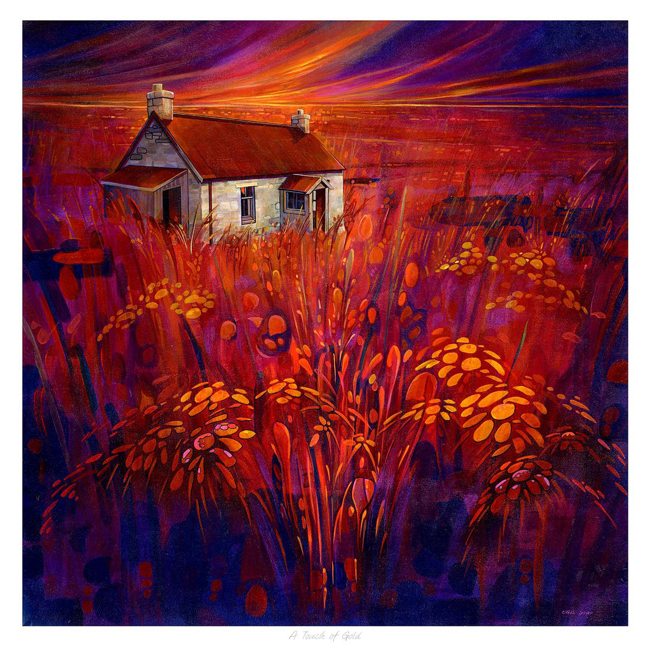
Choosing art for navy blue walls is usually about finding light as much as colour. Navy walls can feel elegant and cocooning, but they need artwork that stops the room from becoming too visually dense. A Touch of Gold handles that balance with real assurance.
Where darker walls can go wrong
Deeper paint shades are beautiful because they create atmosphere, yet they can also swallow weaker decorative pieces. The artwork needs enough energy and tonal lift to stand confidently against the wall while still belonging to a more sophisticated palette.
A Touch of Gold brings exactly that contrast. It has presence, warmth, and a sense of movement, which helps a navy room feel more layered rather than simply dark.
- It suits living rooms, dining rooms, and richer bedroom schemes.
- It adds brightness without breaking the mood of the room.
- It helps a bold wall colour feel deliberate and complete.
Why the finish matters with strong colour
First 4 Frames completes each piece in-house in Falkirk using bespoke framing, colour-managed Giclee printing, and hand-finished craftsmanship. That superior finish matters in a room where saturated paint and evening light make every detail more noticeable.
You can explore more work by Chris Sharp and view the exact framed product here.
If you want art for navy blue walls that feels rich, luminous, and carefully judged, A Touch of Gold is an excellent fit.