
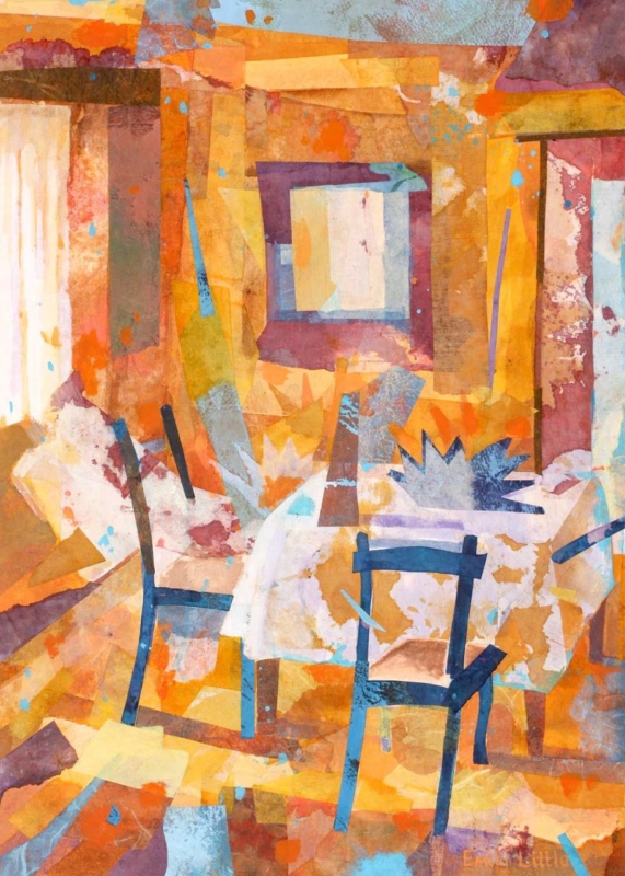
abstract wall art for mixed wood furniture can help a room containing several timber finishes feel collected rather than confused. The Unexpected Visit by Emily Little is especially useful for this task. Amber, ochre, russet, plum, pale cream, and flashes of blue overlap across the image. Those layered colours can relate to light oak, darker walnut, painted chairs, and older pieces without copying any one finish exactly.
How abstract wall art for mixed wood furniture creates unity
Matching every wooden item is rarely necessary. In fact, a room can feel flatter when the table, shelving, floor, and occasional furniture all share an identical stain. The challenge is giving different pieces a relationship. Artwork can provide that bridge by carrying several warm and cool notes in one composition.
The Unexpected Visit contains recognisable chairs and an interior, but neither is described literally. Blocks of translucent colour overlap like memories of paint, fabric, light, and timber. The near-black chair lines give the image structure. Pale areas keep it open, while burnt orange and gold connect naturally to the undertones found in many woods.
Identify undertones before trying to coordinate the room
Look past labels such as oak or walnut and notice whether each piece leans yellow, red, grey, or nearly black. Two woods with different grains can still sit comfortably together when they share a warm undertone. Conversely, furniture sold under the same broad name may look unrelated when one item is honey coloured and another is cool and washed.
| Element in the room | Connection within the artwork |
|---|---|
| Honey oak or pine | Golden and amber passages across the upper and lower image |
| Walnut or mahogany | Plum, brown, and deep red blocks that add weight |
| Black-stained timber | Dark chair outlines that repeat a sharper furniture edge |
| Painted furniture | Small blue and cream areas that prevent an all-brown scheme |
These are relationships, not colour-matching instructions. One print should not prompt a complete furniture replacement. Its role is to show that several tones can coexist within a considered whole.
Choose a position that lets the picture mediate between pieces
Placement matters when the furniture is varied. Above a console, the artwork may appear to belong only to that single item. On a wall visible between a dark dining table and a lighter cabinet, it can connect both. It may also work at the end of an open-plan room, where the portrait format provides a shared visual destination from several seating areas.
- Map the sightlines. Stand at the doorway and at the main seats to see which timber finishes appear beside the proposed wall.
- Test the full frame size. Use paper or low-tack tape, allowing for the mount and moulding as well as the print.
- Leave a quiet margin. Clear wall around the frame stops varied furniture and accessories from merging into one busy field.
- Check evening light. Warm bulbs can intensify orange, so make sure the cooler blue and pale details remain visible after dusk.
The print is available in 360 by 500 millimetres and 230 by 322 millimetres before framing. The larger option can hold a wall between substantial furniture. The smaller size can give a compact reading area or landing a layered focal point. Final dimensions will depend on the chosen mount and moulding.
Select a frame that joins the scheme without adding another mismatch
A frame does not need to imitate the nearest piece of furniture. A slim dark moulding can repeat the chair lines and provide a clean boundary. A restrained warm timber may suit a softer scheme, but it should be compared with the actual artwork and room finishes. Introducing an almost-matching wood without checking it can create more tension than a deliberate contrast.
First 4 Frames uses colour-managed Giclée production and completes bespoke framing by hand at its Falkirk workshop. That in-house approach allows the layered colour, darker linear marks, mount, and moulding to be considered together. It also turns the print into a polished, ready-to-hang piece rather than another loose element in an already varied room.
An interior image that rewards a second look
Emily Little creates paintings and mixed-media work shaped by colour, memory, landscape, and interior space. In this piece, chairs and openings emerge gradually from overlapping surfaces. Explore more at Emily Little’s official website, or browse the Emily Little collection at First 4 Frames.
Well-chosen abstract wall art for mixed wood furniture can turn difference into character. View the framed The Unexpected Visit print for a warm, layered composition that helps light, dark, old, and painted furniture share one confident visual language.