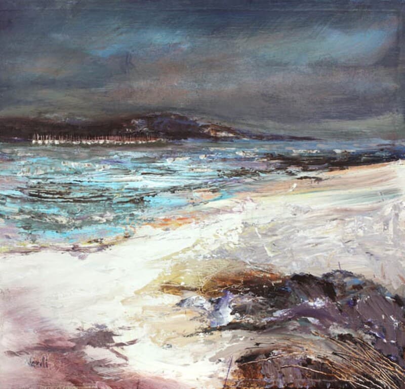
Choosing art for navy walls is often a question of balance. Deep blue can look elegant and cocooning, but it can also make the wrong artwork disappear into the background. On Route To Oban works especially well because it brings movement, light, and a gentle lift without breaking the mood of the room.
Why navy walls need contrast with warmth
Very pale artwork can feel too sharp against a darker wall, while something equally heavy can make the whole scheme feel flat. This piece sits in a more useful middle ground. It has enough brightness to stand clear of the wall colour, but it still feels calm and collected rather than stark.
- It helps a navy room feel layered rather than one-note.
- It adds a clearer focal point without making the wall feel busier.
- It suits both modern furniture and more classic timber pieces.
Where it can work particularly well
This is the kind of framed print that can sit comfortably in a sitting room, bedroom, or study where navy has been used to add depth. Because the scene carries a sense of distance and atmosphere, it stops the darker wall from feeling closed in.
That makes it especially helpful when you want a deeper colour scheme to feel polished and settled, but still welcoming enough for everyday living.
Why the finish matters with stronger wall colours
First 4 Frames completes each piece in-house in Falkirk with bespoke framing, colour-managed Giclée printing, and hand-finished craftsmanship. Against a darker wall, those details matter even more. A superior quality frame gives the artwork enough definition to feel deliberate and properly resolved.
This artwork is by Arie Vardi, and you can view the exact framed product here.
If you are looking for art for navy walls that feels balanced, atmospheric, and beautifully finished, On Route To Oban is a very strong option.