
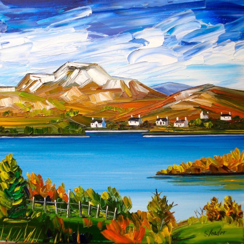
autumn wall art for a room with low daylight needs to bring warmth without absorbing the little natural light the space already receives. Autumn, Loch Lomond by Sheila Fowler offers a useful balance. Copper, orange, and yellow foliage establish the season, while vivid blue water and a broad, cloud-filled sky keep the square composition open. The result feels autumnal without turning the room brown, dim, or overly rustic.
Why autumn wall art for a room with low daylight needs contrast
A darker room does not automatically need pale, nearly colourless art. It needs an image with a readable structure and enough contrast to remain clear throughout the day. In this landscape, the bright horizontal band of the loch separates the deeper foreground from the hills. White cloud moves across the intense sky, while small cottages create crisp points on the far shore.
Those divisions help the scene retain depth when daylight is subdued. The darker greens and burnt orange leaves still provide richness, but they do not fill the entire picture. Open water and sky occupy generous areas, giving the eye somewhere to rest.
Work with the direction of the available light
Before choosing a wall, watch the room at three points: morning, the brightest part of the afternoon, and after the lamps come on. Low daylight may be caused by a northern aspect, a deep window reveal, nearby buildings, or heavy planting outside. Each condition affects the artwork differently.
- Find the clearest wall. A position facing the window may receive useful light, although reflections must be checked.
- Avoid the darkest recess. Rich foreground greens can lose definition if the frame is placed inside a permanently shadowed alcove.
- Check the view from the doorway. The blue loch should read as a bright horizontal pause before the smaller details become visible.
- Test evening lighting. A warm lamp can enrich the foliage, but it should not flatten the blue water or produce glare across the glazing.
Picture lighting is not always necessary. A nearby adjustable wall light or well-placed floor lamp may be enough. Keep bulbs and fittings at a safe distance from the finished frame, and aim the light so the picture is even rather than creating one bright spot.
Use seasonal colour without redecorating the whole room
The painting already carries several autumn notes: russet, ochre, olive, and a small amount of fresh green. Repeating all of them in cushions, throws, and accessories would make the scheme feel too literal. Choose one quieter connection instead. A rust wool cushion, an olive ceramic, or warm timber can relate to the foreground while the rest of the room stays calm.
| Existing room palette | How the artwork can help |
|---|---|
| Cool grey or off-white | Orange foliage adds warmth while the blue water keeps continuity |
| Deep green | Bright sky and loch prevent the scheme from becoming too enclosed |
| Warm neutral | Blue provides a clean counterpoint to beige, oatmeal, or natural linen |
| Dark timber | White cottages and cloud introduce small, useful areas of brightness |
This approach also lets the picture remain on the wall beyond autumn. The clear water, mountain forms, and strong sky are not seasonal props. They carry the landscape throughout the year, while the foliage supplies an extra layer of warmth when the days shorten.
Choose the square size from the viewing distance
The print is available in 265 by 265 millimetres and 500 by 500 millimetres before framing. The smaller option can suit a compact landing, reading corner, or wall beside a doorway. The larger version gives the loch and hills enough presence for a living room or dining area. Mounting and moulding will increase the final dimensions, so map the complete framed size rather than the print alone.
Use a paper template or low-tack tape and view it in the room’s dullest daytime conditions. If the proposed size looks visually slight then, it is unlikely to gain authority after framing. Conversely, a square that crowds furniture or window trim will lose the open quality that makes the landscape helpful.
Frame for definition, not extra heaviness
A restrained dark moulding can sharpen the edges and relate to the deeper foreground. A light neutral frame may suit a smaller, dimmer room, while a carefully chosen warm timber can echo the landscape without adding a heavy brown border. Compare the options against the real print because the blue, white, green, and orange must remain balanced together.
First 4 Frames uses colour-managed Giclée production and completes bespoke framing by hand at its Falkirk workshop. That in-house process helps preserve the separation between bright water, textured cloud, cottages, and foliage. It also allows the mount, moulding, glazing, and final scale to be chosen for the actual light conditions.
Colour and place in Sheila Fowler’s landscape
Sheila Fowler is a Scottish artist known for expressive colour, texture, landscapes, coastlines, and flowers. Explore further work on Sheila Fowler’s official website, or browse the Sheila Fowler collection at First 4 Frames. The painting’s recognisable setting gives the colour a sense of place rather than using autumn as a decorative theme alone.
Effective autumn wall art for a room with low daylight should make limited light feel considered, not apologetic. View the framed Autumn, Loch Lomond print for a bright loch, open sky, and warm seasonal foreground presented with lasting, hand-finished quality.