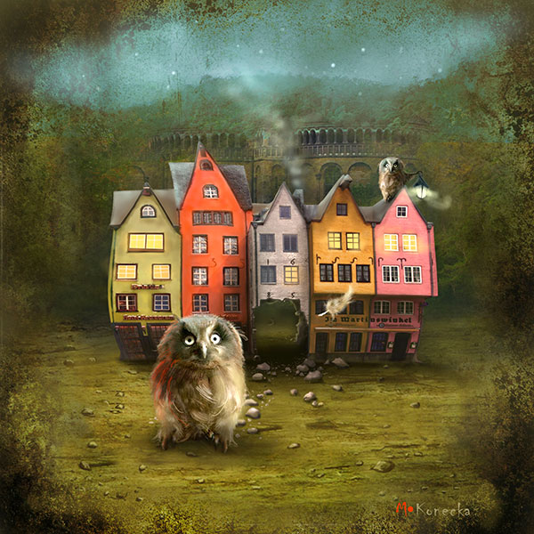
Posted on

Why Ceol Mor (Plockton) Works So Well as B&B Bedroom Wall Art

Ceol Mor (Plockton) depicts a whimsical, brightly colored fishing boat on a lake shore near green hills and mountains, with a white cottage by the water, all shown in a dreamy, painted style.

Good B&B bedroom wall art should make a guest room feel considered from the moment someone walks in. The aim is not to overcrowd the room, but to give it warmth, identity, and a sense of place. Ceol Mor (Plockton) does that beautifully, especially in guest spaces that want a more memorable Scottish character.

Why guest bedrooms benefit from local character

A well-run B&B often feels strongest when the room reflects something of its location or atmosphere. This piece adds personality without becoming themed or fussy. It gives the room a talking point, but it still feels restful enough for somewhere people come to unwind.

  • It helps a guest room feel less generic.
  • It adds warmth without asking for a bold or crowded scheme.
  • It suits spaces where comfort and a sense of place matter equally.

Why it works for hospitality spaces

Ceol Mor (Plockton) can work above a bed, beside a dressing table, or on the main wall guests see first. Because the image carries story and mood, it helps the room feel more individual without making the layout harder to style.

That balance is valuable in B&B rooms, where the space needs to feel both welcoming and easy to maintain.

Why the quality of finish matters to guests

First 4 Frames produces each piece in-house in Falkirk with bespoke framing, colour-managed Giclée printing, and hand-finished craftsmanship. That polished presentation helps a guest room feel more cared for, which is exactly the impression good hospitality spaces should leave.

This artwork is by Matylda Konecka, and you can view the exact framed product here.

If you need B&B bedroom wall art that feels warm, distinctive, and properly finished, Ceol Mor (Plockton) is an excellent option.

Posted on

Why Strange Night (Grassmarket) Suits an Industrial Style Flat So Well

Strange Night (Grassmarket) depicts a whimsical town square at night with leaning buildings, glowing windows, quirky phone booths, and a hilltop castle under swirling stars in a green sky.

The best wall art for an industrial style flat should work with the building’s character rather than fight it. Exposed materials, darker finishes, and cleaner lines can look brilliant, but they can also tip a room into feeling too hard if the artwork is not well judged. Strange Night (Grassmarket) brings a strong sense of atmosphere while still softening the overall effect.

Why this kind of room needs story as well as structure

Industrial interiors already have visual discipline. What they often need is one piece that adds personality, place, and a little emotional warmth. This artwork does that by carrying mood and movement, while still feeling composed enough for a cleaner urban setting.

  • It suits darker wall colours, metal details, and reclaimed timber.
  • It adds local character without looking like a souvenir piece.
  • It gives a room more depth without introducing visual fuss.

Why Grassmarket imagery works here

There is something especially fitting about a city subject in an industrial-style interior. It helps the room feel rooted and lived in rather than styled from a formula. This piece can work beautifully above a sofa, near a dining area, or on the wall that needs one more confident focal point.

That balance of grit, imagination, and finish is what makes it so useful in a converted flat or loft-like space.

Why framing quality helps the look land properly

First 4 Frames produces each piece in-house with bespoke framing, colour-managed Giclée printing, and hand-finished craftsmanship. In an industrial-style room, that superior presentation stops the artwork feeling casual and helps it sit with more confidence alongside stronger materials and bolder architecture.

This artwork is by Matylda Konecka, and you can view the exact framed product here.

If you need wall art for an industrial style flat that feels characterful, atmospheric, and properly finished, Strange Night (Grassmarket) is an excellent fit.

Posted on

Above the Castle (And The Tattoo Too) and the Appeal of Edinburgh Festival Wall Art

A surreal scene from "Above the Castle (And The Tattoo Too)" depicts a stadium of performers and spectators, two giant umbrellas floating in cloudy skies—one with a small dog—and a grand castle in the background.

Well-chosen Edinburgh Festival wall art should do more than simply show a recognisable skyline. It should capture some of the energy, theatre, and layered atmosphere that make the city so memorable at festival time. Above the Castle (And The Tattoo Too) does that in a way that feels imaginative rather than obvious.

Why this subject has real staying power

Festival-inspired artwork can sometimes lean too hard on nostalgia or become overly literal. This piece avoids that by keeping a sense of spectacle while still feeling like a proper artwork for the home. It has movement, wit, and a strong sense of place, but it does not rely on cliché.

That is what makes it useful beyond a short seasonal moment. It still works long after the performances and crowds have gone.

Where it can feel especially at home

  • In a city flat where local character matters.
  • In a hall or sitting room that benefits from one more conversational piece.
  • In a home office where art with imagination helps the room feel less predictable.

Because the image carries so much story, it gives the room personality without needing a whole themed scheme around it.

Why the framed finish is important

At First 4 Frames, each print is completed in-house with bespoke framing, colour-managed Giclée printing, and hand-finished craftsmanship. That level of presentation gives a more playful piece the structure it needs to feel polished and lasting on the wall.

This artwork is by Matylda Konecka, and you can view the exact framed product here.

If you are looking for Edinburgh Festival wall art that feels imaginative, local, and beautifully presented, Above the Castle (And The Tattoo Too) is a superb option.

Posted on

Why The Balloonist Works Brilliantly as Art for a Gallery Wall

The Balloonist features a whimsical owl in an orange hat, seated in a wicker hot air balloon basket over water. Colorful balloons, lanterns, cages, and feathers surround the owl, creating a dreamy and surreal scene.

When people plan art for a gallery wall, the biggest challenge is often cohesion. The Balloonist works brilliantly because it has enough personality to anchor a mixed display without overwhelming everything around it.

A gallery wall can look collected and expressive, but only if at least one piece helps set the tone. The Balloonist does that job well. It brings imagination, movement, and a clear focal point, which makes surrounding smaller pieces feel more deliberate.

  • It helps a gallery wall feel curated rather than scattered.
  • It works well with a mix of landscapes, typography, and smaller prints.
  • It adds story and character without relying on loud colour alone.

How to place it

This piece works especially well slightly off-centre in a salon-style arrangement, above a console or sideboard, or as the print that gives the rest of the display its starting point. Once one framed piece has enough presence, the whole wall usually feels easier to build around.

Why a better framed finish helps

Because First 4 Frames completes the work in-house in Falkirk, the finished piece has the crisp presentation, bespoke framing, and colour-managed quality needed for a display where details are seen up close.

The artwork is by Matylda Konecka, and you can view the exact framed product here.

If you want art for a gallery wall that adds focus, wit, and a more resolved overall look, The Balloonist is an excellent choice.

Posted on

Choosing Scottish Piper Wall Art, Why The Eilean Donan Piper Feels So Atmospheric

A child in red sits on a wooden cart beside the barrel-shaped house, bathed in warm light, under a starry sky with the majestic Eilean Donan Castle (The Eilean Donan Piper, Loch Duich) rising in the distance.

Well-chosen Scottish piper wall art should feel atmospheric rather than predictable. You want the subject to carry heritage and story, but still feel like a genuinely good piece of art for the home. The Eilean Donan Piper (Loch Duich) does that especially well.

Why this subject can work so strongly

There is a reason people are drawn to Scottish imagery with place and character behind it. When handled well, it brings a room a stronger sense of identity. This piece combines the presence of the piper with the atmosphere of Eilean Donan in a way that feels evocative rather than overdone.

  • It suits homes where Scottish landscape and heritage matter personally.
  • It adds story and mood rather than functioning as a simple souvenir image.
  • It works well when you want art with local character and a more imaginative edge.

Where it can make the biggest impact

This piece can work beautifully in an entrance hall, a sitting room, or a study where you want one framed print to carry a stronger sense of place. It also makes sense in homes that already feature natural wood, tweed, or collected Scottish details, because it reinforces that atmosphere without looking too literal.

Why presentation matters

First 4 Frames completes each piece in-house with bespoke framing, colour-managed Giclée printing, and hand-finished craftsmanship. That level of presentation helps heritage-led artwork feel more substantial and far less novelty-driven. It gives the finished piece the polish it needs to sit comfortably in a well-kept home.

This artwork is by Matylda Konecka, and you can view the exact framed product here.

If you want Scottish piper wall art that feels atmospheric, distinctive, and properly finished, The Eilean Donan Piper is a very good choice.

Posted on

Postfox and the Appeal of Fox Wall Art That Still Feels Refined

Postfox features a fox in snowy grass beside a red British postbox, a "Highlands" wooden signpost with glowing string lights, and a scarfed bird, all set in gentle nighttime snowfall.

Good fox wall art should bring character to a room without making the whole scheme feel whimsical for the sake of it. Postfox gets that balance right. It has wit and personality, but it also feels composed enough for a well-finished interior.

Why this kind of wildlife subject works so well

A fox is a familiar subject, but that does not mean the artwork should feel obvious. The most successful pieces give you the charm of the animal while still looking thoughtful on the wall. Postfox does exactly that. It feels imaginative, but not childish, and distinctive without becoming overly busy.

That makes it especially useful in homes where you want a little more personality, but still care about keeping the room polished and easy to live with.

Where it can sit particularly well

  • In a snug or small sitting room that needs warmth and conversation.
  • In a hallway where one characterful piece can give the space identity.
  • In a study or reading corner where the artwork can feel playful without becoming distracting.

Because the image has story as well as subject, it can do more than simply decorate a blank wall. It helps the room feel chosen and personal.

Why the First 4 Frames finish adds to the effect

First 4 Frames completes each piece in-house with bespoke framing, colour-managed Giclée printing, and hand-finished craftsmanship. That refined presentation matters with more characterful artwork. It gives the piece enough structure to feel at home in a smarter interior.

This artwork is by Matylda Konecka, and you can view the exact framed product here.

If you want fox wall art that feels characterful, stylish, and properly finished, Postfox is a lovely choice.

Posted on

Tolbooth (Glasgow) and the Appeal of Glasgow Wall Art for a Converted Flat

A whimsical scene shows small, cartoonish figures pulling the Tolbooth (Glasgow), a leaning clock tower, with rope through a misty city square at night, set against old buildings and a starry teal sky.

Good Glasgow wall art for a converted flat should do more than fill a bare wall. It should help the space feel rooted. Converted flats often mix clean lines with older architecture, so the artwork needs both personality and structure. Tolbooth (Glasgow) is a particularly strong choice for that balance.

Why local character matters in this kind of home

Converted flats can look impressive very quickly, but they do not always feel personal straight away. A city-based print with real presence helps solve that. Tolbooth (Glasgow) brings story, place, and visual rhythm, which helps the room feel less generic and more lived in.

  • It suits brick, timber, painted plaster, and other mixed urban textures.
  • It adds a local point of reference without feeling obvious.
  • It gives a cleaner room more personality without adding clutter.

Where it works best

This piece can work well in an open-plan living space, above a desk, or in a dining area where you want one framed focal point to carry some atmosphere. Because the artwork has a recognisable city subject and a distinctive style, it can anchor the room without dominating it.

That is especially useful in homes where the architecture already does part of the visual work and the art only needs to sharpen the identity of the space.

Why the presentation matters

First 4 Frames completes every piece in-house with bespoke framing, colour-managed Giclée printing, and hand-finished craftsmanship. In a converted flat, that more polished finish helps the artwork feel intentional enough to sit comfortably with stronger architectural features.

This artwork is by Matylda Konecka, and you can view the exact framed product here.

If you are looking for Glasgow wall art for a converted flat that feels distinctive, local, and professionally finished, Tolbooth (Glasgow) is well worth considering.

Posted on

Why Drift (Plockton) Is Such a Good Cafe Wall Art Choice

Drift (Plockton) depicts a whimsical fish-shaped airship floating over water, releasing bubbles above a quirky village with lit houses on the shore; nearby, a rowboat and two sailboats glide across the surface.

The best cafe wall art does more than fill an empty wall. It helps shape the atmosphere people remember after they leave. Drift (Plockton) is a particularly good option for that job because it brings story, place, and personality without making a café feel over-styled.

Why local character matters in hospitality spaces

Cafés often work best when they feel individual. Customers notice when a room has a sense of place rather than the same interchangeable décor they could find anywhere. Drift (Plockton) helps create that feeling. It has charm and movement, but it still feels refined enough for a quality-led interior.

  • It suits independent cafés, coffee corners, and bakery seating areas.
  • It adds warmth without relying on slogans or novelty prints.
  • It can help a compact wall feel finished with one well-chosen piece.

Where a piece like this earns its place

This artwork would sit well near a window table, above bench seating, or on the wall customers see as they queue. In those spots, it contributes to the room quietly but effectively. It gives people something to notice, and that small detail can make the whole café feel more memorable.

Because the style is characterful rather than loud, it works for businesses that want a welcoming interior without tipping into clutter. That is often the sweet spot for good café design.

Why framed presentation matters in a business setting

Commercial interiors need artwork that looks deliberate and professionally finished. First 4 Frames produces each piece in-house in Falkirk with bespoke framing, colour-managed Giclée printing, and hand-finished craftsmanship. That gives the final result a cleaner, more dependable presence than a mass-produced wall print.

This artwork is by Matylda Konecka, and you can view the exact framed product here.

If you want cafe wall art that feels local, thoughtful, and full of character, Drift (Plockton) is a very appealing choice.

Posted on

Why Moving House Works Brilliantly as Estate Agent Office Wall Art

Moving House" features a whimsical illustration of a crooked house on a red sleigh adorned with string lights and a lamp post, set in a snowy landscape with gentle falling snow.

Good estate agent office wall art should make the space feel more human without distracting from the work being done there. Moving House is a particularly fitting choice because it connects naturally with the experience of buying, selling, and relocating, while still feeling distinctive rather than gimmicky.

Why a property office benefits from artwork with character

Many estate agent offices lean heavily on screens, brochures, window cards, and practical furniture. That is understandable, but it can leave the space feeling functional rather than welcoming. This piece helps soften that impression. It gives clients something memorable to notice while they wait, and it reinforces the idea that property is personal, not purely transactional.

  • It suits reception areas, meeting rooms, and client-facing desks.
  • It adds personality without making the office feel informal.
  • It gives a property business a visual link to the idea of home and movement.

A useful talking point without becoming a novelty

The best commercial artwork often gives people an easy point of connection. This print does that well. Its imaginative tone makes the office feel less stiff, but the framed presentation keeps the overall effect polished. That balance matters in a business where trust and approachability need to work together.

Why presentation matters in a client-facing workspace

First 4 Frames completes each piece in-house in Falkirk using colour-managed Giclée printing and hand-finished bespoke framing. In an office where details influence first impressions, that superior quality finish helps the artwork feel chosen with care rather than added as an afterthought.

The artwork is by Matylda Konecka, and you can view the exact framed product here.

If you want estate agent office wall art that feels relevant, welcoming, and a little more memorable than the expected options, Moving House is a very strong choice.

Posted on

How Down the Stairs Can Lift the Wall Above a Console Table

Down the Stairs" is a surreal painting of a narrow, dim staircase where a cat-faced puppet slumps on the steps and a shadowy figure hides behind a corner. Warm light contrasts with dark, textured walls, creating an eerie atmosphere.

Finding the right wall art above a console table can be surprisingly difficult. The space usually needs personality, but not so much visual weight that the area feels crowded. Down the Stairs works especially well because it brings shape, interest, and movement to a narrow wall without overpowering it.

Why this area needs more than a generic filler print

Console tables often sit in halls, landings, or transition spaces where every detail is more noticeable. A weak artwork can make the whole arrangement feel temporary. This piece has enough character to anchor the wall properly, so even a simple table, lamp, or bowl beneath it feels more intentional.

  • It suits hallways, upstairs landings, and apartment entrances.
  • It adds personality without needing a full gallery wall around it.
  • It works well when the furniture below is slim and understated.

A useful way to make a pass-through space feel finished

Not every part of a home needs lots of objects to feel considered. Sometimes one expressive framed print is enough. This artwork helps a circulation space feel designed rather than simply passed through, which is exactly what makes it so useful above a console table.

Why the presentation matters in a small area

First 4 Frames produces the piece in-house in Falkirk with colour-managed Giclée printing and hand-finished bespoke framing. In a smaller wall area, that cleaner finish matters because the eye takes in the whole arrangement at once. A superior quality frame helps the artwork look settled and complete.

The artwork is by Matylda Konecka, and you can view the exact framed product here.

If you want wall art above a console table that feels lively, polished, and easy to place, Down the Stairs is a very good option.