
Posted on

Pink Wall Art Without a Sugary Scheme: Start With a Summer Border

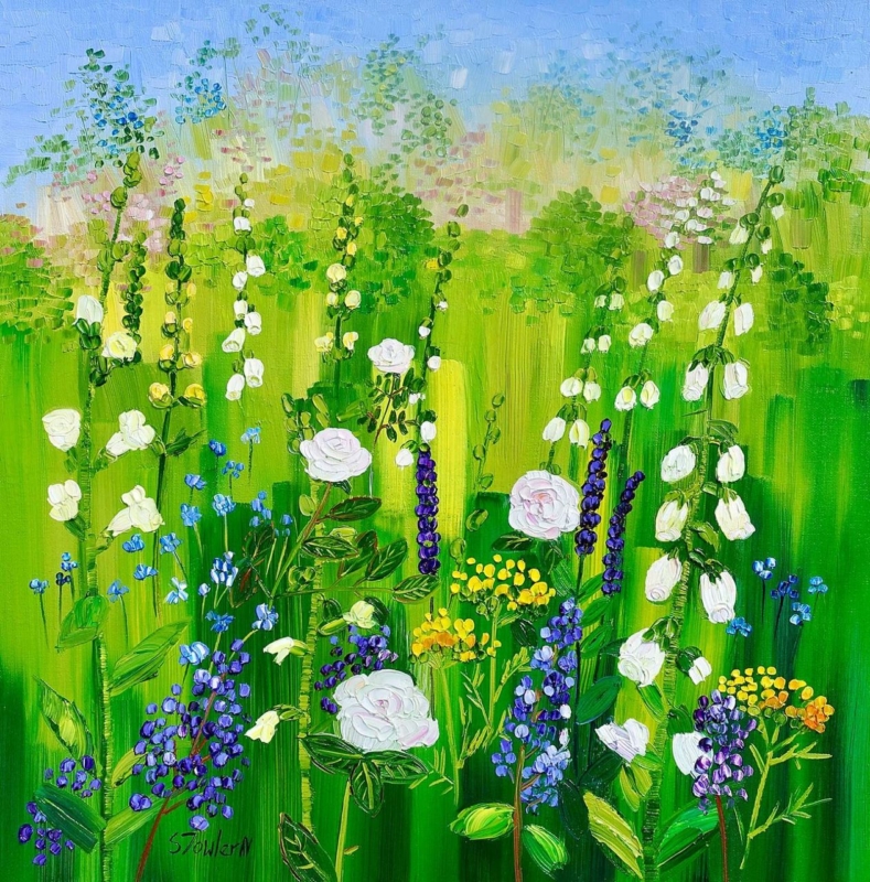
Image of Summer Border with Roses and Foxgloves by Sheila Fowler

pink wall art should answer a real question about the room or recipient. Summer Border with Roses and Foxgloves is useful here because roses and foxgloves place pink among greens and natural notes, giving the colour context instead of asking it to cover the whole room.

pink wall art - Summer Border with Roses and Foxgloves

Build a balanced palette around pink wall art

Choose one pink from the picture as the leading accent, then stop. A cushion edge, small ceramic or thread in a neutral fabric is enough. Green foliage and quiet timber provide balance, while cream, stone or soft grey lets the flower colour stay fresh.

Use the square format deliberately

  • Use 265 x 265 mm on a compact return or above a bedside cabinet.
  • Use 500 x 500 mm above a small chest or in a sitting-room corner.
  • Mark the finished frame and preserve clear wall on every side.

Floral curtains and bedding can compete with a garden picture quickly. If one major textile is patterned, keep other surfaces plain. The artwork can then supply the season and detail instead of becoming another layer of repeated blooms.

Use pink as the invitation to look, then let green and neutral space make the room liveable.

Keep every flower colour distinct

A summer border contains more than its strongest pink. Colour-managed Giclée production separates petals, foliage and quieter notes. A bespoke frame creates a calm boundary against painted walls or fabric.

To explore more of the artist’s floral and Scottish landscape work, visit Sheila Fowler’s official website. Browse the Sheila Fowler collection, or view the exact product and framing choices.

Pink wall art does not require a pink room. Summer Border with Roses and Foxgloves can lead a mature scheme when one accent is repeated and competing patterns are edited back.
Posted on

Pink Wall Art Can Feel Grown-Up, Why Edinburgh In Pink (Open Edition) Works

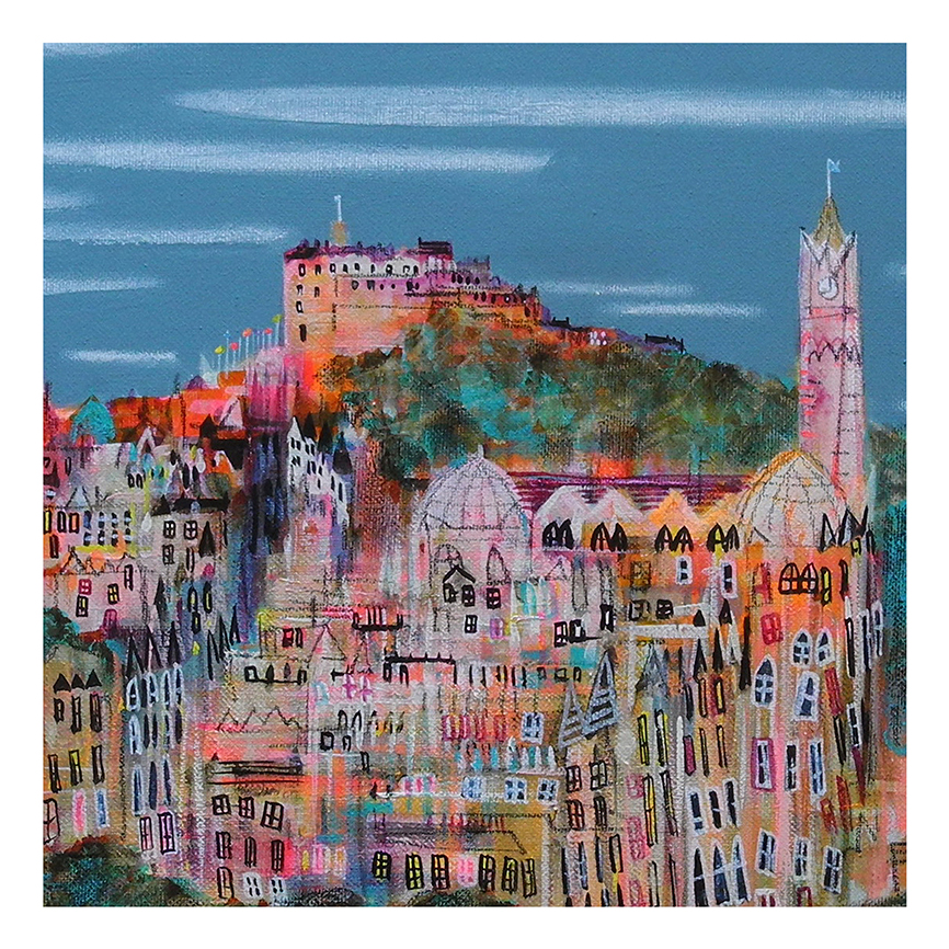
A vibrant, whimsical cityscape of Edinburgh—densely packed buildings, pointed roofs, clock tower, and a hilltop castle beneath a blue sky—expertly depicted in the "Edinburgh In Pink (Open Edition)" framed print.

Good pink wall art should bring warmth and lift without tipping a room into something overly sweet. Edinburgh In Pink (Open Edition) works especially well because the colour comes through a recognisable city setting, which makes the overall effect feel grounded and much more grown-up.

pink wall art - Edinburgh In Pink (Open Edition)

That is often what helps a brighter colour palette last. The artwork feels cheerful, but it still has enough structure to sit naturally in a considered interior.

Why Pink Wall Art Works Best With Some Structure

Pink is often at its strongest when it is balanced by architecture, line, and a sense of place. This Edinburgh scene keeps the room feeling lively while still looking composed.

  • It adds warmth without feeling overly delicate.
  • It helps pink feel decorative in a polished way.
  • It suits rooms that need lift as much as colour.

Where This Piece Can Shine

Edinburgh In Pink (Open Edition) would suit a hallway, dressing room, sitting room, or guest bedroom where one brighter framed piece can make the space feel more welcoming. It works especially well with pale neutrals, soft greys, brushed brass, and painted furniture because the image already balances warmth with definition.

Why The Final Finish Matters

Colour-led artwork needs careful print handling so the brighter notes stay clean rather than heavy. First 4 Frames completes bespoke framing and colour-managed Giclee production in-house, helping the finished piece feel assured from the outset. You can view the exact framed product here, and browse more from Nikki Monaghan if you enjoy Scottish city work with the same lively charm.

For anyone searching for pink wall art that feels warm, stylish, and refreshingly grown-up, this piece is a lovely choice.