
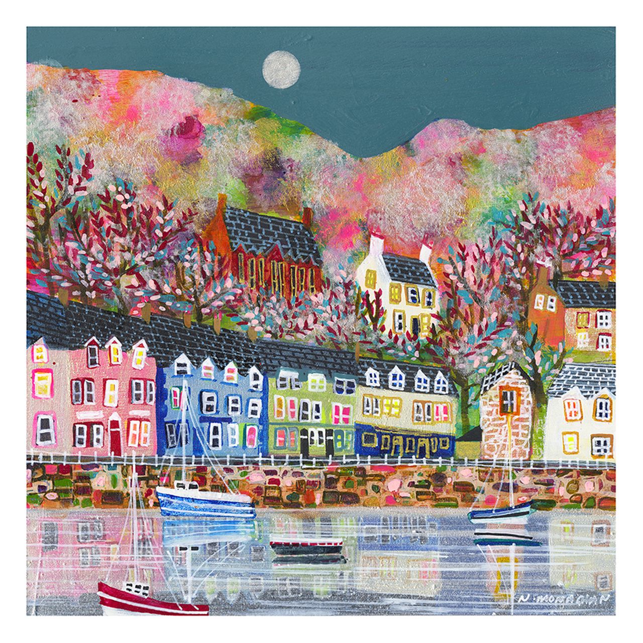
colourful harbour wall art for low winter light needs to bring energy into a room without pretending a grey afternoon is a summer morning. PORTREE, ISLE OF SKYE by Nikki Monaghan takes a more convincing route. Its pink, blue, yellow and white harbour buildings hold their colour beneath a broad teal sky. Lit windows add warmth, while boats and broken reflections carry those accents into the water. The result feels bright, but still belongs to a Scottish coastal evening.
Why colourful harbour wall art for low winter light works
Winter rooms often lose contrast before they lose all their light. Pale walls become flatter, darker furniture feels heavier and small colour differences are harder to see. A useful picture therefore needs more than one brilliant accent. It needs a pattern of light and dark that remains readable at several times of day.
Portree provides that pattern. The charcoal roofs and harbour wall give the brighter cottages a firm edge. A pale moon and silver water prevent the upper and lower parts from becoming dense. Because the colour is spread across architecture, foliage and reflections, the image keeps its character even when natural light is subdued.
Test the wall at the least flattering time of day
Do not judge the position only at midday. Tape a paper rectangle to the wall, then look again in the late afternoon when the room normally feels dullest. If the template disappears into shadow, the artwork may need a neighbouring lamp or a different wall. If glare sits across the centre, moving the picture sideways can work better than increasing the light.
| Winter room condition | What Portree contributes | Practical response |
|---|---|---|
| Cool, flat daylight | Warm windows and pink-orange hills | Use a warm-white lamp nearby, not a cold exposed bulb |
| Dark furniture | Pale water and crisp cottage fronts | Leave clear wall around the finished frame |
| Little direct sun | Strong colour contrast rather than glare | Angle lighting broadly across the image |
| Early evening use | Moon, lit windows and reflective water | Check the picture with the curtains closed |
A picture light is optional, not automatic. One broad source at a gentle angle is preferable to a narrow hot spot. The brightest area should not sit directly over the moon or a white cottage. Test from the seats people actually use, since glazing can reflect a lamp that looks harmless when viewed standing up.
Repeat colour with restraint
The painting already contains a generous palette, so it can do most of the decorative work. Choose one existing note to repeat in the room. A muted blue cushion, a berry-coloured ceramic or a small ochre textile is enough. Repeating pink, turquoise, yellow and red together would turn a lively connection into a forced harbour theme.
Natural materials help settle the stronger hues. Mid-toned timber, woven wool and off-white walls give the colour a grounded setting. Very cool grey can make the darker roofs feel harder in weak daylight, while brilliant white may exaggerate the difference between the wall and a softly lit print.
Use the square format to make a steady winter focal point
The square composition is useful above a compact sideboard, between two windows or on the end wall of a dining area. Its boats and harbour create horizontal movement, but the rows of houses and rising hillside keep the eye moving upwards. That balanced direction makes the piece feel settled rather than panoramic.
- Above furniture: mark the complete framed size and leave a comfortable gap above the surface.
- Between windows: confirm the picture is not struck by two competing reflections.
- Across from seating: keep the centre close to the natural seated sightline.
- Near a lamp: place the shade outside the glazed reflection seen from the main chair.
A crowded gallery arrangement would weaken the open sky and reflective water. One substantial presentation gives the many cottages, blossoms and boats room to be enjoyed. If other pictures must share the wall, keep the spacing consistent and avoid adding several more highly saturated harbour scenes.
Preserve the difference between brightness and glare
Nikki Monaghan builds her Scottish towns and harbours through layered paint, ink, charcoal and pastel. In Portree, those marks keep the hillside textured and the reflections loose, so the image does not depend on flat blocks of colour alone. Explore more at Nikki Monaghan’s official website, or browse the Nikki Monaghan collection at First 4 Frames.
First 4 Frames produces colour-managed Giclée prints and completes bespoke framing in-house at its Falkirk workshop. That careful process helps separate the blue boats from the silvery water and the warm windows from the darker roofs. A hand-finished frame gives the busy harbour a clean edge and arrives ready to hang.
Well-chosen colourful harbour wall art for low winter light can keep a room expressive through short days without fighting the season. View the framed PORTREE, ISLE OF SKYE print for a Portree scene that combines coastal calm with colour strong enough to survive softer daylight.