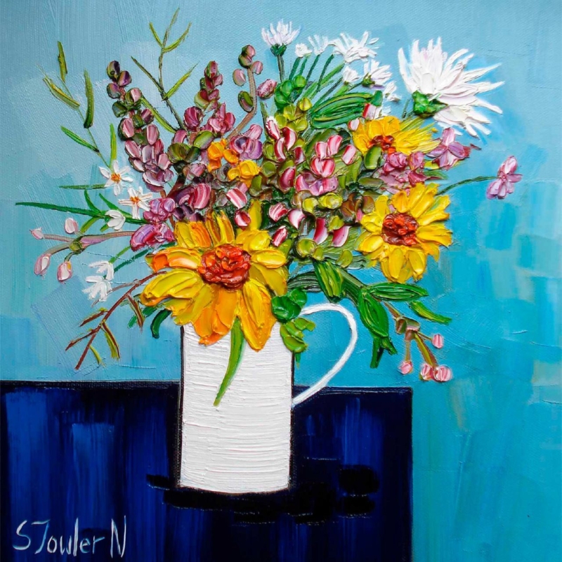
Botanical wall art can make an everyday breakfast corner feel fresher without turning it into a formal dining space. Summer Flowers in a White Jug uses a familiar white jug and summer flowers to create an easy focal point. Its square format is especially useful above a compact table, bench or narrow side unit.
Keep botanical wall art fresh rather than overly decorative
Choose one flower colour from the print for a napkin, bowl or seat pad.
Let the white jug connect with pale ceramics or painted joinery.
Avoid adding floral curtains and patterned tableware at the same time.
Mark the framed square on the wall so it relates to the furniture below.
One concentrated floral image feels more confident than several small botanical references competing around the room.
The available square proportions can bring order to a corner filled with horizontal surfaces. Hang the centre near seated eye level if the work will mainly be seen over breakfast. Where the room opens into a kitchen, check the view from both areas before fixing the final position.
Give summer colour a clean, lasting boundary
Petals, foliage and the pale vessel need clear colour separation if the still life is to feel lively rather than blurred. Colour-managed Giclée production supports those small differences. Bespoke in-house framing gives the composition enough definition to sit comfortably near practical furniture and hard kitchen surfaces.
For a breakfast corner, Summer Flowers in a White Jug shows how botanical wall art can introduce season, warmth and personality while the wider room remains simple and useful.
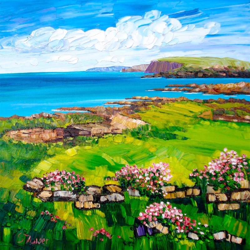
Art for sandy beige walls needs enough clarity to lift the neutral colour without discarding its warmth. Shoreline Croft, Lewis brings a white shoreline croft, turquoise water, green ground and distant blue hills into that setting. The palette feels fresh, while the island landscape keeps the relationship with sand and natural texture believable.
Balance art for sandy beige walls through cool contrast
Detail in the print
Role in the room
Turquoise bay
Adds a clean, cool counterpoint to warm beige.
White croft
Creates a crisp focal point without harsh black contrast.
Green and ochre ground
Connects the image to timber, linen and woven texture.
Keep supporting colour selective. One blue-green cushion or a piece of glazed pottery can echo the bay. Several nautical ornaments would make the room feel themed and would compete with the more interesting texture in the paintwork.
The square format is useful above a compact chest, reading chair or between two wider pieces of furniture. Mark the finished dimensions before ordering. A clear border of wall around the frame lets the pale shore remain expansive.
Frame coastal texture so pale tones stay distinct
The image depends on separation between white sand, the croft, blue sky and textured water. Colour-managed Giclée production protects those quiet differences. A hand-finished frame can then bridge the warm wall and cooler landscape without making either look dull.
For a neutral interior, Shoreline Croft, Lewis demonstrates how art for sandy beige walls can add light, colour and Scottish character while the room remains calm and natural.
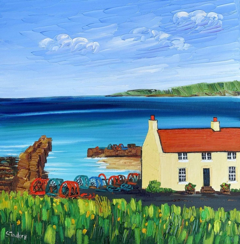
A graduation gift for a St Andrews graduate should recognise both the achievement and the place attached to it. Flowers fade, bottles are opened, and practical presents can disappear into a move. St Andrews Harbour by Sheila Fowler offers a more lasting connection. The harbour is recognisably part of St Andrews, while the framed artwork can belong naturally in the graduate’s next home.
Why place makes a graduation gift more personal
Graduation celebrates years of work, but much of its meaning sits in ordinary memories: familiar walks, weather, shared meals, and views seen repeatedly between deadlines. A picture of a real place can hold those quieter associations without trying to list them. It leaves room for the graduate’s own experience of the town.
The harbour is a thoughtful subject because it is specific without being limited to university buildings. It may recall coastal walks and time away from study as readily as the ceremony itself. This wider connection helps the print remain relevant long after certificates and formal photographs have been put away.
Is this graduation gift for a St Andrews graduate the right fit?
Consider the person before the milestone. This artwork is especially suitable when the graduate:
formed a strong attachment to St Andrews and its coastline;
prefers meaningful objects to branded university merchandise;
is moving into a flat, first home, or professional workspace;
enjoys expressive Scottish landscapes and coastal colour;
would value a finished piece that can be hung straight away.
If several people are contributing, framed art can also make a satisfying group present. It feels substantial enough to mark the occasion, while one carefully chosen piece is easier to live with than a collection of smaller commemorative items.
Choose a size for the graduate’s next space
St Andrews Harbour is available in 265 and 500 millimetre print sizes. The smaller option can suit a first flat, compact study, or a wall shared with other personal pieces. The larger size gives the harbour more presence above a desk, console, or modest sofa. If the recipient moves later, a square format remains flexible and can transfer between rooms more easily than a very wide panorama.
When the future wall is unknown, avoid guessing at a highly specific interior trend. A balanced frame and mount can support the coastal subject while working with different paint colours and furniture. First 4 Frames offers one-to-one framing advice and completes both colour-managed Giclée production and hand-finished framing in-house in Falkirk.
Present it with a short, specific note
A personal message can explain why this view was chosen. Mention a harbour walk, a visit, or the graduate’s affection for the town. Keep the note brief enough that the picture retains space for their own memories. If you do not share the same St Andrews history, simply connect the scene to the new chapter ahead.
Sheila Fowler is a Scottish artist known for colourful, atmospheric landscapes, coastlines, and wildflowers. Her expressive oils use rich colour and texture to give familiar places fresh energy. See more of her practice on Sheila Fowler’s official website, or explore the Sheila Fowler collection at First 4 Frames.
A framed reminder that travels beyond graduation
The best graduation gift for a St Andrews graduate does not need to look like formal memorabilia. It can carry a familiar view into a new job, city, or home and gather new meaning there. View the framed St Andrews Harbour print for a thoughtful way to celebrate academic work, a memorable Scottish place, and what comes next.
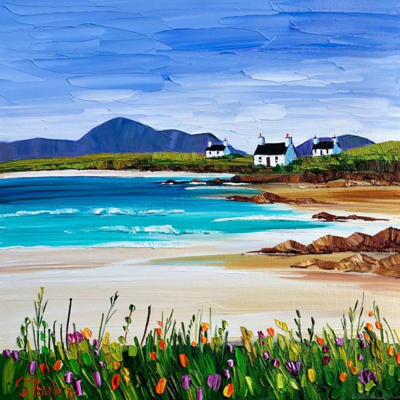
Art for a south facing room has to work with warm, changing daylight rather than simply looking bright in isolation. Summer Machair and Cottages, Harris by Sheila Fowler brings cottages, summer growth, and island atmosphere into that setting. Its fresh colour can hold attention while the square format keeps the effect controlled.
Place art for a south facing room beyond direct glare
Daylight issue
Practical response
Strong midday glare
Use a side wall rather than the wall directly opposite the main window.
Warm cream paint
Choose a frame edge that separates the landscape from the yellow undertone.
Large bright wall
Consider the 500 mm square option so the image does not look stranded.
Small sunlit corner
Use the 265 mm print above one compact piece of furniture.
Judge the position at more than one time of day. A wall that looks perfect at breakfast may catch a hard reflection in mid-afternoon. Mark the finished frame outline with low-tack tape, then check it while the sun moves across the room.
Bright rooms do not always need quieter art; they need colour with enough structure to stay readable.
Keep nearby fabrics and accessories restrained. Linen, pale timber, and a small amount of blue or green will support the island palette. Too many floral patterns could compete with the machair and make the room feel busier in strong light.
Keep island colour distinct in changing daylight
Sheila Fowler’s expressive brushwork and rich colour benefit from accurate separation between flowers, cottages, shore, and sky. Colour-managed Giclée production keeps those relationships clear. A bespoke frame provides a steady boundary as daylight changes across the wall.
When selecting art for a south facing room, Summer Machair and Cottages, Harris offers enough colour and depth to meet strong daylight, provided the position, scale, and frame are chosen with glare in mind.
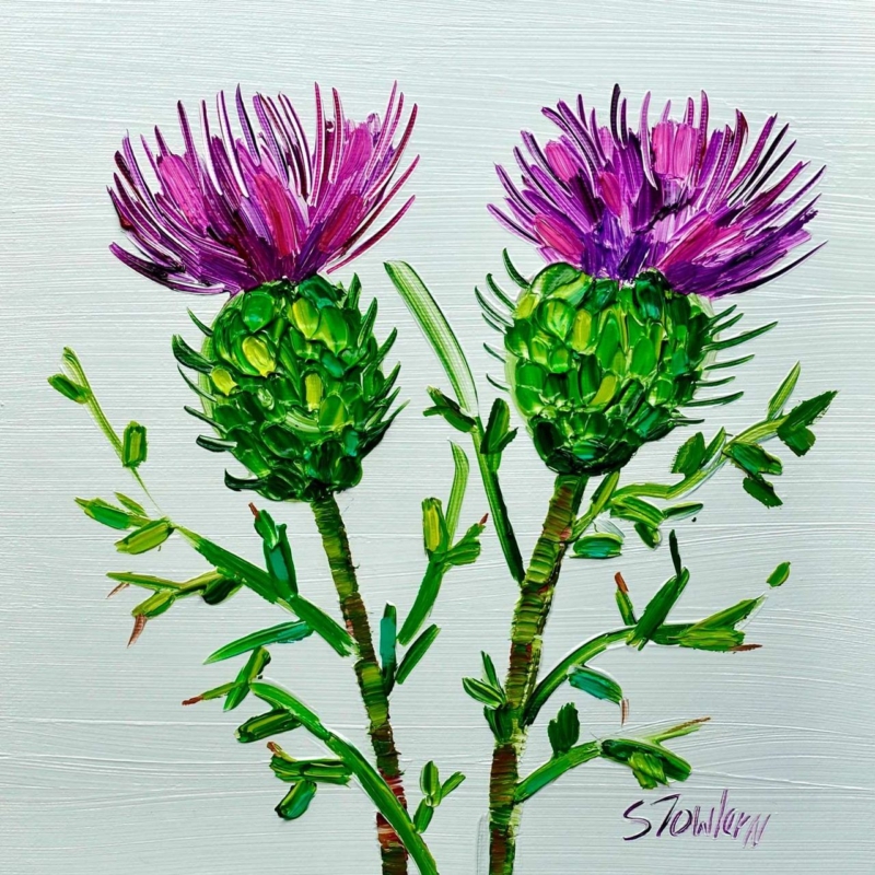
Art for ash wood furniture needs enough colour to define the wall without overwhelming the timber’s pale grain. Two Scottish Thistles by Sheila Fowler offers a compact square composition and a clearly Scottish botanical subject. Its concentrated colour can give light furniture a useful focal point while keeping the room fresh.
Use art for ash wood furniture as a focused colour note
Keep the timber visible
Position the frame above a small ash console, desk, or bedside chest. Leave clear wall between the furniture and artwork so the grain remains part of the scheme.
Repeat colour sparingly
Pick up one purple or green note in a cushion, ceramic, or book spine. Avoid matching every shade, which can make a natural room feel arranged rather than relaxed.
The available square proportions suit a compact furniture arrangement. Centre the print to the piece below it, not automatically to the whole wall. A warm off-white, quiet green, or mineral grey backdrop will keep both the thistles and ash grain distinct.
Give botanical colour a crisp, lasting edge
Sheila Fowler’s expressive colour and texture benefit from accurate tonal separation. Colour-managed Giclée production keeps the flower heads, stems, and surrounding marks clear. A bespoke frame finished in-house in Falkirk provides definition against pale timber without making the arrangement feel heavy.
When choosing art for ash wood furniture, Two Scottish Thistles adds Scottish character and a measured burst of colour while allowing the timber’s quiet warmth to remain visible.
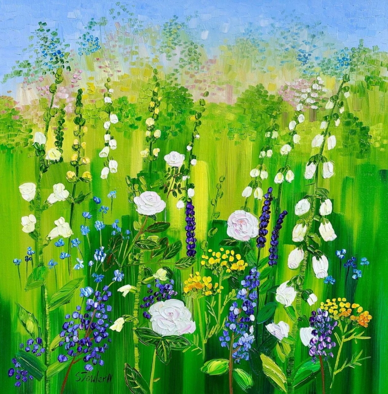
garden centre café wall art has to work across two connected experiences. Customers may arrive inspired by plants and outdoor colour, then expect the café to feel warm, comfortable, and professionally finished. Summer Border with Roses and Foxgloves by Sheila Fowler can bridge those settings. Its garden subject relates naturally to the business, while the square composition gives the dining space a clear and composed focal point.
What garden centre café wall art needs to achieve
A café inside a retail setting can easily feel like an afterthought. Menus, queue signs, retail displays, and practical furniture already compete for attention. Artwork should create atmosphere without adding more instructions or turning every surface into another sales message.
A painted border of roses and foxgloves is relevant without being literal branding. It reminds customers of the pleasure of planting and seasonal change, yet it still reads as art. That balance can make the café feel connected to the wider garden centre while giving people a visual pause during lunch or coffee.
Match the picture to the customer journey
Location
Purpose
Practical check
At the café entrance
Signal a warmer change from retail to hospitality
Keep menus and directional signs clear
Above a two-person table
Create an intimate focal point
Allow for chair movement and cleaning
On the queue sightline
Give waiting customers something pleasant to notice
Avoid competing with the ordering board
Near a seasonal display
Connect planting colour with the café interior
Leave enough wall around the frame
The available print sizes are 265 x 265 and 500 x 500 millimetres before framing. The compact option can define a smaller table or narrow return wall. The larger square can provide more presence near the entrance or on a quieter dining wall. Mock up the full framed dimensions rather than measuring only the printed image.
Use seasonal colour without constant redecorating
Fresh displays may change from spring bulbs to summer bedding, autumn foliage, and winter gifts. Permanent artwork should not need replacing with every retail season. A mixed garden border offers varied colour and recognisable planting, so it can sit comfortably beside changing displays throughout the year.
Repeat only a small part of the palette. A muted green seat fabric, a rose-toned ceramic, or natural timber may be enough. Avoid matching every flower colour across the room. Restraint helps the café feel curated and keeps the artwork from becoming part of a decorative theme.
Plan for light, cleaning, and busy service
Garden centre cafés often have generous glazing, so reflections should be checked at opening time, midday, and late afternoon. Keep framed work away from steam, drink stations, and walls exposed to frequent splashes. It should also sit beyond the path of trays, highchairs, and chairs being pulled back.
A secure fixing and a frame that complements the furniture will give the display a more permanent feel. First 4 Frames uses colour-managed Giclée printing and completes bespoke framing in-house in Falkirk. That hand-finished approach supports both the flower colour and the professional standard expected in a customer-facing space.
Effective garden centre café wall art should reinforce the setting while giving customers a comfortable place to pause. View the framed Summer Border with Roses and Foxgloves print for a floral focal point that links the café to the garden centre with colour, craftsmanship, and a polished finish.
An Orkney leaving gift can carry a familiar place into the next chapter of someone’s life. The best choice feels specific enough to stir real memories, but polished enough to work in a new room. Brough of Birsay, Orkney by Sheila Fowler offers that balance. Its island subject is unmistakably rooted in Orkney, while the square composition makes it practical to display in many kinds of home.
What makes an Orkney leaving gift meaningful
A move away may be exciting, necessary, or bittersweet. A place-led artwork acknowledges that complexity better than a generic farewell present. It does not ask the recipient to pack another practical household item, and it will not disappear after a celebration. Instead, it gives them a familiar view to live with over time.
The Brough of Birsay is a particularly resonant subject. It speaks of coastline, weather, history, and the distinctive scale of the islands. Those associations can matter to someone who grew up nearby, worked in Orkney, studied there, or built an important period of life around the place.
Match the picture to the person’s connection
Recipient
Why the subject works
Message to add
Someone relocating for work
Keeps an island landmark present in a new city
Wish them confidence in the move
A family moving to the mainland
Creates one shared reminder of home
Recall a walk, visit, or favourite season
A retiring colleague
Marks years connected to Orkney
Thank them for their contribution
A student leaving to study
Fits more easily than a large keepsake
Offer encouragement for what comes next
A short handwritten note can make the artwork more personal. Mention why this place was chosen rather than trying to write a long formal dedication. The picture should hold the memory; the note only needs to provide the connection.
A square format that adapts to a new home
The print is available at 265 x 265 and 500 x 500 millimetres before framing. The smaller size is useful when the recipient does not yet know how much wall space they will have. It can fit above a compact console, beside a bookcase, or on a short wall between doors. The larger option has enough presence for a living room, dining area, or generous hallway.
Square art is flexible because it does not need the broad wall demanded by a panorama. It can also join a future collection without losing its identity. If other pictures are added later, leave a consistent gap around each frame and use the Birsay image as the visual anchor rather than crowding every edge.
Choose framing that lets Orkney remain the focus
The landscape already brings colour, texture, and movement. A restrained frame will give it definition without turning the present into souvenir-style decor. Light timber can suit a relaxed coastal interior. A narrow darker moulding can add contrast in a modern flat. The best choice should also work with the recipient’s likely furniture, not only the colours within the print.
First 4 Frames produces colour-managed Giclée prints and completes bespoke framing in-house in Falkirk. That careful finish turns the gift into something ready to hang after the move. It also supports the subtler coastal colour and expressive marks that give the scene its atmosphere.
A successful Orkney leaving gift should feel rooted without becoming a novelty. It should be personal, display-worthy, and able to settle naturally into a different home. View the framed Brough of Birsay, Orkney print for a farewell present that keeps a distinctive island place close.
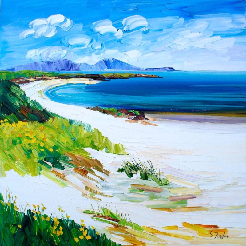
Square coastal wall art for a small dining area can create a sense of openness without requiring a long, uninterrupted wall. Traigh Iar, North Uist by Sheila Fowler brings the atmosphere of North Uist into a balanced square format. That proportion is especially useful beside a compact table, between doorways, or above a narrow side cabinet.
Size square coastal wall art for a small dining area from the table
What to check
Why it matters
Seated sightline
The picture should read comfortably across the table rather than feeling hung for people who are standing.
Wall width
Leave visible wall at both sides so the square shape looks deliberate.
Chair clearance
Keep the lower edge beyond the reach of chair backs and passing shoulders.
Window reflection
Check the glazing at breakfast and in evening light before fixing the final position.
A coastal subject can visually extend a tight corner, but it should not trigger a full seaside theme. Let the artwork provide the location and atmosphere. Plain ceramics, timber, linen, and one restrained blue or green accent are enough to connect it with the room.
A small dining space benefits from visual distance, not from more decorative objects competing for its limited surfaces.
Preserve the coastal colour in changing dining light
Coastal tones can lose their separation when reproduction is uncontrolled. Colour-managed Giclée printing keeps subtle shifts clear, while bespoke in-house framing gives the square composition a confident outer edge. The available sizes also allow the wall, not a standard assumption, to determine the final scale.
As square coastal wall art for a small dining area, Traigh Iar, North Uist supplies space, place, and a polished focal point without overcrowding the room.
Wildflower wall art for a conservatory is especially useful when the garden begins to change at the end of summer. Wildflowers, Loch Lomond by Sheila Fowler carries flowers and Scottish landscape into the room, so the connection with outdoors remains visible on cooler, greyer days.
Use wildflower wall art for a conservatory through changing seasons
Seasonal decision
Simple response
Late-summer colour
Repeat one flower colour in a cushion rather than matching the whole palette.
Autumn light
Check the print in lower afternoon sun before fixing its final height.
Winter views
Let the artwork provide colour while natural timber keeps the room grounded.
Spring planting
Avoid pots directly beneath the frame, where watering and leaves may affect it.
Do not compete with the garden
The print need not reproduce the exact planting outside. Its value lies in creating a lasting impression of flowers, water, and place. That broad connection feels calmer than matching every bloom.
Choose a wall protected from condensation.
Angle nearby lamps away from glazing.
Leave breathing space around trailing plants.
Use one frame finish that relates to the furniture.
Subtle flower colour needs accurate reproduction. Colour-managed Giclée printing preserves the relationships between blooms and landscape, while in-house hand finishing gives the artwork lasting presence.
As wildflower wall art for a conservatory, Wildflowers, Loch Lomond keeps the room connected to colour, nature, and Loch Lomond as the view outside changes.
Choosing art for a downsized home is not simply a matter of buying smaller pictures. A move to a compact house or flat often means deciding which images still carry colour, memory, and a real sense of self. Wildflowers, Loch Lomond by Sheila Fowler is a useful example. Its square format is easy to place, yet the vivid flowers and open Loch Lomond setting give it enough presence to keep a reduced room personal.
Begin art for a downsized home with meaning, not measurements
Measurements matter, but they should not make every decision. Start by identifying what you want the new home to retain. It may be a connection to the west coast, the energy of a garden, a favourite colour, or the feeling of open landscape. A smaller collection becomes stronger when each piece carries more than decorative value.
Wildflowers, Loch Lomond combines several layers in one image. The wildflowers bring close colour and texture, while the water and distant land provide depth. That helps a compact room feel lively without filling it with many separate subjects or accessories.
Use the square format where wall space is interrupted
Smaller homes often have useful but broken-up walls. Doors, windows, radiators, cupboards, and open-plan routes can leave few long uninterrupted areas. A square composition can fit comfortably above a compact console, beside a doorway, between shelving, or over a small dining table.
The print is available at 265 x 265 and 500 x 500 millimetres before framing. Mark the complete proposed frame on the wall with low-tack tape. Then check it from the main seat, the doorway, and the route through the room. The artwork should be legible from a distance without making the furniture below feel undersized.
Edit the room around one confident colour story
Choose one lead artwork. Let it establish the strongest colour and mood in the room.
Repeat colour lightly. Pick up one flower tone in a cushion, ceramic, or book spine rather than matching the whole palette.
Protect clear wall. Empty space around the frame makes the room feel calmer and the picture more important.
Remove competing fillers. Several generic signs or small prints can create more visual clutter than one properly scaled piece.
Keep useful objects useful. Do not sacrifice storage or circulation just to preserve an old furniture-and-art arrangement.
The aim is not minimalism for its own sake. It is to give the best objects enough room to work. The bright foreground of Wildflowers, Loch Lomond can provide energy, while its distant view creates visual breathing space. Quiet upholstery and natural timber allow both qualities to remain clear.
Decide what comes from the previous home
A move may involve existing furniture, frames, and sentimental objects. Lay out those items before choosing new art. If the old collection contains several small pictures with similar value, rotate them seasonally rather than hanging every piece at once. One new focal print can then give the room direction while familiar objects keep the space recognisably yours.
Place matters too. Someone with memories of Loch Lomond or Scotland’s west may see more in this image than flowers and water. That personal association can make it a better choice than a neutral print selected only because its colours fit.
Frame for proportion and long-term flexibility
A simple frame gives the expressive paintwork a clear edge. Pale timber can keep the result light, while a slim darker moulding can sharpen the colour and connect with black hardware or furniture legs. Avoid making the finished piece unnecessarily heavy in visual or physical terms, especially on a narrow wall.
First 4 Frames produces colour-managed Giclée prints and completes bespoke framing in-house in Falkirk. One-to-one advice can help balance the print size, mount, frame profile, and intended wall. That is particularly valuable when every centimetre must work harder.