Posted on

Gie it Laldy: A Scottish Gift for a Choir Singer

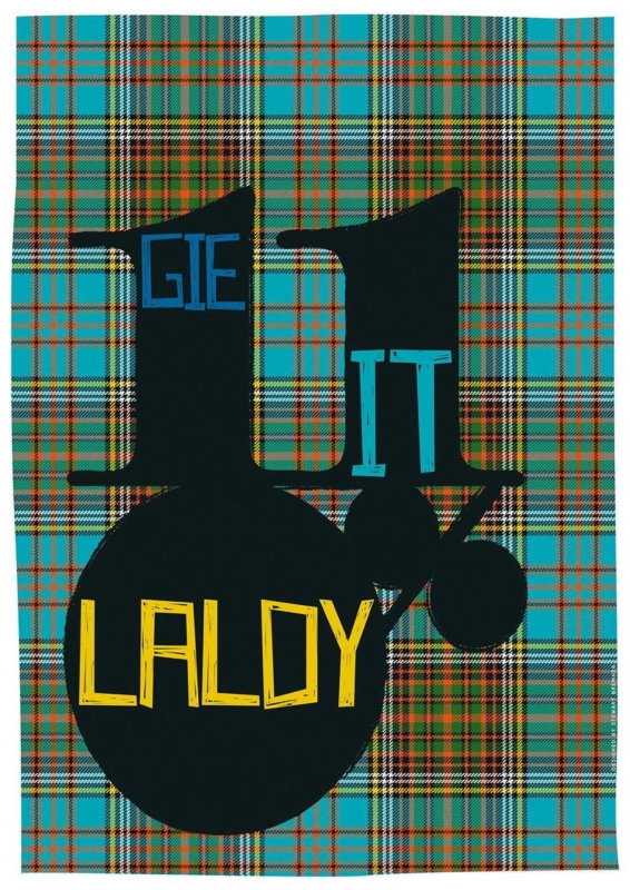
Image of Gie it Laldy by Stewart Bremner

A Scottish gift for a choir singer should recognise the pleasure of singing together, not simply add another treble clef to a shelf. Gie it Laldy by Stewart Bremner takes a more personal route. The familiar Scots phrase means to do something with gusto, making it a fitting tribute to the singer who commits fully to rehearsals, concerts, and every final chorus.

Scottish gift for a choir singer: Gie it Laldy by Stewart Bremner

Why Gie it Laldy suits a singer

The phrase is encouraging without being sentimental. It can recall a conductor asking for more energy, the lift of a full ensemble, or the confidence needed for a solo. Because the wording belongs to everyday Scots, it also carries a sense of home and shared humour that generic music gifts rarely achieve.

The design matters just as much as the saying. Strong typography gives the words presence from across a room, so the piece functions as graphic art rather than a printed slogan. That makes it suitable for an adult home, rehearsal space, or teaching room long after a particular concert has passed.

When a Scottish gift for a choir singer feels especially apt

  • After a first major performance: mark the confidence it took to step on stage and sing as part of the whole.
  • At the end of a choir season: thank a section leader, accompanist, or committed member without choosing a disposable token.
  • For a milestone birthday: connect the gift to the person’s musical life and Scottish voice at the same time.
  • When someone joins a new choir: offer encouragement that feels spirited rather than solemn.

Make the presentation personal without over-explaining it

Add a short card naming the concert, song, or rehearsal memory that made you think of the phrase. One specific reference will give the gift emotional weight. There is no need to cover the back with a long message or ask everyone to sign the artwork itself, which can make future conservation and reframing more difficult.

If the gift comes from the whole choir, collect messages in a separate card. The framed print then remains clean and easy to display, while the handwritten wishes can be kept safely. This approach is practical for a retirement, a move to another ensemble, or thanks to someone who has helped the group find its voice.

Find a wall where the words can be enjoyed

Typography works best where it can be read without visual competition. A hall, home practice corner, kitchen-dining area, or landing can all provide enough passing attention. Leave clear wall around the finished frame, particularly if nearby shelves already hold scores, photographs, and concert programmes.

A simple dark moulding can strengthen the graphic lines. A lighter timber may make the piece feel more relaxed in a home with warm natural finishes. First 4 Frames completes colour-managed Giclée production and bespoke framing in-house in Falkirk, so the final presentation feels like a considered artwork rather than a temporary performance souvenir.

Scots language given a bold visual voice

Stewart Bremner creates graphic prints that celebrate Scottish places, phrases, and identity through clear, contemporary design. Explore more at Stewart Bremner’s official website, or compare other work in the Stewart Bremner collection at First 4 Frames.

For a Scottish gift for a choir singer with humour, cultural character, and a genuine link to wholehearted performance, view the framed Gie it Laldy print. It is a compact way to say keep singing, give it everything, and enjoy the noise.

Posted on

Cloakroom Wall Art With Scottish Wit: Ah Dinnae Ken

Image of Ah Dinnae Ken by Stewart Bremner

cloakroom wall art works best when it responds to the room instead of simply filling an empty surface. Ah Dinnae Ken is a useful example because its portrait format and familiar Scots expression give a small room character without demanding several competing objects.

cloakroom wall art - Ah Dinnae Ken

Keep cloakroom wall art clear and singular

A cloakroom is often seen in a mirror as well as directly. Hold a paper template on the intended wall, close the door and check both views. The 420 × 594 mm print option can suit a vertical space, while the larger 594 × 840 mm option needs more distance than many compact rooms provide.

Three compact-room checks

  • Keep the frame clear of splash zones and towel movement.
  • Allow the wording to be read comfortably from the doorway.
  • Use one characterful piece instead of building a collection of novelty signs.

Let the wall colour do the supporting work. A clean contrast around the frame will make the phrase legible, while restrained accessories stop the joke from becoming a theme.

Give informal wording a properly made finish

Humour does not need a throwaway presentation. In-house Giclée production and bespoke framing give this Scottish phrase crisp definition and a durable, hand-finished presence suited to a carefully decorated home.

For the meaning and history of Scots words and phrases, search Dictionaries of the Scots Language. You can also browse the Stewart Bremner collection or view the exact framed product.

Cloakroom wall art has limited space in which to make an impression. Ah Dinnae Ken does it with one clear phrase, useful portrait proportions and no need for decorative clutter.

Posted on

Wall Art for Home Office Focus: A Clear View From Ardnamurchan

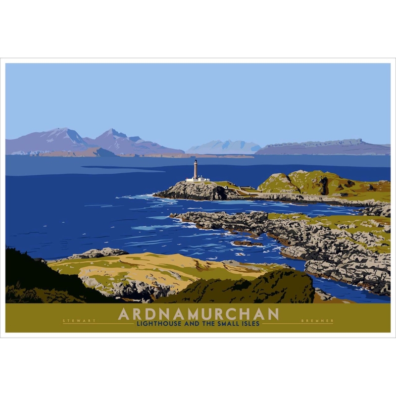
Image of Ardnamurchan: Lighthouse and Small Isles by Stewart Bremner

Wall art for home office spaces should contribute something that a screen cannot. Ardnamurchan: Lighthouse and Small Isles by Stewart Bremner opens a view towards a lighthouse, sea and distant islands. That long horizon can give the eyes a restorative place to settle between tasks, while the graphic composition adds Scottish identity without relying on corporate slogans.

wall art for home office - Ardnamurchan: Lighthouse and Small Isles

Place wall art for home office viewing beyond the monitor

Across from the desk

This position makes the landscape a genuine distance break. Hang it above low furniture so the horizon remains visible rather than hiding behind files, lamps or a second monitor.

On a side wall

A side placement can work in a smaller office. Turn slightly to view it and check that daylight from the window does not create a persistent reflection across the sea.

The 594 × 420 mm print makes a useful landscape focal point above a cabinet or compact meeting table. At 840 × 594 mm, it can hold a broader office wall. Measure the finished framed outline and confirm that it will not collide visually with shelving or video-call backgrounds.

A useful office focal point should reward a pause without becoming another source of information to process.

Keep nearby objects functional and few. A chart, calendar and several framed certificates on the same wall would break the open horizon into fragments. Let the lighthouse scene provide the principal visual direction.

Retain the horizon through clear print and framing

A graphic coastal landscape needs clean shapes, controlled colour and enough tonal separation for the distant islands to remain legible. Colour-managed Giclée production supports that clarity. Bespoke in-house framing can then give the wide image a firm boundary and a professional finish suited to a working room.

To learn about the real landmark and its far-west setting, visit the Ardnamurchan Lighthouse visitor site. Browse the Stewart Bremner collection, or view the exact Ardnamurchan: Lighthouse and Small Isles product.

Well-chosen wall art for home office use can alter how the working day feels. Ardnamurchan: Lighthouse and Small Isles supplies a long view, a clear landmark and a calm Scottish horizon—a welcome counterpoint to the close range of a desk and screen.

Posted on

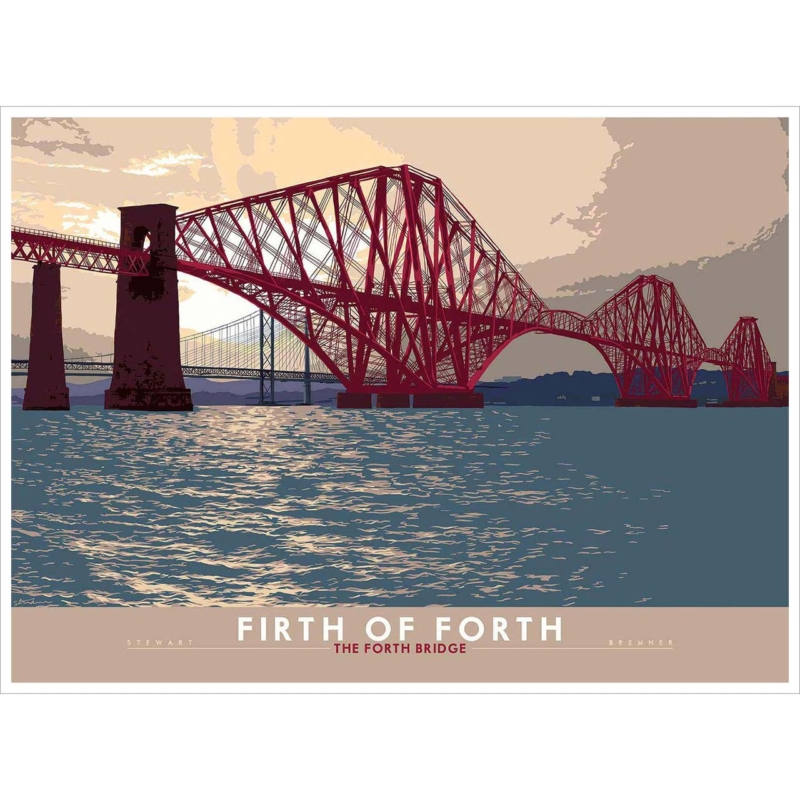
Travel Poster Prints With Engineering Presence: The Forth Bridge

Image of Firth of Forth: The Forth Bridge by Stewart Bremner

Travel poster prints work best when their graphic clarity is matched by a subject with genuine substance. Firth of Forth: The Forth Bridge combines Stewart Bremner’s bold, mid-century-influenced style with one of Scotland’s most recognisable engineering landmarks. The result can give an office, living room or open-plan space a strong horizontal anchor without slipping into souvenir décor.

travel poster prints - Firth of Forth: The Forth Bridge

Use travel poster prints to organise a broad wall

Design decisionPractical effect
Relate the print to a long desk or sideboardThe bridge span connects the furniture and wall instead of floating above it.
Leave clear space at both frame edgesThe architecture keeps its sense of width and movement.
Repeat only one accent colourThe room feels connected without becoming a red-bridge theme.

The available 594 × 420 mm and 840 × 594 mm print sizes suit walls that need a confident landscape proportion. Mark the intended outer frame size before ordering, especially above a monitor or low cabinet. The larger option needs enough surrounding wall to preserve the clean silhouette.

Industrial materials can support the subject, but restraint matters. Dark metal, oak and charcoal upholstery are enough. Repeated bridge models or transport signs would weaken the authority of the artwork itself.

Preserve the clean geometry and Scottish colour

Graphic artwork exposes weak edges and uneven colour quickly. Colour-managed Giclée production keeps the bridge shapes, sky and smaller details distinct. Bespoke framing completed in-house can then give the long composition a precise boundary and the visual weight needed for a working or social room.

For engineering history and visitor information about the landmark, consult the official Forth Bridges guide. Browse the Stewart Bremner collection, or view the exact Firth of Forth: The Forth Bridge product.

Among travel poster prints, Firth of Forth: The Forth Bridge offers more than a destination. It brings proportion, engineering rhythm and a rooted sense of Scotland to a wall that needs one disciplined focal point.

Posted on

Keep the Heid: Scottish Wall Art for a Staff Break Room

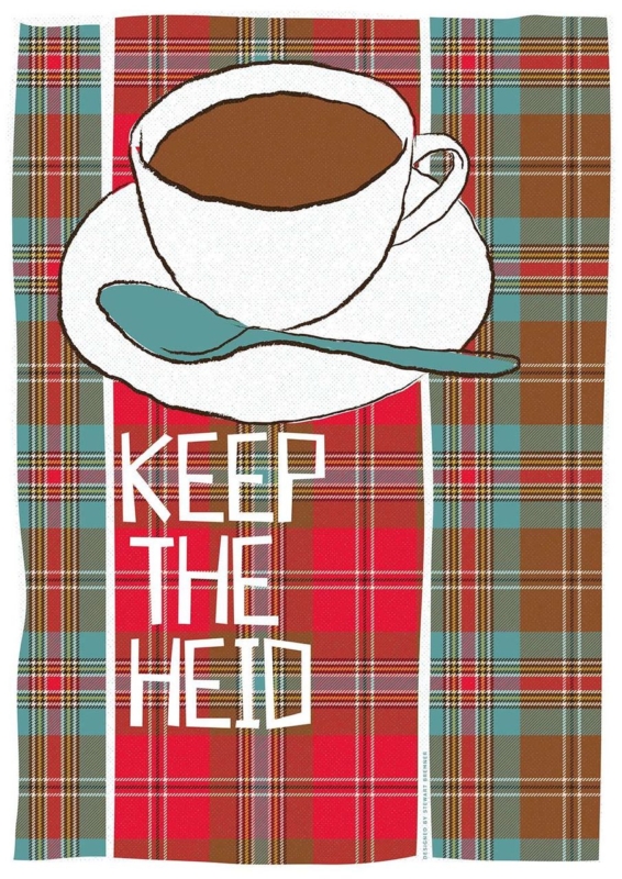
Image of Keep the Heid by Stewart Bremner

Scottish wall art for a staff break room can make a shared pause feel more welcoming without turning the space into an extension of the office noticeboard. Keep the Heid by Stewart Bremner combines a cup of tea, layered tartan, and a familiar Scots reminder to stay calm. It brings humour and local identity to the room, yet its clear graphic design still feels polished enough for a professional workplace.

Scottish wall art for a staff break room: Keep the Heid by Stewart Bremner

What Scottish wall art for a staff break room should do

A break room has a different purpose from reception or a meeting space. It should let people step out of work mode for a few minutes. Artwork can support that change by replacing formal brand language with something warm, recognisable, and human. The aim is character, not another instruction.

Keep the Heid works because the message is conversational. The teacup makes sense in a place used for a quick drink, while the tartan pattern adds colour and Scottish context. The wording offers perspective with a light touch. It can raise a smile after a demanding morning without pretending that a poster can solve workplace pressure.

Keep practical notices away from the focal point

Shared kitchens often collect rotas, cleaning reminders, menus, and safety information. These materials are necessary, but they change regularly and create visual noise. Group them on one clearly defined board. Give the framed print its own wall section above a small table, beside the seating area, or where it can be seen on entering.

AreaBest useHelpful principle
NoticeboardChanging operational informationKeep it current and contained
Refreshment counterKettle, cups, and daily suppliesLeave the wall easy to clean
Seating wallPermanent framed artworkCreate one calm visual anchor

Use the vertical format where floor space is limited

The portrait proportions make the print useful on a narrower wall between a door and a cupboard, or above a compact two-person table. Measure the clear wall rather than the full room. Leave enough margin for the tartan to read as a deliberate block of pattern rather than being squeezed between fittings.

Check the hanging height from a seated position as well as while standing at the counter. The words should be easy to read without the frame sitting directly above heads or chairs. In a busy shared space, secure fixings matter. The artwork should remain safely clear of opening cabinet doors, steam, and regular cleaning activity.

Let the tartan carry the colour

Red, turquoise, cream, and brown already give the design a strong palette. The surrounding room can stay simple. Neutral walls, plain seating, and one small turquoise or warm red detail are enough to connect the piece. Avoid adding several competing slogans or tartan accessories, which can make a workplace feel themed rather than genuinely local.

A restrained frame can sharpen the graphic layout. First 4 Frames produces colour-managed Giclée prints and completes professional framing in-house at its Falkirk workshop. The hand-finished presentation gives the playful subject a durable, display-worthy finish suited to daily use in a business setting.

Scots language with graphic confidence

Stewart Bremner is an Edinburgh-based artist, illustrator, and graphic designer whose work celebrates Scottish language, landscapes, and culture. Learn more on Stewart Bremner’s official website, or browse the Stewart Bremner collection at First 4 Frames.

Well-chosen Scottish wall art for a staff break room should make a shared space feel more personal without becoming distracting. View the framed Keep the Heid print for a clear, good-humoured focal point built around tea, tartan, and a useful Scots phrase.

Posted on

A Scottish Housewarming Gift With Encouragement: Gaun Yersel

Image of Gaun Yersel by Stewart Bremner

A Scottish housewarming gift should feel connected to the person and the beginning they are making. Gaun Yersel by Stewart Bremner does that with a direct Scots expression of encouragement. It is warmer and more individual than a generic new-home message, yet practical enough to become part of the recipient’s everyday surroundings.

Scottish housewarming gift - Gaun Yersel

Choose a Scottish housewarming gift for the life ahead

Match the message

This works especially well for someone taking a first flat, relocating for work, or rebuilding a home after a major change. The phrase offers support without becoming sentimental or overly formal.

Plan the wall

The available A2 and A1 proportions need a clear vertical area. Check a hallway end, stair landing, home office, or the wall beside a dining table before choosing the larger option.

A typographic or graphic piece needs breathing room. Avoid surrounding it with several other sayings, which can dilute the message. Instead, repeat one colour from the print in a useful object such as a lamp, chair, or storage box. This connects the piece to the home without building a theme around it.

What should you write in the card?

Explain why the phrase made you think of the recipient and mention the new beginning you are celebrating. That small detail turns the artwork from an attractive object into a gift with a clear personal reason behind it.

Give bold graphic art a finish that will last

Stewart Bremner’s strong graphic style and contemporary use of colour depend on clean edges and consistent tones. Colour-managed Giclée production preserves that clarity. Bespoke framing completed in-house in Falkirk gives the print the presence needed to stand alone and arrive ready for its new wall.

For help understanding Scots vocabulary and usage, explore Dictionaries of the Scots Language. Browse more work by Stewart Bremner, or view the exact Gaun Yersel framed print.

As a Scottish housewarming gift, Gaun Yersel combines encouragement, cultural character, and a properly hand-finished presentation that can remain meaningful long after the boxes are unpacked.

Posted on

Scottish Lullaby Wall Art: Ally Bally Ally Bally Bee for a Child’s Room

Image of Ally Bally, Ally Bally, Bee by Stewart Bremner

Scottish lullaby wall art can give a child’s room a connection to family memory without relying on short-lived nursery motifs. Ally Bally Ally Bally Bee by Stewart Bremner draws on a song remembered across generations. Its bold graphic treatment also gives it enough presence to remain relevant as the room changes, from early bedtime routines to reading, play, and school years.

Scottish lullaby wall art: Ally Bally Ally Bally Bee by Stewart Bremner

Why Scottish lullaby wall art can outlast the nursery stage

Many pictures chosen for a new baby are closely tied to one brief age. A familiar song works differently. Adults may know it from their own childhood, while children can gradually understand the words and the family stories around them. That gives the artwork an emotional role as well as a decorative one.

The typographic design matters just as much as the reference. Clear shapes and a poster-like composition can sit comfortably with modern furniture, painted joinery, or a simple reading corner. The piece need not be surrounded by tartan, toys, or more words. One confident image is often enough.

Choose a position that supports everyday routines

Start with the activity, not the largest empty wall. Above a low bookcase, the print can mark a reading area. Near a comfortable chair, it can become part of bedtime. On the wall seen from the doorway, it can provide a warm welcome without crowding the space around the bed.

  • Keep it visible: place the centre where a child can enjoy the design, not only at an adult gallery height.
  • Protect the frame: avoid doors, climbing furniture, and places where toys are regularly thrown or stacked.
  • Check reflections: test the wall in daylight and with the bedtime lamp switched on.
  • Allow room to grow: leave enough clear wall for changing furniture and storage needs.

Plan the size around the room, not the child’s age

The available print sizes are 420 x 594 and 594 x 840 millimetres before framing. The smaller option can suit a reading corner or a wall beside a wardrobe. The larger format can hold its own above a chest or on a clearer feature wall. Mark the full expected frame size with paper before ordering, then view it from the doorway and from the bed.

A larger picture does not automatically make a room feel smaller. Several tiny items can create more visual activity than one well-proportioned frame. A single clear composition can give toys, books, and changing accessories a calmer visual anchor.

Frame the memory without making it feel themed

A slim dark frame can reinforce the graphic edges, while a lighter timber can soften the design and relate to natural furniture. The right choice depends on the wall colour and other permanent finishes. It does not need to match every handle or lamp exactly.

First 4 Frames produces colour-managed Giclée prints and completes bespoke, hand-finished framing in-house at its Falkirk workshop. That quality-led presentation helps a piece associated with childhood feel substantial enough to keep, move to another room, or pass through the family later.

A familiar song, presented as lasting artwork

Stewart Bremner is an Edinburgh-based artist, illustrator, and graphic designer whose work celebrates Scottish language, places, and culture. Explore more on Stewart Bremner’s official website, or compare the wider Stewart Bremner collection at First 4 Frames.

Well-chosen Scottish lullaby wall art can carry affection and identity without making a child’s room feel fixed at one age. View the framed Ally Bally Ally Bally Bee print for an expressive link between bedtime tradition, family memory, and contemporary Scottish design.

Posted on

Edinburgh Graduation Wall Art Gifts Can Celebrate Place as Well as Achievement

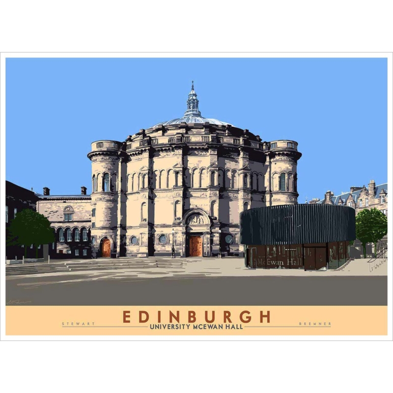
Image of Edinburgh: University McEwan Hall by Stewart Bremner

Edinburgh graduation wall art gift ideas feel more personal when they recognise the setting as well as the qualification. Edinburgh: University McEwan Hall by Stewart Bremner centres on a building closely associated with university ceremonies. It therefore carries a specific memory that a generic congratulatory print cannot provide.

Edinburgh graduation wall art gift - Edinburgh: University McEwan Hall

Choose an Edinburgh graduation wall art gift with a lasting connection

For a new graduate

The framed print can move from a first flat to a later home without losing its meaning. It marks a real place, yet it does not need names, dates, or novelty wording to remain relevant.

For an alumnus

Given later, the same subject can reconnect someone with ceremonies, friendships, and years spent in Edinburgh. That makes it suitable for a milestone birthday or career change too.

Consider where the recipient is likely to display it. Above a desk, the architecture can quietly recall work already completed. In a hallway or sitting room, it becomes a conversation about Edinburgh rather than an overtly academic display. Leave enough clear wall around the horizontal composition, especially at the larger available size.

  • Choose the size by measuring the actual wall, not by guessing from a screen.
  • Relate the frame to one established furniture tone.
  • Add a handwritten message separately, so the artwork itself stays timeless.
  • Keep certificates nearby only if the arrangement has enough breathing space.

Give the graduation memory a properly finished presentation

Architectural detail rewards precise reproduction. First 4 Frames uses colour-managed Giclée production and completes the framing in-house in Falkirk. The hand-finished result gives the gift suitable substance while keeping the subject, rather than the occasion, at the centre.

For context about the venue, read about the history and role of McEwan Hall. Browse more work by Stewart Bremner, or view the exact Edinburgh: University McEwan Hall framed print.

As an Edinburgh graduation wall art gift, Edinburgh: University McEwan Hall combines memory, place, and everyday display value in one considered piece.

Posted on

The Three Bridges: Wall Art for a Civil Engineering Office

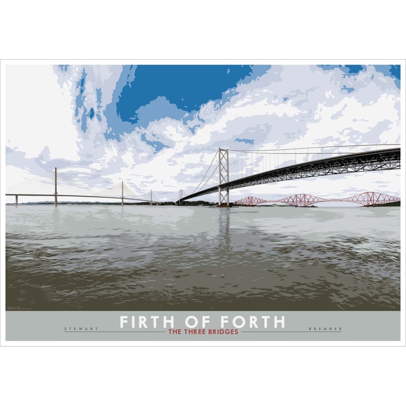
Image of Firth of Forth: the Three Bridges by Stewart Bremner

wall art for a civil engineering office can reflect the discipline’s combination of analysis, scale, and public purpose without turning the workplace into a display of technical diagrams. Firth of Forth: the Three Bridges by Stewart Bremner offers a clear alternative. It brings three generations of bridge design into one broad view. This gives a Scottish practice or project team a strong sense of place and an immediate architectural subject.

wall art for a civil engineering office: Firth of Forth: the Three Bridges by Stewart Bremner

Why wall art for a civil engineering office should feel relevant

Generic office art may fill a blank wall, but it rarely says much about the people working there. A recognisable feat of infrastructure creates a more meaningful connection. The bridges can prompt conversation with visitors, graduates, and project partners. Meanwhile, calm water and open sky stop the subject from feeling like another working document.

This image is especially useful because the three structures are visible together. Their different profiles show how engineering answers evolve with materials, transport needs, and construction methods. The artwork does not need explanatory text to communicate that progression. Its strong silhouettes make the idea clear from across the room.

Choose the wall according to how the office is used

Office locationWhat the artwork contributesPlacement check
Client meeting roomA confident local talking pointKeep it visible from the main seats
Open project areaA visual horizon beyond screens and plansAvoid monitor glare on the glazing
ReceptionAn immediate link to Scottish infrastructureRelate the frame to the desk width
Partner’s officeA composed subject with professional relevanceLeave clear space around the finished frame

Avoid placing the picture in a crowded print zone beside pinboards, safety notices, or project programmes. Those materials change regularly and ask for close reading. Give the artwork its own wall section, where it can offer distance and visual rest. That pause is particularly valuable in a workspace filled with detailed information.

Use the landscape format to create a clear horizon

The print is available at 594 x 420 and 840 x 594 millimetres before framing. Both sizes have a generous horizontal emphasis. The smaller option may suit a private office or compact meeting room. The larger can hold a substantial wall in reception or a shared studio, provided there is enough surrounding space.

Judge the finished dimensions against nearby furniture rather than the empty wall alone. Above a credenza or meeting-room console, the frame should relate comfortably to the width below it. On a freestanding wall, use a paper template to check the view from the entrance and the seats used most often.

Connect the palette to architectural materials

Slate grey water, pale cloud, blue sky, and restrained red make the image easy to use with common office finishes. Grey carpet tiles and white walls gain a clearer focal point. Black metal furniture can connect to the dark road bridge. One small red detail can echo the rail bridge without turning the room into a branded colour exercise.

A slim black frame can reinforce the graphic outlines and suit a contemporary fit-out. A natural timber moulding can introduce warmth where glass, metal, and technical furniture dominate. Whichever direction you choose, avoid an unnecessarily heavy frame. The broad sky and water are part of the composition’s calm, and the presentation should preserve that openness.

From strong graphic design to careful in-house framing

Stewart Bremner’s hand-drawn landscapes take influence from twentieth-century travel posters. That heritage explains the bold shapes and controlled detail. You can read more on Stewart Bremner’s official artist profile and explore the wider Stewart Bremner collection at First 4 Frames.

First 4 Frames uses colour-managed Giclée production and completes bespoke framing in-house in Falkirk. That quality-led approach keeps the fine bridge lines clear and gives the finished piece enough presence for a professional setting. For wall art for a civil engineering office with structural interest and a genuine Scottish connection, view the framed Firth of Forth: the Three Bridges print.

Posted on

Scottish Castle Wall Art for a Library Can Build Atmosphere Without Gloom

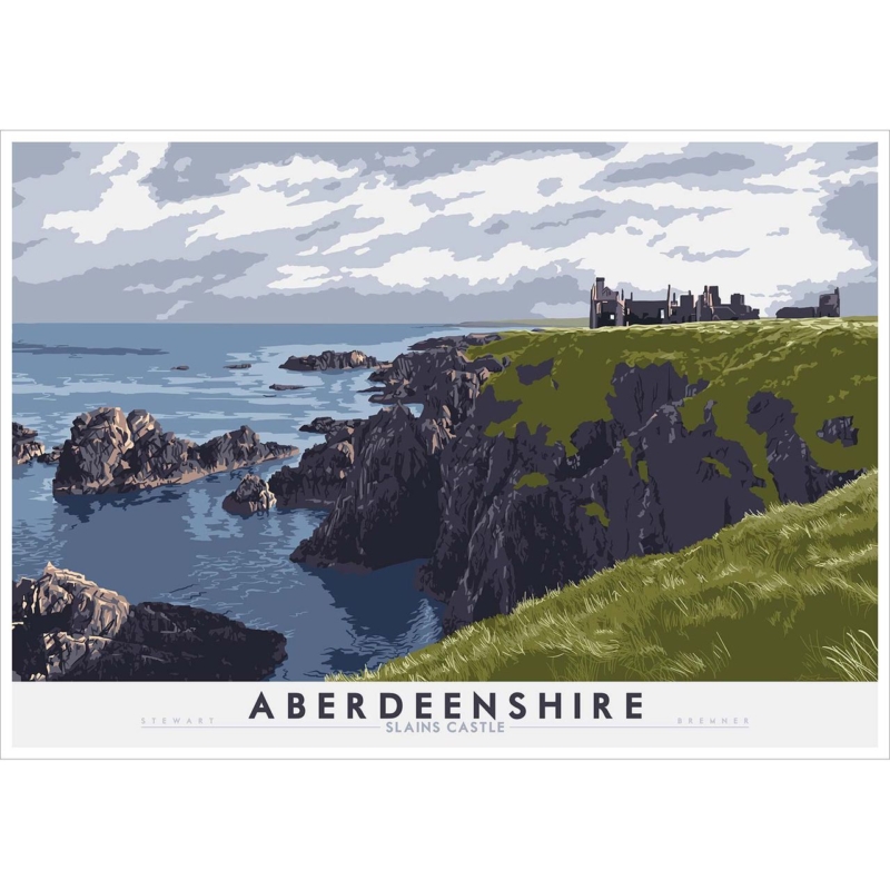
Image of Aberdeenshire: Slains Castle by Stewart Bremner

Scottish castle wall art for a library should deepen the room’s atmosphere without making shelves, timber, and reading chairs feel oppressively dark. Aberdeenshire: Slains Castle by Stewart Bremner provides ruined architecture, Aberdeenshire identity, and a story worth exploring. Its presence suits books, but it does not need theatrical Gothic accessories to make its point.

Scottish castle wall art for a library - Aberdeenshire: Slains Castle

Balance Scottish castle wall art for a library with reading light

For a dark library

Use a pale mount and a frame with a clear edge. Leave wall space around the picture so castle detail remains separate from crowded shelves.

For a light library

A deeper frame can add definition against cream, stone, or soft grey paint. Relate it to one furniture tone rather than matching every bookcase.

Keep the castle clear of the shelves

Hang the piece above a low cabinet, near a reading chair, or on the short wall at the end of the room. Avoid squeezing it into a narrow gap between tall bookcases. The architecture needs enough distance to feel like a destination rather than another object stored among books.

Evening viewing check

Switch on the reading lamps and view the glazing from the main chair. Reposition any lamp whose reflection hides the castle, then confirm the page still receives enough light.

Subtle masonry, sky, and atmosphere benefit from colour-managed Giclée production. First 4 Frames can then complete the piece with a bespoke, hand-finished frame that supports the architecture without overwhelming it.

For historical context behind the subject, explore New Slains Castle and its history. Browse more work by Stewart Bremner, or view the exact Aberdeenshire: Slains Castle framed print.

As Scottish castle wall art for a library, Aberdeenshire: Slains Castle brings place, architecture, and mystery to the room while leaving it comfortable enough for long reading sessions.