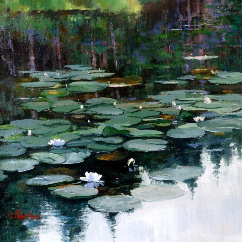
Choosing art for soft blue upholstery is often about giving a gentle room enough depth. Softer blues can make an interior feel restful and elegant, but they also risk becoming a little washed out if the artwork does not bring enough definition. Where Water Dreams works beautifully because it keeps the scheme calm while adding the presence that a pale palette still needs.
Why quieter blue schemes still need contrast
Rooms with soft blue upholstery usually aim for comfort and ease. The best artwork supports that mood but also keeps the space from drifting into looking too light in weight. A framed print can bring exactly the right amount of anchor without sacrificing calmness.
In a gentler room, the artwork does not need to shout, but it does need enough presence to stop everything dissolving into one soft note.
Why Where Water Dreams is so well suited
The image has flow and atmosphere, yet it also brings enough tonal structure to hold the room together. That makes it especially useful in bedrooms, sitting rooms, and guest spaces built around quieter fabrics and lighter colour.
First 4 Frames produces every piece in-house in Falkirk with bespoke framing, colour-managed Giclee printing, and hand-finished craftsmanship. That superior finish helps the subtleties of colour and paper show properly in a scheme where detail matters.
You can explore more from Colin Robertson and view the exact framed print here.
If you are looking for art for soft blue upholstery that feels restful, polished, and beautifully resolved, Where Water Dreams is an excellent choice.