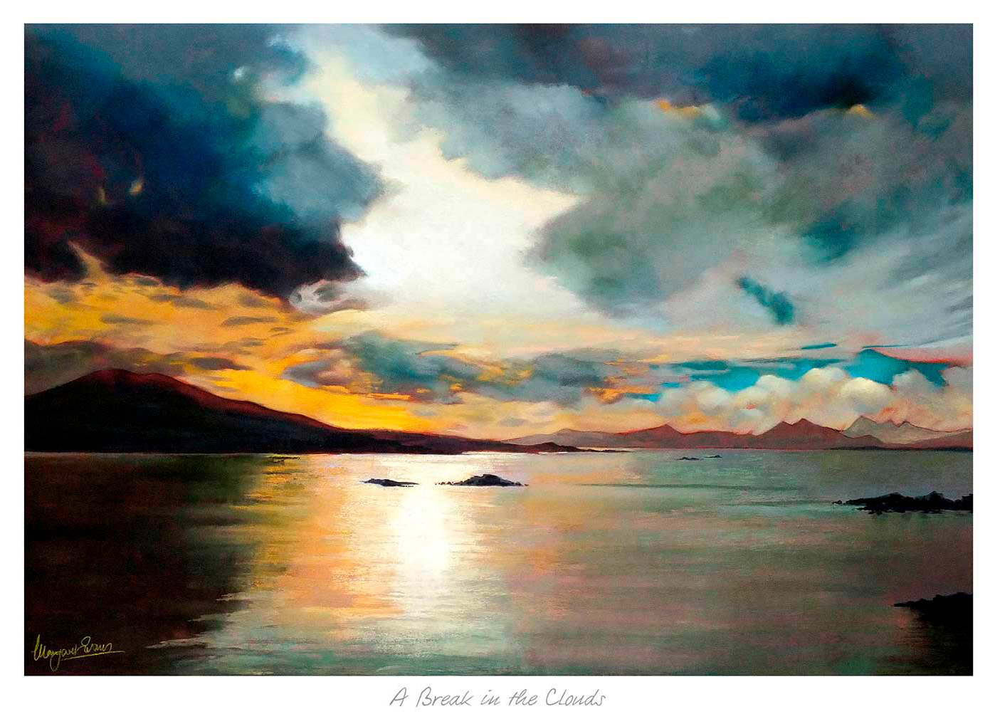
Choosing art for apricot walls is often about refinement. Apricot can be a lovely wall colour because it feels warm and flattering, but it still needs artwork that prevents the room from becoming too sugary or too softly blurred. A Break in the Clouds answers that challenge beautifully.
Why warm paint colours need the right contrast
A warmer wall tone usually looks best when the artwork introduces some lift and breathing space. That does not mean the piece should feel cold or disconnected. It simply needs enough tonal variation to keep the room feeling fresh and carefully put together.
A Break in the Clouds brings exactly that sense of balance. It complements warmth while still introducing clarity, which helps the overall scheme feel more mature and less one-note.
- It suits bedrooms, sitting rooms, and guest spaces with warmer paint tones.
- It helps apricot walls feel more current and polished.
- It adds contrast without making the room feel sharper or colder.
Why quality framing helps the colour read better
First 4 Frames produces every piece in-house in Falkirk with bespoke framing, colour-managed Giclee printing, and hand-finished craftsmanship. That attention to colour and presentation is especially valuable in rooms where paint choice is already doing a lot of the decorative work.
You can explore more work by Margaret Evans and view the exact framed product here.
If you want art for apricot walls that feels fresh, warm, and more refined than the obvious options, A Break in the Clouds is an excellent choice.