
Posted on

Art for Pale Blue Walls Feels More Layered With A Break in the Clouds

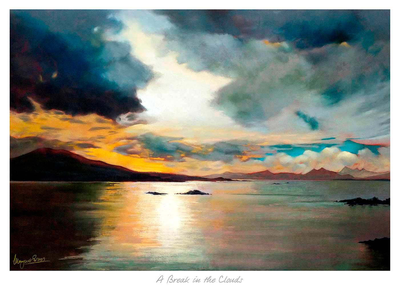
A Break in the Clouds is a dramatic seascape painting featuring dark clouds parting to reveal a glowing sunset, with vibrant orange, yellow, and blue reflections on calm water and distant mountains on the horizon.

Good art for pale blue walls should stop a cool scheme from feeling too slight. Pale blue can be restful and elegant, but it often needs artwork that adds a little warmth and movement. A Break in the Clouds works especially well because it brings light and atmosphere without breaking the calm that made the wall colour appealing in the first place.

art for pale blue walls - A Break in the Clouds

Why A Break in the Clouds suits art for pale blue walls

The strength of A Break in the Clouds is its balance. It keeps enough freshness to sit naturally with pale blue, yet it also introduces tonal variation that stops the room feeling one-note. That makes it useful in bedrooms, sitting rooms, and hallways where you want calm but still need a little visual depth.

It is particularly helpful when pale blue walls are paired with white woodwork, lighter fabrics, or painted furniture. In those rooms the artwork can become the element that makes the scheme feel considered rather than merely safe.

  • It keeps a cool room soft rather than chilly.
  • It adds light and depth without overwhelming the wall colour.
  • It works well with gentler palettes that still need a focal point.

First 4 Frames completes the print and bespoke framing in-house, which is important for artwork built around subtle tonal shifts. That hand-finished presentation helps the final piece feel more substantial and room-ready from the moment it goes up.

For more on the kind of Scottish landscape atmosphere that makes this scene so appealing, VisitScotland’s Cairngorms guide is worth reading. You can also browse more work by Margaret Evans and see the exact framed product here.

If you are looking at art for pale blue walls, A Break in the Clouds is a strong example of how to keep a cooler room layered, welcoming, and quietly interesting.

Posted on

Why A Break in the Clouds Works Beautifully as Art for Apricot Walls

A Break in the Clouds is a dramatic seascape painting featuring dark clouds parting to reveal a glowing sunset, with vibrant orange, yellow, and blue reflections on calm water and distant mountains on the horizon.

Choosing art for apricot walls is often about refinement. Apricot can be a lovely wall colour because it feels warm and flattering, but it still needs artwork that prevents the room from becoming too sugary or too softly blurred. A Break in the Clouds answers that challenge beautifully.

Why warm paint colours need the right contrast

A warmer wall tone usually looks best when the artwork introduces some lift and breathing space. That does not mean the piece should feel cold or disconnected. It simply needs enough tonal variation to keep the room feeling fresh and carefully put together.

A Break in the Clouds brings exactly that sense of balance. It complements warmth while still introducing clarity, which helps the overall scheme feel more mature and less one-note.

  • It suits bedrooms, sitting rooms, and guest spaces with warmer paint tones.
  • It helps apricot walls feel more current and polished.
  • It adds contrast without making the room feel sharper or colder.

Why quality framing helps the colour read better

First 4 Frames produces every piece in-house in Falkirk with bespoke framing, colour-managed Giclee printing, and hand-finished craftsmanship. That attention to colour and presentation is especially valuable in rooms where paint choice is already doing a lot of the decorative work.

You can explore more work by Margaret Evans and view the exact framed product here.

If you want art for apricot walls that feels fresh, warm, and more refined than the obvious options, A Break in the Clouds is an excellent choice.