winter landscape wall art does not require an icy white room; a picture with snow-dusted peaks and warm foreground colour can bridge cooler scenery and an autumnal interior. November Snow Glencoe gives the decision a real subject, palette and finished presentation to assess.
Balance winter landscape wall art with warmer materials
November Snow Glencoe depicts dramatic mountain peaks, a winding stream, vivid autumn colour and early snow beneath a soft cloudy sky. The image contains its own transition between seasons. That makes it easier to place with rust upholstery, ochre textiles, warm timber or aged leather.
Warm element
Let rust, ochre or timber connect with the lower landscape.
Cool element
Use the snow and sky as contrast rather than matching the room in grey.
Texture
Choose wool, linen or wood instead of glittering seasonal accessories.
Lighting
Check that warm lamps do not flatten the cooler mountain distance.
Seasonal artwork should still work in March or July. Avoid building a temporary display of snowflakes, white branches and winter slogans around the frame. The mountain scene can carry the seasonal reference throughout the year.
Does a snow scene need a pale frame?
No. Compare pale, darker and timber samples against the whole image and the actual room. The correct frame should separate the picture from the wall without matching only the snow.
A landscape feels enduring when its seasonal character is supported by the room rather than turned into temporary décor.
Frame winter landscape wall art beyond one season
Snow, cloud, water and warm hillside colour require controlled tonal separation. Colour-managed Giclée production preserves those relationships. In-house bespoke framing can then connect the picture with timber, textile and wall colour while keeping the mountain view distinct.
Winter landscape wall art can sit naturally in a warm room when the image contains more than snow. November Snow Glencoe links autumn colour with mountain weather, creating contrast that remains useful all year.
kitchen wall art needs to work beside practical surfaces, changing daylight and everyday objects while still bringing a distinct mood to the room. Sheep Farm Ochils provides a real subject, colour palette and finished frame to assess.
Let kitchen wall art supply the rural reference once
Sheep Farm Ochils shows grazing sheep, a farmhouse, bare trees and blue hills under clear light. That is enough country character for one room. Checked textiles, animal ornaments and several rustic signs would only weaken the landscape’s sense of place.
Borrow colour selectively
Take one muted blue from the hills or one warm field tone into a tea towel, bowl or painted chair. Do not reproduce the whole palette around the room.
Protect the finished piece
Choose a dry wall away from the hob, sink, kettle steam and direct splashes. Good extraction does not make every kitchen position suitable.
Clear the candidate wall and nearby worktop.
Mark the complete framed outline at standing eye level.
Open cupboards and check appliance doors.
View the position in morning and evening light.
Return only useful objects to the surface below.
Can the print sit above open shelving?
It can, if the shelf remains low and visually quiet. Rows of jars, cookbooks and utensils create many small edges, so clear wall is often the stronger setting.
Give kitchen wall art a durable visual boundary
Sunlit fields, sheep and distant hills rely on clear colour separation. Colour-managed Giclée production protects that balance. Hand-finished bespoke framing gives the landscape definition among harder kitchen materials, provided the chosen wall stays dry and well ventilated.
Kitchen wall art should make the room warmer without making it busier. Sheep Farm Ochils brings landscape, light and local character; disciplined placement keeps those qualities visible.
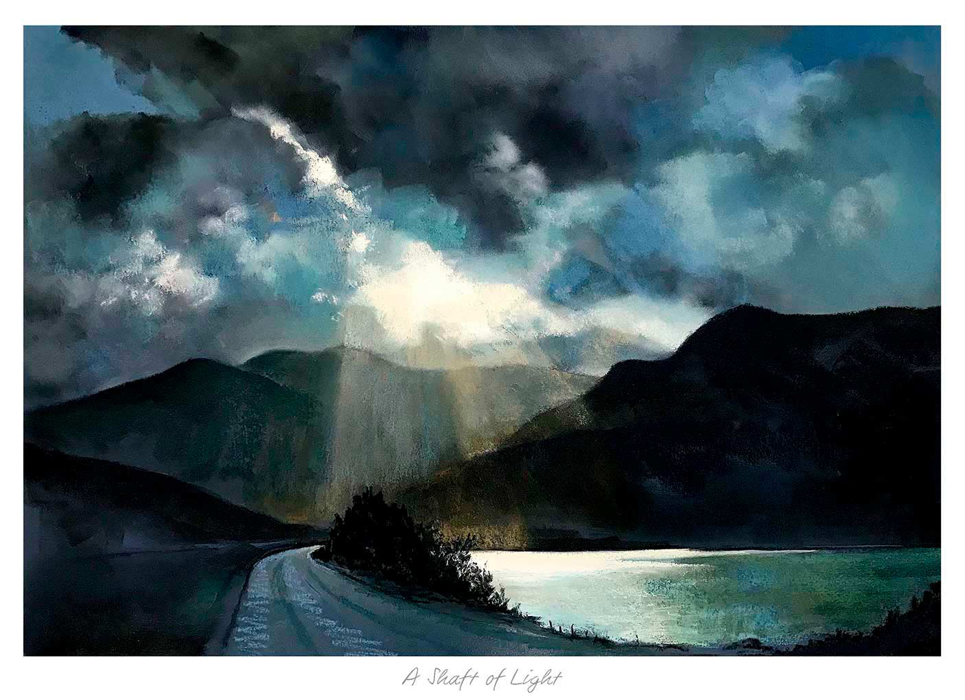
inspirational landscape wall art without words can make a room feel hopeful without telling anyone what to think. A Shaft of Light by Margaret Evans uses a road, reflective water and mountains beneath heavy cloud. A bright opening in the weather changes the scene from simply dramatic to quietly uplifting. The meaning comes from looking, so the picture can remain personal rather than reading like a permanent instruction on the wall.
Why an uplifting picture does not need a slogan
Words are immediate. They can be useful, but a familiar phrase often loses its impact once it has been seen every day. A landscape works more slowly. Different details become important with changes in mood, season and light. One viewer may notice the road continuing towards the mountains. Another may respond to the sun breaking through cloud or the still water holding the sky.
That openness makes the artwork easier to live with. It can encourage reflection without turning a sitting room, study or quiet office into a motivational display. The image also remains visually interesting when its symbolic meaning is not at the front of the viewer’s mind. It is a substantial landscape first, with optimism carried through composition and weather.
How inspirational landscape wall art without words creates meaning
The brightest area is most effective because it is surrounded by darker cloud. That contrast creates direction and gives the eye somewhere to travel. The road strengthens the idea of movement, while the mountain forms add permanence. Together, these elements suggest difficulty, possibility and continuation without reducing the picture to a single fixed message.
Changing light introduces hope without making the scene unrealistically cheerful.
The winding road creates a visual route rather than a static distant view.
Reflective water gives the strong sky a calmer counterpart.
Mountain scale adds perspective and keeps the mood grounded.
These qualities are especially useful when the artwork is intended to mark a transition. A new home, a return to work or the completion of a difficult project may all deserve recognition. The private story can be added in a card. The framed picture can then have a lasting role in the room without announcing the occasion to every visitor.
Choose a wall where the light can remain visible
The image needs enough viewing distance for the road, lake and opening in the clouds to read as one composition. Above a low sideboard or a sofa can work well. In a study, place it where it is visible when looking up from the desk. Avoid squeezing it between tall shelving, because narrow gaps can make an expansive subject feel confined.
Daylight should reach the wall indirectly. Strong sun can create glare and distract from the tonal changes in the cloud. In the evening, a broad, gentle picture light will reveal more than a tight spotlight. Check the proposed position from the chair that is used most often, not only from the doorway, and make sure a lamp shade does not hide the bright centre of the landscape.
Build a room around atmosphere, not matching colours
There is no need to repeat every grey, blue and ochre tone in the furnishings. Start with materials that suit the mood: natural timber, woven wool, dark metal or a quiet ceramic surface. One colour drawn from the landscape can appear in a cushion or throw, but several exact matches will make the arrangement feel too deliberate.
Keep nearby accessories low enough to preserve the view into the picture. A single lamp, a small stack of books or one sculptural object is usually enough on the furniture below. The landscape already contains strong contrasts and several layers of depth. Clear wall around the frame allows those elements to work without additional decoration competing for attention.
Frame dramatic light with restraint
A simple dark moulding can connect with the mountain silhouettes and give the bright sky a clear boundary. A warmer timber frame can soften the scene in a relaxed home. A measured pale mount adds breathing room between the changeable weather and the surrounding wall. An ornate or highly reflective finish may compete with the very light effect that gives the print its character.
First 4 Frames uses colour-managed Giclée production and completes bespoke framing in-house at its Falkirk workshop. Careful printing is important in a subject where small tonal differences separate cloud, mountain and reflected water. Hand-finished framing gives the landscape a durable, ready-to-hang presentation without overwhelming its quieter details.
Good inspirational landscape wall art without words leaves room for the viewer’s own experience. View the framed A Shaft of Light print for a dramatic Scottish landscape that finds optimism in light, distance and a road continuing through the scene.
dining room wall art should remain interesting between meals and become more atmospheric when pendants and lamps replace daylight. Sundown Loch Tulla gives the decision a specific artwork, proportion and palette to test.
Judge dining room wall art from every seated place
View
Question to test
From the doorway
Does the landscape welcome people without being hidden by the pendant?
From the head of the table
Is the horizon comfortable at seated eye level?
From the side chairs
Do glazing reflections obscure the sundown colour?
From the adjacent room
Does the full frame relate to the table rather than float above it?
Mark the finished frame while the table is extended to its usual entertaining size. Sundown Loch Tulla can provide evening warmth without asking for amber walls, tartan textiles or a collection of Highland accessories. Allow the named Scottish place and changing sky to carry that identity.
Choose table materials that support rather than imitate the landscape. Natural timber, linen and one darker ceramic can connect with the atmosphere. Highly polished surfaces may double the pendant and picture reflections, so observe the whole arrangement after sunset before final placement.
The most useful dining-room picture is not reserved for dinner parties; it gives the empty table a destination every day.
Keep sideboard objects below the important part of the image. One lamp may support the evening mood, but several tall candlesticks can divide the landscape into fragments. Clear wall around the frame will make the view feel more generous.
Light dining room wall art for atmosphere and clarity
Sundown colour can easily become muddy if subtle transitions are lost. Colour-managed Giclée production protects the relationship between sky, water and land, while bespoke framing gives the work a substantial, hand-finished presence for a shared room.
Dining room wall art works best when it supports both quiet weekdays and sociable evenings. Sundown Loch Tulla provides a changing mood, while controlled light and uncluttered sightlines keep it clear.
winter landscape art for pale blue walls needs to respond to the room as well as the subject. Winter Magic offers a useful starting point because Margaret Evans’s snowy river and bare trees echo a cool wall colour, yet the landscape’s tonal depth can stop blue paint from feeling flat when warmer materials remain.
Layer winter landscape art for pale blue walls with warm material
Hold a paint sample beside the product image in the room’s actual light. Some pale blues lean grey; others appear green or violet after dark. The artwork does not need to match. It needs enough separation for snow, water and branches to remain legible.
Element
Balancing choice
Pale blue paint
Retain one warm timber, wool or woven surface.
Snowy subject
Avoid repeating snowflakes and winter signs.
Square composition
Relate the complete frame to furniture or a clear wall bay.
Evening light
Use a warm lamp and check glazing reflections.
Harmony comes from shared atmosphere; warmth comes from contrast in material and light.
One rust, oatmeal or natural wood note can make the room feel inhabited. Heavy silver accessories and frosted surfaces may push the scheme towards an artificial winter theme.
Choose a frame for art for pale blue walls in the room
Snow contains subtle colour rather than plain white. Colour-managed Giclée production preserves those quiet distinctions, while one-to-one framing can introduce definition or warmth without placing a heavy border around the winter landscape.
Art for pale blue walls should deepen the palette rather than freeze it. Winter Magic supplies atmosphere and distance, while warm material, light and a considered frame keep the room welcoming.
art for plum walls works best when it responds to the room rather than filling a convenient gap. Blaven Glory gives this decision a specific starting point because its green and reddish land, pale cottages, rugged mountain and animated sky provide both connections and clear contrasts against a deep wall colour.
Use art for plum walls to create tonal separation
Matching every colour is the quickest way to make a plum room feel enclosed. Instead, look for a picture with one related red-purple note and several ways out of it. In Blaven Glory, the pale buildings punctuate the foreground, the sky opens the upper half, and green offers a natural counterweight.
Build the palette in three moves
Place a printed product image against the actual wall in daylight.
Choose a frame boundary that separates the darkest artwork tones from the paint.
Repeat one landscape colour in a cushion or ceramic, then stop.
Rich paint changes under warm lamps, so test the intended position after dusk. A frame that looks crisp in daylight may disappear at night. Keep tall furniture away from the pale cottages and avoid a dark mount that closes down the whole landscape.
The aim is not a perfectly matched purple scheme. It is a layered room where mountain, sky and wall remain distinct.
Give art for plum walls a clear framed edge
Blaven Glory relies on relationships between bright sky, mountain shadow, cottages and changing foreground colour. Controlled Giclée output preserves those differences. A bespoke frame selected in-house can add the light or mid-tone boundary that a deep painted wall needs.
Art for plum walls should bring relief as well as richness. Blaven Glory connects with the room’s deeper colour, then uses sky, white cottages and living greens to keep the result open.
winter landscape wall art for an entrance hall should earn its place by answering a real question about the room or recipient. Farm Tracks Braco Road is a useful starting point because Margaret Evans uses winding tracks, fence lines, bare trees and distant buildings to create a clear visual route, giving an arrival space depth without placing anything else on the floor.
Let winter landscape wall art for an entrance hall lead the eye
Use the direction of travel already present in the picture. The tracks draw the eye towards the farm and coloured horizon, so place the work where that movement complements the route into the home. An end wall can create a destination; a side wall can encourage the gaze onward.
Clear coats and bags before measuring the available wall.
Open the front door and nearby cupboards fully.
Mark the complete framed dimensions with paper.
Check the view from outside and from the inner doorway.
Keep console lamps below the important snow line.
Snow provides light, but the picture is not colourless. The sky introduces warmth while blue shadows and dark trees add structure. Repeat one restrained tone in a runner or painted surface if needed, but let practical flooring and storage remain visually quiet.
A winter subject can stay relevant because it offers distance, route and atmosphere rather than festive symbols. That makes the landscape useful through the whole year, especially in an entrance that needs one composed view more than a collection of small accessories.
Keep snow, shadow and sky distinct
A pastel winter scene relies on controlled differences between pale snow, cool shadow and a warmer horizon. Colour-managed production protects those shifts, while in-house bespoke framing gives the winding composition a durable finish for a frequently used space.
Winter landscape wall art for an entrance hall can create a welcome through visual direction instead of physical decoration. Farm Tracks Braco Road leads the view forward while keeping the route itself clear.
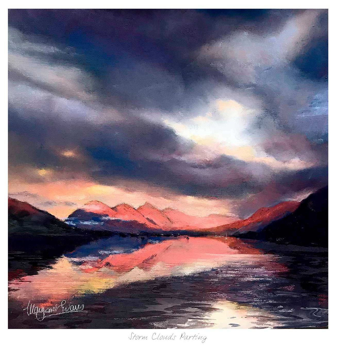
Oversized wall art can command a room without making it feel crowded when much of the composition is given to distance and sky. Storm Clouds Parting uses breaking cloud, mountain silhouettes and sunset light to create drama with breathing room. It can anchor a wide living area while remaining more open than a dense gallery arrangement.
Scale oversized wall art from the furniture outward
Measure the sofa, sideboard or bed that will visually support the piece.
Mark the proposed outer frame, not only the printed image, with low-tack tape.
Check the outline from the main doorway and the usual seated position.
Leave enough space above furniture for objects and lamps to remain separate.
A dramatic sky needs a quieter wall. Avoid placing it beside a television, tall shelving and several small pictures at once. One broad presentation gives the moving cloud and distant land enough room to establish their own pace.
Lighting should reveal the darker land without bleaching the brighter opening in the cloud. Diffused room light or a carefully angled picture light is preferable to direct window reflection. Check the glass from more than one seat before fixing the final position.
Retain every step from storm to clearing light
The composition depends on controlled transitions between dark cloud, illuminated edges, distant mountains and warm sky. Colour-managed Giclée production helps preserve that range. A bespoke hand-finished frame supplies the physical authority expected at larger scale while keeping the boundary simple enough for the sky to dominate.
Storm Clouds Parting makes oversized wall art feel expansive rather than oppressive. Its scale can hold the room, while the open sky and distant horizon stop the wall from becoming visually solid.
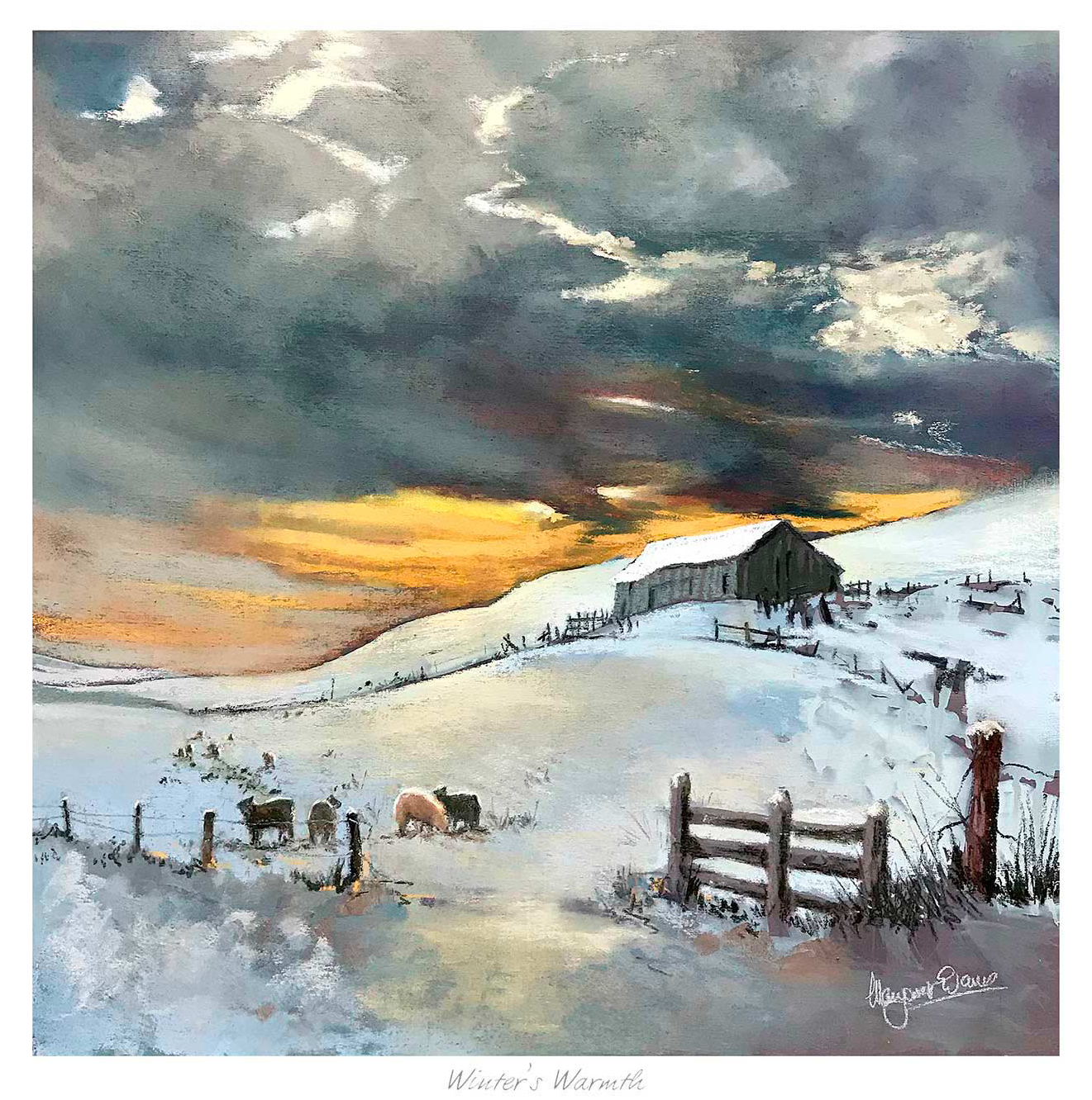
The most effective winter landscape wall art by a wood burning stove creates contrast rather than repeating flames. Winters Warmth looks across a snowy rural landscape towards a barn, grazing cattle, and a narrow orange horizon. That visual cold makes the actual warmth of the room feel even more welcoming.
Position winter landscape wall art by a wood burning stove with care
Room detail
How the artwork responds
Warm firelight
The orange horizon creates a quiet link without copying the flame.
Stone hearth
Snow, fence, and barn add rural texture while retaining visual distance.
Timber furniture
The landscape supports natural materials without turning the room overly rustic.
Dark stove
A controlled dark frame can relate to it while the pale scene keeps the wall open.
Respect heat and clearances
Do not hang framed work where heat, smoke, or repeated temperature changes can affect it. Follow the stove manufacturer’s clearance guidance and choose a neighbouring wall when the chimney breast becomes warm. A side position can still create a strong relationship across the room.
Keep nearby decoration restrained. The fence line and dramatic cloud already give the landscape structure, so the print does not need a cluster of small country accessories around it.
First 4 Frames uses colour-managed Giclée printing to retain the cool snow, deep cloud, and fine band of sunset colour. Bespoke framing is completed by hand in the Falkirk workshop, with personal guidance available for a suitable finish and position.
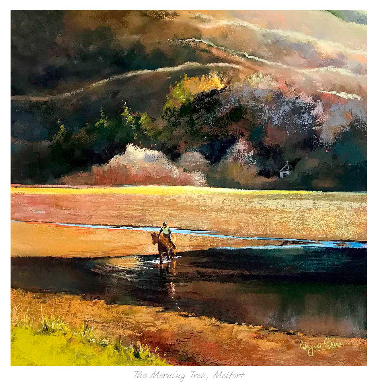
Well-chosen Scottish landscape art can do a lot for a brighter room. It can widen the mood, slow the pace, and make strong daylight feel more inviting. The Morning Trek Melfort does this especially well, using morning atmosphere and distance to keep the wall feeling open rather than overfilled.
How The Morning Trek Melfort helps Scottish landscape art breathe
The Morning Trek Melfort gives the eye somewhere to travel. That matters in rooms with broader walls, stronger daylight, or simpler furniture layouts, where the artwork needs to create atmosphere without becoming too dense. A morning-led landscape often works well here because it feels expansive but still settled.
It keeps a bright room feeling open rather than washed out.
It adds distance, which helps a wall feel less flat.
It suits customers who want calm presence rather than noise.
That sense of calm is strengthened by the final finish. First 4 Frames handles the framing and colour-managed Giclée production in-house, so the subtle transitions in the image hold together cleanly and the whole piece feels properly resolved on the wall.