Posted on

Highland Dance At Stirling as Scottish Dance Studio Waiting Room Wall Art

Highland Dance At Stirling depicts five children in traditional Scottish attire performing the Highland Dance in a circle on green grass, with a tall stone tower and vibrant blue sky, rendered in an impressionistic style.

The right Scottish dance studio waiting room wall art should give the room energy before a class even begins. Waiting areas in dance studios need to feel welcoming for dancers, families, and visitors, but they also need visual choices that look finished rather than makeshift. Highland Dance At Stirling is an excellent fit for that balance.

Why waiting rooms set the tone

A studio waiting room is where first impressions happen. It can easily feel too plain, especially if the room is built around seating, notices, and practical use. One strong framed piece can create a sense of identity without adding clutter.

  • It suits dance studios, waiting rooms, and reception corners with Scottish character.
  • It adds movement and subject relevance without becoming overly literal.
  • It helps the space feel cared for and more memorable to visitors.

Why Highland Dance At Stirling carries the mood so well

The piece has life and rhythm, but it still feels like fully resolved artwork. That makes it ideal for a room that should reflect the subject proudly while maintaining a polished atmosphere.

Why the final finish matters in public-facing spaces

First 4 Frames completes every piece in-house in Falkirk using bespoke framing, colour-managed Giclee printing, and hand-finished craftsmanship. That superior presentation helps the artwork hold its own in a room used every day by different people.

This artwork is by Janet McCrorie, and you can view the exact framed product here.

If you need Scottish dance studio waiting room wall art that feels lively, rooted, and professionally finished, Highland Dance At Stirling is a strong choice.

Posted on

Why Morag and Son Feels Right as Country Pantry Wall Art

Image of Morag and Son by Hillary Barker

Good country pantry wall art should make a practical space feel more enjoyable to use. Pantries, utility-adjacent stores, and back kitchens often have plenty of purpose but not always much softness. Morag and Son is a lovely way to add warmth and character without overcomplicating the room.

Why pantry spaces still deserve visual care

Even a hardworking room benefits from one thoughtful decision on the wall. Artwork can stop a pantry from feeling purely storage-led and help it connect more naturally to the rest of a country home.

  • It suits pantries, utility rooms, and back kitchens with country character.
  • It adds warmth without getting in the way of a working layout.
  • It helps a practical room feel more personal and lived in.

Why Morag and Son works so well here

The subject has humour and familiarity, but the piece still feels polished enough for a quality-led interior. That balance is important in smaller working rooms, where every decorative choice needs to earn its place.

Why in-house craftsmanship matters

First 4 Frames produces each piece in-house in Falkirk using bespoke framing, colour-managed Giclee printing, and hand-finished craftsmanship. That superior quality gives even a quieter domestic space a more finished and cared-for feel.

You can see more from Hillary Barker and view the exact framed product here.

If you are looking for country pantry wall art that feels warm, characterful, and easy to place, Morag and Son is a very strong option.

Posted on

Bidean from the River Coe and the Appeal of Wall Art for Russet Accents

Image of Bidean from the River Coe by Colin Robertson

Choosing wall art for russet accents is often about balance. Russet tones can make a space feel rich, welcoming, and cocooning, but they also need artwork that keeps the room from tipping into something too dark or too season-bound. Bidean from the River Coe brings exactly that kind of balance.

Why richer colour schemes need a steadier focal point

Warm accent colours are at their best when they feel layered rather than loud. One well-chosen framed piece can connect deeper upholstery, cushions, or textiles while still giving the eye somewhere calm to settle.

  • It suits sitting rooms, studies, and bedrooms with warmer textile accents.
  • It adds atmosphere without making the palette feel too dense.
  • It helps richer colours feel considered and lived with rather than theme led.

Why Bidean from the River Coe feels so effective

The landscape has presence and tonal depth, but it still feels composed rather than dramatic for its own sake. That makes it easier to place in a room where warmth already exists and the artwork needs to refine it rather than compete with it.

Craftsmanship that supports the room

First 4 Frames produces each piece in-house in Falkirk using bespoke framing, colour-managed Giclee printing, and hand-finished craftsmanship. That superior presentation helps the finished artwork hold its own beside stronger fabrics, timber tones, and layered soft furnishings.

This artwork is by Colin Robertson, and you can view the exact framed product here.

If you need wall art for russet accents that feels warm, grounded, and easy to live with, Bidean from the River Coe is a strong choice.

Posted on

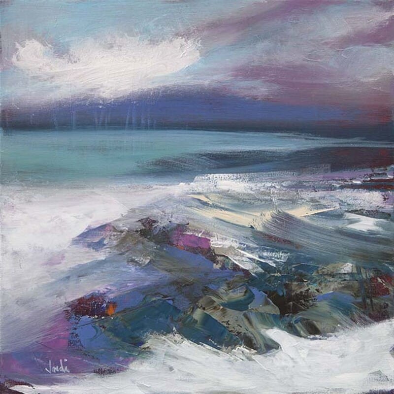
Why Rocky Shore Orkney Works Beautifully as Art for a Room With Sea Glass Colours

Image of Rocky Shore Orkney by Arie Vardi

Good art for a room with sea glass colours should deepen a softer palette without making it feel heavier. Sea glass tones can be beautiful in a room, but they sometimes need one stronger visual anchor to stop the scheme from drifting into something slightly pale or unfinished. Rocky Shore Orkney does that especially well.

Why sea glass colours need a little depth

Rooms built around misty greens, washed blues, and softer coastal neutrals usually feel restful from the start. The challenge is making them feel resolved. Artwork with enough mood and structure can hold the palette together while keeping the room calm.

  • It suits bedrooms, sitting rooms, and coastal guest spaces.
  • It adds definition without disturbing a lighter colour scheme.
  • It helps a quieter room feel more intentional and finished.

Why Rocky Shore Orkney works so naturally here

The image has enough texture and atmosphere to prevent the room feeling flat, yet it still feels easy to live with every day. That balance matters when the surrounding palette is already subtle and the artwork needs to add presence rather than noise.

Why the finish matters

First 4 Frames completes every piece in-house in Falkirk using bespoke framing, colour-managed Giclee printing, and hand-finished craftsmanship. That superior finish helps the artwork sit confidently in a carefully styled room where softer colour is doing much of the work.

This artwork is by Arie Vardi, and you can view the exact framed product here.

If you are looking for art for a room with sea glass colours that feels calm, layered, and properly resolved, Rocky Shore Orkney is an excellent option.

Posted on

Around and About Oban as Wall Art for an Oban Holiday Apartment

A colorful, whimsical painting inspired by Around and About Oban, featuring a Scottish coastal town with red-roofed buildings, people strolling, a large boat at the dock, and an arched viaduct under a crescent moon and starry sky.

Good Oban holiday apartment wall art should help guests feel where they are, not just where they are sleeping. Holiday apartments often default to safe coastal styling, but a stronger local piece can make the stay feel more memorable and more genuinely connected to the town. Around and About Oban is an excellent example of that.

Why local identity matters in holiday apartment interiors

Guests notice when a place feels considered. Artwork with a clear sense of location helps an apartment feel more welcoming and less interchangeable, especially in destinations where visitors want a connection to the area as well as a comfortable base.

  • It suits self-catering apartments, holiday lets, and guest spaces in or around Oban.
  • It adds local character without becoming souvenir-like.
  • It helps the stay feel warmer and more distinctive for visitors.

Why Around and About Oban feels especially effective

The piece has place, movement, and immediate recognisable charm. That gives the interior more personality while still keeping the overall impression polished enough for hospitality use.

Why a superior finish supports the guest experience

First 4 Frames produces each piece in-house in Falkirk using bespoke framing, colour-managed Giclée printing, and hand-finished craftsmanship. That superior finish helps the apartment feel more carefully prepared and a little less generic from the moment guests arrive.

You can see more from Rob Hain and view the exact framed product here.

If you want Oban holiday apartment wall art that feels local, welcoming, and genuinely memorable, Around and About Oban is a strong choice.

Posted on

Footsteps At The Forth and the Appeal of Scottish Rehearsal Room Wall Art

Four dancers in colorful kilts and dresses hold hands and move energetically on a beach as Footsteps At The Forth plays, set beneath a towering red steel bridge under a partly cloudy sky.

The right Scottish rehearsal room wall art should support the life of the room without turning it into a stage set. Rehearsal spaces need energy, but they also need focus, and the artwork has to help both. Footsteps At The Forth works especially well because it brings movement and Scottish identity in a way that still feels polished.

Why practice spaces benefit from better visual identity

A rehearsal room is used for repetition, concentration, and building confidence. That makes atmosphere more important than many people expect. One strong framed piece can make the room feel more cared for, more inspiring, and more connected to the kind of creativity happening inside it.

  • It suits rehearsal rooms, practice studios, and community arts spaces.
  • It adds motion and local character without distraction.
  • It helps the room feel purposeful and welcoming.

Why Footsteps At The Forth feels right for that role

The piece suggests rhythm and movement, which makes it especially fitting for a room built around practice and performance. At the same time, it remains a resolved artwork that can stand on its own outside any single event or season.

Why in-house craftsmanship supports a harder-working room

First 4 Frames completes every piece in-house in Falkirk using bespoke framing, colour-managed Giclée printing, and hand-finished craftsmanship. That superior quality helps the finished piece hold up visually in a space used often and seen by many different people.

This artwork is by Janet McCrorie, and you can view the exact framed product here.

If you are looking for Scottish rehearsal room wall art that feels spirited, rooted, and properly display-worthy, Footsteps At The Forth is a very strong option.

Posted on

Evening Sparkle On The Loch and the Case for Art on Dusky Pink Walls

Image of Evening Sparkle On The Loch by Nikki Monaghan

Choosing art for dusky pink walls is often about keeping warmth while adding definition. Dusky pink can make a room feel welcoming and elegant, but it also needs artwork with enough depth to prevent the scheme becoming too soft or too obviously decorative. Evening Sparkle On The Loch works beautifully because it adds atmosphere and contrast without feeling abrupt.

Why pink walls benefit from a steadier focal point

When the wall colour already brings personality, the artwork has to do more than simply match. It should deepen the scheme and make it feel intentional. The strongest pieces help pink look refined and settled rather than overly sweet.

  • It suits bedrooms, sitting rooms, and welcoming guest spaces with dusky pink tones.
  • It adds depth without draining warmth from the scheme.
  • It helps the room feel more sophisticated and complete.

Why Evening Sparkle On The Loch brings the right balance

The mood is atmospheric, but the image still feels easy to live with. That matters in rooms where the wall colour already carries emotion and the artwork needs to complement it with confidence rather than compete for attention.

Why superior quality presentation makes a difference

First 4 Frames produces each piece in-house in Falkirk using bespoke framing, colour-managed Giclée printing, and hand-finished craftsmanship. That superior finish helps the artwork feel anchored and polished against a more expressive paint colour.

You can explore more work by Nikki Monaghan and view the exact framed product here.

If you need art for dusky pink walls that feels warm, elegant, and properly resolved, Evening Sparkle On The Loch is a strong choice.

Posted on

Why Resting Boats Works Beautifully as Wall Art for Painted Panelling

Image of Resting Boats by Colin Robertson

Good wall art for painted panelling should work with the architecture rather than fight it. Painted panelling gives a room shape and structure, but it can also make the walls feel more formal unless the artwork introduces some ease. Resting Boats is especially effective because it brings calm and openness without losing definition.

Why panelled rooms need a little softness

Joinery brings welcome detail, yet it also creates lines, edges, and repetition. Artwork can balance that by introducing atmosphere and a more relaxed focal point. The aim is not to erase the character of the room, but to stop it feeling overly mannered.

  • It suits dining rooms, stair halls, and sitting rooms with painted panelling.
  • It softens stronger architectural lines.
  • It helps a traditional room feel lighter and more lived in.

Why Resting Boats feels so successful

The composition has enough clarity to stand up to a detailed wall treatment, but the overall mood remains calm. That makes it ideal where the room already has structure and simply needs a more relaxed centre of attention.

Why the First 4 Frames finish matters

First 4 Frames completes every piece in-house in Falkirk using bespoke framing, colour-managed Giclée printing, and hand-finished craftsmanship. That superior presentation helps the finished piece feel worthy of a room with thoughtful joinery and traditional detail.

This artwork is by Colin Robertson, and you can view the exact framed product here.

If you are looking for wall art for painted panelling that feels composed, gentle, and timeless, Resting Boats is a lovely option.

Posted on

Why The Great Guardian Works So Well as Home Library Wall Art

In "The Great Guardian," a shaggy highland cow stands in tall grass, surrounded by whimsical floating objects and fantasy elements like birdhouses, hats, umbrellas, musical instruments, and a snail, creating a dreamy surreal scene.

The best home library wall art should bring character to the room while still protecting the sense of calm that makes the space work. Libraries and book rooms often have shelves, spines, and plenty of visual detail already, so the artwork needs enough presence to matter without turning the wall into noise. The Great Guardian does that beautifully.

Why reading rooms need artwork with quiet confidence

A home library is not just about storage. It is a room for settling in, thinking clearly, and returning to the same space again and again. The artwork should support that atmosphere by offering identity and depth without interrupting the slower rhythm of the room.

  • It suits home libraries, reading rooms, and book-lined studies.
  • It adds imagination without making the room feel busy.
  • It helps a quieter space feel complete and memorable.

Why The Great Guardian feels so right here

The piece has story and presence, but it still feels controlled enough for everyday living. That is exactly what many reading rooms need, especially when the rest of the space already includes plenty of texture and detail through books, timber, and soft furnishings.

Why a superior finish matters

First 4 Frames produces each piece in-house in Falkirk using bespoke framing, colour-managed Giclée printing, and hand-finished craftsmanship. That superior finish gives the artwork the depth and presence needed to sit comfortably in a room built around slower pleasures and careful choices.

You can explore more work by Matylda Konecka and view the exact framed product here.

If you are searching for home library wall art that feels characterful, calm, and genuinely display-worthy, The Great Guardian is an excellent fit.

Posted on

Highland Bull and the Appeal of Better Wall Art for Tartan Upholstery

Image of Highland Bull by Hillary Barker

Choosing wall art for tartan upholstery is often a question of restraint. Tartan already brings identity, rhythm, and a strong sense of place, so the artwork has to complement that confidence rather than compete with it. Highland Bull works so well because it feels grounded and characterful without pushing the room into cliché.

Why tartan rooms need balance, not more noise

Patterned upholstery can make a room feel rich and welcoming, but it also means the walls need careful choices. If the artwork is too busy, the whole space can feel overdone. If it is too timid, the room can lose definition. The goal is warmth with control.

  • It suits country homes, studies, and sitting rooms with tartan chairs or sofas.
  • It adds Scottish character without becoming overly themed.
  • It helps the room feel intentional and comfortably layered.

Why Highland Bull carries the room so well

The subject has personality and presence, which is exactly what a room with tartan can carry. At the same time, the artwork feels composed enough to keep the overall scheme refined rather than overly rustic or playful.

The importance of superior presentation

First 4 Frames completes every piece in-house in Falkirk using bespoke framing, colour-managed Giclée printing, and hand-finished craftsmanship. That superior finish matters when the room already includes distinctive fabrics and detail, because the artwork needs equal confidence.

You can see more from Hillary Barker and view the exact framed product here.

If you are searching for wall art for tartan upholstery that feels rooted, warm, and well judged, Highland Bull is an excellent answer.