Posted on

Speckles: Colourful Wall Art for a Farm Stay Family Room

Image of Speckles by Rikki O'Neill

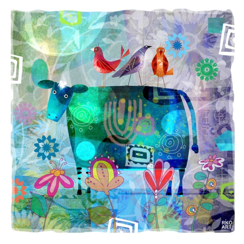
colourful wall art for a farm stay family room has to work for more than one age group. It should feel warm and memorable to visiting families, yet polished enough for adults who have chosen the accommodation for its setting and quality. Speckles by Rikki O’Neill offers that balance. Its blue-green cow, perched birds, flowers, and layered pattern connect naturally with the countryside while keeping the mood imaginative rather than literal.

colourful wall art for a farm stay family room: Speckles by Rikki O'Neill

Why colourful wall art for a farm stay family room needs a broad appeal

A shared room in holiday accommodation is rarely used in just one way. Children may play there after a day outside, adults may plan the next morning, and everyone may gather for a quiet evening. Artwork needs enough character to distinguish the property, but it should not make grown-up guests feel that they are sitting in a playroom.

Speckles is playful without depending on a joke or slogan. The cow provides an immediate rural reference. Three birds create a second story above it, while the surrounding flowers and translucent shapes reward closer looking. Cool turquoise, green, blue, and violet dominate, with smaller red, orange, and pink accents adding energy.

Use local character without building a farm theme

One well-chosen animal image can establish a link with the setting. It does not need support from tractor signs, checked ornaments, novelty cushions, or a collection of rustic objects. Those additions can quickly make guest accommodation feel staged. Instead, let real materials and views do the quieter work around the picture.

Room elementHow to relate it to the print
Timber furnitureKeep the finish simple so the artwork supplies most of the pattern
Plain sofaRepeat one blue-green or violet note in a washable cushion
Outdoor viewHang the picture on a side wall rather than competing with the window
Family games and booksUse closed storage nearby to preserve a clear visual focus

This approach gives the accommodation personality without creating a costume version of rural life. Guests can enjoy the imaginative animal and garden details, while the wider room remains calm, practical, and easy to maintain between stays.

Place the square print where different guests can enjoy it

The available print measures 265 by 265 millimetres before mounting and framing. Its compact square format works above a side table, beside a bookcase, or on a short wall near family seating. It is better treated as a concentrated point of interest than stretched visually across a long empty wall.

Check the finished frame height from both adult and child viewpoints. A position near the main seating area can make the detail easy to see without placing the artwork within reach of bags, toys, or moving furniture. Leave clear wall around it, and avoid hanging it where strong window reflections will obscure the darker blue-green body.

Choose colour that photographs well and feels comfortable in person

Holiday accommodation has to work both online and on arrival. The saturated animal shape can create a recognisable focal point in listing photographs, while the pale layered background prevents the small room from feeling visually heavy. Use the artwork to lead one image of the family room, but also photograph the wider layout honestly so guests understand its scale.

There is no need to copy every colour. One teal throw, a muted violet detail, or fresh greenery can connect the picture to the room. Durable neutral upholstery keeps the setting flexible, and the framed artwork carries the more expressive pattern.

Hand-finished presentation for a hardworking guest space

A family room benefits from a secure, properly finished frame and a presentation that protects the printed surface. First 4 Frames produces colour-managed Giclée prints and completes bespoke framing in-house in Falkirk. The frame can be selected to support the strong outlines and fine layered details while remaining practical for a frequently used room.

Rikki O’Neill is a self-taught illustrator, cartoonist, photographer, and digital artist whose work is known for colour, character, and storytelling. Explore more on Rikki O’Neill’s official Riko Art website, or browse the Rikki O’Neill collection at First 4 Frames.

Well-chosen colourful wall art for a farm stay family room can make accommodation more distinctive while staying welcoming and easy to live with. View the framed Speckles print for a compact focal point that brings rural subject matter, birds, flowers, and confident colour together.

Posted on

High Moon: Art for a Room With Patchwork Textiles

Image of High Moon by Rikki O'Neill

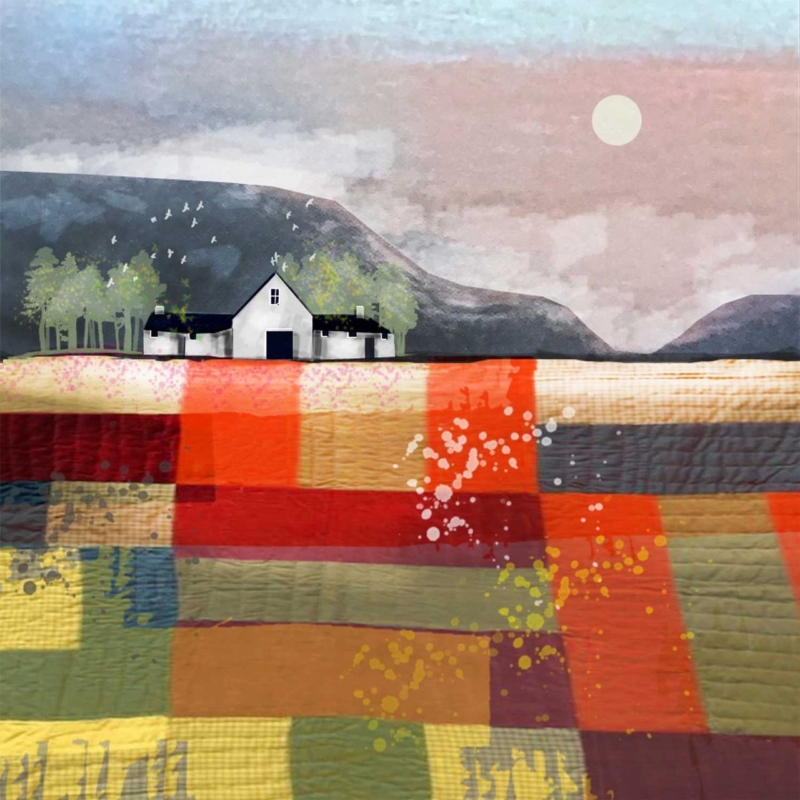
art for a room with patchwork textiles needs to respect the colour and hand-made character already in the room. It should not simply add another unrelated pattern. High Moon by Rikki O’Neill offers a thoughtful connection. Its lower half resembles joined pieces of richly coloured cloth, while the white cottage, distant hills, and pale moon create a quieter destination for the eye.

art for a room with patchwork textiles: High Moon by Rikki O'Neill

Why art for a room with patchwork textiles needs a resting point

Patchwork brings many small decisions together: cloth, stitch, tone, repeat, and contrast. That richness is part of its appeal, but it can leave a wall feeling unsettled if the artwork introduces several more competing motifs. A single framed piece creates a boundary. It can acknowledge the textiles while helping the wider room feel composed.

High Moon manages this through contrast. Blocks of rust, red, ochre, olive, charcoal, and cream give the foreground a fabric-like rhythm. Above them, the simple croft and open sky slow the composition down. The picture therefore feels connected to patchwork without looking like a literal sewing illustration.

Start with the dominant textile, not every fabric

Choose the quilt, throw, cushion, or upholstered chair that has the strongest visual presence. Identify two colours that appear across a useful area rather than focusing on the smallest accent square. In this print, warm red and muted green can connect with an earthy textile. Cream and soft grey can bridge the picture to a quieter wall.

Textile situationHow the artwork can respond
Traditional scrap quiltUse the varied foreground as a link, then keep the frame restrained
Modern geometric throwLet the square picture and block-like colour provide structure
Soft neutral patchworkPick up cream and grey while allowing the warmer tones to lead
Several patterned cushionsLeave clear wall around one framed piece instead of adding a gallery cluster

Avoid trying to match every colour. Exact repetition can make a room look over-planned and may date the scheme when one textile changes. A couple of clear relationships are enough. The remaining picture colours should be allowed to add depth rather than becoming instructions for more accessories.

Give a small square print enough space

The available print size is 265 by 265 millimetres before mounting and framing. That compact square can work above a side table, beside a reading chair, or on a short wall near a textile display. It should not be forced to fill a broad wall by itself. A deliberate pocket of clear space will make the picture feel more important.

If the room contains a quilt hung on the wall, place the print on a separate wall rather than immediately beside it. This lets each hand-made or artist-led element hold its own. Check the view from the doorway and the main seat. The cottage and moon should remain easy to read even when a colourful throw is in the foreground.

Choose framing that separates pattern from pattern

A measured mount can create valuable breathing room between the image and its moulding. A slim dark frame may connect with the cottage roof and charcoal sections. A warm timber can sit comfortably with natural fibres and older furniture. Highly decorated moulding is less helpful because it adds one more repeating surface around an already layered image.

First 4 Frames produces colour-managed Giclée prints and completes bespoke framing in-house at its Falkirk workshop. That approach protects the subtle texture and keeps the pale sky distinct from the saturated foreground. It also allows the mount, frame, and finished dimensions to be chosen for the actual textiles and wall colour.

A landscape built through colour and texture

Rikki O’Neill combines illustration, painting, and textile-influenced texture to create atmospheric, colourful landscapes. The Wraptious profile of Rikki O’Neill gives useful background on his approach, while the Rikki O’Neill collection at First 4 Frames shows more of his distinctive work.

Well-chosen art for a room with patchwork textiles can celebrate pattern while bringing the room back into focus. View the framed High Moon print for a compact landscape that connects layered colour, quiet Scottish scenery, and hand-finished presentation.

Posted on

White Cottages: Art for a Room With White Slipcovered Furniture

Image of White Cottages by Rikki O'Neill

art for a room with white slipcovered furniture has to provide enough definition for a very pale scheme without losing the room’s easy, washable character. White Cottages by Rikki O’Neill makes that contrast gently. The white buildings echo the upholstery, while the surrounding colour gives the wall a stronger focal point and prevents the whole interior from feeling bleached or unfinished.

art for a room with white slipcovered furniture: White Cottages by Rikki O'Neill

How art for a room with white slipcovered furniture adds depth

White covers are popular because they make a room feel informal and bright. They can also be removed for cleaning, which suits busy homes, holiday cottages, and family sitting rooms. The challenge is visual rather than practical. When pale seating, walls, and curtains sit together, their edges can disappear and leave the space looking flatter than intended.

A compact, colourful picture creates a point of focus without changing the basic palette. In this image, the cottages repeat the room’s lightest note. The richer landscape around them provides the missing contrast. This makes the artwork feel connected rather than added simply to introduce colour.

Use contrast in small, deliberate amounts

  • Keep most textiles quiet. Let one cushion or throw echo a secondary colour instead of repeating the full image.
  • Add natural texture. Linen, timber, basketry, or wool can separate one pale surface from another.
  • Choose one clear frame edge. A defined moulding stops the picture fading into a white wall.
  • Leave breathing space. The square format benefits from a calm margin rather than a crowded gallery arrangement.

This measured approach preserves the appeal of slipcovers. The room remains fresh and adaptable, but it gains enough colour to feel inhabited throughout the year. Accessories can change seasonally without requiring the artwork to be replaced.

Match the 265 mm square to the right wall

The available print size is 265 by 265 millimetres before framing. That compact square is better treated as a deliberate detail than stretched across a large empty wall. It can sit above a side table, beside a reading chair, between two narrow windows, or on a short return near the sofa. A mount and moulding increase the final dimensions, so measure using the complete framed size.

Before ordering, tape a paper square to the proposed position. View it from the doorway and from the main seat. If it looks isolated, move it closer to a lamp or small piece of furniture rather than surrounding it with unrelated prints. If it feels too busy, remove nearby accessories and let the artwork carry the colour.

Check pale interiors in changing light

A white room can look cool in northern daylight and warmer under evening lamps. Examine the wall at both times. The frame should maintain a clear boundary, while the print’s colourful details should remain visible without strong glare. A thoughtful mount can add separation and keep the image from feeling pressed against the wall colour.

First 4 Frames uses colour-managed Giclée production and completes bespoke framing by hand in Falkirk. That in-house process supports the bright detail in the artwork and makes the modest square feel properly resolved rather than like a temporary decorative print.

Colourful illustration by Rikki O’Neill

Rikki O’Neill is a self-taught illustrator, cartoonist, photographer, and digital artist whose work is known for colour and imaginative character. See more on Rikki O’Neill’s official website, or browse the wider Rikki O’Neill collection at First 4 Frames.

The right art for a room with white slipcovered furniture can keep a light interior relaxed while giving it a memorable centre. View the framed White Cottages print for a small-scale focal point with bright personality and bespoke, ready-to-hang presentation.

Posted on

Bird Dog: A Colourful Gift for a Dog-Loving Gardener

Image of Bird Dog by Rikki O'Neill

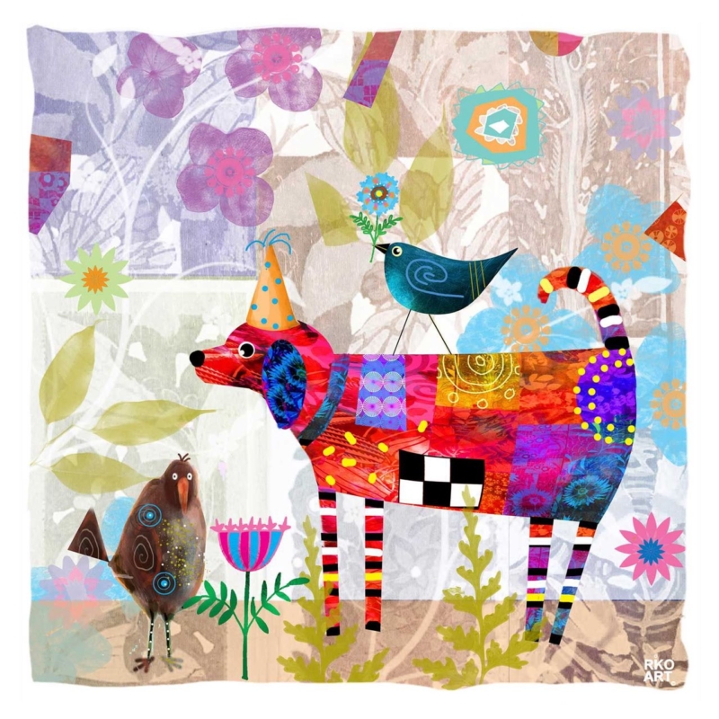
A gift for a dog-loving gardener can reflect two parts of someone’s life without resorting to a slogan, novelty mug, or another practical tool. Bird Dog by Rikki O’Neill brings a lively dog into a garden-like scene filled with flowers and birds. Its patchwork colour and gentle humour make the subject personal, while the framed presentation gives it a lasting place in the home.

gift for a dog-loving gardener: Bird Dog by Rikki O'Neill

Why this gift for a dog-loving gardener feels personal

The most thoughtful gifts connect to real routines and interests. A gardener may spend hours noticing shape, colour, changing plants, and visiting birds. A dog owner also recognises the alert posture, mischief, and companionship that give an animal its character. This print gathers those familiar pleasures into one imaginative scene rather than illustrating either hobby too literally.

The dog’s long striped legs, patterned body, pointed hat, and curled tail create the first focal point. A dark blue bird balances the figure above, while softer flowers and foliage spread through the background. Smaller birds and plants reward a closer look. That layered composition feels celebratory, but the pale ground prevents the square image from becoming visually heavy.

Match the present to the person, not an occasion formula

  • For a birthday: choose it for someone whose dog and garden are central to everyday life.
  • For a new home: use the print to bring character to a breakfast area, hall, or garden room.
  • As a thank-you: make it a lasting alternative to flowers for someone who has helped with a dog or garden.

A short handwritten note can explain why the two subjects made you think of the recipient. That detail matters more than adding several themed extras. The print already carries plenty of colour and story, so simple wrapping and a sincere message are enough.

Choose a wall where the detail can be enjoyed

The square format can sit above a small console, beside a reading chair, or on a shorter wall near a view of the garden. It also suits a kitchen-dining corner where the recipient will see it regularly. Avoid placing it among many small dog signs or botanical prints. Clear space around the frame lets the collage-like detail remain distinct.

Use a paper template based on the finished frame size before hanging. Check the position from the doorway and from the main seat. The red dog should read clearly from a distance, while the birds, flowers, patterns, and line work should invite a second look at closer range.

Let one or two colours connect it to the room

The artwork includes red, turquoise, violet, orange, blue, and fresh green. There is no need to repeat the whole palette. One turquoise plant pot or a deep red cushion can form a quiet link. Keep larger furniture and wall areas calmer so that the picture remains the cheerful focal point rather than one pattern among many.

A pale timber frame can support the garden feeling, while a slim dark moulding can pick up the stronger outlines and checked details. First 4 Frames uses colour-managed Giclée production and completes bespoke framing by hand at its Falkirk workshop. That in-house process gives the playful illustration a polished, ready-to-hang finish.

Illustration made for repeated looking

Rikki O’Neill is a self-taught illustrator, cartoonist, photographer, and digital artist whose work is known for colour, story, and character. Explore more on Rikki O’Neill’s official Riko Art website, or browse the Rikki O’Neill collection at First 4 Frames.

A well-chosen gift for a dog-loving gardener should feel specific to the recipient and good enough to keep. View the framed Bird Dog print for a bright meeting of canine personality, garden life, and hand-finished presentation.

Posted on

Winter Trees: Colourful Wall Art for a Quilting Room

Image of Winter Trees by Rikki O'Neill

colourful wall art for a quilting room should feel at home beside fabric, thread, and works in progress without making a creative space busier. Winter Trees by Rikki O’Neill offers that balance. Its lower half resembles a glowing patchwork of red, orange, green, and violet. Above it, white cottages and bare trees form a calm horizon. The contrast gives the room energy and a visual place to rest.

colourful wall art for a quilting room: Winter Trees by Rikki O'Neill

Why colourful wall art for a quilting room needs structure

A quilting room already contains colour. Folded fabric, sample blocks, rulers, and pinned plans all compete for attention. The strongest artwork does not try to outdo those materials. Instead, it gathers similar visual ideas into one composed image. That makes the room feel intentional even when a project is spread across the table.

In Winter Trees, the broad bands and irregular blocks suggest piecing without copying a traditional quilt pattern. Splashes and transparent-looking layers add movement. The quieter sky and simple buildings then keep the picture open. This mix of order and experiment suits a room where careful measurement and creative instinct work together.

Give the working wall and display wall different jobs

Keep cutting instructions, reference notes, and current fabric choices close to the main table. Place the framed artwork on a separate wall, perhaps above low storage or where it is visible from the sewing machine. Dividing practical information from permanent display reduces distraction and makes tidying between projects much easier.

  • Working zone: reserve pinboards and magnetic rails for changing project material.
  • Storage zone: group fabric by a system you can maintain, rather than by every shade in the picture.
  • Focal zone: leave clear wall around the artwork so its quieter upper half can breathe.

Echo one colour rather than the whole palette

The image contains enough colour to connect with many fabric collections. There is no need to match every tone. Pick one recurring shade, such as turquoise or burnt orange, for a chair cushion, storage label, or small tray. Let neutral shelving and the work surface hold the background. This keeps tools easy to find and allows changing textiles to remain the most flexible layer.

The square print format also helps. It can sit comfortably above a compact cabinet without stretching across valuable storage. Make a paper template using the finished frame dimensions, then view it from both the machine and the cutting table. The cottages should remain readable from a distance, while the layered foreground offers detail at closer range.

Choose a frame that settles the pattern

A simple frame will give the busy lower section a firm edge. Pale timber can relate to an oak table or shelving, while a slim dark moulding can pick up the tree silhouettes and roofline. Avoid selecting from a tiny colour sample alone. Compare the actual print with the room’s permanent finishes and the daylight used for detailed work.

First 4 Frames uses colour-managed Giclée printing and completes bespoke framing by hand at its Falkirk workshop. That in-house process supports the saturated blocks, pale sky, and crisp dark details while producing a polished piece that arrives ready to hang.

Landscape art with an imaginative edge

Rikki O’Neill is a self-taught illustrator, cartoonist, photographer, and digital artist known for vivid, characterful work. Explore more of his practice on Rikki O’Neill’s official Riko Art website, or browse the Rikki O’Neill collection at First 4 Frames.

Good colourful wall art for a quilting room can celebrate colour while making the room feel more settled. View the framed Winter Trees print for a square focal point that connects patchwork rhythm, winter calm, and a practical creative space.

Posted on

Alphie Baa: Colourful Wall Art for a Child’s Homework Corner

Image of Alphie Baa by Rikki O'Neill

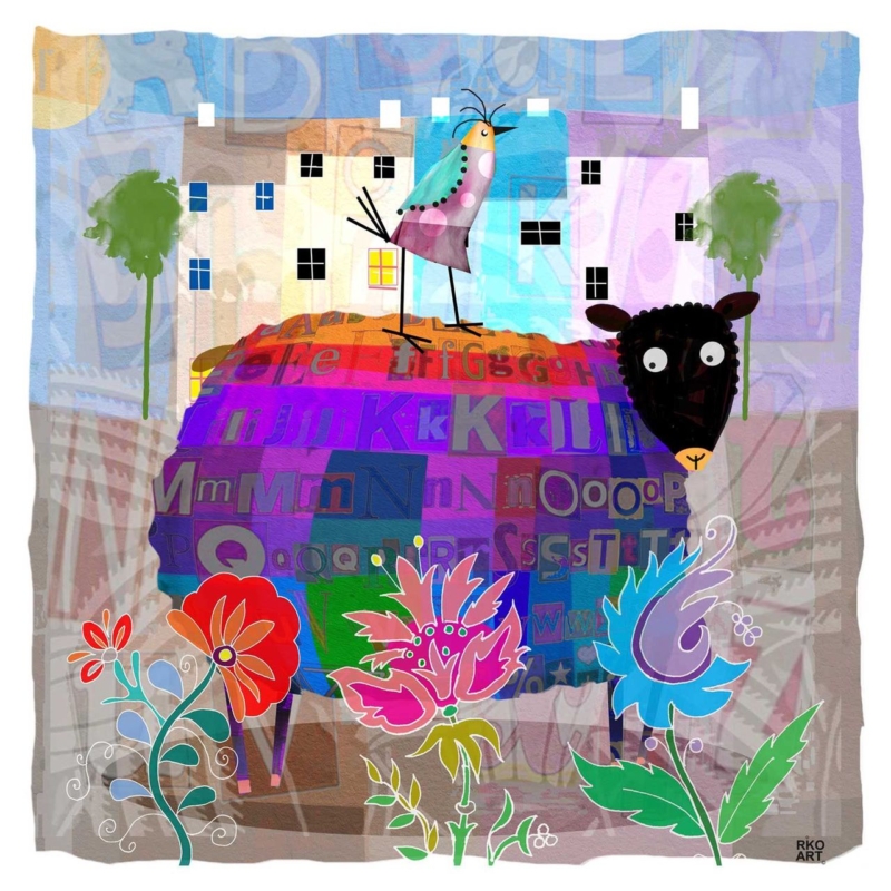
colourful wall art for a child’s homework corner can make a small study area feel like part of the room rather than a desk placed wherever space was available. Alphie Baa by Rikki O’Neill brings together a cheerful sheep, layered letters, flowers, and bright colour. Those details connect naturally with early learning, yet the lively illustration has enough personality to remain enjoyable when worksheets and school routines change.

colourful wall art for a child's homework corner: Alphie Baa by Rikki O'Neill

What colourful wall art for a child’s homework corner can add

A homework corner needs to be practical first. The chair should fit, the light should be comfortable, and pencils or books need somewhere to go. Once those basics are settled, one framed picture can give the area identity. It tells a child that this is a place prepared for them, not an improvised spillover from the kitchen table.

In Alphie Baa, letterforms run through the sheep’s richly coloured fleece. They suggest reading and language without turning the picture into an educational chart. The bird, flowers, houses, and wide-eyed animal create small stories to notice between tasks. That imaginative quality is useful because it makes the corner friendly without covering the wall in instructions or motivational slogans.

Plan a simple three-zone homework setup

  1. Working zone: keep the desk surface clear enough for the current book, paper, and device.
  2. Storage zone: use one drawer, caddy, or shelf so spare materials can leave the work surface quickly.
  3. Visual zone: hang one framed artwork where it can be enjoyed without competing with timetables and reminders.

Separating those jobs reduces visual noise. If notices are needed, place them on a small board beside the desk rather than around the picture. The artwork then remains a positive constant while school information changes. It also makes the setup easier to tidy at the end of the day.

Place the square format with care

The square print size can work well above a narrow desk or on the adjacent wall. It does not need to be centred on the whole room. Instead, relate it to the desk and chair as one small composition. Leave space below for a task light, but avoid hanging it so high that a seated child sees only the underside of the frame.

Make a paper template using the finished frame dimensions and view it from both sitting and standing height. Check that the position is clear of shelving, opening doors, and the path of a rising chair. Secure fixings are essential in a child’s room or family study area, particularly where the wall receives regular bumps.

Use colour to organise rather than overwhelm

The illustration already contains violet, red, blue, green, turquoise, and warm orange. There is no need to repeat them all. Choose one colour for a pencil pot or storage box, then keep the larger desk and wall surfaces calmer. This gives the print presence while helping books and supplies remain easy to find.

A simple frame can contain the energy. A pale timber may keep the result light and friendly, while a slim darker option can define the irregular picture edge and strong black details. The best choice should also relate to the desk, floor, and door finishes so the corner belongs to the wider room.

Choose art that is not tied to one school year

Alphabet posters and age-specific learning aids have a useful but short life. A characterful artwork can last longer because its appeal is visual and imaginative. The letters in the sheep create an early connection to learning, while the humour, collage effect, and confident colour can still suit an older child’s creative corner.

First 4 Frames produces colour-managed Giclée prints and completes professional framing in-house at its Falkirk workshop. The hand-finished presentation turns a playful image into a durable part of the room and means it arrives ready to hang rather than becoming another unfinished decorating task.

Illustration with colour, character, and story

Rikki O’Neill is a self-taught cartoonist, illustrator, photographer, and digital artist whose work includes children’s books and greeting cards. Visit Rikki O’Neill’s official Riko Art website for more of his work, or browse the Rikki O’Neill collection at First 4 Frames.

Useful colourful wall art for a child’s homework corner should welcome a child to the desk without distracting from the work. View the framed Alphie Baa print for a compact, story-rich focal point that brings learning, humour, and colour into better balance.

Posted on

Breakfast Room Wall Art With Wit, Birds and Bright Colour

Image of Speckles by Rikki O'Neill

Breakfast room wall art can be more playful than art chosen for a formal dining room. Speckles gathers a patterned cow, three perched birds, flowers and layered blue-green shapes into one compact square. It brings morning energy to the room without relying on coffee slogans or kitchen typography.

breakfast room wall art - Speckles

Use breakfast room wall art to set an informal rhythm

  1. Choose the wall seen when entering or sitting down, rather than the busiest preparation area.
  2. Leave enough space around the square frame for the layered pattern to remain readable.
  3. Repeat one colour only, such as teal, coral or leaf green, in a small table accessory.
  4. Keep other animal motifs out of the scheme so the artwork retains its wit.

A cheerful room feels collected when colour is echoed with restraint, not copied everywhere.

The print can soften painted cabinetry and hard breakfast-table surfaces. Its rounded animal form and loose flowers provide a friendly contrast to straight chair backs, tiles and cupboard lines. Because the composition is concentrated, it can make a useful focal point even where wall space is limited.

Let the small details reward a closer morning view

Layered pattern needs clean colour separation, especially where translucent blues, greens and floral marks overlap. Colour-managed Giclée printing maintains that detail. In-house framing gives the square image enough definition to hold its own in a practical, frequently used room.

If the garden visitors in the picture inspire you, see RSPB advice on helping birds and wildlife. Browse the Rikki O’Neill collection, or view the exact Speckles framed print.

As breakfast room wall art, Speckles offers colour, humour and detail in a scale that can brighten an everyday corner without overwhelming it.

Posted on

Art for Plum Walls: Make Purple Cottage Stand Apart

Image of Purple Cottage by Rikki O'Neill

Art for plum walls does not have to avoid purple. The key is to create separation so related colours feel layered rather than lost. Purple Cottage by Rikki O’Neill offers a compact square focal point whose cottage subject can bring imagination and structure to a deep painted wall.

art for plum walls - Purple Cottage

Give art for plum walls enough tonal separation

  • Hold the print against the wall in daylight and lamplight before settling on a frame.
  • Use a pale mount or a lighter inner edge if the image boundary disappears into the paint.
  • Keep nearby purple accessories to a minimum so the artwork remains the deliberate focal point.
  • Add one natural material, such as oak, linen, or wool, to soften the depth of the scheme.

The 265 mm square print suits a bedside wall, compact landing, alcove, or the space above a narrow table. Centre it to the furniture or architectural feature below. On a large empty wall, the piece may need a lamp, small chair, or console to give its compact scale a clear visual anchor.

By day

Check whether cool daylight makes the plum paint appear bluer. A warm frame note can prevent the arrangement from becoming too cold.

After dark

Use a soft lamp from the side. Direct glare can flatten both the wall colour and the detail within a small image.

Let a compact image remain clear on a deep wall

Rikki O’Neill’s imaginative digital illustration needs clean colour boundaries and fine detail at a modest scale. Colour-managed Giclée production protects that clarity. Precise in-house framing then creates the contrast required for a small square image to hold its own against saturated paint.

For background on a distinctive Scottish domestic building tradition related to the cottage subject, read the National Trust for Scotland’s history of island blackhouses. Browse more work by Rikki O’Neill, or view the exact Purple Cottage framed print.

When choosing art for plum walls, Purple Cottage shows that colour harmony can be effective when pale space, frame contrast, and disciplined placement stop the composition blending into its background.

Posted on

Ready to Hang Wall Art for a Small Cottage-Inspired Corner

Image of White Cottages by Rikki O'Neill

Ready to hang wall art is especially useful when a small corner needs one resolved focal point rather than another shelf of objects. White Cottages by Rikki O’Neill has a compact square format and an imaginative cottage subject. It can make an overlooked wall feel intentional without demanding much visual space.

ready to hang wall art - White Cottages

Measure ready to hang wall art around the corner, not the whole room

  1. Measure the usable wall between switches, shelves, doors, and furniture.
  2. Mark the finished frame outline with low-tack tape before fixing anything.
  3. Check the view from the doorway and from the nearest seat.
  4. Keep the centre near eye level unless furniture creates a stronger anchor.
How much decoration should sit beside it?

Very little. One lamp, plant, or useful basket is enough. The cottages already provide narrative, so miniature houses and rustic signs would make the corner feel themed.

The 265 mm square print size makes this piece suitable above a slim table or beside a reading chair. Let the clear outer edge create order. That approach gives a modest wall purpose while keeping circulation and practical surfaces uncluttered.

Make a compact print feel properly complete

Small artwork exposes every framing decision because there is nowhere for an untidy edge or muddy detail to hide. Colour-managed Giclée production preserves Rikki O’Neill’s characterful illustration. Hand-finished framing then gives the square image enough presence to stand alone.

For background on a distinctive Scottish domestic building tradition, explore the National Trust for Scotland’s history of island blackhouses. Browse more work by Rikki O’Neill, or view the exact White Cottages framed print.

As ready to hang wall art, White Cottages can turn a neglected corner into a considered part of the home through scale, story, and disciplined placement.

Posted on

Zebra: Welcoming Wall Art for a Children’s Optician Waiting Area

Image of Zebra by Rikki O'Neill

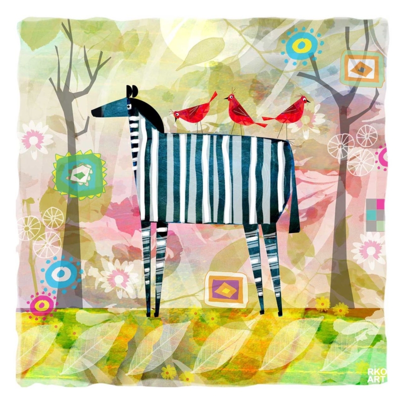
wall art for a children’s optician waiting area can make the first few minutes of an appointment feel easier. Young visitors need something positive to notice, while parents need a waiting space that remains clear and well organised. Zebra by Rikki O’Neill gives both groups a strong focal point. The animal subject is easy to recognise, and the finished artwork feels considered rather than like temporary playroom decoration.

wall art for a children’s optician waiting area: Zebra by Rikki O'Neill

Why wall art for a children’s optician waiting area matters

An eye examination asks a child to look carefully, respond to unfamiliar instructions, and spend time around equipment they may not know. A friendly picture does not replace good communication, but it can give the eye a reassuring place to settle. It also helps the waiting room feel designed for families without making the whole practice look childish.

A zebra is particularly apt in a setting concerned with vision. Its stripes invite observation, comparison, and conversation. A parent might ask a child to find a favourite detail or describe the pattern before the appointment begins. That small activity is gentle and open-ended, with no screens, batteries, or loose pieces to manage.

Give families one clear visual landmark

Busy waiting areas already contain reception signs, product displays, appointment information, and rows of spectacle frames. Adding several unrelated pictures can increase the visual load. One compact, distinctive image can work harder. It creates a memorable landmark while leaving essential information easy to find.

  • Near family seating: place the image within a comfortable sightline, but beyond the reach of small hands.
  • Beside a quieter corner: use it to identify a calm place for children who need less activity.
  • Along the route to the consulting room: let the picture provide a friendly transition without narrowing circulation.
  • Behind reception: keep enough clear wall around it so notices do not compete with the image.

Plan a safe, practical position

The available print size is 265 x 265 millimetres before framing. Its square shape can suit a short wall, a defined panel beside seating, or a compact reception area. Check the final framed dimensions against nearby furniture. The centre should remain visible to a seated child, but the lower edge should not be vulnerable to bags, pushchairs, or passing shoulders.

Secure fixings are important in any public setting. Keep the piece away from doors that open against the wall and from areas cleaned with frequent spray. If glazing catches reflections from a shopfront or examination-room lighting, test the position at different times of day before making the final installation.

Keep the surrounding scheme calm

A characterful illustration does not require animal patterns across the entire room. Let the zebra be the playful element. Pale walls, simple seating, and orderly storage will give it room to work. Repeating one restrained tone in a chair, planter, or reception detail can connect the piece without creating a theme.

The frame should support the practice’s wider interior. A slim dark moulding can give a crisp boundary and relate to black spectacle frames or signage. A light timber finish can soften a clinical white room. First 4 Frames can advise on that balance and completes colour-managed Giclée printing and hand-finished framing in-house in Falkirk.

An imaginative welcome with a professional finish

Rikki O’Neill is a self-taught illustrator and photographer whose work is known for imaginative character. Learn more through this profile of Rikki O’Neill, then explore the wider Rikki O’Neill collection at First 4 Frames.

Good wall art for a children’s optician waiting area should help children feel included while respecting the professional setting around them. View the framed Zebra print for a compact focal point that offers recognition, conversation, and a warm first impression.