Posted on

Wall Art for a Room With Blue Walls Feels More Layered With Blue Reflections

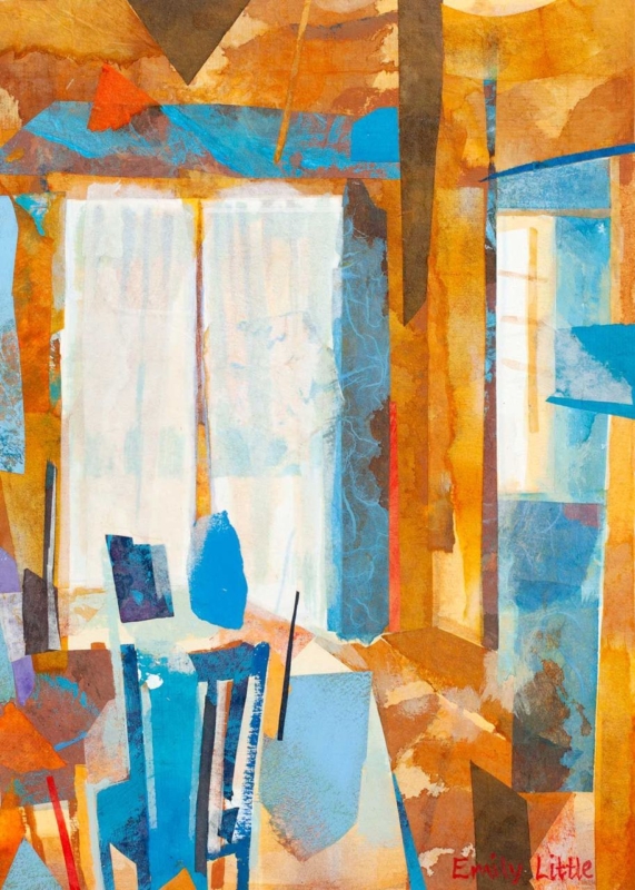
Image of Blue Reflections by Emily Little

The right wall art for a room with blue walls should build on the colour already in the room rather than simply repeating it. Blue Reflections is a strong example because it adds movement, tonal contrast, and a gentler layered feel that stops a blue scheme becoming too flat or overly cool.

wall art for a room with blue walls - Blue Reflections

How Blue Reflections improves wall art for a room with blue walls

Blue Reflections works well when the room already has painted blue walls, upholstery, or cooler accent tones. Rather than disappearing into the scheme, it gives the palette more depth and rhythm. That is especially useful in bedrooms, sitting rooms, or upstairs spaces where the colour story needs variation to feel complete.

  • It keeps a blue room feeling layered rather than one-note.
  • It adds visual movement without introducing a clashing colour story.
  • It helps a cooler scheme feel calmer instead of colder.

Because First 4 Frames completes the framing and Giclée production in-house, the finished piece keeps those shifts of tone intact. That kind of colour-managed presentation is particularly important when a room depends on subtle variation rather than stronger contrast.

If you enjoy the broader role colour can play in a composition, Tate’s guide to colour in art offers useful background. You can also browse more work by Emily Little and view the exact framed print here.

For buyers comparing wall art for a room with blue walls, Blue Reflections is a persuasive choice when the goal is depth, calm, and a more resolved finish.

Posted on

Wall Art for a Room With Blue Walls Feels Softer With Where Water Dreams

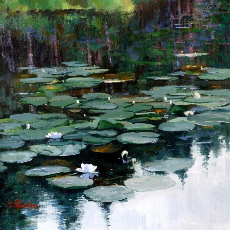
Image of Where Water Dreams by Colin Robertson

Choosing wall art for a room with blue walls is rarely about finding a picture that repeats the exact same shade. Usually the room works better when the artwork deepens the palette and adds a little variation. Where Water Dreams does that beautifully, bringing watery movement and softer contrast that stop blue walls feeling too flat or overcontrolled.

wall art for a room with blue walls - Where Water Dreams

Why Where Water Dreams suits wall art for a room with blue walls

Where Water Dreams works because it keeps the room in the same emotional register without becoming too literal. The image has fluidity, quieter transitions, and enough tonal variation to make blue paint feel intentional rather than one-note. That is especially useful in living rooms, bedrooms, or calmer dining spaces where the wall colour is already doing a lot of the mood-setting work.

  • It keeps a blue scheme calm rather than over-contrasted.
  • It adds movement that prevents the room feeling static.
  • It gives the wall a focal point without looking aggressively colour matched.

This is also where the framed finish matters. A hand-finished frame gives the artwork enough presence to stand with a stronger painted wall, instead of fading into it. First 4 Frames completes that work in-house in Falkirk, combining bespoke framing with colour-managed Giclée production so the final piece feels settled and superior quality from the outset.

If you are thinking about how colour behaves in an interior, the Design Museum on the colour blue offers useful context. You can also browse more work by Colin Robertson and view the exact framed product here.

For anyone weighing up wall art for a room with blue walls, Where Water Dreams is a strong reminder that the best match is often the one that adds depth, softness, and rhythm rather than simply repeating the paint.

Posted on

Wall Art for a Room With Blue Walls, Why Carista Bay Lewis Feels So Balanced

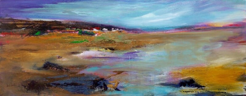
Image of Carista Bay Lewis by Arie Vardi

Choosing wall art for a room with blue walls is usually about balance. Blue can feel calm, elegant, and full of light, but it can also leave a room looking slightly cold if the artwork repeats the same note without adding warmth or movement. Carista Bay Lewis is such a good answer because it keeps the freshness of a blue scheme while softening it with shoreline colour and a more open sense of space.

This kind of piece works especially well when you want a room to feel airy and settled rather than strongly contrasted. The coastal atmosphere gives the eye somewhere gentle to rest, which helps blue walls feel layered rather than flat.

Why It Works With Blue Schemes

Blue rooms often benefit from artwork that introduces a second note without fighting the calm. Carista Bay Lewis does that neatly through soft sand, light, and horizon. The room keeps its cool composure, but it gains more warmth and rhythm.

  • It prevents a blue room from feeling too tonally narrow.
  • It adds movement without making the space feel busy.
  • It suits coastal, modern, and quietly traditional interiors alike.

Best Places To Use It

This piece would work well in a bedroom with painted blue walls, a sitting room with softer navy or denim tones, or a hallway where cooler colour needs something more welcoming to balance it. It also suits rooms with pale timber, natural fibres, and brushed metal details because the palette does not compete with them.

If the wall colour already gives the room enough atmosphere, the artwork does not need to shout. It simply needs to complete the scheme. That is exactly where Carista Bay Lewis feels strongest.

Why The Finish Helps

A blue room usually shows up weak framing very quickly. The piece needs a clean, hand-finished presentation so the colours feel intentional and the wall looks properly dressed. First 4 Frames completes this work in-house with bespoke framing and colour-managed Giclée quality, giving the finished piece much more authority than a standard print.

You can view the framed product here, and explore more from Arie Vardi if you want to build a similarly calm, coastal thread across the home.

For anyone looking for wall art for a room with blue walls that feels warm, airy, and quietly polished, Carista Bay Lewis is a very strong fit.

Posted on

Luss, Loch Lomond and the Appeal of Wall Art for a Room With Blue Walls

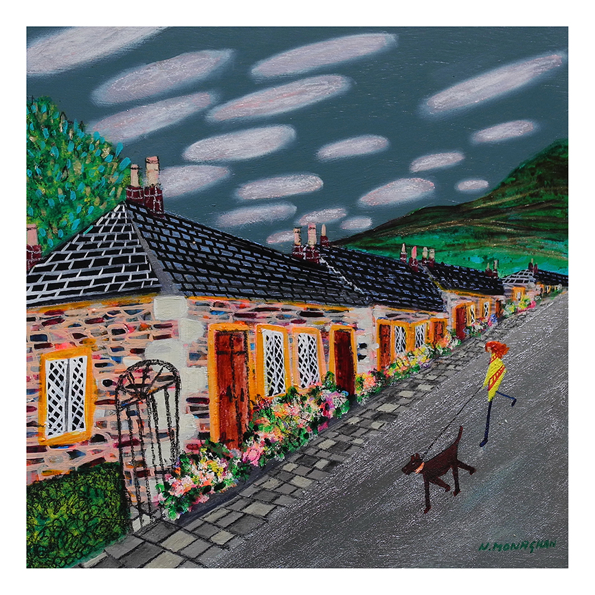
Luss, Loch Lomond" is a vibrant artwork showing stone cottages with orange doors on a sloped street, featuring a person in yellow running with a brown dog beneath cloudy blue skies and scenic hills.

Choosing wall art for a room with blue walls is often about temperature as much as colour. Blue can feel restful and elegant, but it can also make a room seem slightly flat if the artwork does not bring enough contrast or life. Luss, Loch Lomond works beautifully here because it keeps the scheme calm while adding movement and a stronger sense of place.

Blue walls need artwork that adds warmth without fighting the scheme

The best art for a blue room does not simply repeat the wall colour. It gives the eye somewhere else to travel, introducing variation and atmosphere while still feeling connected to the palette. Luss, Loch Lomond handles that balance especially well, making the room feel more layered rather than more matchy.

  • It softens cooler wall colours with a more natural rhythm.
  • It helps the room feel more dimensional rather than one-note.
  • It suits bedrooms, sitting rooms, and hallways where calm still matters.

This can be particularly useful where blue paint is paired with white trim, pale upholstery, or natural timber. The artwork adds warmth and personality, but it still keeps the room composed.

First 4 Frames completes every piece in-house in Falkirk with bespoke framing, colour-managed Giclee printing, and hand-finished craftsmanship. That superior finish helps the print hold its own against a confident wall colour.

You can explore more from Nikki Monaghan and view the exact framed print here.

If you need wall art for a room with blue walls that keeps the scheme calm while giving it more depth, Luss, Loch Lomond is a very appealing option.